自部署静态站点,解决老孟主站图片无法加载。
title: 'AboutDialog' description: '关于对话框,包含应用程序的图标,名称,版本号和版权,以及用于显示该应用程序使用的软件的许可证的按钮' type: widgets
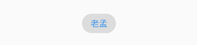
AboutDialog
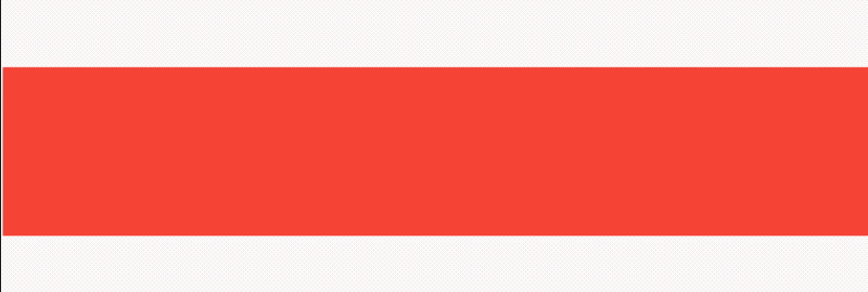
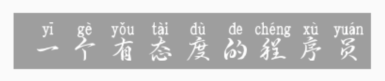
AboutDialog用于描述当前App信息,底部提供2个按钮:查看许可按钮和关闭按钮。AboutDialog需要和showAboutDialog配合使用,用法如下:
showAboutDialog(
context: context,
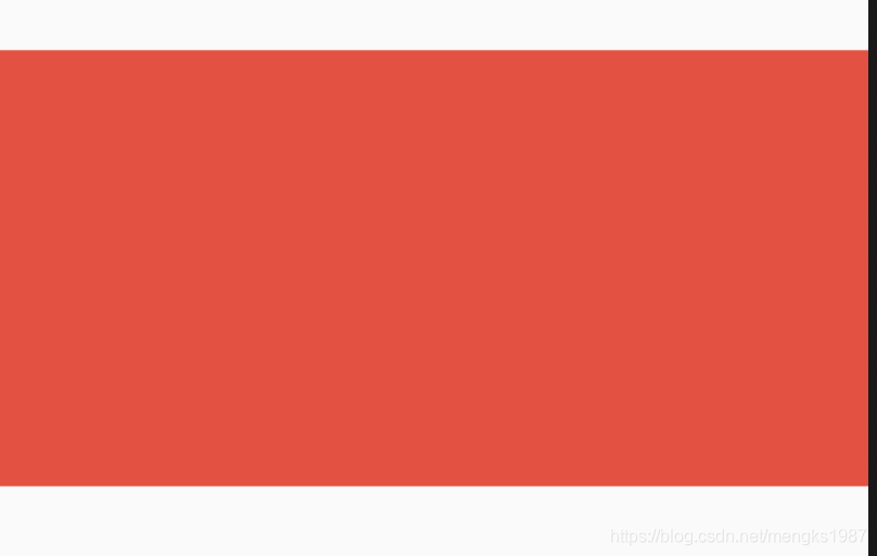
applicationIcon: Image.asset(
'images/bird.png',
height: 100,
width: 100,
),
applicationName: '应用程序',
applicationVersion: '1.0.0',
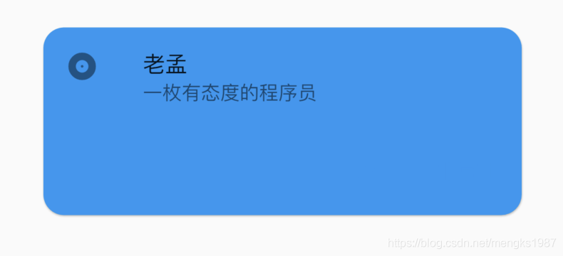
applicationLegalese: 'copyright 老孟,一枚有态度的程序员',
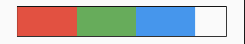
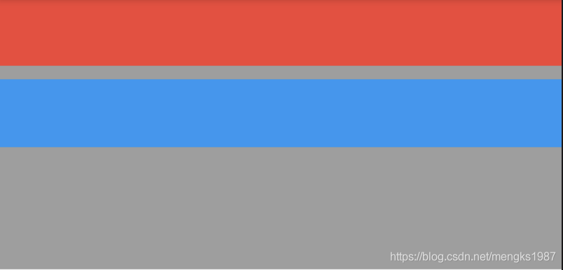
children: <Widget>[
Container(
height: 30,
color: Colors.red,
),
Container(
height: 30,
color: Colors.blue,
),
Container(
height: 30,
color: Colors.green,
)
],
);
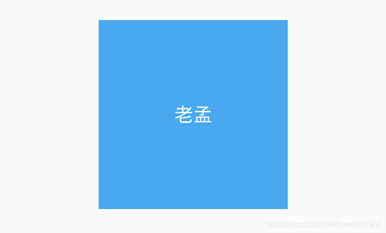
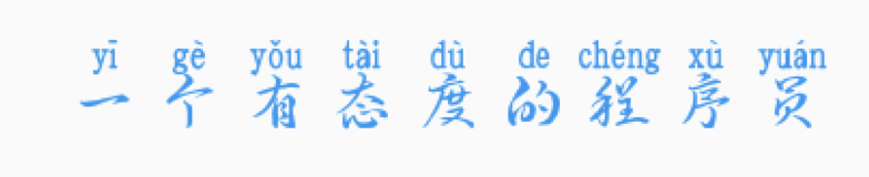
效果如下:
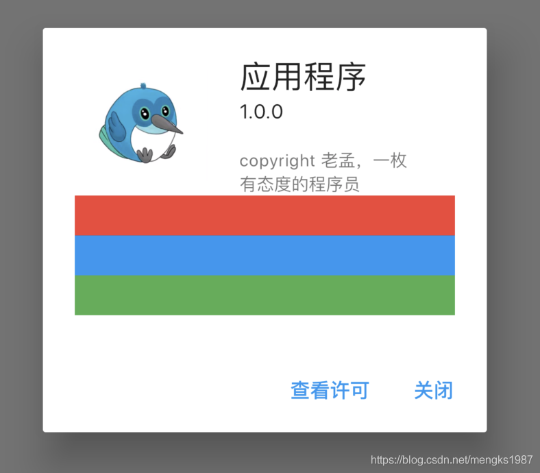
属性说明如下:
applicationIcon:应用程序的图标。applicationName:应用程序名称。applicationVersion:应用程序版本。applicationLegalese:著作权(copyright)的提示。children:位置如上图的红蓝绿色的位置。
所有的属性都需要手动设置,不是自动获取的。
下面的2个按钮根据应用程序支持的语言显示相应的语言,比如显示中文方法如下:
- 在
pubspec.yaml中配置支持国际化:
dependencies:
  flutter:
    sdk: flutter
  flutter_localizations:
    sdk: flutter
- 在MaterialApp中配置当前区域:
MaterialApp(
      title: 'Flutter Demo',
      localizationsDelegates: [
        GlobalMaterialLocalizations.delegate,
        GlobalWidgetsLocalizations.delegate,
      ],
      supportedLocales: [
        const Locale('zh', 'CH'),
        const Locale('en', 'US'),
      ],
      locale: Locale('zh'),
      ...
  )
此时效果:
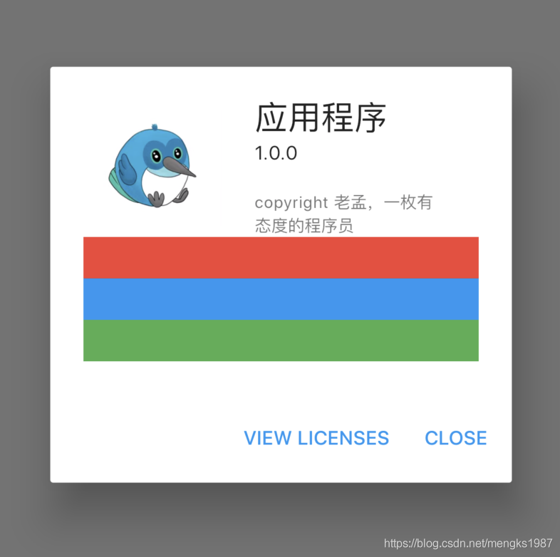
此时点击查看许将会调用showLicensePage,相关效果可以查看showLicensePage。
title: 'AboutListTile' description: '显示”关于信息“的[ListTile],点击弹出AboutDialog' type: widgets
AboutListTile
用法如下:
AboutListTile()
效果如下:
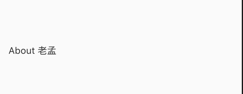
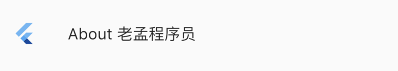
什么也没有设置,怎么会出现“About 老孟”?AboutListTile组件的child参数,默认显示About+应用程序的名称。
设置child参数:
AboutListTile(
  child: Text('About 老孟程序员'),
)
效果如下:
设置icon:
AboutListTile(
  icon: FlutterLogo(),
  child: Text('About 老孟程序员'),
)
效果如下:
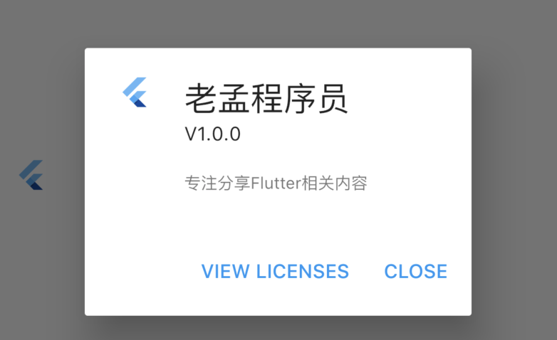
设置应用程序属性:
AboutListTile(
    icon: FlutterLogo(),
    child: Text('About 老孟程序员'),
    applicationName: '老孟程序员',
    applicationVersion: 'V1.0.0',
    applicationIcon: FlutterLogo(),
    applicationLegalese: '专注分享Flutter相关内容')
刷新,控件并没有更新,AboutListTile控件是有点击属性的,点击弹出AboutDialog控件,这些属性出现在AboutDialog控件上,关于AboutDialog的详细内容请查看AboutDialog控件。
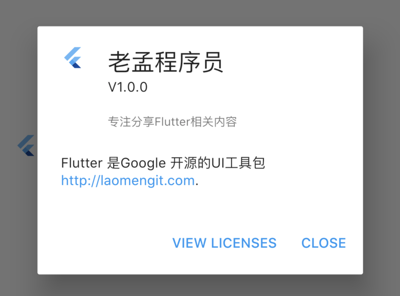
设置aboutBoxChildren:
final TextStyle textStyle = Theme.of(context).textTheme.body1;
final List<Widget> aboutBoxChildren = <Widget>[
  SizedBox(height: 24),
  RichText(
    text: TextSpan(
      children: <TextSpan>[
        TextSpan(
            style: textStyle,
            text: 'Flutter is Google’s UI toolkit for building beautiful, '
                'natively compiled applications for mobile, web, and desktop '
                'from a single codebase. Learn more about Flutter at '),
        TextSpan(
            style: textStyle.copyWith(color: Theme.of(context).accentColor),
            text: 'https://flutter.dev'),
        TextSpan(style: textStyle, text: '.'),
      ],
    ),
  ),
];

return AboutListTile(
  icon: FlutterLogo(),
  child: Text('About 老孟程序员'),
  applicationName: '老孟程序员',
  applicationVersion: 'V1.0.0',
  applicationIcon: FlutterLogo(),
  applicationLegalese: '专注分享Flutter相关内容',
  aboutBoxChildren: aboutBoxChildren,
  dense: false,
)
效果:
总结
此控件通常不会使用,通常会设置一个单独的“关于页面”
title: 'AbsorbPointer | IgnorePointer' description: '在命中测试期间(不)吸收指针的控件' type: widgets
AbsorbPointer
AbsorbPointer是一种禁止用户输入的控件,比如按钮的点击、输入框的输入、ListView的滚动等,你可能说将按钮的onPressed设置为null,一样也可以实现,是的,但AbsorbPointer可以提供多组件的统一控制,而不需要你单独为每一个组件设置。
用法如下:
AbsorbPointer(
  child: Row(
    children: <Widget>[
      RaisedButton(onPressed: (){},),
      RaisedButton(onPressed: (){},),
      RaisedButton(onPressed: (){},),
      RaisedButton(onPressed: (){},),

    ],
  ),
)
默认情况下,这些按钮是否响应点击事件的,如果想要响应点击事件只需设置absorbing为false即可:
AbsorbPointer(
  absorbing: false,
  ...
)
IgnorePointer
IgnorePointer的用法和AbsorbPointer一样,而且达到的效果一样,用法如下:
IgnorePointer(
  child: Row(
    children: <Widget>[
      RaisedButton(onPressed: (){},),
      RaisedButton(onPressed: (){},),
      RaisedButton(onPressed: (){},),
      RaisedButton(onPressed: (){},),
    ],
  ),
)
区别
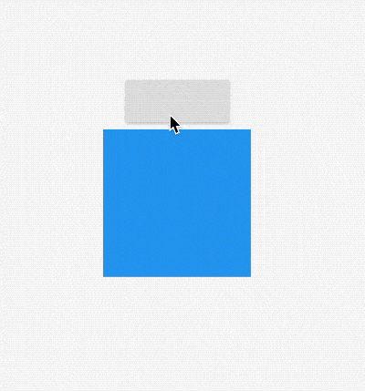
AbsorbPointer本身可以接收点击事件,消耗掉事件,而IgnorePointer无法接收点击事件,其下的控件可以接收到点击事件(不是子控件)。
如果有2个盒子,一个200x200的红色盒子,一个100x100的蓝色盒子,蓝色盒子位于红色盒子之上居中显示,给2个盒子添加点击事件,如下:
return Container(
      height: 200,
      width: 200,
      child: Stack(
        alignment: Alignment.center,
        children: <Widget>[
          Listener(
            onPointerDown: (v) {
              print('click red');
            },
            child: Container(
              color: Colors.red,
            ),
          ),
          Listener(
            onPointerDown: (v) {
              print('click blue');
            },
            child: Container(
              color: Colors.blue,
              width: 100,
              height: 100,
            ),
          ),
        ],
      ),
    );
点击蓝色盒子时,打印结果:
flutter: click blue
点击蓝色盒子区域以外的红色盒子,打印结果:
flutter: click red
此时用AbsorbPointer包裹蓝色盒子:
return Container(
  height: 200,
  width: 200,
  child: Stack(
    alignment: Alignment.center,
    children: <Widget>[
      Listener(
        onPointerDown: (v) {
          print('click red');
        },
        child: Container(
          color: Colors.red,
        ),
      ),
      Listener(
        onPointerDown: (v) {
          print('click blue self');
        },
        child: AbsorbPointer(
          child: Listener(
            onPointerDown: (v) {
              print('click blue child');
            },
            child: Container(
              color: Colors.blue,
              width: 100,
              height: 100,
            ),
          ),
        ),
      ),
    ],
  ),
);
点击蓝色盒子,打印如下:
flutter: click blue self
说明AbsorbPointer本身接收到了点击事件,将AbsorbPointer改为IgnorePointer,打印如下:
flutter: click red
点击事件穿透蓝色盒子到红色盒子,红色盒子接收到了点击事件。
使用场景
1、根据业务需求禁用/启用多个组件。
2、根据业务需求禁用/启用整个App。
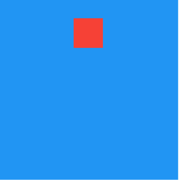
title: 'Align|Center' description: '布局控件' type: widgets
Align
Align和Center控件都是控制子控件位置的控件。
Align
基本用法:
Container(
  color: Colors.lightBlue,
  width: 200,
  height: 200,
  child: Align(
    child: Text('老孟',style: TextStyle(color: Colors.white,fontSize: 20),),
  ),
)
Align默认居中对齐,效果如下;
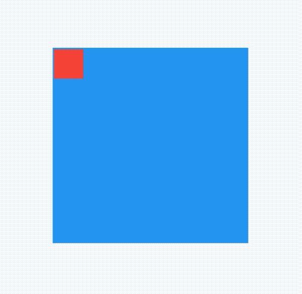
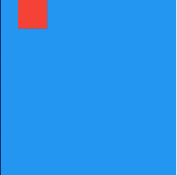
当然还可以设置其他对齐方法,比如bottomRight(右下角)等,用法如下:
Align(
  alignment: Alignment.bottomRight,
  child: Text('老孟',style: TextStyle(color: Colors.white,fontSize: 20),),
)
如果系统提供的位置都不是想要的,可以使用如下方式:
Align(
  alignment: Alignment(0.2,0.5),
  child: Text('老孟',style: TextStyle(color: Colors.white,fontSize: 20),),
)
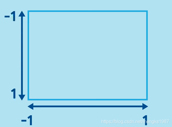
Alignment参数x,y坐标系统如下,注意这个坐标系统和常见的不太一样:
 ·
·
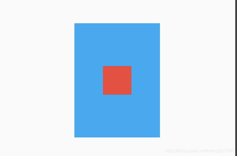
widthFactor和heightFactor参数不为null且父组件没有限制大小,此时Align的宽度等于子控件的宽度乘以对应的factor,用法如下:
Container(
  color: Colors.lightBlue,
  child: Align(
    widthFactor: 3,
    heightFactor: 4,
    child: Container(
      height: 50,
      width: 50,
      color: Colors.red,
    ),
  ),
)
效果如下:
Center
Center控件继承自Align,通过名字我们也知道Center是让子控件居中,用法如下:
Center(
  child: Text('老孟'),
)
title: 'AlignTransition' description: '布局变化动画控件' type: widgets
AlignTransition
对Align子控件位置变换动画,用法如下:
@override
  void initState() {
    _animationController =
        AnimationController(duration: Duration(seconds: 2), vsync: this);
    _animation = Tween<AlignmentGeometry>(
            begin: Alignment.topLeft, end: Alignment.bottomRight)
        .animate(_animationController);

    //开始动画
    _animationController.forward();
    super.initState();
  }

  @override
  Widget build(BuildContext context) {
    return Container(
      height: 200,
      width: 200,
      color: Colors.blue,
      child: AlignTransition(
        alignment: _animation,
        child: Container(
          height: 30,
          width: 30,
          color: Colors.red,
        ),
      ),
    );
  }
效果如下:
title: 'AnimatedAlign' description: '控件介绍' type: widgets
AnimatedAlign
AnimatedAlign组件方便我们构建位置动画,基本用法如下:
var _alignment = Alignment.topLeft;

@override
  Widget build(BuildContext context) {
    return Container(
      width: 200,
      height: 200,
      color: Colors.lightBlue,
      child: AnimatedAlign(
        alignment: _alignment,
        duration: Duration(seconds: 2),
        child: IconButton(
          icon: Icon(Icons.print,color:Colors.red,size: 30,),
          onPressed: (){
            setState(() {
              _alignment = Alignment.bottomRight;
            });
          },
        ),
      ),
    );
  }
效果如下:
我们还可以通过curve设置动画曲线,用法如下:
AnimatedAlign(
  curve: Curves.bounceInOut,
  ...
)
onEnd是动画执行结束回调,用法如下:
AnimatedAlign(
  onEnd: (){
    print('onEnd');
  },
  ...
)
title: 'AnimatedBuilder' description: '控件介绍' type: widgets
AnimatedBuilder
AnimatedBuilder可以让我们轻松的构建动画控件,下面的案例是让flutter logo图片旋转,代码如下:
class _TestState extends State<Test> with TickerProviderStateMixin {
AnimationController animationController;

@override
void initState() {
  animationController =
      AnimationController(duration: Duration(seconds: 2), vsync: this)
        ..addStatusListener((status) {
          if (status == AnimationStatus.completed) {
            animationController.reverse();
          } else if (status == AnimationStatus.dismissed) {
            animationController.forward();
          }
        });
  animation = Tween(begin: 0.0, end: 2.0 * pi).animate(animationController);
  //开始动画
  animationController.forward();
)

@override
Widget build(BuildContext context) {
  return AnimatedBuilder(
    animation: animation,
    builder: (BuildContext context, Widget child) {
      return Transform.rotate(
        angle: animation.value,
        child: child,
      );
    },
    child: FlutterLogo(size: 60,),
  );
}
@override
  dispose() {
    super.dispose();
    animationController.dispose();
  }
}
效果如下:
builder方法是animation的值发生变化会调用builder函数,构建新的组件。
animation参数表示动画。
child参数将会传递给builder方法,如果builder返回一个不依赖于animation的组件,那么这个子控件不会每次都重建,child参数可以不设置,但官方建议设置,它在某些情况下可以优化其体验。
title: 'AnimatedContainer' description: '控件介绍' type: widgets
AnimatedContainer
Flutter中很多用于动画的控件,这篇文章介绍动画控件AnimatedContainer,我们可以通俗的理解AnimatedContainer是带动画功能的Container,关于Container的详细介绍可以查看Flutter Widgets 之 Container,这篇详细介绍了Container的用法。
AnimatedContainer只需要提供动画开始值和结束值,它就会动起来并不需要我们主动调用setState方法。
变化AnimatedContainer的宽高实现变大的效果,代码如下:
bool click = false;

  @override
  Widget build(BuildContext context) {
    return Center(
      child: GestureDetector(
        onTap: () {
          setState(() {
            click = !click;
          });
        },
        child: AnimatedContainer(
          height: click ? 200 : 100,
          width: click ? 200 : 100,
          color: Colors.blue,
          duration: Duration(seconds: 3),

        ),
      ),
    );
  }
效果如下:
动画不仅可以作用在宽高上,还可以作用在颜色、边界、边界圆角半径、背景图片、形状等。
AnimatedContainer有2个必须的参数,一个时长duration,即动画执行的时长,另一个是动画曲线curve,默认是线性,系统为我们提供了很多动画曲线(加速、减速等)。
设置动画曲线代码如下:
AnimatedContainer(
	curve: Curves.bounceIn,
	...
)
如果想在动画执行结束时做一些事情,需要设置onEnd,代码如下:
AnimatedContainer(
	onEnd: (){
		...
	}
}
实战
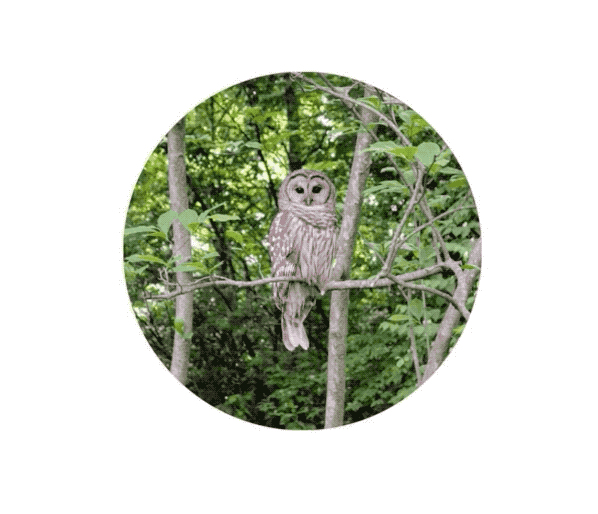
将图片放大并过度到圆形,动画执行结束后在反向执行动画,如此反复,代码如下:
AnimatedContainer(
      height: click ? 200 : 100,
      width: click ? 200 : 100,
      decoration: BoxDecoration(
          image: DecorationImage(
            image: NetworkImage(
                'https://flutter.github.io/assets-for-api-docs/assets/widgets/owl-2.jpg'),
            fit: BoxFit.cover,
          ),
          borderRadius: BorderRadius.all(Radius.circular(
            click ? 200 : 0,
          ))),
      duration: Duration(seconds: 3),
      curve: Curves.linear,
      onEnd: (){
        setState(() {
          click = !click;
        });
      },
    )
动画效果:
title: 'AnimatedCrossFade' description: '控件介绍' type: widgets
AnimatedCrossFade
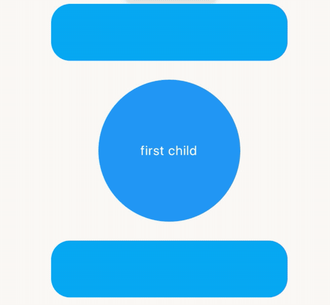
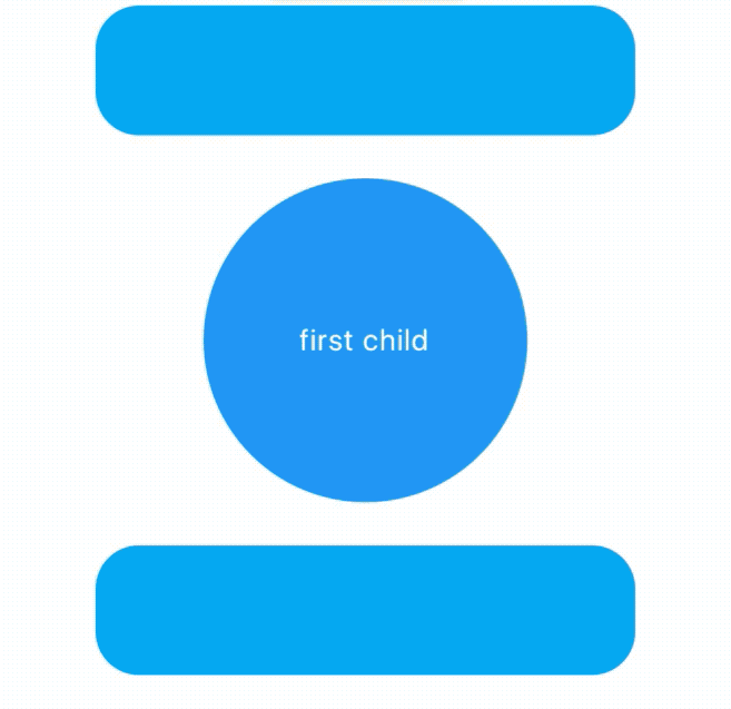
AnimatedCrossFade组件让2个组件在切换时出现交叉渐入的效果,因此AnimatedCrossFade需要设置2个子控件、动画时间和显示第几个子控件,用法如下:
AnimatedCrossFade(
  duration: Duration(seconds: 1),
  crossFadeState:
      _showFirst ? CrossFadeState.showFirst : CrossFadeState.showSecond,
  firstChild: Container(
    height: 150,
    width: 150,
    alignment: Alignment.center,
    decoration: BoxDecoration(shape: BoxShape.circle, color: Colors.blue),
    child: Text('first child',style: TextStyle(color: Colors.white),),
  ),
  secondChild: Container(
    height: 150,
    width: 150,
    alignment: Alignment.center,
    decoration:
        BoxDecoration(shape: BoxShape.rectangle, color: Colors.orange,borderRadius:BorderRadius.circular(20)),
    child: Text('second child',style: TextStyle(color: Colors.white),),
  ),
)
_showFirst参数由一个按钮按住,代码如下:
 bool _showFirst = true;
RaisedButton(
  child: Text('切换'),
  onPressed: () {
    setState(() {
      _showFirst = !_showFirst;
    });
  },
),
效果如下:
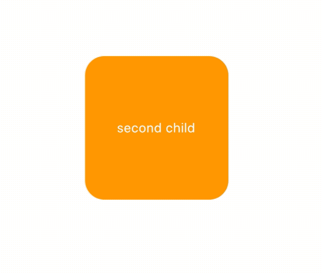
AnimatedCrossFade不仅支持同尺寸,还支持不同尺寸的控件进行切换,效果如下:
当矩形过渡到圆形时有一个抖动,矩形直接变为圆形直径,解决抖动问题使用layoutBuilder,用法如下:
AnimatedCrossFade(
  layoutBuilder: (child1, key1, child2, key2) {
    return Stack(
      overflow: Overflow.visible,
      alignment: Alignment.center,
      children: <Widget>[
        Positioned(
          top: 0,
          bottom: 0,
          key: key2,
          child: child2,
        ),
        Positioned(
          key: key1,
          child: child1,
        ),
      ],
    );
  },
  )
效果如下:
我们还可以设置尺寸和子组件的动画曲线,用法如下:
AnimatedCrossFade(
  firstCurve: Curves.bounceIn,
  secondCurve: Curves.bounceInOut,
  sizeCurve: Curves.easeIn,
  )
title: 'AnimatedDefaultTextStyle' description: '控件介绍' type: widgets
AnimatedDefaultTextStyle
TextStyle属性动画,用法如下:
class AnimationDemo extends StatefulWidget {
  @override
  State<StatefulWidget> createState() => _AnimationDemo();
}

class _AnimationDemo extends State<AnimationDemo>
    with SingleTickerProviderStateMixin {
  TextStyle _style;
  @override
  void initState() {
    _style=TextStyle(color: Colors.blue, fontSize: 14);
  super.initState();
  }

  @override
  Widget build(BuildContext context) {
    return Column(
      children: <Widget>[
        SizedBox(height: 200,),
        AnimatedDefaultTextStyle(
          style: _style,
          duration: Duration(seconds: 2),
          child: Text('老孟'),
        ),
        SizedBox(height: 100,),
        RaisedButton(
          onPressed: (){
            setState(() {
              _style = TextStyle(color: Colors.red, fontSize: 24);
            });
          },
        )
      ],
    );
  }

}
效果如下:
title: 'AnimatedIcon' description: '控件介绍' type: widgets
AnimatedIcon
我们都知道Flutter系统中提供了大量的图标,但你是否知道Flutter还提供了很多动画图标,想要使用这些动画图标需要使用AnimatedIcon控件,首先需要设置图标,代码如下:
AnimatedIcon(
  icon: AnimatedIcons.view_list,
  ...
)
还需要设置progress,progress用于图标的动画,设置如下:
import 'package:flutter/material.dart';

class Test extends StatefulWidget {
  @override
  State<StatefulWidget> createState() => _TestState();
}

class _TestState extends State<Test> with TickerProviderStateMixin {
  AnimationController animationController;

  @override
  void initState() {
    super.initState();
    animationController =
        AnimationController(duration: Duration(seconds: 1), vsync: this)
          ..addStatusListener((AnimationStatus status) {
            if (status == AnimationStatus.completed) {
              animationController.reverse();
            } else if (status == AnimationStatus.dismissed) {
              animationController.forward();
            }
          });
    animationController.forward();
  }

  @override
  Widget build(BuildContext context) {
    return Container(
      height: 100,
      width: 100,
      alignment: Alignment.center,
      child: AnimatedIcon(
        icon: AnimatedIcons.view_list,
        progress: animationController,
      ),
    );
  }

  @override
  dispose() {
    super.dispose();
    animationController.dispose();
  }
}
上面的代码同时对动画的状态进行了监听使动画往复运动,动画效果:
系统提供的图标样式如下:
title: 'AnimatedList' description: '控件介绍' type: widgets
AnimatedList
AnimatedList提供了一种简单的方式使列表数据发生变化时加入过渡动画,
下面是一种动画效果:

AnimatedList主要属性如下表。
| 属性 | 说明 |
|---|---|
| itemBuilder | 一个函数,列表的每一个索引会调用,这个函数有一个animation参数,可以设置成任何一个动画 |
| initialItemCount | item的个数 |
| scrollDirection | 滚动方向,默认垂直 |
| controller | scroll控制器 |
| 列表数据的插入和删除有进出场动画需要调用AnimatedListState指定的方法,只删除原数据并调用setState方法是没有动画效果的,对应方法如下: | |
| >AnimatedListState.insertItem | |
| AnimatedListState.removeItem |
AnimatedListState是AnimatedList的状态类,获取AnimatedListState有两个方法:
- 通过AnimatedList.of(context)方法,代码如下:
AnimatedList.of(context).insertItem(index);
AnimatedList.of(context).removeItem(index, (context,animation)=>{});
2) 通过设置key,用法如下:
final GlobalKey<AnimatedListState> _listKey = GlobalKey<AnimatedListState>();
AnimatedList(
        key: _listKey,
        initialItemCount: _list.length,
        itemBuilder: (BuildContext context, int index, Animation animation) {
          return _buildItem(_list[index].toString(), animation);
        },
      )
调用如下:
_listKey.currentState.insertItem(_index);
需要注意的是AnimatedListState.insertItem或者AnimatedListState.removeItem并不会更新实际数据,需要手动处理。 下面的代码实现了“左进右出”的动画效果:
class AnimatedListDemo extends StatefulWidget {
  @override
  State<StatefulWidget> createState() => _AnimatedListDemo();
}

class _AnimatedListDemo extends State<AnimatedListDemo>
    with SingleTickerProviderStateMixin {
  List<int> _list = [];
  final GlobalKey<AnimatedListState> _listKey = GlobalKey<AnimatedListState>();

  void _addItem() {
    final int _index = _list.length;
    _list.insert(_index, _index);
    _listKey.currentState.insertItem(_index);
  }

  void _removeItem() {
    final int _index = _list.length - 1;
    var item = _list[_index].toString();
    _listKey.currentState.removeItem(
        _index, (context, animation) => _buildItem(item, animation));
    _list.removeAt(_index);

  }

  Widget _buildItem(String _item, Animation _animation) {
    return SlideTransition(
      position: _animation.drive(CurveTween(curve: Curves.easeIn)).drive(Tween<Offset>(begin: Offset(1,1),end: Offset(0,1))),
      child: Card(
        child: ListTile(
          title: Text(
            _item,
          ),
        ),
      ),
    );
  }

  @override
  Widget build(BuildContext context) {
    return Scaffold(
      body: AnimatedList(
        key: _listKey,
        initialItemCount: _list.length,
        itemBuilder: (BuildContext context, int index, Animation animation) {
          return _buildItem(_list[index].toString(), animation);
        },
      ),
      floatingActionButton: Row(
        mainAxisAlignment: MainAxisAlignment.center,
        crossAxisAlignment: CrossAxisAlignment.center,
        children: <Widget>[
          FloatingActionButton(
            onPressed: () => _addItem(),
            child: Icon(Icons.add),
          ),
          SizedBox(
            width: 60,
          ),
          FloatingActionButton(
            onPressed: () => _removeItem(),
            child: Icon(Icons.remove),
          ),
        ],
      ),
    );
  }
}
实现从上掉落的效果,只需将_buildItem方法代码修改如下即可:
  Widget _buildItem(String _item, Animation _animation) {
    return SizeTransition(
      sizeFactor: _animation,
      child: Card(
        child: ListTile(
          title: Text(
            _item,
          ),
        ),
      ),
    );
  }
title: 'AnimatedModalBarrier' description: '一个小部件,可防止用户与其自身背后的小部件进行交互,并且可以使用动画颜色值进行配置' type: widgets
AnimatedModalBarrier
对ModalBarrier控件的颜色进行动画,用法如下:
class AnimationDemo extends StatefulWidget {
  @override
  State<StatefulWidget> createState() => _AnimationDemo();
}

class _AnimationDemo extends State<AnimationDemo>
    with SingleTickerProviderStateMixin {
  AnimationController _animationController;
  Animation _animation;

  @override
  void initState() {
    _animationController =
        AnimationController(duration: Duration(seconds: 2), vsync: this);

    _animation = ColorTween(
            begin: Colors.red,
            end: Colors.blue)
        .animate(_animationController);

    //开始动画
    _animationController.forward();
    super.initState();
  }

  @override
  Widget build(BuildContext context) {
    return Center(
      child: Container(
        height: 100,
        width: 100,
        child: AnimatedModalBarrier(
          color: _animation,
        ),
      ),
    );
  }

  @override
  void dispose() {
    _animationController.dispose();
    super.dispose();
  }
}
效果如下:
title: 'AnimatedOpacity' description: '控件介绍' type: widgets
AnimatedOpacity
AnimatedOpacity是一个隐式的动画组件,它可以使子组件变的透明,用法如下:
var _opacity = 1.0;
AnimatedOpacity(
  opacity: _opacity,
  duration: Duration(seconds: 2),
  child: Container(
    height: 60,
    width: 150,
    color: Colors.blue,
  ),
)
duration参数是动画执行的时间,opacity参数是透明值,值的范围是0.0-1.0。如果仅仅是构建这样一个组件是不会有动画效果,需要让opacity参数发生变化,点击按钮设置新的opacity值:
RaisedButton(
  onPressed: (){
    setState(() {
      _opacity = 0;
    });
  },
)
效果如下:
通过curve参数设置动画执行的曲线,默认直线执行,系统提供了很多中动画执行曲线,比如加速、减速、弹簧等,用法如下:
AnimatedOpacity(
  curve: Curves.easeIn,
  ...
)
如果想要在动画执行结束时处理一些事情,可以在onEnd回调中处理,用法如下:
AnimatedOpacity(
  onEnd: (){
    //动画执行结束回调
  },
  ...
)
title: 'AnimatedPadding' description: '控件介绍' type: widgets
AnimatedPadding
AnimatedPadding是一个隐式的动画组件,提供动态改变内边距的动画组件,用法如下:
var _padding = 0.0;
AnimatedPadding(
      padding: EdgeInsets.symmetric(horizontal: _padding),
      duration: Duration(seconds: 2),
      child: Container(color: Colors.red),
    )
duration参数是动画执行的时间。如果仅仅是构建这样一个组件是不会有动画效果,需要让padding参数发生变化,点击按钮设置新的_padding值:
RaisedButton(
          onPressed: () {
            setState(() {
              _padding = 50;
            });
          },
        )
效果如下:
通过curve参数设置动画执行的曲线,默认直线执行,系统提供了很多中动画执行曲线,比如加速、减速、弹簧等,用法如下:
AnimatedOpacity(
  curve: Curves.easeIn,
  ...
)
如果想要在动画执行结束时处理一些事情,可以在onEnd回调中处理,用法如下:
AnimatedOpacity(
  onEnd: (){
    //动画执行结束回调
  },
  ...
)
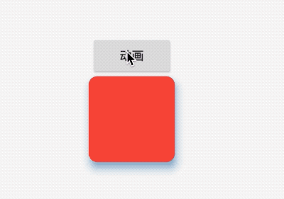
title: 'AnimatedPhysicalModel' description: '对PhysicalModel组件进行动画' type: widgets
AnimatedPhysicalModel
AnimatedPhysicalModel组件为动画组件,对PhysicalModel组件进行动画,用法如下:
@override
  Widget build(BuildContext context) {
    return Center(
      child: Column(
        mainAxisSize: MainAxisSize.min,
        children: <Widget>[
          RaisedButton(
            child: Text('动画'),
            onPressed: () {
              setState(() {
                _animated = !_animated;
              });
            },
          ),
          _buildAnimatedPhysicalModel(),
        ],
      ),
    );
  }

  bool _animated = false;

  _buildAnimatedPhysicalModel() {
    return AnimatedPhysicalModel(
      borderRadius: BorderRadius.circular(_animated ? 20 : 10),
      shape: BoxShape.rectangle,
      color: _animated ? Colors.blue : Colors.red,
      elevation: _animated ? 18 : 8,
      shadowColor: !_animated ? Colors.blue : Colors.red,
      child: Container(
        height: 100,
        width: 100,
      ),
      duration: Duration(seconds: 1),
    );
  }
效果如下:
title: 'AnimatedPositioned' description: '控件介绍' type: widgets
AnimatedPositioned
AnimatedPositioned是一个隐式的动画组件,提供动态改变位置的动画组件,用法如下:
var _top = 30.0;
Stack(
      alignment: Alignment.center,
      children: <Widget>[
        AnimatedPositioned(
          top: _top,
          duration: Duration(seconds: 2),
          child: Container(height: 50, width: 50, color: Colors.red),
        )
      ],
    )
相关参数说:
-
duration参数是动画执行的时间。 -
AnimatedPositioned提供
left、top、right、bottom四种定位属性,和 Positioned组件用相同。 -
AnimatedPositioned只能用于Stack组件中。
-
left、right和width3个参数只能设置其中2个,因为设置了其中2个,第三个已经确定了,同理top、bottom和height也只能设置其中2个。
仅仅是构建这样一个组件是不会有动画效果,需要让_top参数发生变化,点击按钮设置新的_top值:
RaisedButton(
          onPressed: () {
            setState(() {
              _top = 180;
            });
          },
        )
效果如下:
通过curve参数设置动画执行的曲线,默认直线执行,系统提供了很多中动画执行曲线,比如加速、减速、弹簧等,用法如下:
AnimatedOpacity(
  curve: Curves.easeIn,
  ...
)
如果想要在动画执行结束时处理一些事情,可以在onEnd回调中处理,用法如下:
AnimatedOpacity(
  onEnd: (){
    //动画执行结束回调
  },
  ...
)
title: 'AnimatedPositionedDirectional' description: '控件介绍' type: widgets
AnimatedPositionedDirectional
AnimatedPositionedDirectional是一个隐式的动画组件,提供动态改变位置的动画组件,用法如下:
Stack(
      children: <Widget>[
        AnimatedPositionedDirectional(
          start: _start,
          width: 50,
          height: 50,
          duration: Duration(seconds: 2),
          child: Container(color: Colors.red),
        ),
      ],
    )
相关参数说:
-
duration参数是动画执行的时间。 -
提供
top、bottom、start、end四种定位属性,分别表示距离上、下、开始、结尾的距离。 -
只能用于Stack组件中。
-
start、end和width3个参数只能设置其中2个,因为设置了其中2个,第三个已经确定了,同理top、bottom和height也只能设置其中2个。
仅仅是构建这样一个组件是不会有动画效果,需要让_start参数发生变化,点击按钮设置新的_start值:
RaisedButton(
          onPressed: () {
            setState(() {
              _start = 180;
            });
          },
        )
效果如下:
通过curve参数设置动画执行的曲线,默认直线执行,系统提供了很多中动画执行曲线,比如加速、减速、弹簧等,用法如下:
AnimatedOpacity(
  curve: Curves.easeIn,
  ...
)
如果想要在动画执行结束时处理一些事情,可以在onEnd回调中处理,用法如下:
AnimatedOpacity(
  onEnd: (){
    //动画执行结束回调
  },
  ...
)
AnimatedSize
AnimatedSize是一个动画组件,当指定子组件的尺寸发生变化时,它就会在给定的时间内自动变换其尺寸。
用法如下:
class _WidgetsDemo extends State<WidgetsDemo>
    with SingleTickerProviderStateMixin {
  var _height = 100.0;
  var _width = 100.0;
  var _color = Colors.red;

  @override
  Widget build(BuildContext context) {
    return Center(
      child: Column(
        mainAxisAlignment: MainAxisAlignment.center,
        children: <Widget>[
          RaisedButton(
            onPressed: () {
              setState(() {
                _height = 200.0;
                _width = 200.0;
                _color = Colors.blue;
              });
            },
          ),
          AnimatedSize(
            vsync: this,
            duration: Duration(seconds: 1),
            child: Container(
              height: _height,
              width: _width,
              color: _color,
            ),
          )
        ],
      ),
    );
  }
}
效果如下:
title: 'AnimatedSwitcher' description: '控件介绍' type: widgets
AnimatedSwitcher
AnimatedSwitcher在2个或者多个子组件之间切换时使用动画,基本用法如下:
var _currChild = Container(
    key: ValueKey("1"),
    height: 300,
    width: 300,
    color: Colors.red,
  );

AnimatedSwitcher(
      duration: Duration(seconds: 1),
      child: _currChild,
)
duration参数为动画执行时间。
点击按钮切换为另一个子组件:
RaisedButton(
  onPressed: () {
    setState(() {
      _currChild = Container(
                  key: ValueKey("2"),
                  height: 100,
                  width: 100,
                  color: Colors.blue,
                );
    });
  },
),
切换的子组件一定要有不同的key,子组件从红色切换到蓝色,默认情况下使用的动画是FadeTransiton,即渐隐渐显。效果如下:
我们也可以使用其他动画,比如缩放动画、旋转动画等,缩放动画用法如下:
AnimatedSwitcher(
  duration: Duration(seconds: 1),
  child: _currChild,
  transitionBuilder: (Widget child, Animation<double> value) {
    return ScaleTransition(
      child: child,
      scale: value,
    );
  },
)
缩放动画效果如下:
通过switchInCurve和switchOutCurve参数是进出场动画执行的曲线,默认直线执行,系统提供了很多中动画执行曲线,比如加速、减速、弹簧等,用法如下:
AnimatedSwitcher(
  switchInCurve: Curves.easeIn,
  ...
)
transitionBuilder参数是转换动画,如上面缩放动画。
layoutBuilder是定位子组件位置的函数,用法如下:
AnimatedSwitcher(
  duration: Duration(seconds: 1),
  child: _currChild,
  layoutBuilder: (Widget currentChild, List<Widget> previousChildren){
    return Stack(
      children: <Widget>[
        ...previousChildren,
        currentChild
      ],
      alignment: Alignment.center,
    );
  },
)
将当前的子组件和前面的子组件封装在Stack中,叠加显示。
title: 'AppBar' description: '控件介绍' type: widgets
AppBar
AppBar是material风格的应用程序栏,结构图如下:
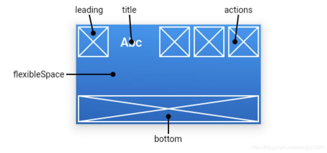
leading属性通常设置返回按钮,用法如下:
Scaffold(
  appBar: AppBar(
    leading: BackButton(),
    title: Text('老孟'),
  ),
)
效果如下:
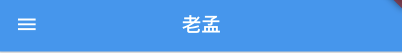
如果leading属性未设置,且Scaffold设置了Drawer则显示打开Drawer的图标,用法如下:
Scaffold(
  appBar: AppBar(
    title: Text('老孟'),
  ),
  drawer: Drawer(),
)
效果如下:
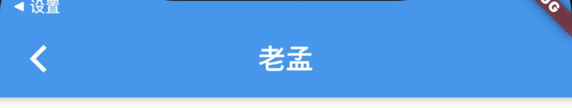
如果leading属性未设置,Scaffold也未设置Drawer,此时如果有前一个路由,则显示BackButton,设置如下:
@override
Widget build(BuildContext context) {
  return Scaffold(
    appBar: AppBar(
      title: Text('老孟'),
    ),
    body: Center(
      child: RaisedButton(
        onPressed: () {
          Navigator.push(context, MaterialPageRoute(builder: (context) {
            return Scaffold(
              appBar: AppBar(
                title: Text('老孟1'),
              ),
            );
          }));
        },
      ),
    ),
  );
}
效果如下:
通过automaticallyImplyLeading属性改变其行为,设置为false将不会自动设置控件,用法如下:
AppBar(
  automaticallyImplyLeading: false,
  ...
)
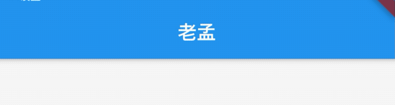
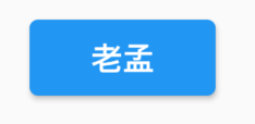
title属性是应用栏上的标题,一般设置Text文本,用法如下:
AppBar(
  title: Text('老孟'),
)
注意title不一定是居中的,在Android平台默认是靠左的,设置居中代码如下:
AppBar(
  title: Text('老孟'),
  centerTitle: true,
)
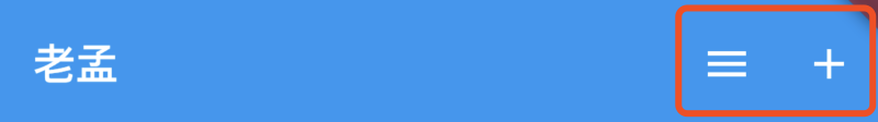
actions在程序栏的右边,可以设置多个功能按钮,用法如下:
Scaffold(
  appBar: AppBar(
    title: Text('老孟'),
    actions: <Widget>[
      IconButton(icon: Icon(Icons.menu),onPressed: (){},),
      IconButton(icon: Icon(Icons.add),onPressed: (){},)
    ],
  )
效果如下:
flexibleSpace属性在AppBar中一般用不到,此控件和AppBar的height保持一致,只有在改变AppBar的尺寸的时候才会出现效果,因此一般用在SliverAppBar中。
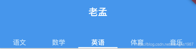
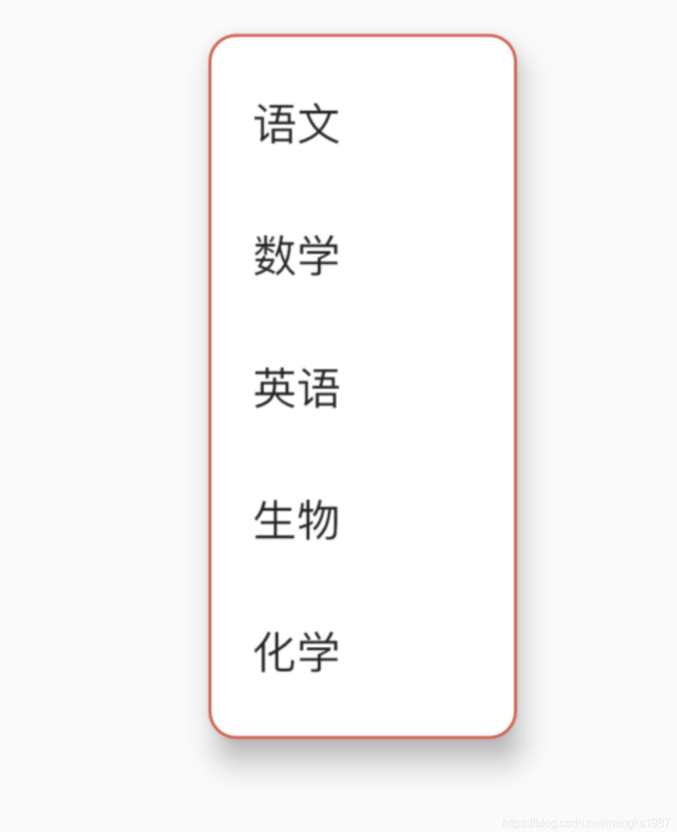
bottom属性通常请求下设置TabBar,用法如下:
Scaffold(
  appBar: AppBar(
    title: Text('老孟'),
    bottom:TabBar(
      tabs: <Widget>[
        Text('语文'),
        Text('数学'),
        Text('英语'),
        Text('体育'),
        Text('音乐'),
      ],
      controller: TabController(length: 5,vsync: this),
    )
  )
)
效果如下:
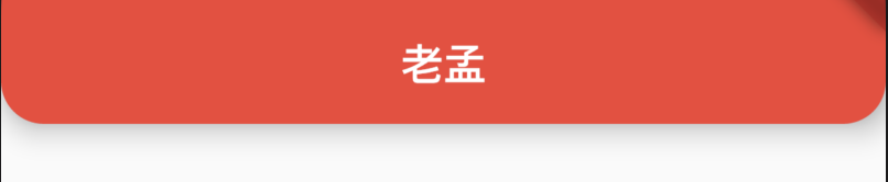
设置阴影、形状、背景颜色:
AppBar(
          elevation: 10,
          shape:
              RoundedRectangleBorder(borderRadius: BorderRadius.circular(20)),
          backgroundColor: Colors.red,
  )
效果如下:
设置icon样式及文字样式:
AppBar(
    iconTheme:IconThemeData(size: 24),
    actionsIconTheme: IconThemeData(size: 24),
    textTheme: TextTheme(title: TextStyle(color: Colors.red)),
    title: Text('老孟'),
  )
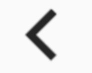
title: 'BackButtonIcon' description: '返回图标' type: widgets
BackButtonIcon
看名字你以为这是一个Button,其实是一个Icon,没有点击效果,具有点击效果的组件是BackButton
用法如下:
BackButtonIcon()
此在不同平台上显示的效果不同,iOS效果如下:
android和fuchsia效果如下:
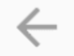
源代码实现也比较简单,如下:
/// Returns the appropriate "back" icon for the given `platform`.
static IconData _getIconData(TargetPlatform platform) {
  switch (platform) {
    case TargetPlatform.android:
    case TargetPlatform.fuchsia:
      return Icons.arrow_back;
    case TargetPlatform.iOS:
      return Icons.arrow_back_ios;
  }
  assert(false);
  return null;
}

@override
Widget build(BuildContext context) => Icon(_getIconData(Theme.of(context).platform));
title: 'BackdropFilter | ImageFilter' description: '控件介绍' type: widgets
BackdropFilter
使用BackdropFilter和ImageFilter可以将图片模糊处理。
基本用法如下:
Stack(
  alignment: Alignment.center,
  children: <Widget>[
    Container(
      width: 300,
      height: 400,
      child: Image.asset('images/1.png'),
    ),
    BackdropFilter(
      filter: ImageFilter.blur(sigmaX: 5.0,sigmaY: 5.0),
      child: Center(
        child: Container(
          color: Colors.red.withOpacity(0),
        ),
      ),
    )
  ],
)
效果如下:
BackdropFilter不仅可以模糊图片,还可以模糊任何组件,BackdropFilter只处理它下面的控件,child参数的组件不模糊处理,如果想在模糊图片的显示文字,只需修改如下:
BackdropFilter(
  filter: ImageFilter.blur(sigmaX: 5.0,sigmaY: 5.0),
  child: Center(
    child: Container(
      color: Colors.red.withOpacity(0),
      child: Text('老孟,一枚有态度的程序员',style: TextStyle(color: Colors.blue),),
    ),
  ),
)
效果如下:
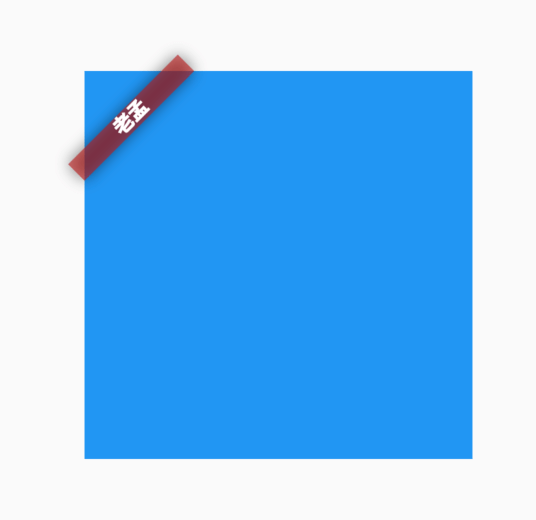
title: 'Banner|CheckedModeBanner' description: '在小部件的角落上方显示对角消息' type: widgets
Banner
在父组件的角上显示一个对角线的消息的控件,比如debug模式下,显示在App右上角的DEBUG就是此组件实现的。
用法如下:
Banner(
  message: '老孟',
  location: BannerLocation.topStart,
)
效果如下:
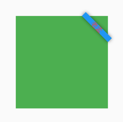
默认情况下Banner超出了父控件的范围,可以使用ClipRect截取超出的部分。
设置背景颜色、消息样式及位置:
Banner(
  message: '老孟',
  location: BannerLocation.topEnd,
  color: Colors.blue,
  textStyle: TextStyle(color: Colors.red),
)
效果如下:
设置child参数,child显示在消息后面:
Banner(
  message: '老孟',
  child: Container(color: Colors.yellow,),
  location: BannerLocation.topEnd,
)
CheckedModeBanner
封装了Banner,MaterialApp使用此控件在右上角显示DEBUG标签,源代码如下:
@override
Widget build(BuildContext context) {
  Widget result = child;
  assert(() {
    result = Banner(
      child: result,
      message: 'DEBUG',
      textDirection: TextDirection.ltr,
      location: BannerLocation.topEnd,
    );
    return true;
  }());
  return result;
}
title: 'Baseline' description: '控件介绍' type: widgets
Baseline
基准线布局,是指将所有的元素都统一的放在一条水平线上,是根据child的baseline,来调整child的位置,即在不同的child都处在规定的基准线位置,多用文字排版中的时候,就算是不同大小的文字处于同一水平线上,基本用法:
Baseline({
    Key key,
    @required this.baseline,
    @required this.baselineType,
    Widget child
})
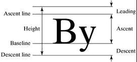
属性说明:
- baseline 基准线位置,是以像素为基本的单位,从顶部算.
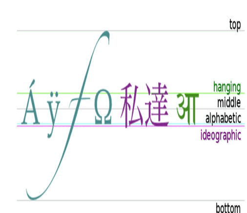
- baselineType bseline类型,定位child的基准线类型,分为两种:
baselineType.alphabetic 对齐字符底部的水平线.
baselineType.ideographic 表意字符的水平线.
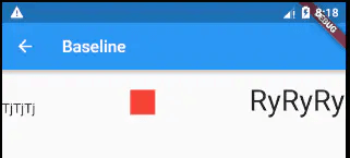
案例
Row(
  mainAxisAlignment: MainAxisAlignment.spaceBetween,
  children: <Widget>[
    Baseline(
      baseline: 50.0,
      baselineType: TextBaseline.alphabetic,
      child: Text(
        'TjTjTj',
        style: new TextStyle(
          fontSize: 20.0,
          textBaseline: TextBaseline.alphabetic,
        ),
      ),
    ),
    Baseline(
      baseline: 50.0,
      baselineType: TextBaseline.alphabetic,
      child: Container(
        width: 30.0,
        height: 30.0,
        color: Colors.red,
      ),
    ),
    Baseline(
      baseline: 50.0,
      baselineType: TextBaseline.alphabetic,
      child: Text(
        'RyRyRy',
        style: TextStyle(
          fontSize: 35.0,
          textBaseline: TextBaseline.alphabetic,
        ),
      ),
    ),
  ],
)
上述运行结果是左右两个文本跟中间的Container底部在一个水平线上,这也印证了Baseline的布局行为。
效果:
本文由Rock提供。
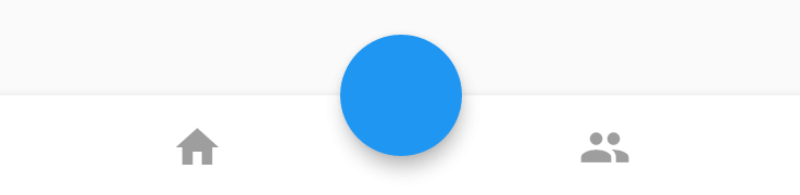
BottomAppBar
BottomAppBar通常用于Scaffold.bottomNavigationBar,并且可以在其顶部留出一个缺口给floatingActionButton使用。
用法如下:
Scaffold(
        bottomNavigationBar: BottomAppBar(
          child: Row(
            mainAxisAlignment: MainAxisAlignment.spaceAround,
            children: <Widget>[
              IconButton(
                icon: Icon(Icons.home),
              ),
              IconButton(
                icon: Icon(Icons.people),
              )
            ],
          ),
        ),
        floatingActionButton: FloatingActionButton(),
        floatingActionButtonLocation: FloatingActionButtonLocation.centerDocked,
  )
效果如下:
FloatingActionButton是悬浮在BottomAppBar上面,并没有嵌入里面,嵌入里面用法如下:
BottomAppBar(
  shape: CircularNotchedRectangle(),
  ...
)
增加BottomAppBar的形状,效果如下:
elevation参数为阴影值:
BottomAppBar(
  elevation: 8.0,
  ...
)
notchMargin参数表示缺口外边距:
BottomAppBar(
  notchMargin: 10,
  ...
)
效果如下:
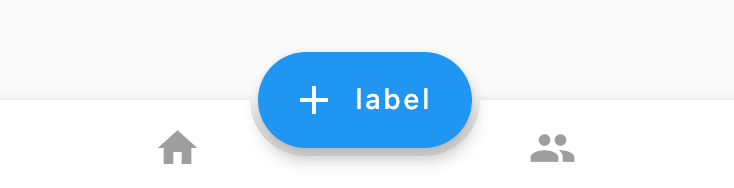
改变FloatingActionButton的形状为足球场形状,切嵌入的形状随之变化,代码如下:
Scaffold(
bottomNavigationBar: BottomAppBar(
shape: AutomaticNotchedShape(
RoundedRectangleBorder(), StadiumBorder(side: BorderSide())),
child: Row(
mainAxisAlignment: MainAxisAlignment.spaceAround,
children: <Widget>[
IconButton(
icon: Icon(Icons.home),
),
IconButton(
icon: Icon(Icons.people),
)
],
),
),
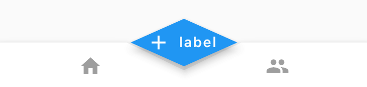
floatingActionButton: FloatingActionButton.extended(
onPressed: () {},
icon: new Icon(Icons.add),
label: const Text("label"),
),
floatingActionButtonLocation: FloatingActionButtonLocation.centerDocked,
)
效果如下:
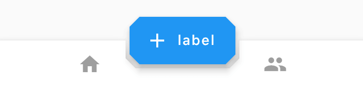
改为多边形:
Scaffold(
        bottomNavigationBar: BottomAppBar(
          shape: AutomaticNotchedShape(
              RoundedRectangleBorder(), BeveledRectangleBorder(borderRadius: BorderRadius.circular(10))),
          child: Row(
            mainAxisAlignment: MainAxisAlignment.spaceAround,
            children: <Widget>[
              IconButton(
                icon: Icon(Icons.home),
              ),
              IconButton(
                icon: Icon(Icons.people),
              )
            ],
          ),
        ),
        floatingActionButton: FloatingActionButton.extended(
          onPressed: () {},
          shape: BeveledRectangleBorder(borderRadius: BorderRadius.circular(10)),
          icon: new Icon(Icons.add),
          label: const Text("label"),
        ),
        floatingActionButtonLocation: FloatingActionButtonLocation.centerDocked,
      )
效果如下:
当然也可以改为棱形:
Scaffold(
        bottomNavigationBar: BottomAppBar(
          shape: AutomaticNotchedShape(
              RoundedRectangleBorder(), BeveledRectangleBorder(borderRadius: BorderRadius.circular(100))),
          ...
        floatingActionButton: FloatingActionButton.extended(
          onPressed: () {},
          shape: BeveledRectangleBorder(borderRadius: BorderRadius.circular(100)),
          icon: new Icon(Icons.add),
          label: const Text("label"),
        ),
        ...
      )
效果如下:
我们可以通过此控件定义任何我们想要的效果。
title: 'BottomNavigationBar' description: '控件介绍' type: widgets
BottomNavigationBar
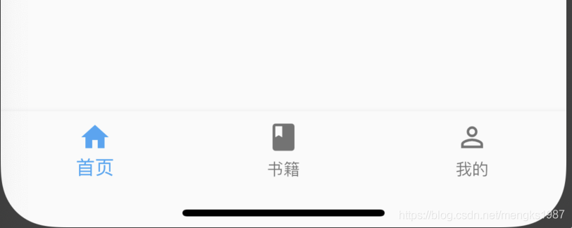
BottomNavigationBar 和 BottomNavigationBarItem配合Scaffold控件使用可以实现底部导航效果,类似于微信底部的导航效果,下面是一个简单的底部导航案例:
Scaffold(
      bottomNavigationBar: BottomNavigationBar(
        items: <BottomNavigationBarItem>[
          BottomNavigationBarItem(title: Text('首页'),icon: Icon(Icons.home)),
          BottomNavigationBarItem(title: Text('书籍'),icon: Icon(Icons.book)),
          BottomNavigationBarItem(title: Text('我的'),icon: Icon(Icons.perm_identity)),
        ],
      ),
    );
效果:
点击其他2个item时没有反应,添加切换效果:
int _currentIndex = 0;
BottomNavigationBar(
	onTap: (int index) {
    	setState(() {
        	_currentIndex = index;
        });
    },
    currentIndex: _currentIndex,
	...
currentIndex代表当前显示导航的索引,当前切换时调用onTap,在onTap回调中调用setState方法改变_currentIndex的值达到切换的效果。
效果如下:

BottomNavigationBar有2种显示模式,其中一种是fixed效果,前面的展示就是fixed效果,这也是默认值,另一种是shifting效果,
BottomNavigationBar(
	type:BottomNavigationBarType.shifting,
    selectedItemColor: Theme.of(context).primaryColor,
    unselectedItemColor: Colors.black,
	...
}
设置shifting时需要设置selectedItemColor和 unselectedItemColor,效果如下:
我们还可以设置其背景颜色(backgroundColor)、图标大小(iconSize)、选中和未选中图标、字体的颜色,大小等。
BottomNavigationBarItem
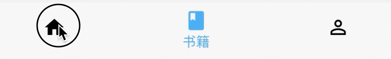
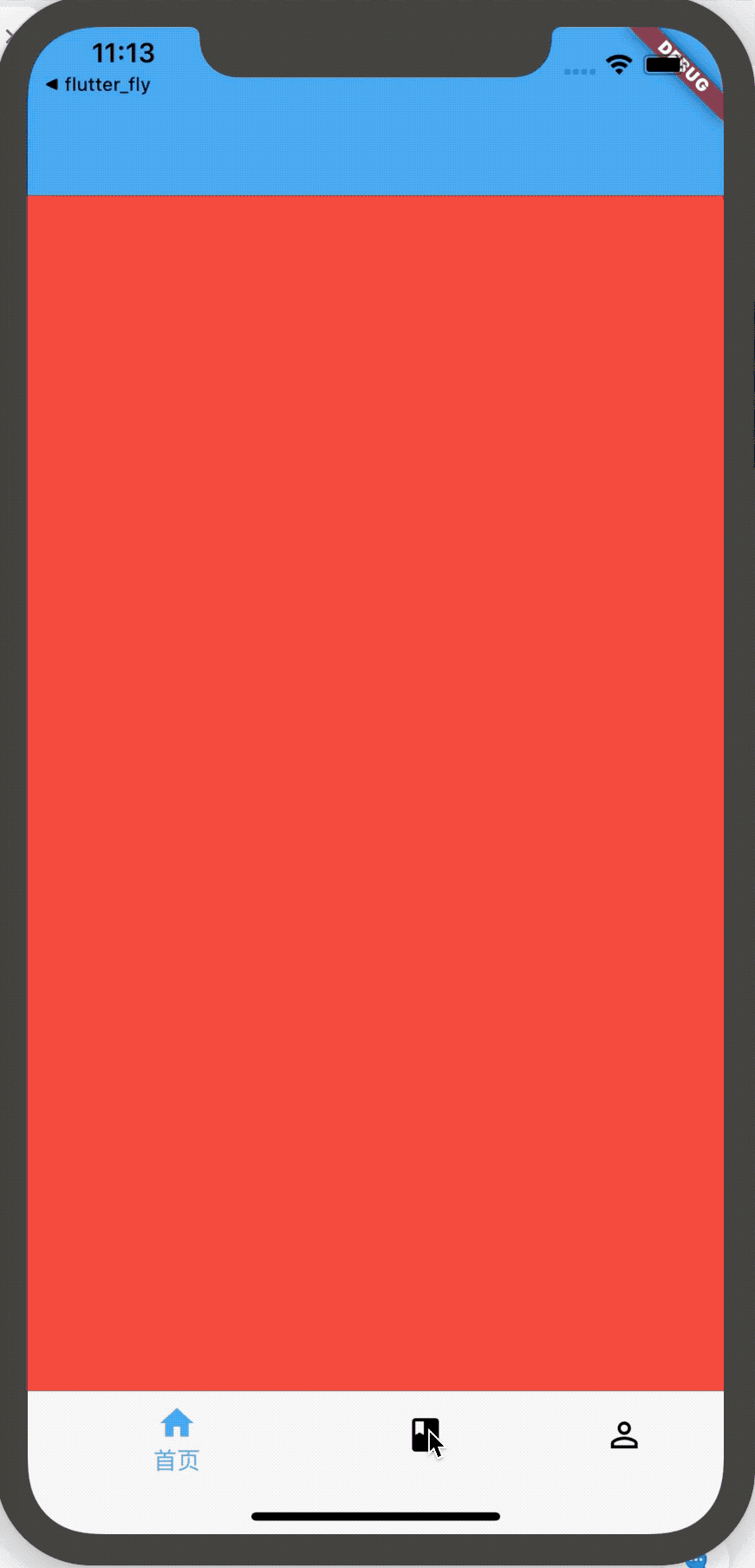
如果导航的图标是自己设计的图标,这时仅仅通过BottomNavigationBar是无法实现我们想要的效果的,比如微信的导航的效果,虽然选中和未选中也是颜色的区别,但图标不是Icons自带的图标,想要实现切换2个图标需要BottomNavigationBarItem控件的支持,其中的icon和activeIcon分别代表未选中和选中。
通过切换导航而改变页面是App中最常用的方式,开始构建页面的切换:
int _currentIndex = 0;

Widget _currBody = HomePage();

_onTap(int index) {
    switch (index) {
      case 0:
        _currBody = HomePage();;
        break;
      case 1:
        _currBody = BookPage();
        break;
      case 2:
        _currBody = MyPage();
        break;
    }
    setState(() {
      _currentIndex = index;
    });
  }

Scaffold(
      body: _currBody,
      bottomNavigationBar: BottomNavigationBar(
        onTap: _onTap,
        type: BottomNavigationBarType.shifting,
        selectedItemColor: Theme.of(context).primaryColor,
        unselectedItemColor: Colors.black,
        currentIndex: _currentIndex,
        items: <BottomNavigationBarItem>[
          BottomNavigationBarItem(title: Text('首页'), icon: Icon(Icons.home)),
          BottomNavigationBarItem(title: Text('书籍'), icon: Icon(Icons.book)),
          BottomNavigationBarItem(
              title: Text('我的'), icon: Icon(Icons.perm_identity)),
        ],
      ),
    );
Scaffold控件的body表示导航上面,AppBar下面的页面,HomePage ,BookPage ,MyPage 对应3个导航的页面,背景分别是红、蓝、黄色,效果如下:
title: 'Builder' description: '调用闭包以获取其子控件的控件' type: widgets
Builder
官方介绍A platonic widget that calls a closure to obtain its child widget,直接翻译是:
调用闭包以获取其子小部件的小部件
嗯...,反正只看介绍和翻译看不懂,下面来说下Builder能干什么吧。
基础用法:
Builder(
  builder: (BuildContext context){
    return Container();
  },
)
Builder中有一个builder,返回一个Widget即可,那和直接使用Container有什么区别吗?
答案肯定是有的,用处主要体现在context上。
使用场景一
看下这个异常信息:Scaffold.of() called with a context that does not contain a Scaffold,这个异常学习Flutter的过程中会经常遇到,原因就是当前的context没有包含在Scaffold控件中,比如下面的写法就会出现此异常:
class HomePage extends StatelessWidget {
  @override
  Widget build(BuildContext context) {
    return Scaffold(
      appBar: AppBar(
        title: Text('老孟'),
      ),
      body: Center(
        child: RaisedButton(
          color: Colors.pink,
          textColor: Colors.white,
          onPressed: _displaySnackBar(context),
          child: Text('show SnackBar'),
        ),
      ),
    );
  }
}

_displaySnackBar(BuildContext context) {
  final snackBar = SnackBar(content: Text('老孟'));
  Scaffold.of(context).showSnackBar(snackBar);
}
使用Build解决此问题:
Scaffold(
    appBar: AppBar(
        title: Text('老孟'),
    ),
    body: Builder(
        builder: (context) =>
            Center(
            child: RaisedButton(
            color: Colors.pink,
            textColor: Colors.white,
            onPressed: () => _displaySnackBar(context),
            child: Text('老孟'),
            ),
        ),
    ),
);
使用场景二
自定义事件分发,代码如下:
NotificationListener<CustomNotification>(
  onNotification: (CustomNotification notification) {
    print('介绍事件——2:${notification.value}');
    return false;
  },
  child: Center(
    child: RaisedButton(
      child: Text('发送'),
      onPressed: () {
        CustomNotification('自定义事件').dispatch(context);
      },
    ),
  ),
)
此时点击按钮并不会分发事件,修改如下:
NotificationListener<CustomNotification>(
  onNotification: (CustomNotification notification) {
    print('介绍事件——2:${notification.value}');
    return false;
  },
  child: Center(
    child: Builder(
      builder: (context) {
        return RaisedButton(
          child: Text('发送'),
          onPressed: () {
            CustomNotification('自定义事件').dispatch(context);
          },
        );
      },
    ),
  ),
)
只需在RaisedButton外面包裹Builder即可,为什么会出现此问题?
因为没有Builder的context表示当前整个控件的context,其上并没有NotificationListener监听,而加上Builder后,context表示Builder控件,其上有NotificationListener监听
title: 'Button ' description: '控件介绍' type: widgets
Button
Flutter内置了10多种Button(按钮)类控件供我们使用,了解这些控件有助于提高我们的开发速度。
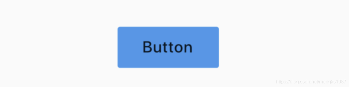
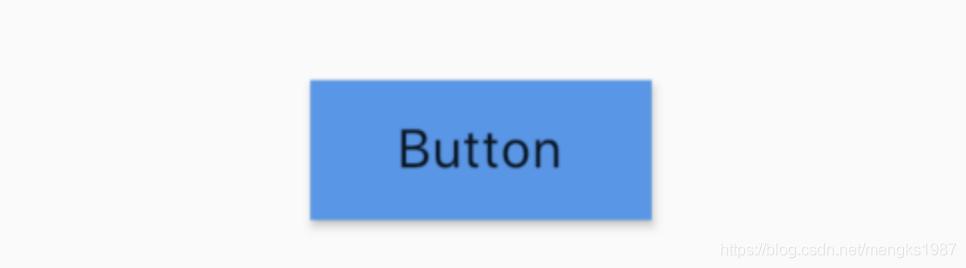
RaisedButton
RaisedButton是一个material风格”凸起“的按钮,基本用法:
RaisedButton(
  child: Text('Button'),
  onPressed: (){
  },
)
效果:

onPressed为null或不设置时,按钮是禁用状态。
onHighlightChanged为高亮变化回调,按下时处于高亮状态,抬起处于不高亮状态,用法如下:
RaisedButton(
  onHighlightChanged: (high){
  },
  ...
)
按钮可以设置字体及各种状态颜色,总结如下:
| 属性 | 说明 |
|---|---|
| textColor | 字体颜色 |
| disabledTextColor | 禁用状态下字体颜色 |
| color | 背景颜色 |
| disabledColor | 禁用状态下背景颜色 |
| highlightColor | 高亮颜色,按下时的颜色 |
| splashColor | 水波纹颜色,按下松开会有水波纹效果 |
以textColor为例,用法如下:
RaisedButton(
  textColor: Colors.red,
  ...
)
也可以通过textTheme设置字体样式,用法如下:
RaisedButton(
  textTheme: ButtonTextTheme.primary,
  ...
)
ButtonTextTheme的值介绍如下:
- normal:黑色或者白色字体,依赖于
ThemeData.brightness - accent:字体颜色依赖于
ThemeData.accentColor - primary :字体颜色依赖于
ThemeData.primaryColor
这3个值在MaterialApp控件中进行全局设置,设置如下:
MaterialApp(
  title: 'Flutter Demo',
  theme: ThemeData(
    primaryColor: Color(0xFF42A5F5),
    accentColor: Colors.yellow,
    brightness: Brightness.light
  ),
  ...
)
设置按钮阴影、高亮阴影、禁用阴影,用法如下:
RaisedButton(
  elevation: 5.0,
  highlightElevation: 5.0,
  disabledElevation: 5.0,
  ...
)
shape设置按钮的形状,比如设置为圆形,代码如下:
RaisedButton(
  shape: CircleBorder(),
  ...
)
效果如下:
和hover相关的属性是指鼠标悬停时的状态,移动端没有效果,focus相关的属性为获取焦点时的状态。
FlatButton
FlatButton是一个扁平的按钮,用法和RaisedButton一样,代码如下:
FlatButton(
  child: Text('Button'),
  color: Colors.blue,
  onPressed: () {},
)
效果如下:
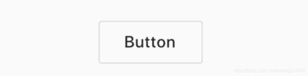
OutlineButton
OutlineButton 是一个带边框的按钮,用法和RaisedButton一样,代码如下:
OutlineButton(
  child: Text('Button'),
  onPressed: () {},
)
效果如下:
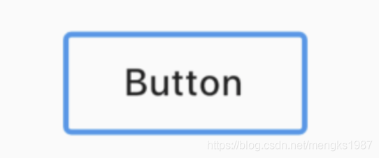
设置其边框样式,代码如下:
OutlineButton(
  borderSide: BorderSide(color: Colors.blue,width: 2),
  disabledBorderColor: Colors.black,
  highlightedBorderColor: Colors.red,
  child: Text('Button'),
  onPressed: () {},
)
效果如下:
DropdownButton
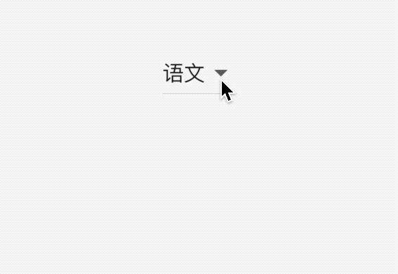
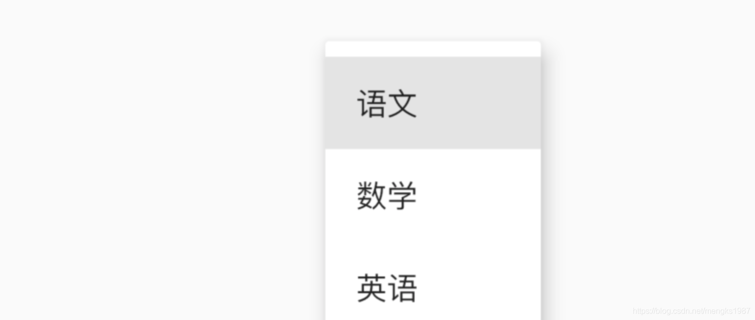
DropdownButton为下拉选择按钮,基本用法如下:
var _dropValue = '语文';

_buildButton() {
  return DropdownButton(
    value: _dropValue,
    items: [
      DropdownMenuItem(child: Text('语文'),value: '语文',),
      DropdownMenuItem(child: Text('数学'),value: '数学'),
      DropdownMenuItem(child: Text('英语'),value: '英语'),
    ],
    onChanged: (value){
      setState(() {
        _dropValue = value;
      });
    },
  );
}
items是点击时弹出选项,onChanged选项发生变化时回调。效果如下:
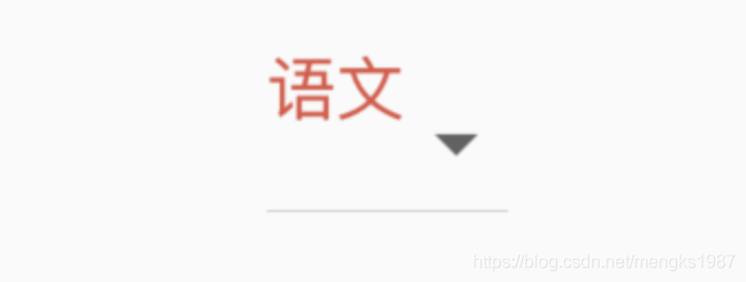
如果你对选中的选项的样式不满意,可以自定义,用法如下:
DropdownButton(
  selectedItemBuilder: (context){
    return [
      Text('语文',style: TextStyle(color: Colors.red),),
      Text('数学',style: TextStyle(color: Colors.red),),
      Text('英语',style: TextStyle(color: Colors.red),)
    ];
  },
  ...
)
selectedItemBuilder返回的组件要和items中一一对应,选中样式如下:
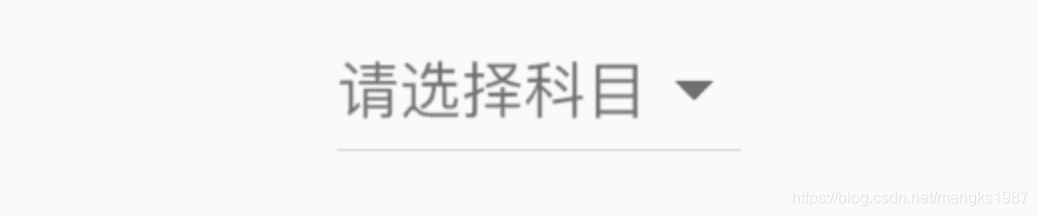
当用户未选中时,即value 为null,显示''请选中",用法如下:
DropdownButton(
  hint: Text('请选择'),
  value: null,
  ...
)
效果如下:
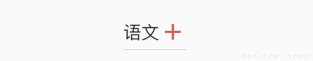
默认情况下,下拉选项的图标是倒立的三角,也可以进行自定义,用法如下:
DropdownButton(
  icon: Icon(Icons.add),
  iconSize: 24,
  iconDisabledColor: Colors.red,
  iconEnabledColor: Colors.red,
  ...
)
效果如下:
RawMaterialButton
RawMaterialButton是基于Semantics, Material和InkWell创建的组件,它不使用当前的系统主题和按钮主题,用于自定义按钮或者合并现有的样式,而RaisedButton和FlatButton都是基于RawMaterialButton配置了系统主题和按钮主题,相关属性可以参考RaisedButton,参数基本一样,基本用法如下:
RawMaterialButton(
  onPressed: (){},
  fillColor: Colors.blue,
  child: Text('Button'),
)
效果如下:
PopupMenuButton
PopupMenuButton是一个菜单选中控件,用法如下:
PopupMenuButton<String>(
  itemBuilder: (context) {
    return <PopupMenuEntry<String>>[
      PopupMenuItem<String>(
        value: '语文',
        child: Text('语文'),
      ),
      PopupMenuItem<String>(
        value: '数学',
        child: Text('数学'),
      ),
      PopupMenuItem<String>(
        value: '英语',
        child: Text('英语'),
      ),
      PopupMenuItem<String>(
        value: '生物',
        child: Text('生物'),
      ),
      PopupMenuItem<String>(
        value: '化学',
        child: Text('化学'),
      ),
    ];
  },
)
效果如下:

设置其初始值:
PopupMenuButton<String>(
  initialValue: '语文',
  ...
)
设置初始值后,打开菜单后,设置的值将会高亮,效果如下:
获取用户选择了某一项的值,或者用户未选中,代码如下:
PopupMenuButton<String>(
  onSelected: (value){
    print('$value');
  },
  onCanceled: (){
    print('onCanceled');
  },
  ...
)
tooltip是长按时弹出的提示,用法如下:
PopupMenuButton<String>(
  tooltip: 'PopupMenuButton',
  ...
)
效果如下:
设置其阴影值、内边距和弹出菜单的背景颜色:
PopupMenuButton<String>(
  elevation: 5,
  padding: EdgeInsets.all(5),
  color: Colors.red,
  ...
)
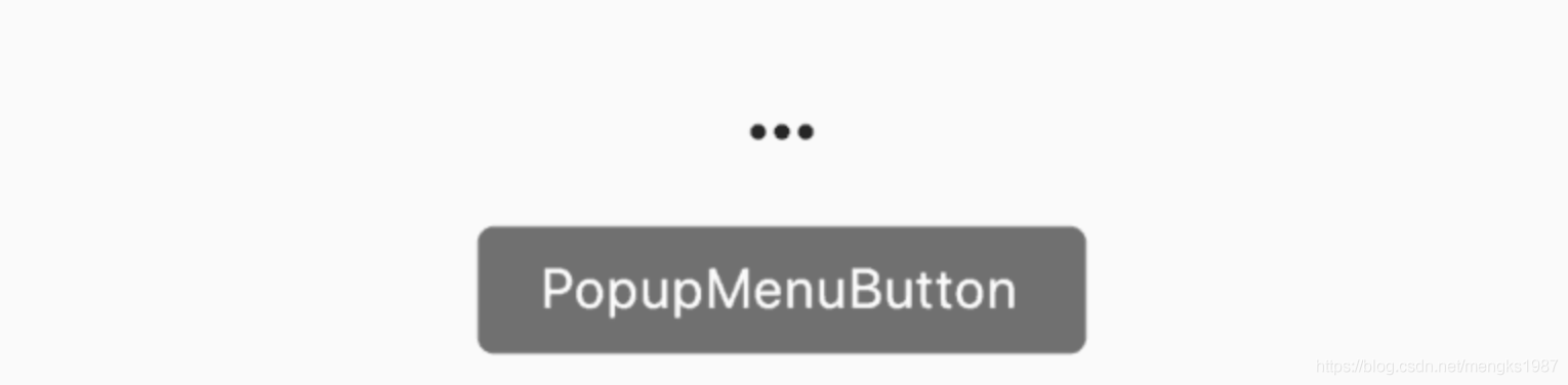
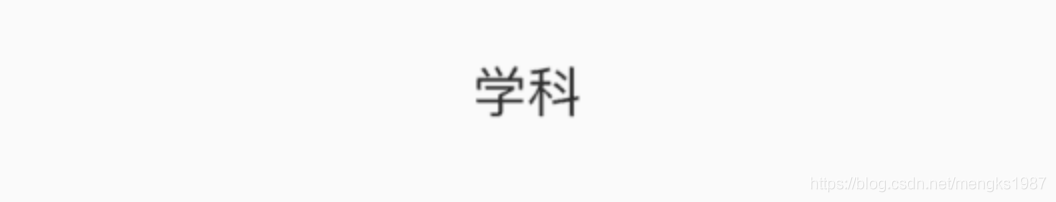
默认情况下,PopupMenuButton显示3个小圆点,我们也可以对齐进行设置,设置文字如下:
PopupMenuButton<String>(
  child: Text('学科'),
  ...
)
child组件将会被InkWell包裹,点击弹出菜单,效果如下:
也可以设置其他图标:
PopupMenuButton<String>(
	icon: Icon(Icons.add),
	...
)
效果如下:

设置弹出菜单边框:
PopupMenuButton<String>(
  shape: RoundedRectangleBorder(
    side: BorderSide(
      color: Colors.red
    ),
    borderRadius: BorderRadius.circular(10)
  ),
	...
)
效果如下:
IconButton
IconButton是一个图标按钮,用法如下:
IconButton(
  icon: Icon(Icons.person),
  iconSize: 30,
  color: Colors.red,
  onPressed: () {},
)
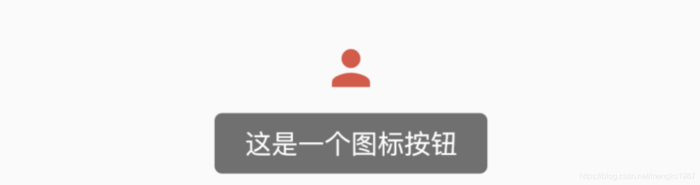
设置提示属性:
IconButton(
  tooltip: '这是一个图标按钮',
  icon: Icon(Icons.person),
  iconSize: 30,
  color: Colors.red,
  onPressed: () {},
)
当长按时显示提示,效果如下:
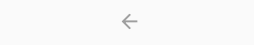
BackButton
BackButton是一个material风格的返回按钮,本身是一个IconButton,点击时默认执行Navigator.maybePop即如果路由栈有上一页则返回到上一页。
BackButton()
Android和IOS平台显示的图标是不一样的,ios效果如下:
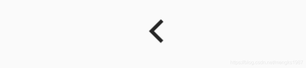
Android效果如下:
CloseButton
CloseButton是一个material风格的关闭按钮,本身是一个IconButton,点击时默认执行Navigator.maybePop即如果路由栈有上一页则返回到上一页。
和BackButton适用场景不同,BackButton适用于全屏的页面,而CloseButton适用于弹出的Dialog。
用法如下:
CloseButton()
效果如下:
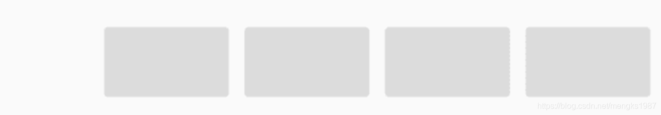
ButtonBar
ButtonBar并不是一个单独的按钮控件,而是末端对齐的容器类控件,当在水平方向上没有足够空间时候,按钮将整体垂直排列,而不是换行。基本用法如下:
ButtonBar(
  children: <Widget>[
    RaisedButton(),
    RaisedButton(),
    RaisedButton(),
    RaisedButton(),
  ],
)
效果如下:
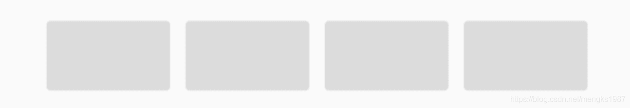
设置主轴的对齐方式及主轴的尺寸:
ButtonBar(
  alignment: MainAxisAlignment.center,
  mainAxisSize: MainAxisSize.max,
  ...
)
效果如下:
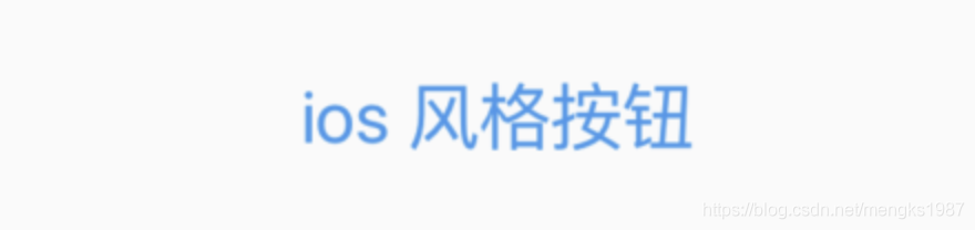
CupertinoButton
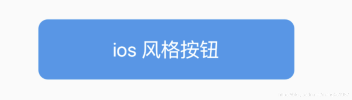
CupertinoButton ios风格的按钮,基本用法如下:
CupertinoButton(
  child: Text('ios 风格按钮'),
  onPressed: (){},
)
效果如下:
设置背景色及按下时透明度:
CupertinoButton(
  child: Text('ios 风格按钮'),
  onPressed: (){},
  color: Colors.blue,
  pressedOpacity: .5,
)
效果如下:
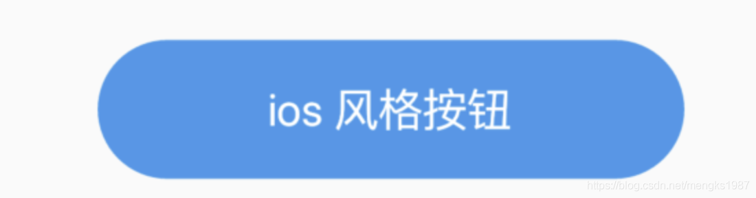
设置圆角半径:
CupertinoButton(
  borderRadius: BorderRadius.circular(40),
  ...
)
效果如下:
title: 'ButtonBarTheme ButtonBarThemeData ButtonBar样式' description: '' type: widgets
ButtonBarTheme
继承关系 Object> DiagnosticableTree> Widget> ProxyWidget> InheritedWidget> ButtonBarTheme
构造函数
const ButtonBarTheme({
  Key key,
  @required this.data,
  Widget child,
}) : assert(data != null), super(key: key, child: child);
- key 组件的唯一标示。
- data 主题的数据来源ButtonBarThemeData,详细的配置信息。
- child 通常ButtonBar组件,默认继承ButtonBarThemeData的配置,设置局部主题时使用。
ButtonBarTheme通常用于ButtonBar的主题使用,它有一套默认主题,在你没有做变更的前提下,作为ThemeData构造函数的参数,你可以轻松做到全局改主题样式。
配置全局样式在中设置:
MaterialApp(
  theme: ThemeData(
      buttonBarTheme:
          ButtonBarThemeData(buttonTextTheme: ButtonTextTheme.normal)),
  ...
)
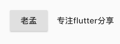
使用ButtonBar时采用此主题:
ButtonBar(
  children: <Widget>[
    RaisedButton(child: Text('老孟'),onPressed: (){

    },),
    FlatButton(child: Text('专注flutter分享'),onPressed: (){

    },)
  ],
)
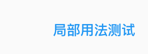
局部用法,主题和全局主题不一致,用法如下:
ButtonBarTheme(
  data: ButtonBarThemeData(buttonTextTheme: ButtonTextTheme.accent),
  child: ButtonBar(
    children: <Widget>[
      FlatButton(
        onPressed: () {},
        child: Text("局部用法测试"),
      )
    ],
  ),
)
ButtonBarThemeData
ButtonBarThemeData 是ButtonBarTheme样式属性,属性如下:
const ButtonBarThemeData({
  this.alignment,//主轴对其方式,具体可查看MainAxisAlignment
  this.mainAxisSize,//主轴方向尺寸,min:尽可能小,max:尽可能大
  this.buttonTextTheme,//按钮文本样式
  this.buttonMinWidth,//按钮最小宽度
  this.buttonHeight,//按钮高度
  this.buttonPadding,//按钮内边距
  this.buttonAlignedDropdown,//当DropdownButton内包含ButtonBar时,true表示DropdownButton宽度和ButtonBar匹配
  this.layoutBehavior,//按钮高度,constrained:最小高度52,padded:根据按钮主题计算
  this.overflowDirection, //按钮一行放不开时,垂直方向布局方式,up:开始位置对其, down:结束位置对其
})
用法如下:
ButtonBarTheme(
data: ButtonBarThemeData(
alignment: MainAxisAlignment.spaceBetween,
mainAxisSize: MainAxisSize.max),
child: ButtonBar(
children: <Widget>[
RaisedButton(
onPressed: () {},
child: Text("老孟"),
),
RaisedButton(
onPressed: () {},
child: Text("老孟1"),
),
RaisedButton(
onPressed: () {},
child: Text("老孟2"),
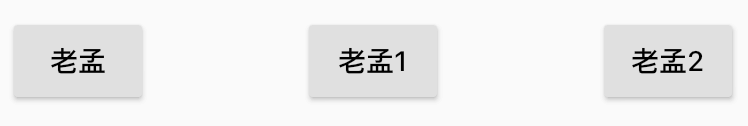
),
],
),
)
总结
ButtonBarTheme 是一个InheritedWidget组件,它可以高效的将数据在Widget树中向下传递、共享,所有才有了全局主题和局部主题的用法。
本文由 i校长提供。
title: 'ButtonTheme' description: '' type: widget
ButtonTheme
用于控制Button类控件的样式。
textTheme表示按钮文本的样式:
ButtonTextTheme.normal:按钮文本的颜色是黑色或者白色,依赖于ThemeData.brightnessButtonTextTheme.accent:按钮文本的颜色是ThemeData.accentColorButtonTextTheme.primary:按钮文本的颜色是ThemeData.primaryColor
ButtonTheme(
  textTheme: ButtonTextTheme.primary,
  child: RaisedButton(
    child: Text('老孟'),
    onPressed: () {},
  ),
)
layoutBehavior:控制控件尺寸
- constrained:高最小52
- padded:根据样式样式计算内边距
minWidth:最小宽度
height:高度
padding:内边距
shape:形状,所有形状查看ShapeBorder
buttonColor:按钮颜色
disabledColor:禁用状态下颜色
focusColor:获取焦点颜色
hoverColor:鼠标悬浮其上时的颜色
highlightColor:高亮颜色
splashColor:水波纹颜色
materialTapTargetSize:配置组件点击区域大小,具体查看MaterialTapTargetSize
title: 'Card' description: '控件介绍' type: widgets
Card
Card是material风格的卡片控件,Card有较小的圆角和阴影。Card通常用于展示一组信息,比如相册、位置信息等。
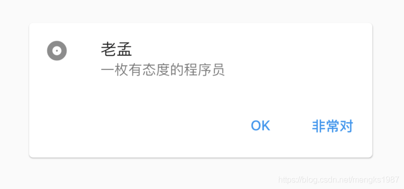
基本用法如下:
Card(
  child: Column(
    mainAxisSize: MainAxisSize.min,
    children: <Widget>[
      const ListTile(
        leading: Icon(Icons.album),
        title: Text('老孟'),
        subtitle: Text('一枚有态度的程序员'),
      ),
      ButtonBar(
        children: <Widget>[
          FlatButton(
            child: const Text('OK'),
            onPressed: () {

            },
          ),
          FlatButton(
            child: const Text('非常对'),
            onPressed: () {

            },
          ),
        ],
      ),
    ],
  ),
)
子控件可以是任何Widget,效果如下:
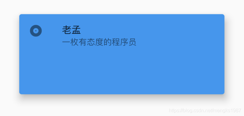
设置其背景颜色及阴影值:
Card(
  color: Colors.blue,
  elevation: 10,
  ...
)
效果如下:
设置控件的形状为圆角矩形:
Card(
  shape: RoundedRectangleBorder(borderRadius: BorderRadius.circular(15)),
  ...
)
效果如下:
title: 'Checkbox' description: '控件介绍' type: widgets
Checkbox
Checkbox是勾选框控件,本身不包含任何状态,改变状态需要通过改变value的值改变。基本用法如下:
var _checkValue = false;
_buildCheckbox(){
  return Checkbox(
    value: _checkValue,
    onChanged: (value){
      setState(() {
        _checkValue = value;
      });
    },
  );
}
效果如下:
value值为bool类型,true表示选择状态。
onChanged为发生变化时回调,即点击控件时回调,方法内的参数为新的值。
activeColor为激活状态下颜色,是矩形区域内的颜色,checkColor是选中后“对勾”的颜色,用法如下:
Checkbox(
  activeColor: Colors.red,
  checkColor: Colors.blue,
  ...
)
效果如下:
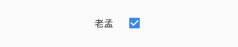
CheckboxListTile
通常情况下,我们不直接使用Checkbox,而是使用CheckboxListTile,因为我们需要Checkbox后面添加说明,用法如下:
Container(
  width: 120,
  child: CheckboxListTile(
    title: Text('老孟'),
    value: _checkValue,
    onChanged: (value){
      setState(() {
        _checkValue = value;
      });
    },
  ),
)
CheckboxListTile默认是充满父组件的,因此需要Container限制其宽度,效果如下:
一般的习惯是将勾选框放在前面,用法如下:
CheckboxListTile(
  controlAffinity: ListTileControlAffinity.leading,
  ...
)
ListTileControlAffinity取值范围说明如下:
- leading:勾选框在开头位置。
- trailing:勾选框在结尾位置,
- platform:根据平台确定
还可以设置其子标题和第二图标,用法如下:
CheckboxListTile(
  subtitle: Text('一枚有态度的程序员'),
  secondary: Icon(Icons.person),
  ...
)
secondary一般放置一个图标,位于勾选框的另一边。效果如下:
selected参数设置true,secondary、title和subtitle都会被渲染为activeColor的颜色。
title: 'Chip' description: 'Material风格标签控件' type: widgets
Chip
RawChip
Material风格标签控件,此控件是其他标签控件的基类,通常情况下,不会直接创建此控件,而是使用如下控件:
- Chip
- InputChip
- ChoiceChip
- FilterChip
- ActionChip
如果你想自定义标签类控件时通常使用此控件。
RawChip可以通过设置onSelected被选中,设置onDeleted被删除,也可以通过设置onPressed而像一个按钮,它有一个label属性,有一个前置(avatar)和后置图标(deleteIcon)。
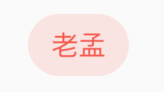
基本用法如下:
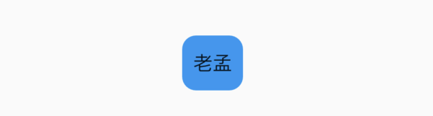
RawChip(
  label: Text('老孟'),
)
效果如下:
禁用状态设置:
RawChip(
  label: Text('老孟'),
  isEnabled: false,
)
效果如下:
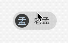
设置左侧控件,一般是图标:
RawChip(
  avatar: CircleAvatar(
    child: Text('孟'),
  ),
  label: Text('老孟'),
)
效果如下:
设置label的样式和内边距:
RawChip(
  label: Text('老孟'),
  labelStyle: TextStyle(color: Colors.blue),
  labelPadding: EdgeInsets.symmetric(horizontal: 10),
)
效果如下:
设置删除相关属性:
RawChip(
  label: Text('老孟'),
  onDeleted: (){
    print('onDeleted');
  },
  deleteIcon: Icon(Icons.delete),
  deleteIconColor: Colors.red,
  deleteButtonTooltipMessage: '删除',
)
效果如下:
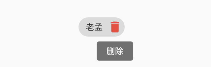
点击删除图标,回调onDeleted。
设置形状、背景颜色及内边距:
RawChip(
  label: Text('老孟'),
  shape: RoundedRectangleBorder(borderRadius: BorderRadius.circular(10)),
  backgroundColor: Colors.blue,
  padding: EdgeInsets.symmetric(vertical: 10),
)
效果如下:
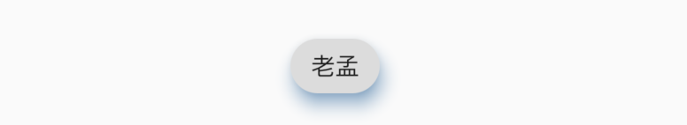
设置阴影:
RawChip(
  label: Text('老孟'),
  elevation: 8,
  shadowColor: Colors.blue,
)
效果如下:
materialTapTargetSize属性控制最小点击区域,详情查看:MaterialTapTargetSize
设置选中状态、颜色:
bool _selected = false;
RawChip(
  label: Text('老孟'),
  selected: _selected,
  onSelected: (v){
    setState(() {
      _selected = v;
    });
  },
  selectedColor: Colors.blue,
  selectedShadowColor: Colors.red,
)
效果如下:
设置选中状态下“前置对勾”图标:
RawChip(
  label: Text('老孟'),
  selected: true,
  showCheckmark: true,
  checkmarkColor: Colors.red,
)
效果如下:
showCheckmark为false时,无“前置对勾”图标。
设置点击属性:
RawChip(
  label: Text('老孟'),
  onPressed: (){
    print('onPressed');
  },
  pressElevation: 12,
)
效果如下:
点击时有水波纹效果。
Chip
Chip是一个简单的标签控件,仅显示信息和删除相关属性,是一个简化版的RawChip,用法和RawChip一样。源代码如下:
@override
Widget build(BuildContext context) {
  assert(debugCheckHasMaterial(context));
  return RawChip(
    avatar: avatar,
    label: label,
    labelStyle: labelStyle,
    labelPadding: labelPadding,
    deleteIcon: deleteIcon,
    onDeleted: onDeleted,
    deleteIconColor: deleteIconColor,
    deleteButtonTooltipMessage: deleteButtonTooltipMessage,
    tapEnabled: false,
    shape: shape,
    clipBehavior: clipBehavior,
    focusNode: focusNode,
    autofocus: autofocus,
    backgroundColor: backgroundColor,
    padding: padding,
    materialTapTargetSize: materialTapTargetSize,
    elevation: elevation,
    shadowColor: shadowColor,
    isEnabled: true,
  );
}
InputChip
以紧凑的形式表示一条复杂的信息,例如实体(人,地方或事物)或对话文本。
InputChip 本质上也是RawChip,用法和RawChip一样。源代码如下:
@override
Widget build(BuildContext context) {
  assert(debugCheckHasMaterial(context));
  return RawChip(
    avatar: avatar,
    label: label,
    labelStyle: labelStyle,
    labelPadding: labelPadding,
    deleteIcon: deleteIcon,
    onDeleted: onDeleted,
    deleteIconColor: deleteIconColor,
    deleteButtonTooltipMessage: deleteButtonTooltipMessage,
    onSelected: onSelected,
    onPressed: onPressed,
    pressElevation: pressElevation,
    selected: selected,
    tapEnabled: true,
    disabledColor: disabledColor,
    selectedColor: selectedColor,
    tooltip: tooltip,
    shape: shape,
    clipBehavior: clipBehavior,
    focusNode: focusNode,
    autofocus: autofocus,
    backgroundColor: backgroundColor,
    padding: padding,
    materialTapTargetSize: materialTapTargetSize,
    elevation: elevation,
    shadowColor: shadowColor,
    selectedShadowColor: selectedShadowColor,
    showCheckmark: showCheckmark,
    checkmarkColor: checkmarkColor,
    isEnabled: isEnabled && (onSelected != null || onDeleted != null || onPressed != null),
    avatarBorder: avatarBorder,
  );
}
ChoiceChip
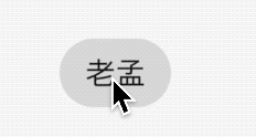
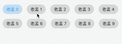
允许从一组选项中进行单个选择,创建一个类似于单选按钮的标签,本质上ChoiceChip也是一个RawChip,ChoiceChip本身不具备单选属性。
单选demo如下:
int _selectIndex = 0;
Wrap(
  spacing: 15,
  children: List.generate(10, (index) {
    return ChoiceChip(
      label: Text('老孟 $index'),
      selected: _selectIndex == index,
      onSelected: (v) {
        setState(() {
          _selectIndex = index;
        });
      },
    );
  }).toList(),
)
效果如下:
本控件由普通程序员提供。
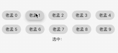
FilterChip
FilterChip可以作为过滤标签,本质上也是一个RawChip,用法如下:
List<String> _filters = [];

Column(
  children: <Widget>[
    Wrap(
      spacing: 15,
      children: List.generate(10, (index) {
        return FilterChip(
          label: Text('老孟 $index'),
          selected: _filters.contains('$index'),
          onSelected: (v) {
            setState(() {
              if(v){
                _filters.add('$index');
              }else{
                _filters.removeWhere((f){
                  return f == '$index';
                });
              }
            });
          },
        );
      }).toList(),
    ),
    Text('选中:${_filters.join(',')}'),
  ],
)
效果如下:
ActionChip
显示与主要内容有关的一组动作,本质上也是一个RawChip,用法如下:
ActionChip(
    avatar: CircleAvatar(
      backgroundColor: Colors.grey.shade800,
      child: Text('孟'),
    ),
    label: Text('老孟'),
    onPressed: () {
      print("onPressed");
    })
效果如下:
效果很像按钮类控件。
title: 'ChipTheme ChipThemeData' description: '' type: widget
ChipTheme
用于Chip类组件样式,比如Chip、InputChip、ChoiceChip、FilterChip、ActionChip等。
用法如下:
ChipTheme(
  data: ChipThemeData.fromDefaults(
      primaryColor: Colors.red,
      secondaryColor: Colors.blue,
      labelStyle: TextStyle()),
  child: RawChip(
    label: Text('老孟'),
  ),
)
ChipThemeData
ChipTheme 中就是设置ChipThemeData的各种属性,查看其构造函数:
const ChipThemeData({
  @required this.backgroundColor, //背景颜色
  this.deleteIconColor, //删除图标颜色
  @required this.disabledColor,// 禁用背景颜色
  @required this.selectedColor,//选中颜色
  @required this.secondarySelectedColor,
  this.shadowColor,//阴影颜色
  this.selectedShadowColor,//选中阴影颜色
  this.showCheckmark,//是否显示“前置对勾”图标
  this.checkmarkColor,//“前置对勾”图标颜色
  @required this.labelPadding,//label内边距
  @required this.padding,//内边距
  @required this.shape,//形状
  @required this.labelStyle,//label文本样式
  @required this.secondaryLabelStyle,
  @required this.brightness,//主题的亮度
  this.elevation,//阴影值
  this.pressElevation,//按压时的阴影值
})
这些属性看起名字就知道其作用了。
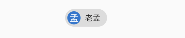
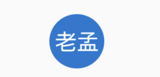
title: 'CircleAvatar' description: '代表用户的圆圈的控件,通常与用户的个人资料图片一起使用' type: widgets
CircleAvatar
代表用户的圆圈的控件,通常与用户的个人资料图片一起使用,或者在没有此类图片的情况下与用户的姓名缩写一起使用。 为了保持一致,给定用户的姓名缩写应始终与相同的背景色配对。
用法如下:
CircleAvatar(
  child: Text('孟'),
)
效果如下:
设置背景颜色:
CircleAvatar(
  child: Text('孟'),
  backgroundColor: Colors.blue,
)
效果如下:
设置文字颜色:
CircleAvatar(
  child: Text('孟'),
  foregroundColor: Colors.red,
)
效果如下:
设置背景图片:
CircleAvatar(
  child: Text('孟'),
  backgroundImage: AssetImage('images/1.png'),
)
效果如下:
设置半径:
CircleAvatar(
  child: Text('孟'),
  radius: 40,
)
效果如下:
title: 'ClipRect' description: '控件介绍' type: widgets
ClipRect
ClipRect组件使用矩形裁剪子组件,通常情况下,ClipRect作用于CustomPaint 、 CustomSingleChildLayout 、 CustomMultiChildLayout 、 Align 、 Center 、 OverflowBox 、 SizedOverflowBox组件,例如ClipRect作用于Align,可以仅显示上半部分,代码如下:
ClipRect(
  child: Align(
    alignment: Alignment.topCenter,
    heightFactor: 0.5,
    child: Container(
      height: 150,
      width: 150,
      child: Image.asset(
        'images/1.png',
        fit: BoxFit.cover,
      ),
    ),
  ),
)
全图效果:
裁剪效果:
clipper参数定义裁剪规则,下面具体介绍。
clipBehavior参数定义了裁剪的方式,只有子控件超出父控件的范围才有裁剪的说法,各个方式说明如下:
- none:不裁剪,系统默认值,如果子组件不超出边界,此值没有任何性能消耗。
- hardEdge:裁剪但不应用抗锯齿,速度比
none慢一点,但比其他方式快。 - antiAlias:裁剪而且抗锯齿,此方式看起来更平滑,比
antiAliasWithSaveLayer快,比hardEdge慢,通常用于处理圆形和弧形裁剪。 - antiAliasWithSaveLayer:裁剪、抗锯齿而且有一个缓冲区,此方式很慢,用到的情况比较少。
ClipRRect
ClipRRect组件可以对子组件进行圆角裁剪,默认圆角半径为0,注意ClipRRect有2个R,不是上面介绍的ClipRect。
用法如下:
ClipRRect(
  borderRadius: BorderRadius.circular(20),
  child: Container(
    height: 150,
    width: 150,
    child: Image.asset(
      'images/1.png',
      fit: BoxFit.cover,
    ),
  ),
)
效果如图:
ClipOval
ClipOval裁剪为椭圆形,椭圆形的大小为正切父组件,因此如果父组件为正方形,切出来是圆形,用法如下:
ClipOval(
  child: Container(
    height: 150,
    width: 250,
    child: Image.asset(
      'images/1.png',
      fit: BoxFit.cover,
    ),
  ),
)
效果如下:
ClipPath
ClipPath组件根据路径进行裁剪,我们自定义裁剪路径也可以使用系统提供的,用法如下:
ClipPath.shape(
  shape: StadiumBorder(),
  child: Container(
    height: 150,
    width: 250,
    child: Image.asset(
      'images/1.png',
      fit: BoxFit.cover,
    ),
  ),
)
shape参数是ShapeBorder类型,系统已经定义了很多形状,介绍如下:
-
RoundedRectangleBorder:圆角矩形
-
ContinuousRectangleBorder:直线和圆角平滑连续的过渡,和RoundedRectangleBorder相比,圆角效果会小一些。
-
StadiumBorder:类似于足球场的形状,两端半圆。
-
BeveledRectangleBorder:斜角矩形。效果如图:
- CircleBorder:圆形。
CustomClipper
CustomClipper并不是一个组件,而是一个abstract(抽象)类,使用CustomClipper可以绘制出任何我们想要的形状,比如三角形,代码如下:
@override
Widget build(BuildContext context) {
  return Center(
    child: ClipPath(
      clipper: TrianglePath(),
      child: Container(
        height: 150,
        width: 250,
        child: Image.asset(
          'images/1.png',
          fit: BoxFit.cover,
        ),
      ),
    ),
  );
}
自定义TrianglePath代码如下:
class TrianglePath extends CustomClipper<Path>{
  @override
  Path getClip(Size size) {
    var path = Path();
    path.moveTo(size.width/2, 0);
    path.lineTo(0, size.height);
    path.lineTo(size.width, size.height);
    return path;
  }

  @override
  bool shouldReclip(CustomClipper<Path> oldClipper) {
    return true;
  }
}
效果如下:
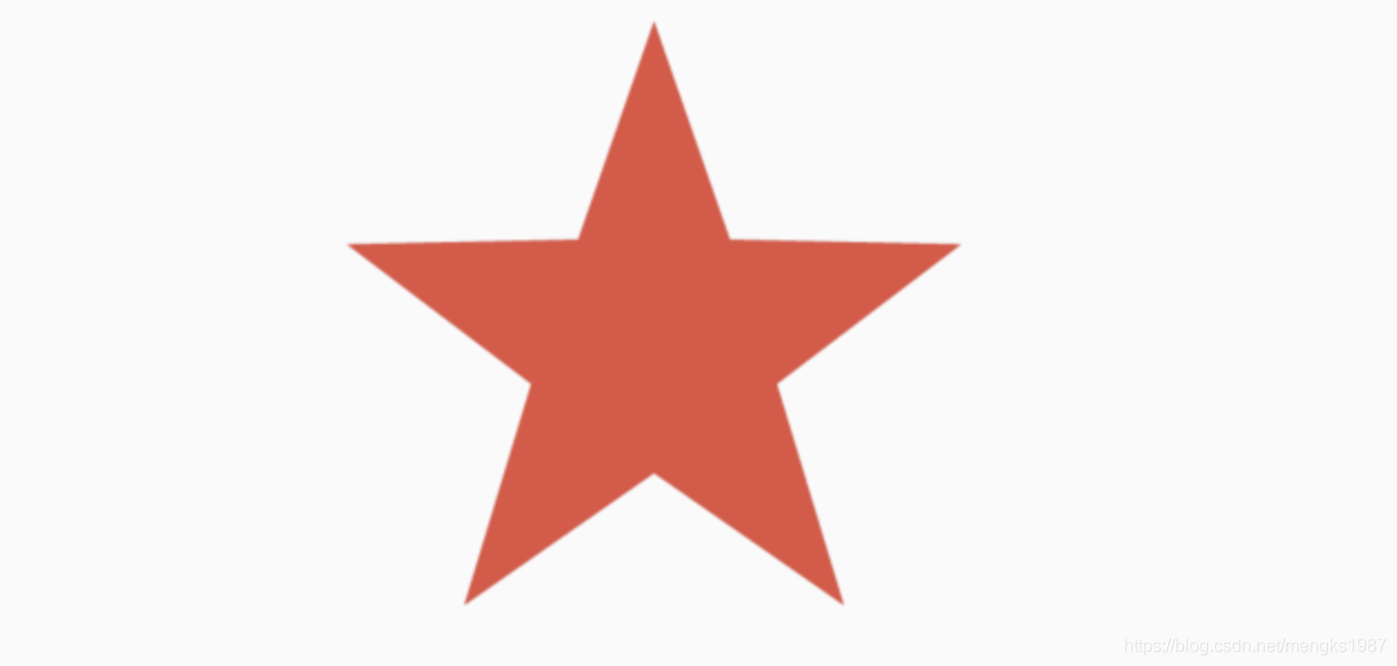
我们还可以绘制五角星,代码如下:
class StarPath extends CustomClipper<Path> {
  StarPath({this.scale = 2.5});

  final double scale;

  double perDegree = 36;

  /// 角度转弧度公式
  double degree2Radian(double degree) {
    return (pi * degree / 180);
  }

  @override
  Path getClip(Size size) {
    var R = min(size.width / 2, size.height / 2);
    var r = R / scale;
    var x = size.width / 2;
    var y = size.height / 2;

    var path = Path();
    path.moveTo(x, y - R);
    path.lineTo(x - sin(degree2Radian(perDegree)) * r,
        y - cos(degree2Radian(perDegree)) * r);
    path.lineTo(x - sin(degree2Radian(perDegree * 2)) * R,
        y - cos(degree2Radian(perDegree * 2)) * R);
    path.lineTo(x - sin(degree2Radian(perDegree * 3)) * r,
        y - cos(degree2Radian(perDegree * 3)) * r);
    path.lineTo(x - sin(degree2Radian(perDegree * 4)) * R,
        y - cos(degree2Radian(perDegree * 4)) * R);
    path.lineTo(x - sin(degree2Radian(perDegree * 5)) * r,
        y - cos(degree2Radian(perDegree * 5)) * r);
    path.lineTo(x - sin(degree2Radian(perDegree * 6)) * R,
        y - cos(degree2Radian(perDegree * 6)) * R);
    path.lineTo(x - sin(degree2Radian(perDegree * 7)) * r,
        y - cos(degree2Radian(perDegree * 7)) * r);
    path.lineTo(x - sin(degree2Radian(perDegree * 8)) * R,
        y - cos(degree2Radian(perDegree * 8)) * R);
    path.lineTo(x - sin(degree2Radian(perDegree * 9)) * r,
        y - cos(degree2Radian(perDegree * 9)) * r);
    path.lineTo(x - sin(degree2Radian(perDegree * 10)) * R,
        y - cos(degree2Radian(perDegree * 10)) * R);
    return path;
  }

  @override
  bool shouldReclip(StarPath oldClipper) {
    return oldClipper.scale != this.scale;
  }
}
scale参数表示间隔的点到圆心的缩放比例,五角星效果如下:
下面用动画动态设置scale,代码如下:
class StartClip extends StatefulWidget {
  @override
  State<StatefulWidget> createState() => _StartClipState();
}

class _StartClipState extends State<StartClip>
    with SingleTickerProviderStateMixin {
  AnimationController _controller;
  Animation _animation;

  @override
  void initState() {
    _controller =
        AnimationController(duration: Duration(seconds: 2), vsync: this)
          ..addStatusListener((status) {
            if (status == AnimationStatus.completed) {
              _controller.reverse();
            } else if (status == AnimationStatus.dismissed) {
              _controller.forward();
            }
          });
    _animation = Tween(begin: 1.0, end: 4.0).animate(_controller);
    _controller.forward();
    super.initState();
  }

  @override
  Widget build(BuildContext context) {
    return Center(
      child: AnimatedBuilder(
          animation: _animation,
          builder: (context, child) {
            return ClipPath(
              clipper: StarPath(scale: _animation.value),
              child: Container(
                height: 150,
                width: 150,
                color: Colors.red,
              ),
            );
          }),
    );
  }
}
效果如下:
title: 'ColorFiltered' description: '控件介绍' type: widgets
ColorFiltered
Flutter中大部分多组件都有color属性,可以方便的改变颜色,但如果想改变图片颜色就不是那么容易了,虽然Image组件也有color属性,但设置的color属性会覆盖整个组件,这并不是我们想要的,而ColorFiltered组件可以帮我们解决这个问题。
假设我们有这么一种图片,图片只有一段文字,其他地方透明:
Container(
        color: Colors.grey, child: Image.asset('images/content.png'));
效果如下:
由于字体是白色的,所以将背景设置为灰色,这时来了一个需求根据系统样式改变字体颜色,大部分人第一个想法就是让UI切处所有颜色的图片,虽然效果可以实现,但问题太大了,第一:样式比较多的话必然会有大量的图片,导致App的体积较大。第二:如果允许用户自定义主题颜色,按照上面的方式基本无法实现。
我们可以使用ColorFiltered来实现上面的效果:
Container(
        child: ColorFiltered(
          colorFilter: ColorFilter.mode(Colors.blue, BlendMode.modulate),
          child: Image.asset('images/content.png'),
        ));
效果如下:
想要什么颜色直接改变颜色值即可。
ColorFiltered还可以实现类似“滤镜”效果,让一张图片和color进行融合:
Row(
      children: <Widget>[
        Expanded(
          child: Image.asset('images/1.png'),
        ),
        Expanded(
            child: ColorFiltered(
          colorFilter: ColorFilter.mode(Colors.pink[200], BlendMode.modulate),
          child: Image.asset('images/1.png'),
        ))
      ],
    )
原始图片和融合后图片效果对比:

可以作用于任何组件,如果想让某一个区域变为灰色,用法如下:
ColorFiltered(
          colorFilter: ColorFilter.mode(Colors.grey, BlendMode.saturation),
          child: Container(
            height: 100,
            width: 200,
            color: Colors.blue,
          ),
        )
对比效果如下:
ColorFiltered用法比较简单,其中的blendMode非常重要,系统为我们提供了非常多的融合模式,关于blendMode可以查看如下文章:
title: 'Row|Column' description: '控件介绍' type: widgets
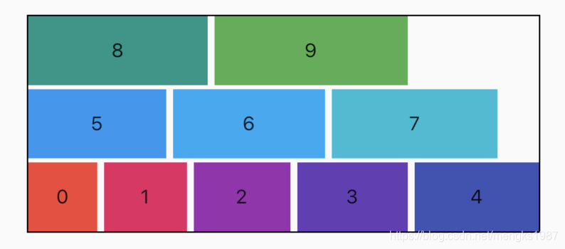
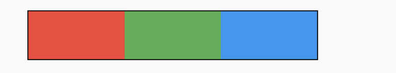
Row Column
在Row和Column中有一个非常重要的概念:MainAxisAlignment(主轴)和CrossAxisAlignment(交叉轴),简单来说,MainAxisAlignment(主轴)就是与当前控件方向一致的轴,而CrossAxisAlignment(交叉轴)就是与当前控件方向垂直的轴,比如Row的主轴是水平方向,交叉轴是垂直方向,而Column的主轴是垂直方向,交叉轴是水平方向。
Row和Column是多子控件的容器类控件,Row控件水平布局,Column控件垂直布局。
主轴对齐方式
Row控件的主轴mainAxisAlignment对齐方式默认值是MainAxisAlignment.start,即子控件从开始处排列,这个开始处不一定是屏幕的左边,是从左到右还是从右到左排列取决于文本方向textDirection属性,比如阿拉伯文本方向是从右到左的。
3个颜色块水平排列,代码如下:
Row(
        children: <Widget>[
          Container(
            height: 50,
            width: 100,
            color: Colors.red,
          ),
          Container(
            height: 50,
            width: 100,
            color: Colors.green,
          ),
          Container(
            height: 50,
            width: 100,
            color: Colors.blue,
          ),
        ],
      )
效果如图:
 黑色边框是Row控件的范围,默认情况下Row铺满父组件。主轴的对齐方式设置代码如下:
Row(
	mainAxisAlignment: MainAxisAlignment.center,
	...
)
主轴对齐方式有6种,效果如下图:
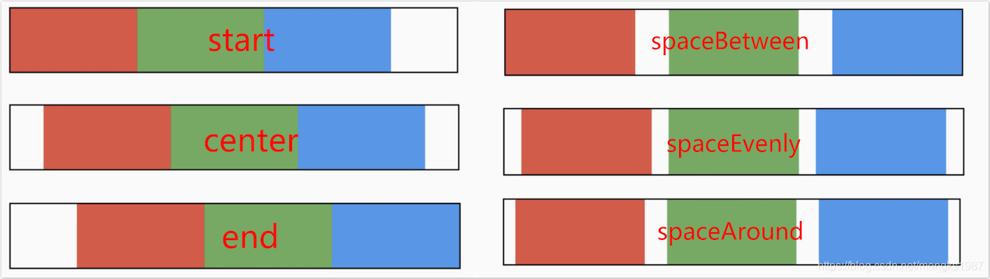
spaceAround和spaceEvenly区别是:
- spaceAround:第一个子控件距开始位置和最后一个子控件距结尾位置是其他子控件间距的一半。
- spaceEvenly:所有间距一样。
交叉轴对齐方式
和主轴相对应的就是交叉轴crossAxisAlignment,交叉轴对齐方式默认是居中。Row控件的高度是依赖子控件高度,因此子控件高都一样时,Row的高和子控件高相同,此时是无法体现交叉轴对齐方式,修改3个颜色块高分别为50,100,150,这样Row的高是150,代码如下:
Row(
        children: <Widget>[
          Container(
            height: 50,
            width: 100,
            color: Colors.red,
          ),
          Container(
            height: 100,
            width: 100,
            color: Colors.green,
          ),
          Container(
            height: 150,
            width: 100,
            color: Colors.blue,
          ),
        ],
      )
效果如下:
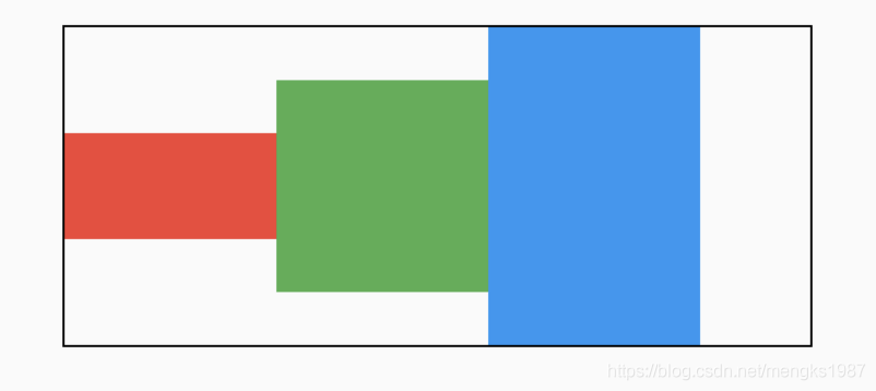
交叉轴属性设置代码如下:
Row(
	crossAxisAlignment: CrossAxisAlignment.center,
	...
)
交叉轴对齐方式介绍如下:
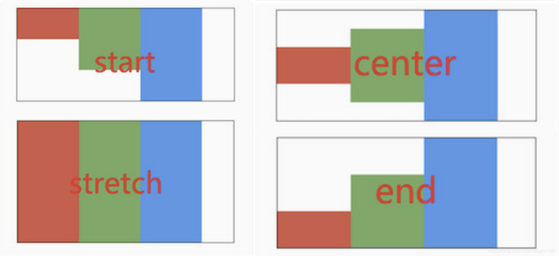
CrossAxisAlignment.stretch 表示使子控件填满交叉轴。
textDirection和verticalDirection
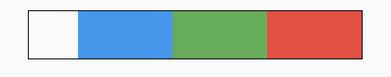
属性textDirection控制水平方向布局,值包含TextDirection.ltr(从左到右)和TextDirection.rtl(从右到左),verticalDirection控制垂直方向布局,值包含VerticalDirection.up(从上到下)和VerticalDirection.down(从下到上),用法如下:
Row(
	textDirection: TextDirection.rtl,
	...
)
效果如下:
 想一想这种效果完全可以通过主轴的方式实现,那么为什么还要有
textDirection和verticalDirection这2个属性,官方API文档已经解释了这个问题:
This is also used to disambiguate
startandendvalues (e.g. [MainAxisAlignment.start] or [CrossAxisAlignment.end]).
用于消除“start”和“end”值的歧义的。
主轴尺寸
主轴尺寸由mainAxisSize属性控制,仅有min和max两种方式,默认是max方法。min表示尽可能小,而max表示尽可能大,设置min的代码如下:
Row(
	mainAxisSize: MainAxisSize.min,
	...
)
效果如下:
 黑色边框是Row的边框。
title: 'ConstrainedBox | UnconstrainedBox' description: '控件介绍' type: widgets
ConstrainedBox
Flutter中尺寸限制类容器组件包括ConstrainedBox、UnconstrainedBox、SizedBox、AspectRatio、FractionallySizedBox、LimitedBox、Container。这些组件可以约束子组件的尺寸,下面一一介绍。
ConstrainedBox
ConstrainedBox组件约束子组件的最大宽高和最小宽高,假如一个组件宽高都是300,包裹在ConstrainedBox中,并给ConstrainedBox添加最大宽高约束,用法如下:
ConstrainedBox(
constraints: BoxConstraints(maxHeight: 60, maxWidth: 200),
child: Container(height: 300, width: 300, color: Colors.red),
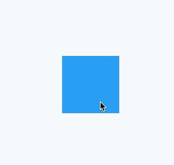
)
这时子组件是无法突破BoxConstraints设置的最大宽高,效果如下:
BoxConstraints的默认值如下:
const BoxConstraints({
  this.minWidth = 0.0,
  this.maxWidth = double.infinity, //无限大
  this.minHeight = 0.0,
  this.maxHeight = double.infinity, //无限大
});
BoxConstraints提供了便捷的构建函数,方便开发者调用,如BoxConstraints.tight(Size size)和BoxConstraints.expand()等。
如果BoxConstraints嵌套使用,有2个ConstrainedBox,如下:
ConstrainedBox(
  constraints: BoxConstraints(maxHeight: 60, maxWidth: 200),
  child: ConstrainedBox(
    constraints: BoxConstraints(maxHeight: 100, maxWidth: 240),
    child: Container(height: 300, width: 300, color: Colors.red),
  ),
)
以最大宽为例,第一个BoxConstraints的maxHeight值是60,也就是约束其子控件最大高是60,第二个BoxConstraints的maxHeight值是100,由于第二个BoxConstraints也受第一个的约束,所以第二个BoxConstraints最大高也只能是60,最终子组件的最大高是60,同理最大宽是200,因此多级BoxConstraints嵌套约束最大值最终值等于多个BoxConstraints约束中的最小值。同理嵌套约束最小值等于多个BoxConstraints约束中的最大值。
UnconstrainedBox
UnconstrainedBox组件不对子组件做任何约束,比如有一个父组件大小是200x200,子组件是UnconstrainedBox,UnconstrainedBox包裹一个300x300的组件,代码如下:
Container(
  height: 200,
  width: 200,
  child: UnconstrainedBox(
    child: Container(height: 300, width: 300, color: Colors.red),
  ),
)
效果如下:
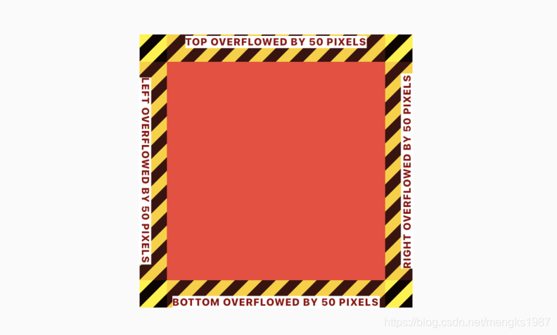
注意:黄色区域表示子控件超出父控件的区域了,黄色区域只会在debug模式下存在,在release模式下,只有红色区域。
UnconstrainedBox虽然不限制其子控件的大小,但仍然受父控件的约束,超出父控件的区域将会截取。
UnconstrainedBox允许设置对齐方式,用法如下:
UnconstrainedBox(
  alignment: Alignment.topLeft,
  ...
)
效果如下:
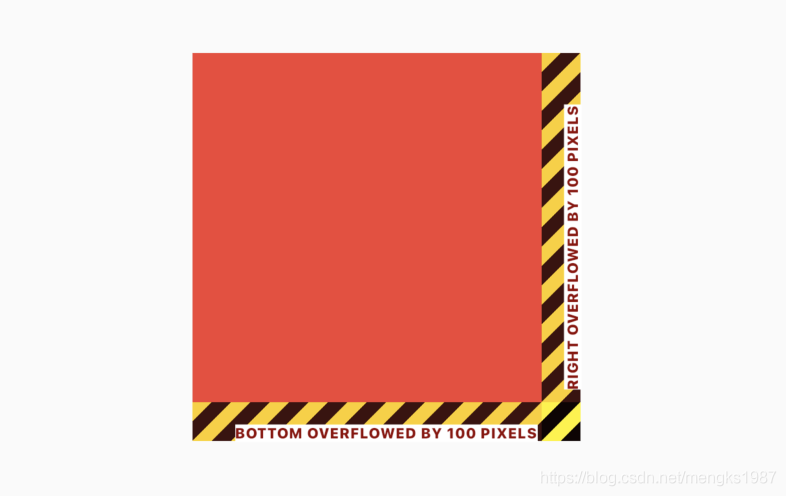
和上一个图对比,这次左边和上边没有超出区域,右边和下边各超出100px。
SizedBox
SizedBox是具有固定宽高的组件,直接指定具体的宽高,用法如下:
SizedBox(
  height: 60,
  width: 200,
  child: RaisedButton(
    child: Text('this is SizedBox'),
  ),
)
我们也可以设置尺寸无限大,如下:
SizedBox(
  height: double.infinity,
  width: double.infinity,
  ...
)
虽然设置了无限大,子控件是否会无限长呢?不,不会,子控件依然会受到父组件的约束,会扩展到父组件的尺寸,还有一个便捷的方式设置此方式:
SizedBox.expand(
  child: RaisedButton(
    child: Text('this is SizedBox'),
  ),
)
SizedBox可以没有子组件,但仍然会占用空间,所以SizedBox非常适合控制2个组件之间的空隙,用法如下:
Column(
  children: <Widget>[
    Container(height: 30,),
    SizedBox(height: 10,),
    Container(height: 30,),
  ],
)
AspectRatio
AspectRatio组件是固定宽高比的组件,如果组件的宽度固定,希望高是宽的1/2,可以用AspectRatio实现此效果,用法如下:
AspectRatio(
  aspectRatio: 2 / 1,
  child: Container(color: Colors.red),
)
aspectRatio参数是宽高比,可以直接写成分数的形式,也可以写成小数的形式,但建议写成分数的形式,可读性更高。效果如下:
FractionallySizedBox
当我们需要一个控件的尺寸是相对尺寸时,比如当前按钮的宽度占父组件的70%,可以使用FractionallySizedBox来实现此效果。
使用FractionallySizedBox包裹子控件,设置widthFactor宽度系数或者heightFactor高度系数,系数值的范围是0-1,0.7表示占父组件的70%,用法如下:
FractionallySizedBox(
  widthFactor: .7,
  child: RaisedButton(
    child: Text('button'),
  ),
)
通过alignment参数控制子组件显示的位置,默认为center,用法如下:
FractionallySizedBox(
  alignment: Alignment.centerLeft,
  ...
)
如果想让2个控件之间的间隔是当前父控件的10%,可以使用无子控件的FractionallySizedBox,用法如下:
Container(
  height: 200,
  color: Colors.grey,
  child: Column(
    children: <Widget>[
      Container(
        height: 50,
        color: Colors.red,
      ),
      Flexible(
        child: FractionallySizedBox(
          heightFactor: .1,
        ),
      ),
      Container(
        height: 50,
        color: Colors.blue,
      ),
    ],
  ),
)
效果如下:
LimitedBox
LimitedBox组件是当不受父组件约束时限制它的尺寸,什么叫不受父组件约束?就像这篇文章介绍的其他组件,它们都会对子组件约束,没有约束的父组件有ListView、Row、Column等,如果LimitedBox的父组件受到约束,此时LimitedBox将会不做任何操作,我们可以认为没有这个组件,代码如下:
Container(
  height: 100,
  width: 100,
  child: LimitedBox(
    maxHeight: 50,
    maxWidth: 100,
    child: Container(color: Colors.green,),
  ),
)
效果如下:
LimitedBox设置的宽高不是正方形,此时效果时正方形,说明LimitedBox没有起作用。
在ListView中直接添加Container组件,如下:
ListView(
  children: <Widget>[
    Container(
      color: Colors.green,
    ),
    Container(
      color: Colors.red,
    ),
  ],
)
这时你会发现什么也没有,因为在容器不受约束时,大小将会设置0,只需将Container包裹在LimitedBox中即可:
ListView(
  children: <Widget>[
    LimitedBox(
      maxHeight: 100,
      child: Container(
        color: Colors.green,
      ),
    ),
    LimitedBox(
      maxHeight: 100,
      child: Container(
        color: Colors.red,
      ),
    ),
  ],
)
效果:
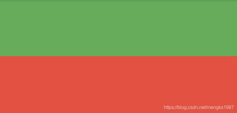
Container
Container组件应该是最常用的组件之一,Container组件可以直接设置其宽高,用法如下:
Container(
  height: 100,
  width: 100,
  ...
)
Container组件是这些组件里面属性最多的一个,当然也是用法最复杂的一个,这里重点介绍Container对子组件的约束,我在前面的文章中已经详细的介绍了Container,这里不在介绍,奉上跳转地址:https://blog.csdn.net/mengks1987/article/details/104388393
总结
这么多约束类的容器组件,到底要使用哪一个组件呢?总结如下:
- ConstrainedBox:适用于需要设置最大/小宽高,组件大小以来子组件大小,但不能超过设置的界限。
- UnconstrainedBox:用到情况不多,当作ConstrainedBox的子组件可以“突破”ConstrainedBox的限制,超出界限的部分会被截取。
- SizedBox:适用于固定宽高的情况,常用于当作2个组件之间间隙组件。
- AspectRatio:适用于固定宽高比的情况。
- FractionallySizedBox:适用于占父组件百分比的情况。
- LimitedBox:适用于没有父组件约束的情况。
- Container:适用于不仅有尺寸的约束,还有装饰(颜色、边框、等)、内外边距等需求的情况。
title: 'Container' description: '结合了常见的绘画,定位和调整大小的组件' type: widgets
Container
Container将会是我们以后最常用的控件之一,Container是单容器类控件,即只包含一个子控件。Container可以装饰和定位子控件,例如设置背景颜色、形状等。
无任何参数设置
如果只用Container包装子控件而没有任何其他参数的设置,代码如下:
Container(
	child: Text('老孟'),
 )
Container内的子控件不会发生任何外观上的变化,效果如下:
设置背景颜色
如果想要给子控件添加背景颜色可以使用color属性,代码如下:
Container(
	color: Colors.blue,
    child: Text('老孟'),
)
效果如下:
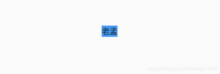 没有其他参数设置时,Container将会根据子控件自行调整大小。
padding 和 margin
如果想在Container和子元素之间添加空白可以使用padding属性,代码如下:
Container(
color: Colors.blue,
child: Text('老孟'),
padding: EdgeInsets.all(20),
)
效果如下:
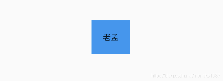 margin的用法和padding一样,padding表示内边距,margin表示外边距。
Decoration 装饰
decoration属性可以设置子控件的背景颜色、形状等。设置背景为圆形,颜色为蓝色,代码如下:
Container(
child: Text('老孟,一个有态度的程序员'),
decoration: BoxDecoration(
shape: BoxShape.circle,
color: Colors.blue
),
)
效果如下:
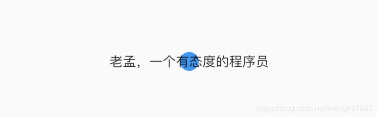 默认情况下,圆形的直径等于Container的窄边长度,相当于在矩形内绘制内切圆。
上面的情况明显不是我们希望看到了,太丑了,我们希望背景是圆角矩形,代码如下:
Container(
child: Text('老孟,一个有态度的程序员'),
padding: EdgeInsets.symmetric(horizontal: 10),
decoration: BoxDecoration(
shape: BoxShape.rectangle,
borderRadius: BorderRadius.all(Radius.circular(20)),
color: Colors.blue
),
)
效果如下:
 这就好看多了吗。
除了背景我们可以设置边框效果,代码如下:
Container(
child: Text('老孟,一个有态度的程序员'),
padding: EdgeInsets.symmetric(horizontal: 10),
decoration: BoxDecoration(
borderRadius: BorderRadius.circular(12),
border: Border.all(
color: Colors.blue,
width: 2,
),
),
)
效果如下:
 我们也可以通过此方式创建圆角图片和圆形图片,代码如下:
Container(
height: 200,
width: 200,
decoration: BoxDecoration(
image: DecorationImage(
image: NetworkImage(
'https://flutter.github.io/assets-for-api-docs/assets/widgets/owl-2.jpg'),
fit: BoxFit.cover,
),
border: Border.all(
color: Colors.blue,
width: 2,
),
borderRadius: BorderRadius.circular(12),
),
)
效果如图:
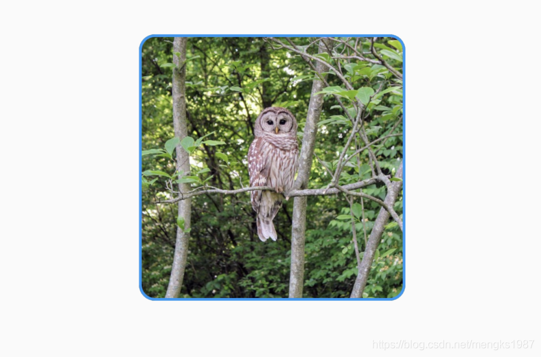 修改其形状为圆形,代码如下:
Container(
height: 200,
width: 200,
decoration: BoxDecoration(
image: DecorationImage(
image: NetworkImage(
'https://flutter.github.io/assets-for-api-docs/assets/widgets/owl-2.jpg'),
fit: BoxFit.cover,
),
border: Border.all(
color: Colors.blue,
width: 2,
),
shape: BoxShape.circle,
),
)
效果如图:
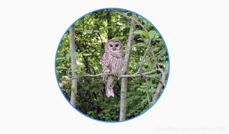
Alignment 对齐方式
注意:设置对齐方式后,Container将会充满其父控件,相当于Android中match_parent,不在是根据子控件调整大小
设置对齐方式为居中,背景色为蓝色,代码如下:
Container(
color: Colors.blue,
child: Text('老孟,一个有态度的程序员'),
alignment: Alignment.center,
)
效果如下:
 通过背景色可以看出Container充满其父控件。
宽、高、约束宽高
我们也可以设置固定的宽高属性,代码如下:
Container(
color: Colors.blue,
child: Text('老孟,一个有态度的程序员'),
alignment: Alignment.center,
height: 60,
width: 200,
)
效果如图:
还可以通过constraints属性设置最大/小宽、高来确定大小,constraints如果不设置,默认最小宽高是0,最大宽高是无限大(double.infinity),约束width代码如下:
Container(
color: Colors.blue,
child: Text('老孟,一个有态度的程序员'),
alignment: Alignment.center,
constraints: BoxConstraints.tightForFinite(
width: 200
),
)
效果如图:
transform 变换
通过transform可以旋转、平移、缩放Container,旋转代码如下:
Container(
color: Colors.blue,
child: Text('老孟,一个有态度的程序员'),
alignment: Alignment.center,
height: 60,
width: 200,
transform: Matrix4.rotationZ(0.5),
)
注意:Matrix4.rotationZ()参数的单位是弧度而不是角度
效果如图:
title: 'CupertinoActionSheet' description: 'IOS风格底部弹出的提示框' type: widgets
CupertinoActionSheet
CupertinoActionSheet组件是Cupertino(ios)风格底部弹出的提示框,一般情况下点击按钮弹出:
RaisedButton(
child: Text('点我'),
onPressed: () {
showCupertinoModalPopup(...);
},
)
showCupertinoModalPopup方法是系统方法,其中的builder参数就是构建CupertinoActionSheet,用法如下:
showCupertinoModalPopup(
context: context,
builder: (context) {
return CupertinoActionSheet();
}
)
CupertinoActionSheet组件的actions属性提供给用户几个选项,
CupertinoActionSheet(
title: Text('提示'),
message: Text('是否要删除当前项?'),
actions: <Widget>[
CupertinoActionSheetAction(
child: Text('删除'),
onPressed: () {},
isDefaultAction: true,
),
CupertinoActionSheetAction(
child: Text('暂时不删'),
onPressed: () {},
isDestructiveAction: true,
),
],
)
CupertinoActionSheetAction
actions的子组件一般使用CupertinoActionSheetAction组件,CupertinoActionSheetAction组件向按钮组件一样,提供了子控件和onPressed回调,isDefaultAction属性设置为true时,文字加粗,isDestructiveAction属性设置为true时,文字颜色变为红色,效果如下:
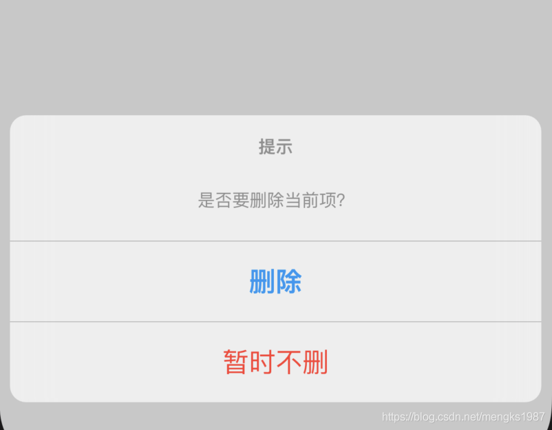
如果想要一个和其他选项分开的组件,可以使用cancelButton属性,用法如下:
CupertinoActionSheet(
cancelButton: CupertinoActionSheetAction(
child: Text('取消'),
onPressed: () {},
),
)
效果如下:
那我们如何知道用户选择了哪个选项呢,我们需要在onPressed回调中返回不同的值,如下:
onPressed: () {
Navigator.of(context).pop('delete');
}
showCupertinoModalPopup方法是Future方法,用户点击了某一项时返回,完整代码如下:
@override
Widget build(BuildContext context) {
return Center(
child: RaisedButton(
child: Text('点我'),
onPressed: () {
_showCupertinoActionSheet();
},
));
}
_showCupertinoActionSheet() async{
var result = await showCupertinoModalPopup(
context: context,
builder: (context) {
return CupertinoActionSheet(
title: Text('提示'),
message: Text('是否要删除当前项?'),
actions: <Widget>[
CupertinoActionSheetAction(
child: Text('删除'),
onPressed: () {
Navigator.of(context).pop('delete');
},
isDefaultAction: true,
),
CupertinoActionSheetAction(
child: Text('暂时不删'),
onPressed: () {
Navigator.of(context).pop('not delete');
},
isDestructiveAction: true,
),
],
cancelButton: CupertinoActionSheetAction(
child: Text('取消'),
onPressed: () {
Navigator.of(context).pop('cancel');
},
),
);
});
print('$result');
}
通过result不同的值判断用户选择了哪一项。
title: 'CupertinoContextMenu CupertinoContextMenuAction' description: '' type: widget
CupertinoContextMenu
CupertinoContextMenu 效果类似以iOS 3D Touch,长按弹出菜单,用法如下:
CupertinoContextMenu(
child: Container(
color: Colors.red,
height: 60,
width: 100,
),
actions: <Widget>[
CupertinoContextMenuAction(
child: const Text('Action one'),
onPressed: () {
Navigator.pop(context);
},
),
CupertinoContextMenuAction(
child: const Text('Action two'),
onPressed: () {
Navigator.pop(context);
},
),
],
)
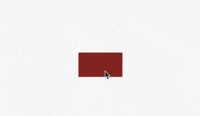
previewBuilder如果不指定则显示child,此属性展示打开状态下的样式,比如上面的红色框打开时变为圆角:
CupertinoContextMenu(
child: Container(
color: Colors.red,
height: 60,
width: 100,
),
previewBuilder: (
BuildContext context,
Animation<double> animation,
Widget child,
) {
return Container(
decoration: BoxDecoration(
borderRadius: BorderRadius.circular(10 * animation.value),
color: Colors.red,
),
height: 60,
width: 100,
);
},
actions: <Widget>[
CupertinoContextMenuAction(
child: const Text('Action one'),
onPressed: () {
Navigator.pop(context);
},
),
CupertinoContextMenuAction(
child: const Text('Action two'),
onPressed: () {
Navigator.pop(context);
},
),
],
)
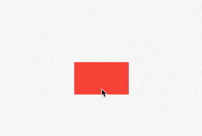
CupertinoContextMenuAction
CupertinoContextMenuAction 用于CupertinoContextMenu组件中,当作actions,用法如下:
CupertinoContextMenuAction(
child: const Text('Action one'),
onPressed: () {
Navigator.pop(context);
},
)
onPressed表示点击回调。
设置isDefaultAction为true,字体变为加粗:
CupertinoContextMenuAction(
isDefaultAction: true,
child: const Text('Action one'),
onPressed: () {
Navigator.pop(context);
},
)
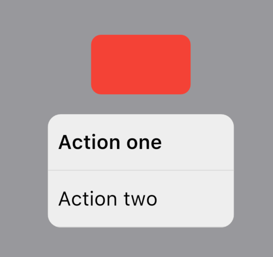
设置isDestructiveAction为true,字体变为红色:
CupertinoContextMenuAction(
isDestructiveAction: true,
child: const Text('Action one'),
onPressed: () {
Navigator.pop(context);
},
)
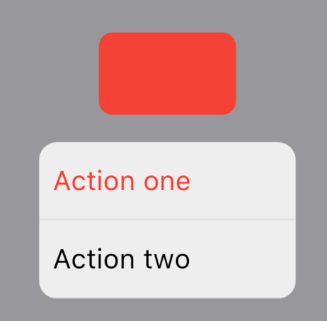
title: 'CupertinoFullscreenDialogTransition' description: '平移动画组件' type: widgets
CupertinoFullscreenDialogTransition
不要被这个组件的名字迷惑了,它本质上是一个SlideTransition组件,从(0,1)移动到(0,0)。用法如下:
AnimationController _animationController;
@override
void initState() {
_animationController = AnimationController(
vsync: this,
duration: Duration(milliseconds: 500),
);
super.initState();
}
@override
Widget build(BuildContext context) {
return Column(
children: <Widget>[
Expanded(
child: Container(),
),
Row(
mainAxisAlignment: MainAxisAlignment.spaceAround,
children: <Widget>[
RaisedButton(
onPressed: () => _animationController.forward(),
child: Text('Forward'),
),
RaisedButton(
onPressed: () => _animationController.reverse(),
child: Text('Reverse'),
),
],
),
CupertinoFullscreenDialogTransition(
animation: _animationController,
child: Container(
color: Colors.blueGrey,
height: 300,
),
),
],
);
}
效果如下:

title: 'CupertinoNavigationBar CupertinoSliverNavigationBar' description: '控件介绍' type: widgets
CupertinoNavigationBar
ios风格的导航条,对应Material风格的AppBar,用法如下:
CupertinoNavigationBar(
middle: Text('老孟'),
)
middle表示中间的控件,效果如下:
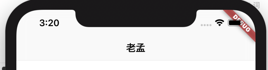
导航条左边的控件:
CupertinoPageScaffold(
navigationBar: CupertinoNavigationBar(
leading: Icon(Icons.arrow_back),
middle: Text('老孟'),
),
child: FirstPage(),
)
效果如下:
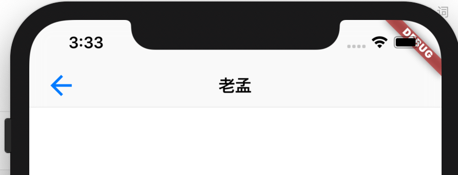
leading为null而且automaticallyImplyLeading设置true(默认就是true)
- 在
fullscreenDialog上显示一个“关闭”图标。 - 如果
previousPageTitle不为null,显示一个“返回”图标+previousPageTitle的值。 - 如果当前路由和前一个路由都是
CupertinoPageRoute类型,显示“返回”图标+上一个路由的title。
第二张情况的第一个页面:
@override
Widget build(BuildContext context) {
return Center(
child: RaisedButton(
child: Text('去下一个页面'),
onPressed: () {
Navigator.of(context).push(CupertinoPageRoute(builder: (context) {
return SecondPage();
});
},
),
);
}
第二个页面:
class SecondPage extends StatelessWidget {
@override
Widget build(BuildContext context) {
return CupertinoPageScaffold(
navigationBar: CupertinoNavigationBar(
previousPageTitle: '返回',
middle: Text('老孟'),
),
child: Center(
child: RaisedButton(
child: Text('to third'),
onPressed: () {
Navigator.of(context).push(CupertinoPageRoute(builder: (context) {
return ThirdPage();
}));
},
),
),
);
}
}
效果如下:
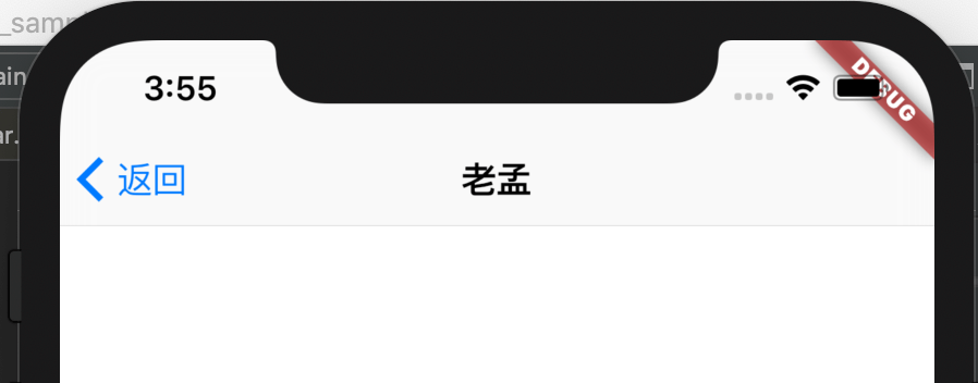
middle和trailing分别表示中间和末尾的控件,用法如下:
CupertinoNavigationBar(
middle: Text('老孟'),
trailing: Icon(Icons.timer),
)
设置背景颜色和padding:
CupertinoNavigationBar(
middle: Text('老孟'),
backgroundColor: Colors.red,
padding: EdgeInsetsDirectional.only(start: 10),
)
CupertinoSliverNavigationBar
CupertinoSliverNavigationBar的属性CupertinoNavigationBar基本一样,比CupertinoNavigationBar多了一个largeTitle属性,而且CupertinoSliverNavigationBar是Sliver控件,通常用于CustomScrollView中。
CustomScrollView(
slivers: <Widget>[
CupertinoSliverNavigationBar(
largeTitle: Text('老孟'),
),
],
)
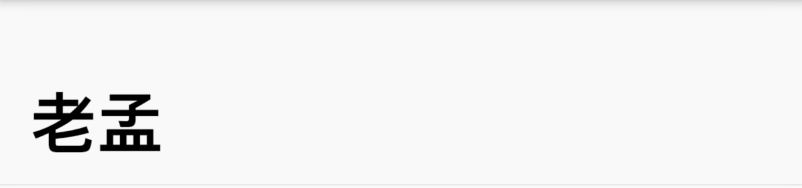
title: 'CupertinoNavigationBarBackButton' description: '导航后退按钮' type: widgets
CupertinoNavigationBarBackButton
CupertinoNavigationBarBackButton是一个导航后退按钮,通常用在CupertinoNavigationBar中,用法如下:
CupertinoNavigationBarBackButton(
color: Colors.red,
previousPageTitle: '返回',
onPressed: (){},
)
效果如下:
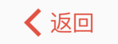
title: 'CupertinoPageScaffold' description: '控件介绍' type: widgets
CupertinoPageScaffold
CupertinoPageScaffold和Material 风格的Scaffold的作用是一样的,是应用程序整体布局的控件,但比Scaffold的功能要少的多,为什么呢?嗯,我猜,Google想让你使用Scaffold。
CupertinoPageScaffold只有顶部的导航条和内容区域(导航条下面的部分)两部分,用法如下:
CupertinoApp(
home: CupertinoPageScaffold(
navigationBar: CupertinoNavigationBar(
middle: Text('老孟'),
),
child: FirstPage(),
),
)
CupertinoNavigationBar 是导航控件,效果如下:
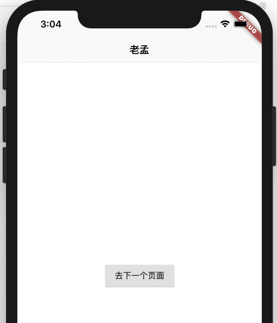
child属性表示导航条下面的部分,系统并没有提供类似Scaffold的抽屉控件和底部导航控件。
title: 'CupertinoPicker' description: '控件介绍' type: widgets
CupertinoPicker
ios风格的选择器,和ListWheelScrollView类似。
基本用法如下:
CupertinoPicker(
itemExtent: 45,
onSelectedItemChanged: (index){
},
children: <Widget>[
Container(color: Colors.primaries[1],),
Container(color: Colors.primaries[2],),
Container(color: Colors.primaries[3],),
Container(color: Colors.primaries[4],),
Container(color: Colors.primaries[5],),
Container(color: Colors.primaries[6],),
],
)
效果如下:
itemExtent每个子控件的高度。
onSelectedItemChanged:选择的选项发生变化回调。
title: 'CupertinoSegmentedControl' description: '' type: widget
CupertinoSegmentedControl
iOS样式的分段控制组件,用法如下:
CupertinoSegmentedControl(
children: {
'语文':Container(child: Text('语文'), padding: EdgeInsets.symmetric(vertical: 5,horizontal: 10),),
'数学':Container(child: Text('数学'), padding: EdgeInsets.symmetric(vertical: 5,horizontal: 10),),
'体育':Container(child: Text('体育'), padding: EdgeInsets.symmetric(vertical: 5,horizontal: 10),)
},
onValueChanged: (value){
print(value);
},
)
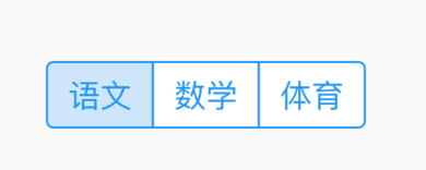
groupValue表示当前选中的值,
String _value = '语文';
@override
Widget build(BuildContext context) {
return Center(
child: CupertinoSegmentedControl(
children: {
'语文':Container(child: Text('语文'), padding: EdgeInsets.symmetric(vertical: 5,horizontal: 10),),
'数学':Container(child: Text('数学'), padding: EdgeInsets.symmetric(vertical: 5,horizontal: 10),),
'体育':Container(child: Text('体育'), padding: EdgeInsets.symmetric(vertical: 5,horizontal: 10),)
},
groupValue: _value,
onValueChanged: (value){
setState(() {
_value = value;
});
},
),
);
}
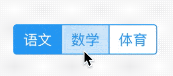
unselectedColor表示未选中的背景颜色和选中的字体颜色:
CupertinoSegmentedControl(
unselectedColor: Colors.yellow,
...
)
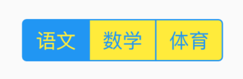
selectedColor表示选中的背景颜色和未选中的字体颜色:
CupertinoSegmentedControl(
selectedColor: Colors.red,
...
)
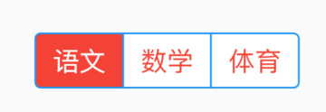
pressedColor表示按住时的颜色:
CupertinoSegmentedControl(
pressedColor: Colors.red,
...
)
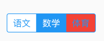
borderColor表示边框颜色:
CupertinoSegmentedControl(
borderColor: Colors.red,
...
)
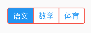
title: 'CupertinoSlidingSegmentedControl' description: '' type: widget
CupertinoSlidingSegmentedControl
iOS 13 样式分段控件。
String _value = '语文';
@override
Widget build(BuildContext context) {
return Center(
child: CupertinoSlidingSegmentedControl(
children: {
'语文':Container(child: Text('语文'), padding: EdgeInsets.symmetric(vertical: 5,horizontal: 10),),
'数学':Container(child: Text('数学'), padding: EdgeInsets.symmetric(vertical: 5,horizontal: 10),),
'体育':Container(child: Text('体育'), padding: EdgeInsets.symmetric(vertical: 5,horizontal: 10),)
},
groupValue: _value,
onValueChanged: (value){
setState(() {
_value = value;
});
},
),
);
}
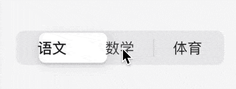
title: 'CupertinoTabBar' description: 'iOS样式的底部导航标签栏' type: widgets
CupertinoTabBar
CupertinoTaBar并不是对应TabBar,CupertinoTaBar和CupertinoTabScaffold配合使用,是一个底部导航。
基本用法如下:
CupertinoTabScaffold(
tabBar: CupertinoTabBar(
items: [
BottomNavigationBarItem(icon: Icon(Icons.home), title: Text('tab1')),
BottomNavigationBarItem(icon: Icon(Icons.home), title: Text('tab2')),
],
)
...
)
items表示每一个tab,类型是BottomNavigationBarItem,效果如下:
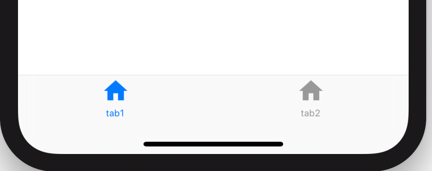
onTap是点击tab时的回调,背景色、选中状态icon颜色、未选中颜色设置如下:
CupertinoTabBar(
items: [
BottomNavigationBarItem(icon: Icon(Icons.home), title: Text('tab1')),
BottomNavigationBarItem(icon: Icon(Icons.home), title: Text('tab2')),
],
onTap: (index){
print('$index');
},
currentIndex: 1,
backgroundColor: Colors.blue,
activeColor: Colors.red,
)
效果如下:
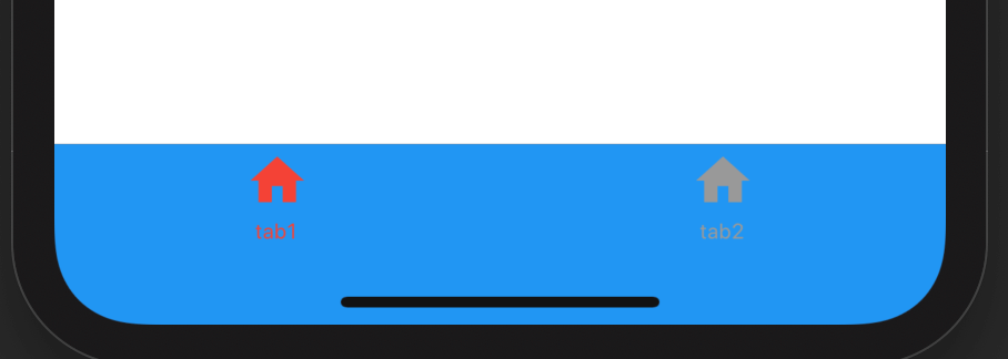
CupertinoTabView
CupertinoTabView是拥有导航状态和历史的单独控件,用法如下:
CupertinoTabScaffold(
tabBar: CupertinoTabBar(
items: [
BottomNavigationBarItem(icon: Icon(Icons.home), title: Text('tab1')),
BottomNavigationBarItem(icon: Icon(Icons.home), title: Text('tab2')),
],
),
tabBuilder: (context, index) {
return CupertinoTabView(
defaultTitle: '老孟',
builder: (context){
return Center(
child: Text('$index'),
);
},
);
},
)
builder构建当前的控件,defaultTitle并不是显示在顶部的title,而是路由的title。
routes、onGenerateRoute、onUnknownRoute、navigatorObservers的用法和MaterialApp对应参数用法一样。
title: 'CupertinoTabScaffold' description: '控件介绍' type: widgets
CupertinoTabScaffold
CupertinoTabScaffold 提供了类似微信式的底部导航,用法如下:
@override
Widget build(BuildContext context) {
return CupertinoTabScaffold(
tabBar: CupertinoTabBar(
items: [
BottomNavigationBarItem(
icon: Icon(Icons.home),
title: Text('tab1')
),
BottomNavigationBarItem(
icon: Icon(Icons.home),
title: Text('tab2')
),
],
),
tabBuilder: (context,index){
return Center(
child: Text('$index'),
);
},
);
}
效果如下:
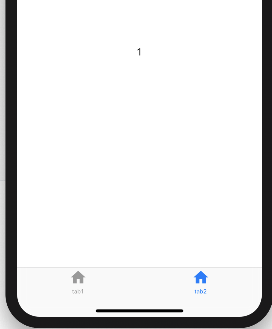
通过CupertinoTabController实现动态切换tab:
var _controller = CupertinoTabController();
@override
Widget build(BuildContext context) {
return CupertinoTabScaffold(
controller: _controller,
tabBar: CupertinoTabBar(
items: [
BottomNavigationBarItem(icon: Icon(Icons.home), title: Text('tab1')),
BottomNavigationBarItem(icon: Icon(Icons.home), title: Text('tab2')),
],
),
tabBuilder: (context, index) {
return Center(
child: RaisedButton(
child: Text('切换$index'),
onPressed: () {
_controller.index = 1;
},
),
);
},
);
}
这时你会发现顶部没有导航啊,添加导航的方式是修改其tabBuilder方法:
tabBuilder: (context, index) {
return CupertinoPageScaffold(
navigationBar: CupertinoNavigationBar(
middle: Text('老孟'),
),
child: Center(
child: RaisedButton(
child: Text('切换$index'),
onPressed: () {
_controller.index = 1;
},
),
),
);
}
效果如下:
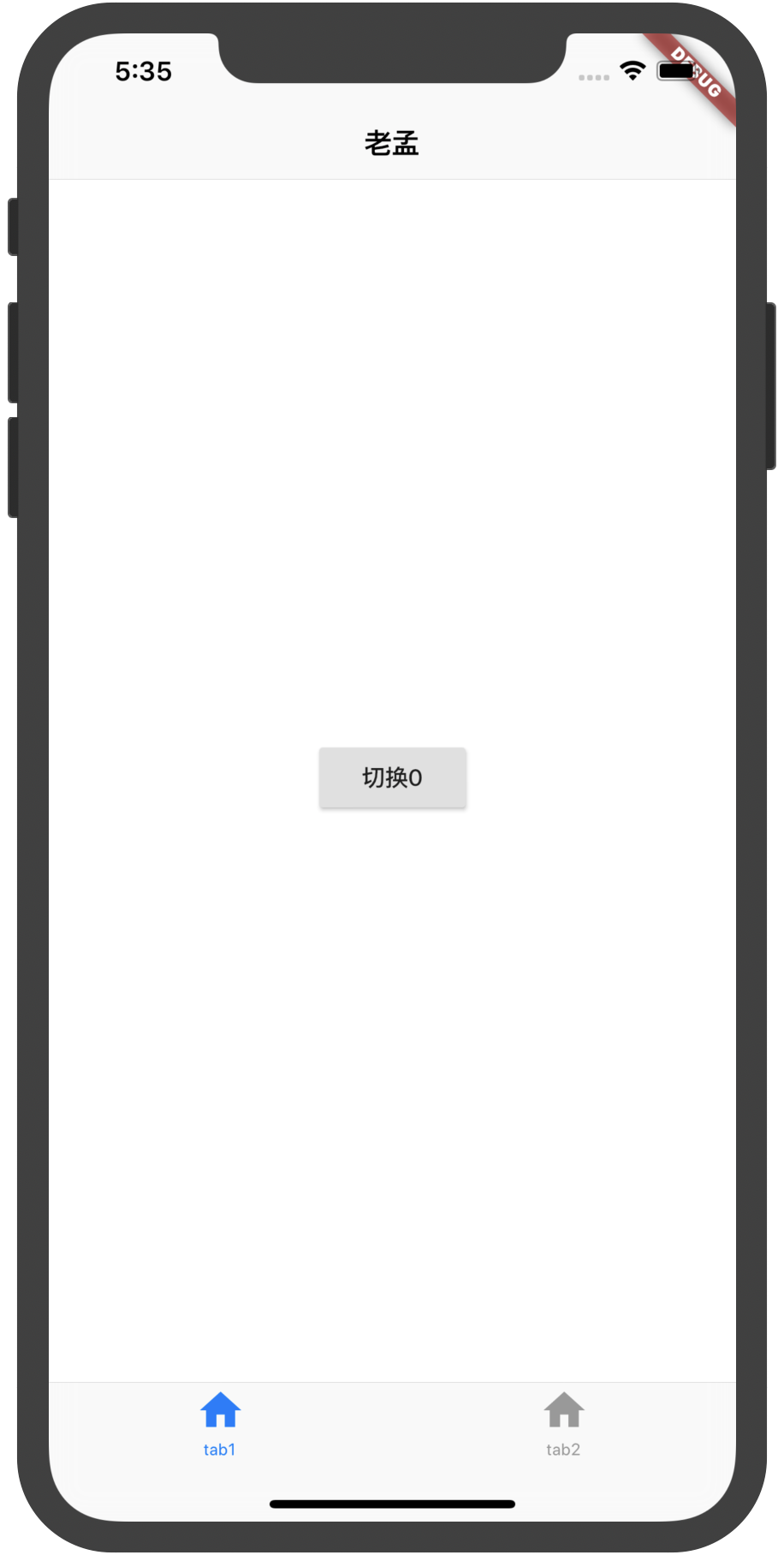
title: 'CupertinoTextSelectionToolbar' description: '' type: widget
CupertinoTextSelectionToolbar
选中文本时显示的ios样式的工具条,通常包含复制和剪贴。
看下构造函数:
发现此控件没有默认构造函数,所以此控件仅仅是给系统使用的,我们是无法使用的。
title: 'CustomMultiChildLayout LayoutId' description: '' type: widget
CustomMultiChildLayout
CustomMultiChildLayout允许我们通过delegate自定义子组件的布局约束、位置以及父组件的大小(父组件大小不依赖于子组件的情况下),和CustomSingleChildLayout基本一样,区别就是CustomSingleChildLayout包裹一个子控件,而CustomMultiChildLayout包裹多个。
下面定义一个布局,2个控件分别位于左上角和右下角,delegate定义如下:
enum FollowTheLeaderId { leader, follower }
class FollowTheLeader extends MultiChildLayoutDelegate {
@override
void performLayout(Size size) {
Size leaderSize = Size.zero;
if (hasChild(FollowTheLeaderId.leader)) {
leaderSize =
layoutChild(FollowTheLeaderId.leader, BoxConstraints.loose(size));
positionChild(FollowTheLeaderId.leader, Offset.zero);
}
if (hasChild(FollowTheLeaderId.follower)) {
Size followerSize = layoutChild(FollowTheLeaderId.follower, BoxConstraints.loose(size));
positionChild(
FollowTheLeaderId.follower,
Offset(
size.width - followerSize.width, size.height - followerSize.height));
}
}
@override
bool shouldRelayout(MultiChildLayoutDelegate oldDelegate) => false;
}
用法:
Container(
width: 200,
height: 200,
color: Colors.red,
child: CustomMultiChildLayout(
delegate: FollowTheLeader(),
children: <Widget>[
LayoutId(
id: FollowTheLeaderId.leader,
child: Text('老孟'),
),
LayoutId(
id: FollowTheLeaderId.follower,
child: Text('专注分享Flutter'),
),
],
),
)
LayoutId
用于在[CustomMultiChildLayout]中标识子控件的元数据,MultiChildLayoutDelegate中的hasChild、layoutChild和positionChild都会用到此标识。
注意:这个id并不是key。
用法参考上面CustomMultiChildLayout的案例。
title: 'CustomPaint Canvas 自定义动画' description: '' type: widget
CustomPaint
CustomPaint可以称之为自定义动画之父,CustomPaint可以实现很多酷炫的动画和效果。
基本用法
CustomPaint的用法非常简单,如下:
CustomPaint(
painter: MyCustomPainter(),
)
MyCustomPainter定义如下:
class MyCustomPainter extends CustomPainter {
@override
void paint(Canvas canvas, Size size) {}
@override
bool shouldRepaint(MyCustomPainter oldDelegate) {
return this != oldDelegate;
}
}
上面的MyCustomPainter为了看起来清晰,什么也没有做,通常情况下,在paint方法内绘制自定义的效果。shouldRepaint方法通常在当前实例和旧实例属性不一致时返回true。
paint通过canvas绘制,size为当前控件的大小,下面看看canvas的方法。
绘制点:
Paint _paint = Paint()
..color = Colors.red
..strokeWidth = 3;
@override
void paint(Canvas canvas, Size size) {
var points = [
Offset(0, 0),
Offset(size.width / 2, size.height / 2),
Offset(size.width, size.height),
];
canvas.drawPoints(PointMode.points, points, _paint);
}
PointMode有3种模式:
- points:点
- lines:将2个点绘制为线段,如果点的个数为奇数,最后一个点将会被忽略
- polygon:将整个点绘制为一条线
绘制线
canvas.drawLine(Offset(0, 0),Offset(size.width, size.height), _paint);
绘制路径
Paint _paint = Paint()
..color = Colors.red
..style = PaintingStyle.stroke
..strokeWidth = 3;
@override
void paint(Canvas canvas, Size size) {
print('size:$size');
var _path = Path()
..moveTo(0, 0)
..lineTo(size.width, 0)
..lineTo(size.width, size.height)
..close();
canvas.drawPath(_path, _paint);
}
这里注意Paint.style,还可以设置为PaintingStyle.fill,效果如下:
此时Path的路径不要在一条直线上,否则会看不到效果。
绘制各种形状
绘制圆形
canvas.drawCircle(Offset(size.width/2, size.height/2), 20, _paint);
绘制椭圆
canvas.drawOval(Rect.fromLTRB(0, 0, size.width, size.height/2), _paint);
如果给定的Rect为正方形,那么椭圆将会变为圆形。
绘制弧
canvas.drawArc(
Rect.fromLTRB(0, 0, size.width, size.height), 0, pi/2, true, _paint);
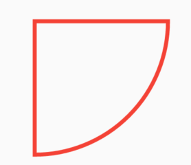
绘制圆角矩形
canvas.drawRRect(
RRect.fromLTRBR(0, 0, size.width, size.height, Radius.circular(10)), _paint)
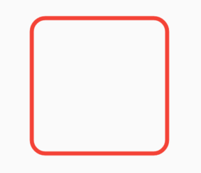
canvas还有很多绘制函数,比如贝塞尔曲线、三次贝塞尔曲线、画布的反转等操作,这里不在一一介绍。
这些函数和Android的Canvas基本一摸一样,如果你有Android基础,直接套用即可。
最后奉上一个绘制玫瑰的动画效果:
这个效果是不是很酷炫,我们看下绘制花骨朵代码:
///
/// 绘制花骨朵
///
_drawFlower(Canvas canvas, Size size) {
//将花变为红色
if (flowerPaths.length >= RoseData.flowerPoints.length) {
var path = Path();
for (int i = 0; i < flowerPaths.length; i++) {
if (i == 0) {
path.moveTo(flowerPaths[i].dx, flowerPaths[i].dy);
} else {
path.lineTo(flowerPaths[i].dx, flowerPaths[i].dy);
}
}
_paint.style = PaintingStyle.fill;
_paint.color = _flowerColor;
canvas.drawPath(path, _paint);
}
//绘制线
_paint.style = PaintingStyle.stroke;
_paint.color = _strokeColor;
//去掉最后2个点,最后2个点为了绘制红色
var points = flowerPaths.sublist(0, max(0, flowerPaths.length - 2));
canvas.drawPoints(PointMode.polygon, points, _paint);
}
花骨朵的绘制只通过canvas.drawPath就实现了,其实整个玫瑰花的绘制都是通过canvas.drawPath加上动画控制实现的。
CustomPaint可以实现任何你想要的动画的效果,比如绘画版的实现就可以通过此控件实现。
获取完整代码方式扫码下方二维码回复:rose

title: 'CustomScrollView' description: '使用Sliver组件创建自定义滚动效果的滚动组件' type: widgets
CustomScrollView
CustomScrollView是使用Sliver组件创建自定义滚动效果的滚动组件。使用场景:
- ListView和GridView相互嵌套场景,ListView嵌套GridView时,需要给GridView指定高度,但我们希望高度随内容而变化(不指定),ListView和GridView使用同一个滚动效果。
- 一个页面顶部是AppBar,然后是GridView,最后是ListView,这3个区域以整体来滚动,AppBar具有吸顶效果。
CustomScrollView就像一个粘合剂,将多个组件粘合在一起,具统一的滚动效果。
Sliver系列组件有很多,比如SliverList、SliverGrid、SliverFixedExtentList、SliverPadding、SliverAppBar等。
相互嵌套场景
在实际业务场景中经常见到这样的布局,顶部是网格布局(GridView),然后是列表布局(ListView),滚动的时候做为一个整体,此场景是无法使用GridView+ListView来实现的,而是需要使用CustomScrollView+SliverGrid+SliverList来实现,实现代码如下:
CustomScrollView(
slivers: <Widget>[
SliverGrid.count(crossAxisCount: 4,children: List.generate(8, (index){
return Container(
color: Colors.primaries[index%Colors.primaries.length],
alignment: Alignment.center,
child: Text('$index',style: TextStyle(color: Colors.white,fontSize: 20),),
);
}).toList(),),
SliverList(
delegate: SliverChildBuilderDelegate((content, index) {
return Container(
height: 85,
alignment: Alignment.center,
color: Colors.primaries[index % Colors.primaries.length],
child: Text('$index',style: TextStyle(color: Colors.white,fontSize: 20),),
);
}, childCount: 25),
)
],
)
效果如下:
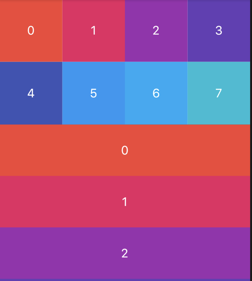
顶部是AppBar场景
实际项目中页面顶部是AppBar,然后是GridView,最后是ListView,这3个区域以整体来滚动,AppBar具有吸顶效果,此效果也是我们经常遇到的,用法如下:
CustomScrollView(
slivers: <Widget>[
SliverAppBar(
pinned: true,
expandedHeight: 230.0,
flexibleSpace: FlexibleSpaceBar(
title: Text('复仇者联盟'),
background: Image.network(
'http://img.haote.com/upload/20180918/2018091815372344164.jpg',
fit: BoxFit.fitHeight,
),
),
),
SliverGrid.count(crossAxisCount: 4,children: List.generate(8, (index){
return Container(
color: Colors.primaries[index%Colors.primaries.length],
alignment: Alignment.center,
child: Text('$index',style: TextStyle(color: Colors.white,fontSize: 20),),
);
}).toList(),),
SliverList(
delegate: SliverChildBuilderDelegate((content, index) {
return Container(
height: 85,
alignment: Alignment.center,
color: Colors.primaries[index % Colors.primaries.length],
child: Text('$index',style: TextStyle(color: Colors.white,fontSize: 20),),
);
}, childCount: 25),
)
],
)
效果如下:
通过scrollDirection和reverse参数控制其滚动方向,用法如下:
CustomScrollView(
scrollDirection: Axis.horizontal,
reverse: true,
...
)
scrollDirection滚动方向,分为垂直和水平方向。
reverse参数表示反转滚动方向,并不是垂直转为水平,而是垂直方向滚动时,默认向下滚动,reverse设置false,滚动方向改为向上,同理水平滚动改为水平向左。
primary设置为true时,不能设置controller,因为primarytrue时,controller使用PrimaryScrollController,这种机制带来的好处是父组件可以控制子树中可滚动组件的滚动行为,例如,Scaffold正是使用这种机制在iOS中实现了点击导航栏回到顶部的功能。
controller为滚动控制器,可以监听滚到的位置,设置滚动的位置等,用法如下:
_scrollController = ScrollController();
//监听滚动位置
_scrollController.addListener((){
print('${_scrollController.position}');
});
//滚动到指定位置
_scrollController.animateTo(20.0);
CustomScrollView(
controller: _scrollController,
...
)
physics表示可滚动组件的物理滚动特性,具体查看ScrollPhysics
title: 'CustomSingleChildLayout' description: '' type: widget
CustomSingleChildLayout
CustomSingleChildLayout允许我们通过delegate自定义子组件的布局约束、位置以及父组件的大小(父组件大小不依赖于子组件的情况下)。
所以CustomSingleChildLayout重点是delegate,delegate类型是SingleChildLayoutDelegate,这是一个抽象类,需要我们重写,源码如下:
abstract class SingleChildLayoutDelegate {
/// Creates a layout delegate.
///
/// The layout will update whenever [relayout] notifies its listeners.
const SingleChildLayoutDelegate({ Listenable relayout }) : _relayout = relayout;
final Listenable _relayout;
/// 返回控件的大小,默认是尽可能大。
Size getSize(BoxConstraints constraints) => constraints.biggest;
/// 返回子组件的约束条件。
BoxConstraints getConstraintsForChild(BoxConstraints constraints) => constraints;
/// 返回子组件的位置
Offset getPositionForChild(Size size, Size childSize) => Offset.zero;
/// 是否重新布局,此方法必须重写
bool shouldRelayout(covariant SingleChildLayoutDelegate oldDelegate);
}
我们自定义一个布局,此布局偏移10:
class MySingleChildLayoutDelegate extends SingleChildLayoutDelegate {
MySingleChildLayoutDelegate(this.position);
final Offset position;
@override
Offset getPositionForChild(Size size, Size childSize) {
return Offset(position.dx, position.dy);
}
@override
bool shouldRelayout(MySingleChildLayoutDelegate oldDelegate) {
return oldDelegate.position != position;
}
}
使用如下:
Container(
height: 200,
width: 200,
color: Colors.blue,
child: CustomSingleChildLayout(
delegate: MySingleChildLayoutDelegate(Offset(10, 10)),
child: Container(
color: Colors.red,
),
),
)
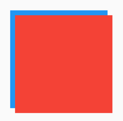
title: 'DataTable' description: '控件介绍' type: widgets
DataTable
DataTable控件显示表格数据,DataTable需要设置行和列,用法如下:
DataTable(
columns: [
DataColumn(label: Text('姓名')),
DataColumn(label: Text('年龄')),
],
rows: [
DataRow(cells: [
DataCell(Text('老孟')),
DataCell(Text('18')),
]),
],
)
columns参数是DataTable的列,rows参数是DataTable的每一行数据,效果如下:
在添加一行数据,只需要添加一个DataRow即可,用法如下:
DataTable(
...
rows: [
DataRow(cells: [
DataCell(Text('老孟')),
DataCell(Text('18')),
]),
DataRow(cells: [
DataCell(Text('大黄')),
DataCell(Text('20')),
]),
],
)
在表头显示排序图标:
DataTable(
sortColumnIndex: 1,
sortAscending: true,
...
)
sortColumnIndex参数表示表格显示排序图标的索引,sortAscending参数表示升序或者降序,效果如下:
这里要注意DataTable本身不能对数据进行排序,这些参数仅仅是外观上的控制。
DataColumn
默认情况下数据是左对齐的,让某一列右对齐只需设置DataColumn中numeric参数true,设置如下:
DataTable(
columns: [
DataColumn(label: Text('姓名')),
DataColumn(label: Text('年龄'),numeric: true),
],
...
)
效果:
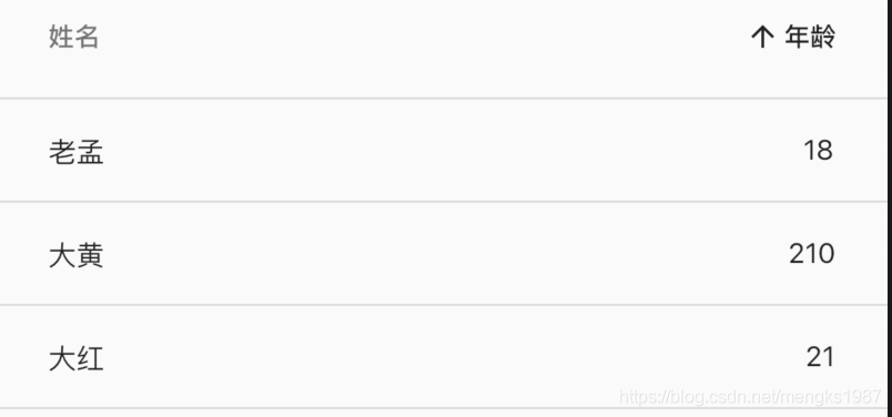
设置DataColumn中tooltip参数表示当长安此表头时显示提示,用法如下:
DataColumn(label: Text('姓名'),tooltip: '长按提示')
长按提示:
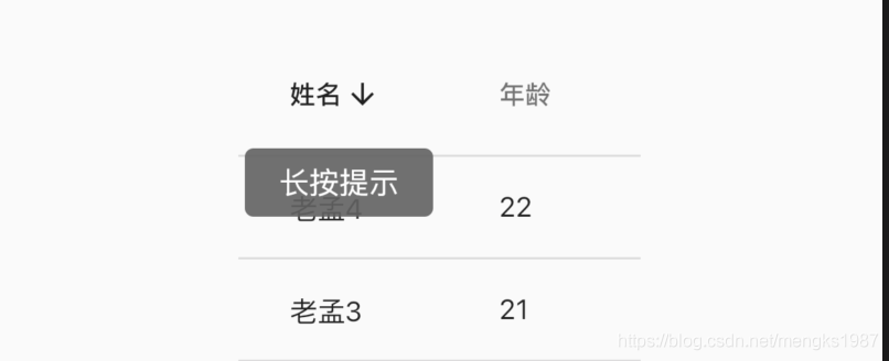
onSort回调是用户点击表头(DataColumn)时的回调,onSort中第一个参数columnIndex表示索引,ascending参数表示升序或者降序,用法如下:
DataColumn(label: Text('年龄'), onSort: (int columnIndex, bool ascending){
//排序算法
}),
DataRow
可以显示其中一行被选中,设置DataRow中selected参数为true,用法如下:
DataRow(
selected: true,
...
)
效果如下:
onSelectChanged参数是点击每一行数据时的回调,用法如下:
DataRow(
onSelectChanged: (selected){
}
...
)
设置了onSelectChanged参数,在数据的每一行和表头的前面显示勾选框,效果如下:
当然现在点击还不能显示选中的效果,增加选中效果,修改User model类,增加selected属性,表示当前行是否选中:
class User {
User(this.name, this.age, {this.selected = false});
String name;
int age;
bool selected;
}
修改数据:
List<User> data = [
User('老孟', 18),
User('老孟1', 19,selected: true),
User('老孟2', 20),
User('老孟3', 21),
User('老孟4', 22),
];
构建DataTable:
List<DataRow> dateRows = [];
for (int i = 0; i < data.length; i++) {
dateRows.add(DataRow(
selected: data[i].selected,
onSelectChanged: (selected){
setState(() {
data[i].selected = selected;
});
},
cells: [
DataCell(Text('${data[i].name}')),
DataCell(Text('${data[i].age}')),
],
));
}
return DataTable(columns: [
DataColumn(label: Text('姓名')),
DataColumn(
label: Text('年龄'),
),
], rows: dateRows);
效果如下:
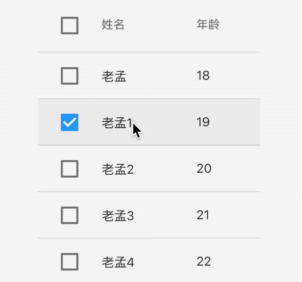
我们并没有对表头的全选/取消全选勾选框进行控制,一个很大的疑问:点击全选/取消全选勾选框,如果都勾选了,真实数据是否也发生变化了,对应本示例就是User中的selected参数是否全部为true,可以肯定的告诉你User中的selected参数已经全部变为true了,那是如何实现的呢?非常简单,每一行的onSelectChanged都被回调了一次。
DataCell
DataCell是DataRow中每一个子控件,DataCell子控件不一定是文本,也可以是图标等任意组件,我们可以给DataCell设置编辑图标:
DataCell(Text('name'),showEditIcon: true)
效果如下:
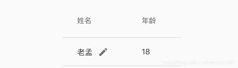
当然仅仅是一个图标,placeholder参数也是一样的,设置为true,仅仅是文字的样式变化了,onTap为点击回调,用法如下:
DataCell(Text('name'),showEditIcon: true,onTap: (){
print('DataCell onTap');
},placeholder: true)
效果如下:
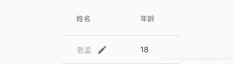
排序
DateTable本身是没有排序功能的,当用户点击表头时对数据按照本列数据进行排序,用法如下,
数据model类:
class User {
User(this.name, this.age);
final String name;
final int age;
}
初始化数据及默认排序:
List<User> data = [
User('老孟', 18),
User('老孟1', 19),
User('老孟2', 20),
User('老孟3', 21),
User('老孟4', 22),
];
var _sortAscending = true;
构建DataTable:
DataTable(
sortColumnIndex: 1,
sortAscending: _sortAscending,
columns: [
DataColumn(label: Text('姓名')),
DataColumn(label: Text('年龄'), onSort: (int columnIndex, bool ascending){
setState(() {
_sortAscending = ascending;
if(ascending){
data.sort((a, b) => a.age.compareTo(b.age));
}else {
data.sort((a, b) => b.age.compareTo(a.age));
}
});
}),
],
rows: data.map((user) {
return DataRow(cells: [
DataCell(Text('${user.name}')),
DataCell(Text('${user.age}')),
]);
}).toList())
效果如下:
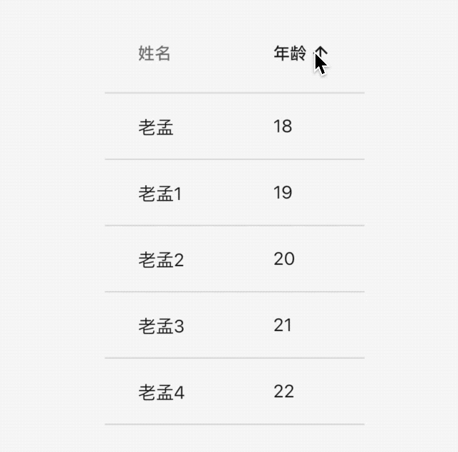
如果想给姓名列也加上排序呢,修改如下:
var _sortAscending = true;
var _sortColumnIndex =0;
DataTable(
sortColumnIndex: _sortColumnIndex,
sortAscending: _sortAscending,
columns: [
DataColumn(label: Text('姓名'),onSort: (int columnIndex, bool ascending){
setState(() {
_sortColumnIndex = columnIndex;
_sortAscending = ascending;
if(ascending){
data.sort((a, b) => a.name.compareTo(b.name));
}else {
data.sort((a, b) => b.name.compareTo(a.name));
}
});
}),
DataColumn(label: Text('年龄'), onSort: (int columnIndex, bool ascending){
setState(() {
_sortColumnIndex = columnIndex;
_sortAscending = ascending;
if(ascending){
data.sort((a, b) => a.age.compareTo(b.age));
}else {
data.sort((a, b) => b.age.compareTo(a.age));
}
});
}),
],
...
)
效果如下:
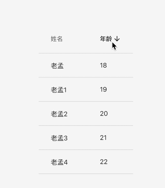
处理数据显示不全问题
当表格列比较多的时候,可以使用SingleChildScrollView包裹DataTable,显示不全时滚动显示,用法如下:
List<DataRow> dateRows = [];
for (int i = 0; i < data.length; i++) {
dateRows.add(DataRow(
cells: [
DataCell(Text('${data[i].name}')),
DataCell(Text('${data[i].age}')),
DataCell(Text('男')),
DataCell(Text('2020')),
DataCell(Text('10')),
],
));
}
return SingleChildScrollView(
scrollDirection: Axis.horizontal,
child: DataTable(columns: [
DataColumn(label: Text('姓名')),
DataColumn(
label: Text('年龄'),
),
DataColumn(
label: Text('性别'),
),
DataColumn(
label: Text('出生年份'),
),
DataColumn(
label: Text('出生月份'),
),
], rows: dateRows),
);
效果如下:

title: 'showDatePicker | 日期选择组件' description: '日期选择组件' type: widgets
日期选择组件
Flutter系统提供了一些日期选择类组件,比如DayPicker、MonthPicker、YearPicker、showDatePicker、CupertinoDatePicker等,其中前4个为Material风格组件,最后一个为iOS风格组件。本文介绍了控件的基本用法及如何实现国际化,如果系统提供的国际化不满足你的需要,最后也介绍了如何实现自定义国际化。
DayPicker
显示给定月份的日期,并允许选择一天。这些天以矩形网格排列,一周的每一天都有一列。
DayPicker有几个必填参数,分别如下:
- selectedDate:选中的日期,选中的日期有圆形背景。
- currentDate:当前日期,文字高亮。
- onChanged:用户选择的日期发生变化时回调。
- firstDate:可选日期的开始值。
- lastDate:可选日期的结束值。
- displayedMonth:显示的月份
显示2020年5月,代码如下:
DateTime _selectedDate = DateTime.now();
DayPicker(
selectedDate: _selectedDate,
currentDate: DateTime.now(),
onChanged: (date) {
setState(() {
_selectedDate = date;
});
},
firstDate: DateTime(2020, 5, 1),
lastDate: DateTime(2020, 5, 31),
displayedMonth: DateTime(2020, 5),
)
效果如下:
selectableDayPredicate参数定义用户的可选日期,返回false表示不可选,例如只可选今天以前的日期:
DayPicker(
selectableDayPredicate: (date) {
return date.difference(DateTime.now()).inMilliseconds < 0;
},
...
)
效果如下:
今天以后的日期全部为灰色,不可选状态。
MonthPicker
可选择的月份选择器,在顶部有一个滚动的月份列表,每个月份下面展示当前月份的天,本质上MonthPicker是滚动的月份列表+ DayPicker,用法如下:
DateTime _selectedDate = DateTime.now();
MonthPicker(
selectedDate: _selectedDate,
onChanged: (date) {
setState(() {
_selectedDate = date;
});
},
firstDate: DateTime(2020, 1),
lastDate: DateTime(2020, 12),
)
效果如下:
属性和DayPicker基本一致。
YearPicker
年份选择器,用法如下:
YearPicker(
selectedDate: _selectedDate,
onChanged: (date) {
setState(() {
_selectedDate = date;
});
},
firstDate: DateTime(2000, 1),
lastDate: DateTime(2020, 12),
)
效果如下:
年份选择器和月份选择器略有不同,年份选择器并不包含当前年份下的月份。
不管是YearPicker,还是MonthPicker、DayPicker,"我们都很少直接使用",而是使用showDatePicker,它会创建一个日期选择器对话框。个人觉得showDatePicker的样式风格不是很符合国内的审美,我们可能更多的时候是使用YearPicker、MonthPicker和DayPicker自定义日期控件。
showDatePicker
showDatePicker并不是一个新的控件,而是封装了YearPicker和MonthPicker,并进行了联动,用法如下:
RaisedButton(
onPressed: () async {
var result = await showDatePicker(
context: context,
initialDate: DateTime.now(),
firstDate: DateTime(2020),
lastDate: DateTime(2030));
print('$result');
},
)
效果如下:
相关参数介绍如下:
-
initialDate初始化时间,通常情况下设置为当前时间。 -
firstDate表示开始时间,不能选择此时间前面的时间。 -
lastDate表示结束时间,不能选择此时间之后的时间。 -
showDatePicker方法是Future方法,点击日期选择控件的确定按钮后,返回选择的日期。 -
selectableDayPredicate参数定义用户的可选日期,返回false表示不可选,与DayPicker用法相同。
builder参数可用于包装对话框窗口小部件以添加继承的窗口小部件,例如Theme,设置深色主题用法如下:
showDatePicker(
builder: (context, child) {
return Theme(
data: ThemeData.dark(),
child: child,
);
},
...
)
效果如下:
上面是Material风格的日期控件,下面介绍下iOS风格的日期控件。
CupertinoDatePicker
ios风格的日期选择器,用法如下:
var _dateTime = DateTime.now();
CupertinoDatePicker(
initialDateTime: _dateTime,
onDateTimeChanged: (date) {
setState(() {
_dateTime = date;
});
},
)
效果如下:
mode参数设置日期的格式:
- time:只显示时间,效果:
4 | 14 | PM - date:只显示日期,效果:
July | 13 | 2012 - dateAndTime:时间和日期都显示,效果:
Fri Jul 13 | 4 | 14 | PM
设置最大日期和最小日期:
CupertinoDatePicker(
minimumDate: DateTime.now().add(Duration(days: -1)),
maximumDate: DateTime.now().add(Duration(days: 1)),
...
)
效果如下:
使用24小时制:
CupertinoDatePicker(
use24hFormat: true,
...
)
showTimePicker
时间选择器只能通过showTimePicker的方式来调用,用法如下:
RaisedButton(
onPressed: () async {
showTimePicker(
context: context, initialTime: TimeOfDay.now());
},
)
效果如下:
builder参数用于控制子控件,可以向DatePicker一样设置深色主题,还可以设置其显示24小时,用法如下:
showTimePicker(
context: context,
initialTime: TimeOfDay.now(),
builder: (context, child) {
return MediaQuery(
data: MediaQuery.of(context)
.copyWith(alwaysUse24HourFormat: true),
child: child,
);
});
效果如下:
CupertinoTimerPicker
CupertinoTimerPicker 是ios风格的时间选择器,基本用法如下:
CupertinoTimerPicker(
onTimerDurationChanged: (Duration duration){
},
)
效果如下:
设置只显示小时和分钟:
CupertinoTimerPicker(
mode: CupertinoTimerPickerMode.hm,
...
)
默认情况下,CupertinoTimerPicker显示0:0:0,设置显示当前时间:
var now = DateTime.now();
return Container(
height: 200,
child: CupertinoTimerPicker(
initialTimerDuration: Duration(hours: now.hour,minutes: now.minute,seconds: now.second),
onTimerDurationChanged: (Duration duration) {},
),
);
国际化
增加国际化处理,在pubspec.yaml添加支持:
dependencies:
flutter_localizations:
sdk: flutter
在顶级控件MaterialApp添加支持,具体信息可查MaterialApp控件:
MaterialApp(
localeListResolutionCallback:
(List<Locale> locales, Iterable<Locale> supportedLocales) {
return Locale('zh');
},
localeResolutionCallback:
(Locale locale, Iterable<Locale> supportedLocales) {
return Locale('zh');
},
localizationsDelegates: [
GlobalMaterialLocalizations.delegate,
GlobalWidgetsLocalizations.delegate,
GlobalCupertinoLocalizations.delegate,
],
supportedLocales: [
const Locale('zh', 'CH'),
const Locale('en', 'US'),
],
...
)
以上方式对所有日期控件都有效果,效果如下:
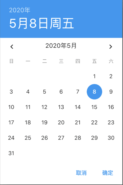
自定义国际化
我们对iOS风格的控件自定义国际化为例,新建新的类MyLocalizationsDelegate:
class MyLocalizationsDelegate
extends LocalizationsDelegate<CupertinoLocalizations> {
const MyLocalizationsDelegate();
@override
bool isSupported(Locale locale) => locale.languageCode == 'zh';
@override
Future<CupertinoLocalizations> load(Locale locale) =>
ZhCupertinoLocalizations.load(locale);
@override
bool shouldReload(MyLocalizationsDelegate old) => false;
@override
String toString() => 'DefaultCupertinoLocalizations.delegate(zh)';
}
ZhCupertinoLocalizations定义如下:
class ZhCupertinoLocalizations implements CupertinoLocalizations {
const ZhCupertinoLocalizations();
static const List<String> _shortWeekdays = <String>[
'自周一',
'自周二',
'自周三',
'自周四',
'自周五',
'自周六',
'自周日',
];
static const List<String> _shortMonths = <String>[
'1月',
'2月',
'3月',
'4月',
'5月',
'6月',
'7月',
'8月',
'9月',
'10月',
'11月',
'12月',
];
static const List<String> _months = <String>[
'1月',
'2月',
'3月',
'4月',
'5月',
'6月',
'7月',
'8月',
'9月',
'10月',
'11月',
'12月',
];
@override
String datePickerYear(int yearIndex) => yearIndex.toString();
@override
String datePickerMonth(int monthIndex) => _months[monthIndex - 1];
@override
String datePickerDayOfMonth(int dayIndex) => dayIndex.toString();
@override
String datePickerHour(int hour) => hour.toString();
@override
String datePickerHourSemanticsLabel(int hour) => hour.toString() + " o'clock";
@override
String datePickerMinute(int minute) => minute.toString().padLeft(2, '0');
@override
String datePickerMinuteSemanticsLabel(int minute) {
if (minute == 1) return '1 分';
return minute.toString() + ' 分';
}
@override
String datePickerMediumDate(DateTime date) {
return '${_shortWeekdays[date.weekday - DateTime.monday]} '
'${_shortMonths[date.month - DateTime.january]} '
'${date.day.toString().padRight(2)}';
}
@override
DatePickerDateOrder get datePickerDateOrder => DatePickerDateOrder.mdy;
@override
DatePickerDateTimeOrder get datePickerDateTimeOrder =>
DatePickerDateTimeOrder.date_time_dayPeriod;
@override
String get anteMeridiemAbbreviation => '上午';
@override
String get postMeridiemAbbreviation => '下午';
@override
String get todayLabel => '今天';
@override
String get alertDialogLabel => 'Alert';
@override
String timerPickerHour(int hour) => hour.toString();
@override
String timerPickerMinute(int minute) => minute.toString();
@override
String timerPickerSecond(int second) => second.toString();
@override
String timerPickerHourLabel(int hour) => hour == 1 ? '小时' : '小时';
@override
String timerPickerMinuteLabel(int minute) => '分.';
@override
String timerPickerSecondLabel(int second) => '秒.';
@override
String get cutButtonLabel => '剪贴';
@override
String get copyButtonLabel => '拷贝';
@override
String get pasteButtonLabel => '黏贴';
@override
String get selectAllButtonLabel => '选择全部';
static Future<CupertinoLocalizations> load(Locale locale) {
return SynchronousFuture<CupertinoLocalizations>(
const ZhCupertinoLocalizations());
}
/// A [LocalizationsDelegate] that uses [DefaultCupertinoLocalizations.load]
/// to create an instance of this class.
static const LocalizationsDelegate<CupertinoLocalizations> delegate =
MyLocalizationsDelegate();
}
注意开始的属性_shortWeekdays,这个属性表示星期几,故意写成'自周x',为了和系统的区分,在根控件MaterialApp的localizationsDelegates属性中增加:ZhCupertinoLocalizations.delegate,这个就是上面定义的国际化文件,效果如下:
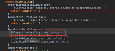
注意:ZhCupertinoLocalizations.delegate要放在GlobalCupertinoLocalizations.delegate,的前面,系统加载顺序为从上到下。
效果如下:
title: 'DecoratedBox' description: '' type: widget
DecoratedBox
DecoratedBox 是一个装饰类组件。
decoration属性可以设置子控件的背景颜色、形状等。通常使用BoxDecoration。
设置背景为矩形,颜色为蓝色,代码如下:
DecoratedBox(
decoration: BoxDecoration(shape: BoxShape.rectangle, color: Colors.blue),
child: Text('老孟,一个有态度的程序员'),
)
效果如下:
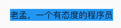
修改为圆角矩形,代码如下:
DecoratedBox(
decoration: BoxDecoration(
shape: BoxShape.rectangle,
color: Colors.blue,
borderRadius: BorderRadius.circular(20)),
child: Text('老孟,一个有态度的程序员'),
)
效果如下:
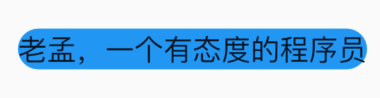
除了背景我们可以设置边框效果,代码如下:
DecoratedBox(
decoration: BoxDecoration(
shape: BoxShape.rectangle,
color: Colors.blue,
borderRadius: BorderRadius.circular(20),
border: Border.all(
color: Colors.red,
width: 2,
),
),
child: Text('老孟,一个有态度的程序员'),
)
效果如下:
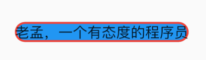 我们也可以通过此方式创建圆角图片和圆形图片,代码如下:
DecoratedBox(
decoration: BoxDecoration(
image: DecorationImage(
image: NetworkImage(
'https://flutter.github.io/assets-for-api-docs/assets/widgets/owl-2.jpg'),
fit: BoxFit.cover,
),
border: Border.all(
color: Colors.blue,
width: 2,
),
borderRadius: BorderRadius.circular(12),
),
child: Container(
height: 200,
width: 200,
),
)
效果如图:
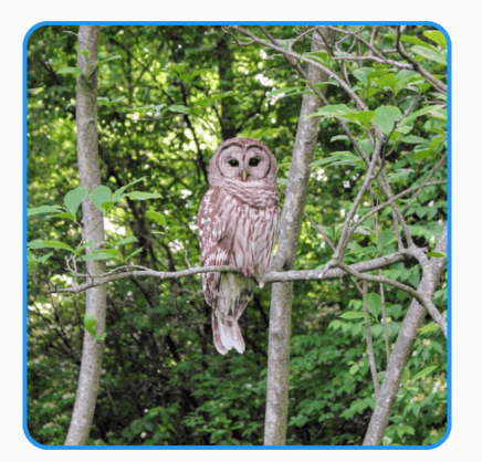 修改其形状为圆形,代码如下:
DecoratedBox(
decoration: BoxDecoration(
image: DecorationImage(
image: NetworkImage(
'https://flutter.github.io/assets-for-api-docs/assets/widgets/owl-2.jpg'),
fit: BoxFit.cover,
),
border: Border.all(
color: Colors.blue,
width: 2,
),
shape: BoxShape.circle,
),
child: Container(
height: 200,
width: 200,
),
)
效果如图:
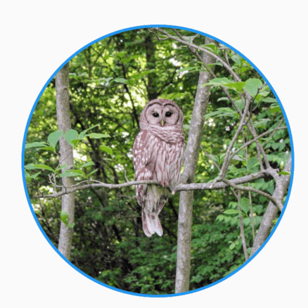
设置渐变色:
DecoratedBox(
decoration: BoxDecoration(
gradient: RadialGradient(
center: const Alignment(-0.5, -0.6),
radius: 0.15,
colors: <Color>[
const Color(0xFFEEEEEE),
const Color(0xFF111133),
],
stops: <double>[0.9, 1.0],
),
),
child: Container(
height: 100,
width: 100,
),
)
title: 'DecoratedBoxTransition' description: '控件介绍' type: widgets
DecoratedBoxTransition
外观装饰属性动画,用法如下:
class AnimationDemo extends StatefulWidget {
@override
State<StatefulWidget> createState() => _AnimationDemo();
}
class _AnimationDemo extends State<AnimationDemo>
with SingleTickerProviderStateMixin {
AnimationController _animationController;
Animation _animation;
@override
void initState() {
_animationController =
AnimationController(duration: Duration(seconds: 2), vsync: this);
_animation = DecorationTween(begin: BoxDecoration(
color: Colors.red,
borderRadius: BorderRadius.circular(15)
), end: BoxDecoration(
color: Colors.blue,
borderRadius: BorderRadius.circular(55)
))
.animate(_animationController);
//开始动画
_animationController.forward();
super.initState();
}
@override
Widget build(BuildContext context) {
return DecoratedBoxTransition(
decoration: _animation,
child: Container(
height: 100,
width: 100,
),
);
}
@override
void dispose() {
_animationController.dispose();
super.dispose();
}
}
效果如下:
title: 'DefaultAssetBundle 读取资源文件' description: '' type: widget
DefaultAssetBundle
通常情况下,使用DefaultAssetBundle读取asset资源文件,比如读取json文件:
在pubspec.yaml中配置assets:
在项目中创建assets/json/文件夹,在此目录下创建json文件,读取:
DefaultAssetBundle.of(context).loadString("assets/json/data.json"),
其他文件也是一样的读取方式。
title: 'DefaultTextStyle' description: '' type: widget
DefaultTextStyle
适用于子控件[Text]的文本样式,除非显示指定样式。
DefaultTextStyle(
style: TextStyle(color: Colors.red),
child: Text('老孟'),
)
如果显示指定了样式,则使用显示指定的。
DefaultTextStyle(
style: TextStyle(color: Colors.red),
child: Text('老孟',style: TextStyle(color: Colors.blue),),
)
softWrap表示自动换行。
overflow表示超出部分如何处理,
Container(
width: 150,
color: Colors.red,
child: DefaultTextStyle(
style: TextStyle(fontSize: 18),
overflow: TextOverflow.ellipsis,
child: Text('老孟Flutter,专注分享Flutter相关技术'),
),
)
超出部分处理方式:
- clip:直接截取
- fade:渐隐
- ellipsis:省略号形式
- visible:可见
title: 'DefaultTextStyleTransition' description: '控件介绍' type: widgets
DefaultTextStyleTransition
TextStyle属性动画,用法如下:
class AnimationDemo extends StatefulWidget {
@override
State<StatefulWidget> createState() => _AnimationDemo();
}
class _AnimationDemo extends State<AnimationDemo>
with SingleTickerProviderStateMixin {
AnimationController _animationController;
Animation _animation;
@override
void initState() {
_animationController =
AnimationController(duration: Duration(seconds: 2), vsync: this);
_animation = TextStyleTween(
begin: TextStyle(color: Colors.blue, fontSize: 14),
end: TextStyle(color: Colors.red, fontSize: 24))
.animate(_animationController);
//开始动画
_animationController.forward();
super.initState();
}
@override
Widget build(BuildContext context) {
return DefaultTextStyleTransition(
style: _animation,
child: Text('老孟'),
);
}
@override
void dispose() {
_animationController.dispose();
super.dispose();
}
}
效果如下:
title: 'AlertDialog' description: '控件介绍' type: widgets
AlertDialog
当应用程序进行重要操作时经常需要用户进行2次确认,以避免用户的误操作,比如删除文件时,一般会弹出提示“是否要删除当前文件”,用户点击确认后才会进行删除操作,这时我们可以使用提示框(AlertDialog或者CupertinoAlertDialog)。
根据设计的不同,我们可以选择Material风格的AlertDialog或者Cupertino(ios)风格的CupertinoAlertDialog,
Material风格基础用法如下:
RaisedButton(
child: Text('切换'),
onPressed: () {
showDialog(
context: context,
builder: (context) {
return AlertDialog(
title: Text('提示'),
content: Text('确认删除吗?'),
actions: <Widget>[
FlatButton(child: Text('取消'),onPressed: (){},),
FlatButton(child: Text('确认'),onPressed: (){},),
],
);
});
},
)
Material风格效果:
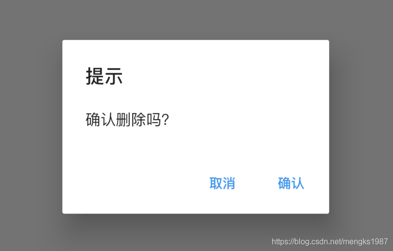
AlertDialog的属性相对比较丰富,可以设置title样式、content样式、背景颜色、阴影值,设置是形状:
AlertDialog(
title: Text('提示'),
content: Text('确认删除吗?'),
backgroundColor: Colors.lightBlueAccent,
elevation: 24,
shape: RoundedRectangleBorder(borderRadius: BorderRadius.circular(50)),
actions: <Widget>[
FlatButton(child: Text('取消'),onPressed: (){},),
FlatButton(child: Text('确认'),onPressed: (){},),
],
)
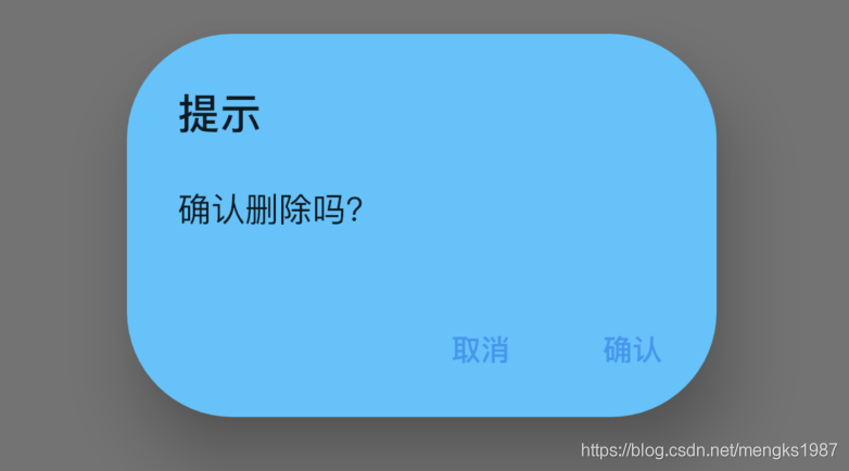
用户点击“取消”或者“确定”按钮后退出对话框,App需要知道知道用户选择了哪个选项,用法如下:
RaisedButton(
child: Text('切换'),
onPressed: () async {
var result = await showDialog(
context: context,
builder: (context) {
return AlertDialog(
title: Text('提示'),
content: Text('确认删除吗?'),
actions: <Widget>[
FlatButton(
child: Text('取消'),
onPressed: () {
Navigator.of(context).pop('cancel');
},
),
FlatButton(
child: Text('确认'),
onPressed: () {
Navigator.of(context).pop('ok');
},
),
],
);
});
print('$result');
},
)
CupertinoAlertDialog
Cupertino(ios)风格基础用法如下:
RaisedButton(
child: Text('切换'),
onPressed: () {
showCupertinoDialog(
context: context,
builder: (context) {
return CupertinoAlertDialog(
title: Text('提示'),
content: Text('确认删除吗?'),
actions: <Widget>[
CupertinoDialogAction(child: Text('取消'),onPressed: (){},),
CupertinoDialogAction(child: Text('确认'),onPressed: (){},),
],
);
});
},
)
Cupertino(ios)风格效果如下:
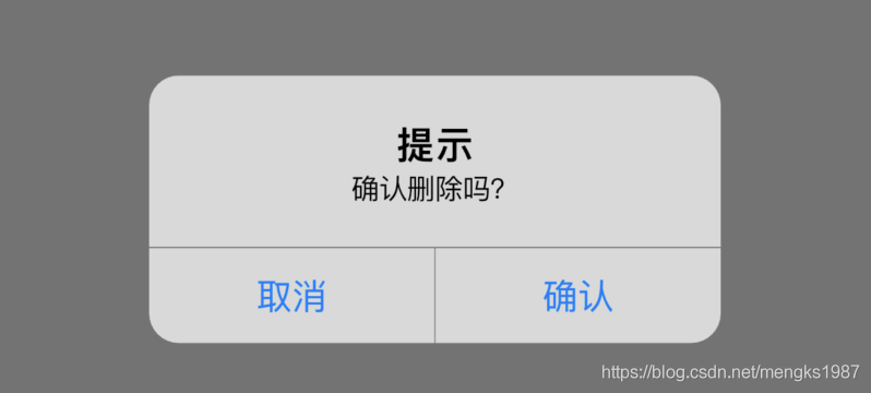
showDialog和AlertDialog配合使用展示Material风格对话框,showCupertinoDialog和CupertinoAlertDialog配合使用展示iOS风格对话框,showCupertinoDialog点击空白处是无法退出对话框的,而showDialog点击空白处默认退出对话框,barrierDismissible属性控制点击空白处的行为,用法如下:
showDialog(
barrierDismissible: false,
)
SimpleDialog
如果你觉得系统提供的这2个风格的对话框不够个性,你可以试试SimpleDialog,用法和AlertDialog基本相同,如下:
SimpleDialog(
title: Text('提示'),
children: <Widget>[
Container(
height: 80,
alignment: Alignment.center,
child: Text('确认删除吗?'),
),
Divider(height: 1,),
FlatButton(
child: Text('取消'),
onPressed: () {
Navigator.of(context).pop('cancel');
},
),
Divider(height: 1,),
FlatButton(
child: Text('确认'),
onPressed: () {
Navigator.of(context).pop('ok');
},
),
],
)
效果如下:
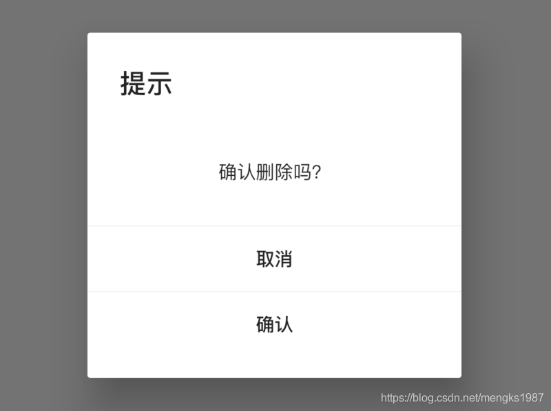
Dialog
如果你觉得这还是不够个性,那可以祭出终极大招了,直接使用Dialog,Dialog可以定制任何对话框,只需将对话框的内容给child属性:
Dialog(
child: MyDialog(),
);
当然一般情况下,系统提供的对话框就够用了,这几个对话框组件用法基本一样,不同的地方仅仅是灵活性和使用简易程度的不要,Dialog最灵活,但使用起来比AlertDialog复杂一些,AlertDialog使用起来非常简单,但布局和基本样式都已经固定好,不如Dialog灵活。
title: 'Directionality' description: '' type: widget
Directionality
定义文本的方向,默认文本从左到右,但有些国家的文字从右到左,比如阿拉伯。
Container(
height: 100,
width: 100,
color: Colors.red,
child: Directionality(
textDirection: TextDirection.rtl,
child: Text('老孟'),
),
)
title: 'Dismissible' description: '控件介绍' type: widgets
Dismissible
Dismissible组件可通过左滑或者右滑清除列表项。
基本用法如下:
Dismissible(
key: ValueKey('key'),
child: Container(
height: 80,
color: Colors.red,
),
)
效果如下:
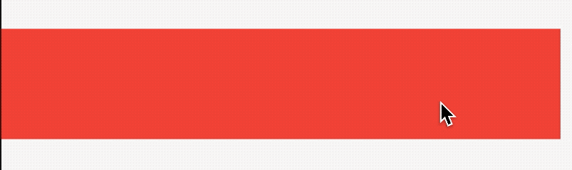
background和secondaryBackground都是背景组件,都是在child组件后面,如果secondaryBackground设置了值,那么background仅在向右或者下拖动时显示,secondaryBackground是当向左或者上拖动组件时显示。
confirmDismiss参数确认是否移除组件,需要返回Future<bool>,如果返回true,组件将会被移除,否则组件将会移动到原始的位置,而且返回false,onDismissed和onResize不会在调用,用法如下:
Dismissible(
confirmDismiss:(DismissDirection direction) async{
return false;
},
...
)
效果如下:
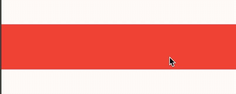
onResize是当尺寸变化时调用,onDismissed组件移除时调用,用法如下:
Dismissible(
onResize: (){
print('onResize');
},
onDismissed: (DismissDirection direction){
print('onDismissed:$direction');
},
...
)
设置direction调整拖动消除的方向,用法如下:
Dismissible(
direction: DismissDirection.vertical,
...
)
resizeDuration尺寸变化时长,注意在子组件移除后,background或者secondaryBackground有一个移除动画,设置如下:
Dismissible(
resizeDuration: Duration(seconds: 1),
...
)
dismissThresholds参数表示拖动到什么程度才消除组件,默认是0.4,至少向右滑动80%才消除,用法如下:
Dismissible(
dismissThresholds: {
DismissDirection.endToStart:0.8
},
...
)
movementDuration参数是消除组件或者回到原始位置的时间,用法如下:
Dismissible(
movementDuration: Duration(seconds: 1),
...
)
crossAxisEndOffset参数表示交叉轴方向上偏移量,用法如下:
Dismissible(
crossAxisEndOffset: 0.5,
...
)
效果如下:
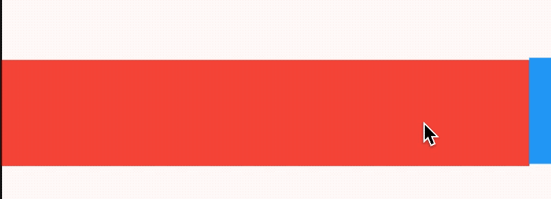
title: 'Divider' description: '控件介绍' type: widgets
Divider
Divider是一个分割线控件。基本用法如下:
Divider(
height: 10,
thickness: 5,
color: Colors.red,
indent: 10,
endIndent: 20,
)
height:是控件的高,并不是线的高度,绘制的线居中。
thickness:线的高度。
indent:分割线前面空白区域。
endIndent:分割线后面空白区域。
效果如下:
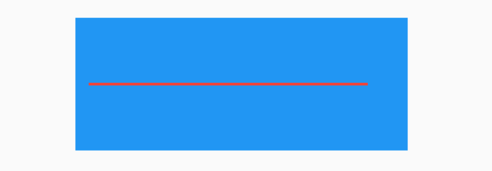
蓝色区域为父控件,红色为分割线。
VerticalDivider
VerticalDivider 和Divider用法一样,Divider是水平分割线,而VerticalDivider是垂直分割线,用法如下:
VerticalDivider(
width: 20,
thickness: 2,
color: Colors.red,
indent: 10,
endIndent: 30,
)
效果如下:
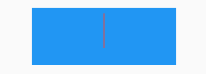
全局设置
在MaterialApp中对分割线进行全局属性设置:
MaterialApp(
...
theme: ThemeData(
dividerTheme: DividerThemeData(
),
...
),
)
DividerThemeData的属性和Divider基本一样,唯一一个不同的就是space,space对应Divider的height和VerticalDivider中的width。
注意: 1.12.13+hotfix.5 • channel stable 源代码中说明如下:
/// The [Divider]'s width or the [VerticalDivider]'s height.
///
/// This represents the amount of horizontal or vertical space the divider
/// takes up.
final double space;
这个说明是错误的,看下Divider实现源代码:
@override
Widget build(BuildContext context) {
final DividerThemeData dividerTheme = DividerTheme.of(context);
final double height = this.height ?? dividerTheme.space ?? 16.0;
final double thickness = this.thickness ?? dividerTheme.thickness ?? 0.0;
final double indent = this.indent ?? dividerTheme.indent ?? 0.0;
final double endIndent = this.endIndent ?? dividerTheme.endIndent ?? 0.0;
return SizedBox(
height: height,
child: Center(
child: Container(
height: thickness,
margin: EdgeInsetsDirectional.only(start: indent, end: endIndent),
decoration: BoxDecoration(
border: Border(
bottom: createBorderSide(context, color: color, width: thickness),
),
),
),
),
);
}
height的值定义如下:
final double height = this.height ?? dividerTheme.space ?? 16.0;
所以dividerTheme.space的值代表Divider的height。
title: 'DividerTheme DividerThemeData' description: '' type: widget
DividerTheme
用于Divider或者VerticalDividers组件的样式。
DividerTheme(
data: DividerThemeData(
color: Colors.red
),
child: Divider(),
)

DividerThemeData
分割线样式说明
const DividerThemeData({
this.color,//分割线颜色
this.space,//分割线宽度(Divider)或者高度(VerticalDivider),这只是控件的宽/高,不是实际绘制线的宽/高
this.thickness,//实际绘制线的宽/高
this.indent,//分割线前面的空白区域
this.endIndent,//分割线后面的空白区域
});
title: 'Draggable' description: '控件介绍' type: widgets
Draggable
Draggable系列组件可以让我们拖动组件。
Draggable
Draggable组件有2个必须填写的参数,child参数是子控件,feedback参数是拖动时跟随移动的组件,用法如下:
Draggable(
child: Container(
height: 100,
width: 100,
alignment: Alignment.center,
decoration: BoxDecoration(
color: Colors.red,
borderRadius: BorderRadius.circular(10)
),
child: Text('孟',style: TextStyle(color: Colors.white,fontSize: 18),),
),
feedback: Container(
height: 100,
width: 100,
alignment: Alignment.center,
decoration: BoxDecoration(
color: Colors.blue,
borderRadius: BorderRadius.circular(10)
),
child: Text('孟',style: TextStyle(color: Colors.white,fontSize: 18),),
),
)
效果如下:
蓝色的组件是feedback,如果想在拖动的时候子组件显示其他样式可以使用childWhenDragging参数,用法如下:
Draggable(
childWhenDragging: Container(
height: 100,
width: 100,
alignment: Alignment.center,
decoration: BoxDecoration(
color: Colors.grey, borderRadius: BorderRadius.circular(10)),
child: Text(
'孟',
style: TextStyle(color: Colors.white, fontSize: 18),
),
),
...
)
效果如下:
我们还可以控制拖动的方向,比如只允许垂直方向移动,代码如下:
Draggable(
axis: Axis.vertical,
...
)
Draggable组件为我们提供了4中拖动过程中的回调事件,用法如下:
Draggable(
onDragStarted: (){
print('onDragStarted');
},
onDragEnd: (DraggableDetails details){
print('onDragEnd:$details');
},
onDraggableCanceled: (Velocity velocity, Offset offset){
print('onDraggableCanceled velocity:$velocity,offset:$offset');
},
onDragCompleted: (){
print('onDragCompleted');
},
...
)
说明如下:
- onDragStarted:开始拖动时回调。
- onDragEnd:拖动结束时回调。
- onDraggableCanceled:未拖动到DragTarget控件上时回调。
- onDragCompleted:拖动到DragTarget控件上时回调。
Draggable有一个data参数,这个参数是和DragTarget配合使用的,当用户将控件拖动到DragTarget时此数据会传递给DragTarget。
DragTarget
DragTarget就像他的名字一样,指定一个目的地,Draggable组件可以拖动到此控件,用法如下:
DragTarget(
builder: (BuildContext context, List<dynamic> candidateData,
List<dynamic> rejectedData) {
...
}
)
当onWillAccept返回true时, candidateData参数的数据是Draggable的data数据。
当onWillAccept返回false时, rejectedData参数的数据是Draggable的data数据,
DragTarget有3个回调,说明如下:
- onWillAccept:拖到该控件上时调用,需要返回true或者false,返回true,松手后会回调onAccept,否则回调onLeave。
- onAccept:onWillAccept返回true时,用户松手后调用。
- onLeave:onWillAccept返回false时,用户松手后调用。
用法如下:
var _dragData;
@override
Widget build(BuildContext context) {
return Center(
child: Column(
children: <Widget>[
_buildDraggable(),
SizedBox(
height: 200,
),
DragTarget<Color>(
builder: (BuildContext context, List<Color> candidateData,
List<dynamic> rejectedData) {
print('candidateData:$candidateData,rejectedData:$rejectedData');
return _dragData == null
? Container(
height: 100,
width: 100,
alignment: Alignment.center,
decoration: BoxDecoration(
borderRadius: BorderRadius.circular(10),
border: Border.all(color: Colors.red)),
)
: Container(
height: 100,
width: 100,
alignment: Alignment.center,
decoration: BoxDecoration(
color: Colors.red,
borderRadius: BorderRadius.circular(10)),
child: Text(
'孟',
style: TextStyle(color: Colors.white, fontSize: 18),
),
);
},
onWillAccept: (Color color) {
print('onWillAccept:$color');
return true;
},
onAccept: (Color color) {
setState(() {
_dragData = color;
});
print('onAccept:$color');
},
onLeave: (Color color) {
print('onLeave:$color');
},
),
],
),
);
}
_buildDraggable() {
return Draggable(
data: Color(0x000000FF),
child: Container(
height: 100,
width: 100,
alignment: Alignment.center,
decoration: BoxDecoration(
color: Colors.red, borderRadius: BorderRadius.circular(10)),
child: Text(
'孟',
style: TextStyle(color: Colors.white, fontSize: 18),
),
),
feedback: Container(
height: 100,
width: 100,
alignment: Alignment.center,
decoration: BoxDecoration(
color: Colors.blue, borderRadius: BorderRadius.circular(10)),
child: DefaultTextStyle.merge(
style: TextStyle(color: Colors.white, fontSize: 18),
child: Text(
'孟',
),
),
),
);
}
效果如下:
LongPressDraggable
LongPressDraggable继承自Draggable,因此用法和Draggable完全一样,唯一的区别就是LongPressDraggable触发拖动的方式是长按,而Draggable触发拖动的方式是按下。
title: 'DraggableScrollableActuator' description: '' type: widget
DraggableScrollableActuator
通知子控件DraggableScrollableSheet重置其位置到初始化状态,调用DraggableScrollableActuator.reset(context)方法即可。
DraggableScrollableActuator(child: DraggableScrollableSheet(
builder:
(BuildContext context, ScrollController scrollController) {
return Container(
color: Colors.blue[100],
child: ListView.builder(
controller: scrollController,
itemCount: 100,
itemBuilder: (BuildContext context, int index) {
return ListTile(
title: Text('评论 $index'),
onTap: () {
DraggableScrollableActuator.reset(context);
},
);
},
),
);
}))
点击时调用DraggableScrollableActuator.reset(context),立即回到初始位置,
title: 'DraggableScrollableSheet' description: '控件介绍' type: widgets
DraggableScrollableSheet
DraggableScrollableSheet组件可以在屏幕上拖动,builder属性需要返回其子控件,可以是任何类型的子控件,一般返回一个ListView,用法如下:
DraggableScrollableSheet(
builder:
(BuildContext context, ScrollController scrollController) {
return Container(
color: Colors.blue[100],
child: ListView.builder(
controller: scrollController,
itemCount: 100,
itemBuilder: (BuildContext context, int index) {
return ListTile(title: Text('评论 $index'));
},
),
);
})
还可以设置其初始尺寸、最大尺寸和最小尺寸,用法如下:
DraggableScrollableSheet(
initialChildSize: 0.4,
minChildSize: 0.4,
maxChildSize: 1,
...
)
expand属性表示是否充满父组件,大部分情况下设置true,如果父组件将根据其所需大小来定位此组件时需要设置为false,比如Center,设置如下:
DraggableScrollableSheet(
expand: false,
...
)
一个电影的详情介绍页面,包含顶部的海报图、中间介绍部分以及底部的评论部分,在滑动评论的时候希望评论能滑到顶部,这样用户的体验会非常好,效果如下:
实现此效果的代码:
@override
Widget build(BuildContext context) {
return Stack(
children: <Widget>[
Column(
children: <Widget>[
Image.network(
'https://timgsa.baidu.com/timg?image&quality=80&size=b9999_10000&sec=1583224371276&di=c8a9d759bdde3218aef0f24268f11ab2&imgtype=0&src=http%3A%2F%2Fi1.sinaimg.cn%2Fent%2Fr%2F2009-03-27%2FU2507P28T3D2441286F328DT20090327082744.jpg'),
Container(
height: 200,
color: Colors.grey,
alignment: Alignment.center,
child: Text('电影介绍'),
),
],
),
Positioned.fill(
child: DraggableScrollableSheet(
expand: false,
initialChildSize: 0.4,
minChildSize: 0.4,
maxChildSize: 1,
builder:
(BuildContext context, ScrollController scrollController) {
return Container(
color: Colors.blue[100],
child: ListView.builder(
controller: scrollController,
itemCount: 100,
itemBuilder: (BuildContext context, int index) {
return ListTile(title: Text('评论 $index'));
},
),
);
}))
],
);
}
title: 'Drawer' description: '控件介绍' type: widgets
Drawer
Drawer是一个抽屉导航组件,导航一般使用底部导航BottomNavigationBar或者抽屉导航。
Drawer一般和Scaffold组合使用,用法如下:
Scaffold(
drawer: Drawer(),
)
如果设置了AppBar,而没有设置AppBar的leading属性,在AppBar的左侧默认出现抽屉的图标,用法如下:
Scaffold(
appBar: AppBar(),
drawer: Drawer(),
)
效果如下:
可以通过点击这个抽屉图标或者从屏幕左侧向右侧滑动打开抽屉,打开抽屉效果如下:
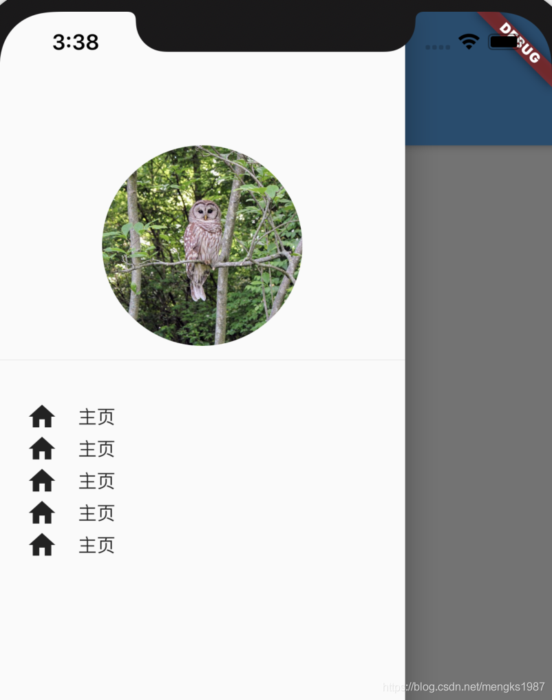
也可以设置Scaffold的endDrawer属性,在右侧显示一个Drawer,代码如下:
Scaffold(
endDrawer: Drawer(),
)
通过代码的方式打开Drawer,需要获取Scaffold状态,用法如下:
RaisedButton(
child: Text(
'点我,弹出Drawer',
),
onPressed: () {
Scaffold.of(context).openDrawer();
},
)
取消Drawer也很容易,向左滑动即可,当然也可以通过代码的方式控制:
RaisedButton(
child: Text(
'点我,隐藏Drawer',
),
onPressed: () {
Navigator.of(context).pop();
},
)
Drawer里面可以放置任何组件,但是一般使用ListView,分为DrawerHeader和ListTiles,用法如下:
drawer: Drawer(
child: ListView(
children: <Widget>[
DrawerHeader(),
ListTile(),
ListTile(),
ListTile(),
ListTile(),
],
),
),
title: 'DrawerHeader'
description: '通常用于Drawer组件的顶部区域'
type: widgets
DrawerHeader
通常用于Drawer组件的顶部区域,DrawerHeader本质上是一个Container,用法如下:
DrawerHeader(
decoration: BoxDecoration(
color: Colors.blue.withOpacity(.5)
),
child: Row(
children: <Widget>[
CircleAvatar(
child: Text('孟'),
),
SizedBox(width: 10,),
Text('老孟')
],
),
)
效果如下:
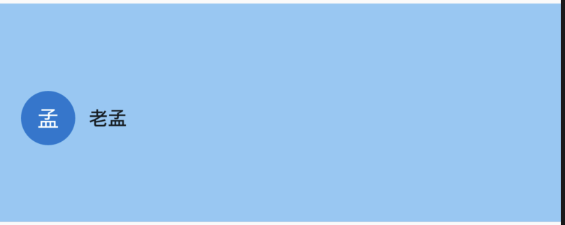
当外形发生变化时,会有动画过度:
DrawerHeader(
decoration: BoxDecoration(
color: _color
),
duration: Duration(seconds: 1),
child: Row(
children: <Widget>[
CircleAvatar(
child: Text('孟'),
),
SizedBox(width: 10,),
ActionChip(
label: Text('老孟'),
onPressed: (){
setState(() {
_color = Colors.red.withOpacity(.5);
});
},
)
],
),
)
效果如下:
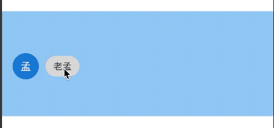
title: 'DropdownButtonFormField' description: '' type: widget
DropdownButtonFormField
DropdownButtonFormField 是一个组合控件,将[DropdownButton]包装在[FormField]中,用法如下:
var _value='语文';
@override
Widget build(BuildContext context) {
return DropdownButtonFormField(
value: _value,
items: [
DropdownMenuItem(
child: Text('语文'),
value: '语文',
),
DropdownMenuItem(child: Text('数学'), value: '数学'),
DropdownMenuItem(child: Text('英语'), value: '英语'),
],
onChanged: (String value){
setState(() {
_value = value;
});
},
);
}
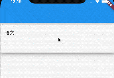
selectedItemBuilder用于自定义选中item的控件,此属性的子控件要和items一一对应,
DropdownButtonFormField(
items: [
DropdownMenuItem(
child: Text('语文'),
value: '语文',
),
DropdownMenuItem(child: Text('数学'), value: '数学'),
DropdownMenuItem(child: Text('英语'), value: '英语'),
],
selectedItemBuilder: (context) {
return [
OutlineButton(child: Text('语文'),onPressed: (){},),
OutlineButton(child: Text('数学'),onPressed: (){},),
OutlineButton(child: Text('英语'),onPressed: (){},),
];
},
...
)
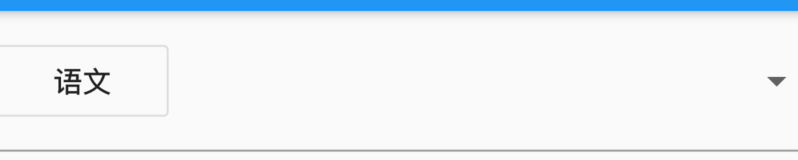
当value为null时,设置提示
DropdownButtonFormField(
hint: Text('请选择'),
value: null,
...
)
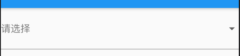
decoration是装饰属性,具体信息查看InputDecoration
onSaved和validator是FormField组件的相关参数。
而剩余属性均为DropdownButton属性。
title: 'DropdownButtonHideUnderline' description: '' type: widgets
DropdownButtonHideUnderline
DropdownButtonHideUnderline 这个控件非常特别,因为其他控件是添加UI,而此控件是为了减少控件,如果DropdownButton是DropdownButtonHideUnderline的子控件,那么DropdownButton的下划线将不会起作用,要不是看源代码还真是无法理解这个控件的作用。
没有使用DropdownButtonHideUnderline的DropdownButton,代码如下:
var _dropValue = '语文';
DropdownButton(
value: _dropValue,
underline: Divider(
color: Colors.red,
height: 5,
thickness: 5,
),
items: [
DropdownMenuItem(
child: Text('语文'),
value: '语文',
),
DropdownMenuItem(child: Text('数学'), value: '数学'),
DropdownMenuItem(child: Text('英语'), value: '英语'),
],
onChanged: (value) {
setState(() {
_dropValue = value;
});
},
)
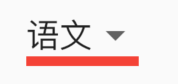
使用DropdownButtonHideUnderline包裹:
DropdownButtonHideUnderline(
child: DropdownButton()
)
和上面相比较,红色下划线消失了。
title: 'ErrorWidget' description: '屏蔽错误页面组件' type: widgets
ErrorWidget
屏蔽错误页面组件,ErrorWidget的构造函数的参数是exception的对象,然后返回一个内容是exception message信息的RenderBox.
正常错误页面
要想Flutter的错误页面显示成自定义的页面,只要设置ErrorWidget的builder就行
ErrorWidget.builder = (FlutterErrorDetails flutterErrorDetails){
print(flutterErrorDetails.toString());
return Center(
child: Text("Flutter 走神了"),
);
};
ErrorWidget.builder 返回一个Widget,当Flutter出错的时候就会显示这个Widget。
ErrorWidget用法
ErrorWidget组件在build Widget的过程中调用。
案例
Widget built;
try {
built = build();
} catch (e, stack) {
//ErrorWidget.builder
built = ErrorWidget.builder(_debugReportException('building $this', e, stack));
}
try {
built = build();
} catch (exception, stack) {
//FlutterErrorDetails
final FlutterErrorDetails details = FlutterErrorDetails(
exception: exception,
stack: stack,
library: 'widgets library',
context: 'attaching to the render tree'
);
FlutterError.reportError(details);
final Widget error = ErrorWidget.builder(details);
built = updateChild(null, error, _rootChildSlot);
}
本文由Rock提供。
title: 'ExpandIcon'
description: '旋转展开/折叠按钮'
type: widget
ExpandIcon
ExpandIcon是一个旋转展开/折叠按钮的组件。
基本用法如下:
bool _expanded = false;
return ExpandIcon(
onPressed: (value) {
setState(() {
_expanded = !_expanded;
});
},
isExpanded: _expanded,
);
效果如下:
点击时,向下的箭头旋转180度。
设置大小和颜色:
ExpandIcon(
size: 48,
color: Colors.blue,
...
)
效果如下:
设置禁用颜色和打开颜色:
ExpandIcon(
disabledColor: Colors.green,
expandedColor: Colors.blue,
color: Colors.red,
onPressed: (value) {
setState(() {
_expanded = !_expanded;
});
},
isExpanded: _expanded,
)
效果如下:
color:正常未打开状态箭头的颜色。
disabledColor:禁用状态(onPressed = null)箭头的颜色。
expandedColor:打开状态箭头的颜色。
title: 'ExpansionPanelList' description: '控件介绍' type: widgets
ExpansionPanelList
ExpansionPanelList 提供了ListView下展开/关闭的控件。
基本用法如下:
List<bool> dataList = List.generate(20, (index) => false).toList();
return SingleChildScrollView(
child: Container(
child: _buildExpansionPanelList(),
),
);
_buildExpansionPanelList() {
return ExpansionPanelList(
expansionCallback: (index, isExpanded) {
setState(() {
dataList[index] = !isExpanded;
});
},
children: dataList.map((value) {
return ExpansionPanel(
isExpanded: value,
headerBuilder: (context, isExpanded) {
return ListTile(
title: Text('老孟'),
);
},
body: Container(
height: 100,
color: Colors.greenAccent,
),
);
}).toList(),
);
}
注意ExpansionPanelList要被SingleChildScrollView包裹,否则抛出如下异常:

ExpansionPanelList效果如下:
expansionCallback为展开/关闭回调,返回展开/关闭子控件的索引及状态。
title: 'ExpansionTile' description: '控件介绍' type: widgets
ExpansionTile
ExpansionTile 组件是分组组件,点击尾部的按钮打开/关闭子控件。
基本用法如下:
ExpansionTile(
title: Text('学科'),
children: <Widget>[
Text('英语'),
Text('数学'),
Text('语文')
],
)
效果如下:
设置头部图标、子标题、背景颜色:
ExpansionTile(
leading: Icon(Icons.home),
subtitle: Text('各种学科'),
backgroundColor: Colors.greenAccent,
title: Text('学科'),
children: <Widget>[
Text('英语'),
Text('数学'),
Text('语文')
],
)
效果如下:
initiallyExpanded表示是否打开,用法如下:
ExpansionTile(
initiallyExpanded: true,
...
)
onExpansionChanged打开/关闭回调:
ExpansionTile(
onExpansionChanged: (bool value) {},
...
)
title: 'FadeInImage' description: '加载目标[image]时显示[占位符]图像的图像,载后淡入新图像' type: widgets
FadeInImage
在加载网络图片时通常需要一张展位图,当网络图片没有加载时先显示占位图,FadeInImage可以很好的实现这个功能。
基本用法:
FadeInImage(
placeholder: AssetImage('...'),
image: NetworkImage('...'),
)
开始的时候先显示placeholder图片,等网络图片加载完成显示image,动画的效果是渐隐渐显,还可以设置其动画的时长和动画曲线,包括进场和出场:
FadeInImage(
fadeOutDuration: Duration(milliseconds: 200),
fadeInCurve: Curves.easeIn,
其他属性参考Image。
title: 'FadeTransition' description: '控件介绍' type: widgets
FadeTransition
FadeTransition提供了快速构建渐隐渐显动画的组件,用法如下:
class FadeTransitionDemo extends StatefulWidget {
@override
State<StatefulWidget> createState() => _FadeTransitionDemo();
}
class _FadeTransitionDemo extends State<FadeTransitionDemo>
with SingleTickerProviderStateMixin {
Animation<double> animation;
AnimationController controller;
@override
void initState() {
super.initState();
controller =
AnimationController(vsync: this, duration: Duration(seconds: 1))..repeat();
animation = Tween(begin: 0.0, end: 1.0).animate(controller);
controller.forward();
}
@override
Widget build(BuildContext context) {
return Center(
child: FadeTransition(
opacity: animation,
child: Container(
color: Colors.red,
width: 100,
height: 100,
),
),
);
}
@override
void dispose() {
super.dispose();
controller.dispose();
}
}
动画效果:
title: 'FittedBox' description: '控件介绍' type: widgets
FittedBox
当子组件的宽高比和父组件的宽高比不一样时,我们等比拉伸或者填充父组件,这时我们可以使用FittedBox,用法如下:
Container(
height: 200,
width: 200,
color: Colors.green,
child: FittedBox(
child: Container(
height: 50,
width: 80,
color: Colors.red,
),
),
)
效果如下:
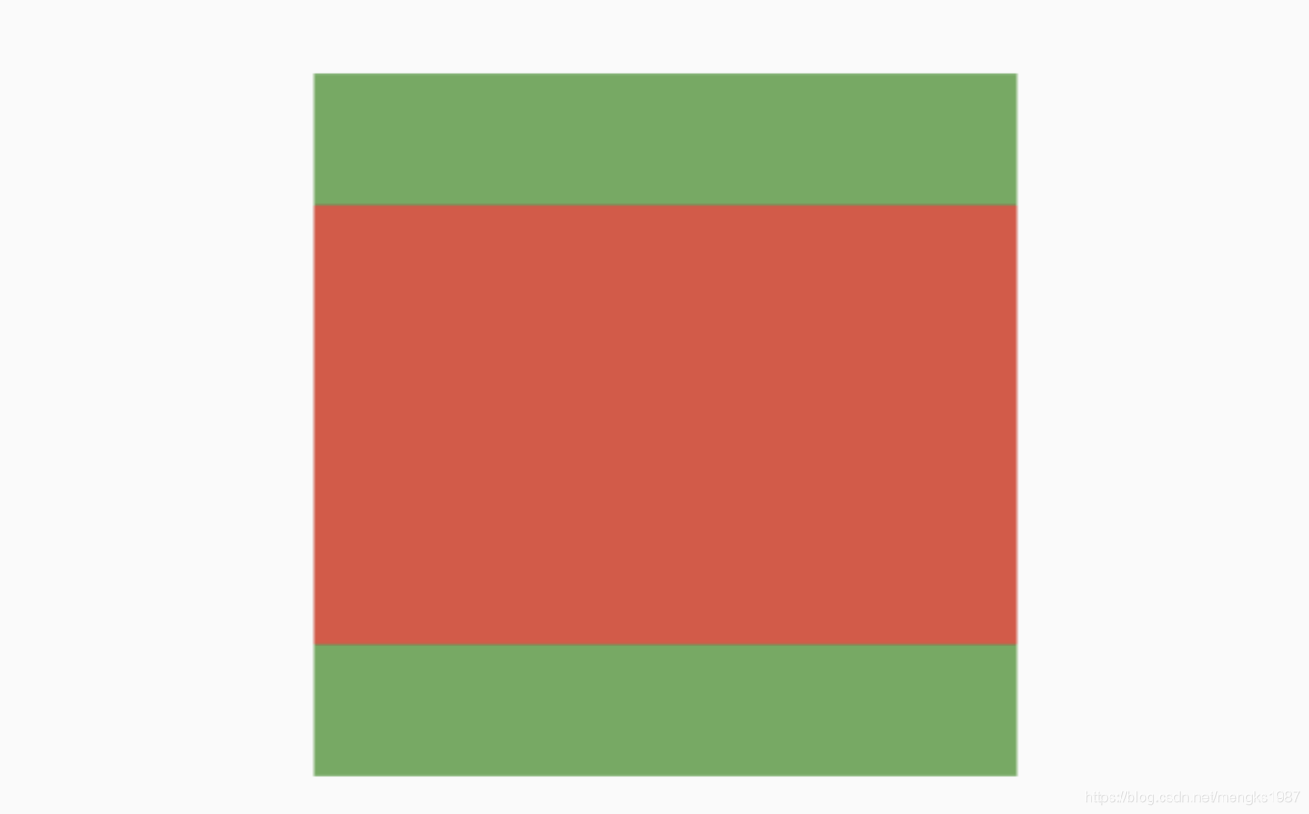
fit参数表示了子控件的填充方式,说明如下:
- fill:填充父组件,宽高比发生变化。
- contain:等比拉伸,但子控件不能超出父控件。
- cover:尽可能的小,等比拉伸充满父控件。
- fitWidth:等比拉伸,宽充满父控件。
- fitHeight:等比拉伸,高充满父控件。
- none:默认子控件居中,不做拉伸处理,超出父控件的部分裁剪。
- scaleDown:在子控件为Image且缩小的情况和
contain一样,否则和none一样。
title: 'Flexible | Expanded | Spacer' description: '具有权重属性的组件,按照比例分配' type: widgets
Flexible
Expanded、Flexible和Spacer都是具有权重属性的组件,可以控制Row、Column、Flex的子控件如何布局的控件。
Flexible
Flexible组件可以控制Row、Column、Flex的子控件占满父控件,比如,Row中有3个子控件,2边的固定宽,中间的占满剩余的空间,代码如下:
Row(
children: <Widget>[
Container(
color: Colors.blue,
height: 50,
width: 100,
),
Flexible(
child: Container(
color: Colors.red,
height: 50,
)
),
Container(
color: Colors.blue,
height: 50,
width: 100,
),
],
)
效果如图:
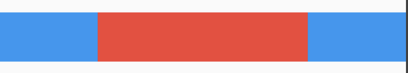
还是有3个子控件,希望第一个占1/6,第二个占2/6,第三个占3/6,代码如下:
Column(
children: <Widget>[
Flexible(
flex: 1,
child: Container(
color: Colors.blue,
alignment: Alignment.center,
child: Text('1 Flex/ 6 Total',style: TextStyle(color: Colors.white),),
),
),
Flexible(
flex: 2,
child: Container(
color: Colors.red,
alignment: Alignment.center,
child: Text('2 Flex/ 6 Total',style: TextStyle(color: Colors.white),),
),
),
Flexible(
flex: 3,
child: Container(
color: Colors.green,
alignment: Alignment.center,
child: Text('3 Flex/ 6 Total',style: TextStyle(color: Colors.white),),
),
),
],
)
效果如图:
子控件占比 = 当前子控件flex/所有子控件flex之和。
Flexible中fit参数表示填满剩余空间的方式,说明如下:
- tight:必须(强制)填满剩余空间。
- loose:尽可能大的填满剩余空间,但是可以不填满。
这2个看上去不是很好理解啊,什么叫尽可能大的填满剩余空间?什么时候填满?看下面的例子:
Row(
children: <Widget>[
Container(
color: Colors.blue,
height: 50,
width: 100,
),
Flexible(
child: Container(
color: Colors.red,
height: 50,
child: Text('Container',style: TextStyle(color: Colors.white),),
)
),
Container(
color: Colors.blue,
height: 50,
width: 100,
),
],
)
效果图:
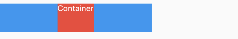
这段代码是在最上面代码的基础上给中间的红色Container添加了Text子控件,此时红色Container就不在充满空间,再给Container添加对齐方式,代码如下:
Row(
children: <Widget>[
Container(
color: Colors.blue,
height: 50,
width: 100,
),
Flexible(
child: Container(
color: Colors.red,
height: 50,
alignment: Alignment.center,
child: Text('Container',style: TextStyle(color: Colors.white),),
)
),
Container(
color: Colors.blue,
height: 50,
width: 100,
),
],
)
效果图:
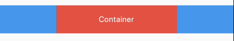 此时又填满剩余空间。
大家是否还记得Container控件的大小是调整的吗?Container默认是适配子控件大小的,但当设置对齐方式时Container将会填满父控件,在Flutter Widgets 之 Container中已经详细介绍,因此是否填满剩余空间取决于子控件是否需要填满父控件。
如果把Flexible中子控件由Container改为OutlineButton,代码如下:
Row(
children: <Widget>[
Container(
color: Colors.blue,
height: 50,
width: 100,
),
Flexible(
child: OutlineButton(
child: Text('OutlineButton'),
),
),
Container(
color: Colors.blue,
height: 50,
width: 100,
),
],
)
OutlineButton正常情况下是不充满父控件的,因此最终的效果应该是不填满剩余空间,效果如图:
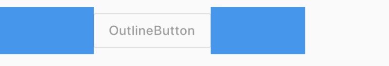
Expanded
看一下Expanded的源代码:
class Expanded extends Flexible {
/// Creates a widget that expands a child of a [Row], [Column], or [Flex]
/// so that the child fills the available space along the flex widget's
/// main axis.
const Expanded({
Key key,
int flex = 1,
@required Widget child,
}) : super(key: key, flex: flex, fit: FlexFit.tight, child: child);
}
Expanded继承字Flexible,fit参数固定为FlexFit.tight,也就是说Expanded必须(强制)填满剩余空间。上面的OutlineButton想要充满剩余空间可以使用Expanded:
Row(
children: <Widget>[
Container(
color: Colors.blue,
height: 50,
width: 100,
),
Expanded(
child: OutlineButton(
child: Text('OutlineButton'),
),
),
Container(
color: Colors.blue,
height: 50,
width: 100,
),
],
)
效果如图:
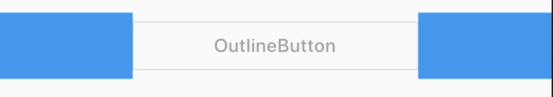
Spacer
看下Spacer的build源代码:
@override
Widget build(BuildContext context) {
return Expanded(
flex: flex,
child: const SizedBox.shrink(),
);
}
Spacer的通过Expanded的实现的,和Expanded的区别是:Expanded可以设置子控件,而Spacer的子控件尺寸是0,因此Spacer适用于撑开Row、Column、Flex的子控件的空隙,用法如下:
Row(
children: <Widget>[
Container(width: 100,height: 50,color: Colors.green,),
Spacer(flex: 2,),
Container(width: 100,height: 50,color: Colors.blue,),
Spacer(),
Container(width: 100,height: 50,color: Colors.red,),
],
)
效果如下:
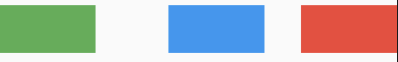
总结
总结如下:
- Spacer是通过Expanded来实现的,Expanded继承自Flexible。
- 填满剩余空间直接使用Expanded更方便。
- Spacer用于撑开Row、Column、Flex的子控件的空隙。
FlexibleSpaceBar
AppBar的一部分,它可以扩展,折叠,延伸,最常用于SliverAppBar.flexibleSpace字段。
用法如下:
CustomScrollView(
slivers: <Widget>[
SliverAppBar(
pinned: true,
expandedHeight: 200.0,
flexibleSpace: FlexibleSpaceBar(
title: Text('复仇者联盟'),
background: Image.network(
'http://img.haote.com/upload/20180918/2018091815372344164.jpg',
fit: BoxFit.fitHeight,
),
),
),
SliverList(
delegate: SliverChildBuilderDelegate((content, index) {
return Container(
height: 65,
color: Colors.primaries[index % Colors.primaries.length],
);
}, childCount: 50),
)
],
)
效果如下:
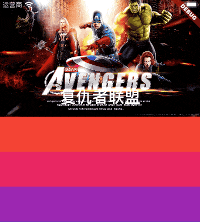
FlexibleSpaceBar中有一个非常重要的属性就是stretchModes,此参数控制拉伸区域的滚动特性:
- StretchMode.zoomBackground- >背景小部件将展开以填充额外的空间。
- StretchMode.blurBackground- >使用[ImageFilter.blur]效果,背景将模糊。
- StretchMode.fadeTitle- >随着用户过度滚动,标题将消失。
使用stretchModes属性需要开始stretch模式,用法如下:
SliverAppBar(
pinned: true,
expandedHeight: 200.0,
stretch: true,
flexibleSpace: FlexibleSpaceBar(
stretchModes: [StretchMode.zoomBackground],
...
)
stretchModes为一个数组,3种模式可以组合使用,也可以单独使用,效果如下:
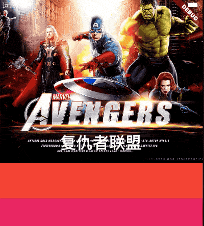
使用StretchMode.zoomBackground和StretchMode.blurBackground:
FlexibleSpaceBar(
stretchModes: [StretchMode.zoomBackground,StretchMode.blurBackground],
...
)
效果如下:
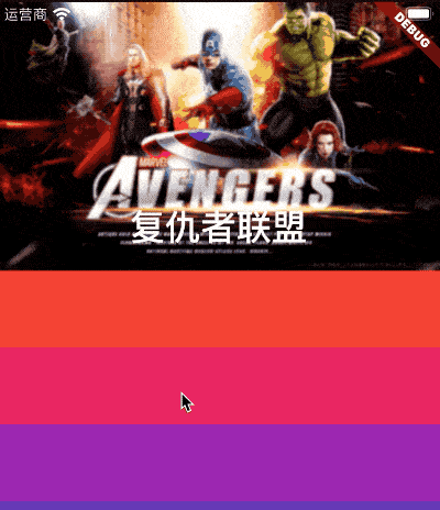
我们还可以通过stretchTriggerOffset 和onStretchTrigger监听拉伸事件,用法如下:
SliverAppBar(
stretch: true,
stretchTriggerOffset: 100,
onStretchTrigger: (){
print('onStretchTrigger');
},
...
)
注意此属性是在SliverAppBar中设置,但拉伸超过100时,将会回调onStretchTrigger函数。
title: 'FloatingActionButton' description: '控件介绍' type: widgets
FloatingActionButton
FloatingActionButton通常和Scaffold一起使用,在底部导航栏嵌入按钮。
基本用法如下:
Scaffold(
floatingActionButton: FloatingActionButton(),
)
没有底部导航栏的位置如下:
加入底部导航栏:
Scaffold(
floatingActionButton: FloatingActionButton(),
bottomNavigationBar: BottomNavigationBar(
items: [
BottomNavigationBarItem(icon: Icon(Icons.person),title: Text('老孟')),
BottomNavigationBarItem(icon: Icon(Icons.home),title: Text('程序员'))
],
),
)
效果如下:
设置按钮嵌入底部导航栏:
Scaffold(
floatingActionButtonLocation: FloatingActionButtonLocation.centerDocked,
floatingActionButton: FloatingActionButton(),
bottomNavigationBar: BottomNavigationBar(
backgroundColor: Colors.yellow,
items: [
BottomNavigationBarItem(icon: Icon(Icons.person),title: Text('老孟')),
BottomNavigationBarItem(icon: Icon(Icons.home),title: Text('程序员'))
],
)
)
用法如下:
title: 'Flow|流式 半圆菜单' description: '' type: widgets
Flow
流式小部件,同类型的有Wrap,Row等,Flow的特点是可以调整子组件的位置和大小,结合Matrix4绘制出各种酷炫的效果。
Flow({
Key key,
@required FlowDelegate delegate, //继承FlowDelegate的管理类,来控制子组件的定位
List<Widget> children: const [] //可放多个子组件
})
Flow仅有2个属性,children表示子控件,delegate是调整子组件的位置和大小,需要自定义。
水平展开/收起菜单
使用Flow实现水平展开/收起菜单的功能,代码如下:
class DemoFlowPopMenu extends StatefulWidget {
@override
_DemoFlowPopMenuState createState() => _DemoFlowPopMenuState();
}
class _DemoFlowPopMenuState extends State<DemoFlowPopMenu>
with SingleTickerProviderStateMixin {
//动画必须要with这个类
AnimationController _ctrlAnimationPopMenu; //定义动画的变量
IconData lastTapped = Icons.notifications;
final List<IconData> menuItems = <IconData>[
//菜单的icon
Icons.home,
Icons.new_releases,
Icons.notifications,
Icons.settings,
Icons.menu,
];
void _updateMenu(IconData icon) {
if (icon != Icons.menu) {
setState(() => lastTapped = icon);
} else {
_ctrlAnimationPopMenu.status == AnimationStatus.completed
? _ctrlAnimationPopMenu.reverse() //展开和收拢的效果
: _ctrlAnimationPopMenu.forward();
}
}
@override
void initState() {
super.initState();
_ctrlAnimationPopMenu = AnimationController(
//必须初始化动画变量
duration: const Duration(milliseconds: 250), //动画时长250毫秒
vsync: this, //SingleTickerProviderStateMixin的作用
);
}
//生成Popmenu数据
Widget flowMenuItem(IconData icon) {
final double buttonDiameter =
MediaQuery.of(context).size.width * 2 / (menuItems.length * 3);
return Padding(
padding: const EdgeInsets.symmetric(vertical: 8.0),
child: RawMaterialButton(
fillColor: lastTapped == icon ? Colors.amber[700] : Colors.blue,
splashColor: Colors.amber[100],
shape: CircleBorder(),
constraints: BoxConstraints.tight(Size(buttonDiameter, buttonDiameter)),
onPressed: () {
_updateMenu(icon);
},
child: Icon(icon, color: Colors.white, size: 30.0),
),
);
}
@override
Widget build(BuildContext context) {
return Center(
child: Flow(
delegate: FlowMenuDelegate(animation: _ctrlAnimationPopMenu),
children: menuItems
.map<Widget>((IconData icon) => flowMenuItem(icon))
.toList(),
),
);
}
}
FlowMenuDelegate定义如下:
class FlowMenuDelegate extends FlowDelegate {
FlowMenuDelegate({this.animation}) : super(repaint: animation);
final Animation<double> animation;
@override
void paintChildren(FlowPaintingContext context) {
double x = 50.0; //起始位置
double y = 50.0; //横向展开,y不变
for (int i = 0; i < context.childCount; ++i) {
x = context.getChildSize(i).width * i * animation.value;
context.paintChild(
i,
transform: Matrix4.translationValues(x, y, 0),
);
}
}
@override
bool shouldRepaint(FlowMenuDelegate oldDelegate) =>
animation != oldDelegate.animation;
}
圆形展开/收起
使用Flow实现圆形展开/收起菜单的功能,代码如下:
class DemoFlowCircle extends StatefulWidget {
@override
_DemoFlowCircleState createState() => _DemoFlowCircleState();
}
class _DemoFlowCircleState extends State<DemoFlowCircle>
with TickerProviderStateMixin { //动画需要这个类来混合
//动画变量,以及初始化和销毁
AnimationController _ctrlAnimationCircle;
@override
void initState() {
super.initState();
_ctrlAnimationCircle = AnimationController( //初始化动画变量
lowerBound: 0,upperBound: 80,duration: Duration(seconds: 3),vsync: this);
_ctrlAnimationCircle.addListener(() => setState(() {}));
}
@override
void dispose() {
_ctrlAnimationCircle.dispose(); //销毁变量,释放资源
super.dispose();
}
//生成Flow的数据
List<Widget> _buildFlowChildren() {
return List.generate(
15,
(index) => Container(
child: Icon(
index.isEven ? Icons.timer : Icons.ac_unit,
color: Colors.primaries[index % Colors.primaries.length],
),
));
}
//系统生成页面
@override
Widget build(BuildContext context) {
return Center(
child: GestureDetector(
onTap: () {
setState(() { //点击后让动画可前行或回退
_ctrlAnimationCircle.status == AnimationStatus.completed
? _ctrlAnimationCircle.reverse(): _ctrlAnimationCircle.forward();
});
},
child: Container(
color: Colors.blueAccent.withOpacity(0.4),
width: 200,height: 200,
child: Flow(
delegate: FlowAnimatedCircle(_ctrlAnimationCircle.value),
children: _buildFlowChildren(),
),
),
),
);
}
}
FlowMenuDelegate定义如下:
class FlowAnimatedCircle extends FlowDelegate {
final double radius; //绑定半径,让圆动起来
FlowAnimatedCircle(this.radius);
@override
void paintChildren(FlowPaintingContext context) {
double x = 0; //开始(0,0)在父组件的中心
double y = 0;
for (int i = 0; i < context.childCount; i++) {
x = radius * cos(i * 2 * pi / (context.childCount - 1));//根据数学得出坐标
y = radius * sin(i * 2 * pi / (context.childCount - 1));//根据数学得出坐标
context.paintChild(i, transform: Matrix4.translationValues(x, y, 0));
} //使用Matrix定位每个子组件
}
@override
bool shouldRepaint(FlowDelegate oldDelegate)=>true;
}
半圆菜单展开/收起
class DemoFlowMenu extends StatefulWidget {
@override
_DemoFlowMenuState createState() => _DemoFlowMenuState();
}
class _DemoFlowMenuState extends State<DemoFlowMenu>
with TickerProviderStateMixin {
//动画需要这个类来混合
//动画变量,以及初始化和销毁
AnimationController _ctrlAnimationCircle;
@override
void initState() {
super.initState();
_ctrlAnimationCircle = AnimationController(
//初始化动画变量
lowerBound: 0,
upperBound: 80,
duration: Duration(milliseconds: 300),
vsync: this);
_ctrlAnimationCircle.addListener(() => setState(() {}));
}
@override
void dispose() {
_ctrlAnimationCircle.dispose(); //销毁变量,释放资源
super.dispose();
}
//生成Flow的数据
List<Widget> _buildFlowChildren() {
return List.generate(
5,
(index) => Container(
child: Icon(
index.isEven ? Icons.timer : Icons.ac_unit,
color: Colors.primaries[index % Colors.primaries.length],
),
));
}
@override
Widget build(BuildContext context) {
return Stack(
children: <Widget>[
Positioned.fill(
child: Flow(
delegate: FlowAnimatedCircle(_ctrlAnimationCircle.value),
children: _buildFlowChildren(),
),
),
Positioned.fill(
child: IconButton(
icon: Icon(Icons.menu),
onPressed: () {
setState(() {
//点击后让动画可前行或回退
_ctrlAnimationCircle.status == AnimationStatus.completed
? _ctrlAnimationCircle.reverse()
: _ctrlAnimationCircle.forward();
});
},
),
),
],
);
}
}
class FlowAnimatedCircle extends FlowDelegate {
final double radius; //绑定半径,让圆动起来
FlowAnimatedCircle(this.radius);
@override
void paintChildren(FlowPaintingContext context) {
if (radius == 0) {
return;
}
double x = 0; //开始(0,0)在父组件的中心
double y = 0;
for (int i = 0; i < context.childCount; i++) {
x = radius * cos(i * pi / (context.childCount - 1)); //根据数学得出坐标
y = radius * sin(i * pi / (context.childCount - 1)); //根据数学得出坐标
context.paintChild(i, transform: Matrix4.translationValues(x, -y, 0));
} //使用Matrix定位每个子组件
}
@override
bool shouldRepaint(FlowDelegate oldDelegate) => true;
}
小结
Flow 和Animation、Matrix4组合可玩性很强,这里只讲到这两个类的最基础的。
Flow组件对使用转换矩阵操作子组件经过系统优化,性能非常高效。
title: 'FlutterLogo' description: 'Flutter Logo图标' type: widgets
FlutterLogo
FlutterLogo是一个显示Flutter Logo的控件,虽然FlutterLogo使用起来比较简单,但其实现并不简单,首先FlutterLogo是一个动画控件(AnimatedContainer实现),其次FlutterLogo是通过Painter绘制出来。
用法如下:
FlutterLogo(
size: 60,
colors: Colors.red,
)
效果如下:

显示Flutter文字标识,代码如下:
FlutterLogo(
size: 160,
colors: Colors.red,
style: FlutterLogoStyle.horizontal,
textColor: Colors.blue,
)
效果如下:
style属性有3个值:
- markOnly:只显示logo
- horizontal:flutter文字显示在logo右面
- stacked:flutter文字显示在logo下面
设置动画:
var _style = FlutterLogoStyle.horizontal;
Column(
children: <Widget>[
FlutterLogo(
size: 160,
colors: Colors.red,
style: _style,
textColor: Colors.blue,
duration: Duration(seconds: 1),
curve: Curves.linear,
),
RaisedButton(
onPressed: (){
setState(() {
_style = FlutterLogoStyle.stacked;
});
},
),
],
)
效果如下:
title: 'TextFormField' description: '表单控件' type: widgets
Form
Form、FormField、TextFormField是表单相关控件,类似于H5中form。
FormField
FormField是一个表单控件,此控件包含表单的状态,方便更新UI,通常情况下,我们不会直接使用FormField,而是使用TextFormField。
TextFormField
TextFormField继承自FormField,是一个输入框表单,因此TextFormField中有很多关于TextField的属性,TextFormField的基本用法:
TextFormField(
onSaved: (value){
print('$value');
},
autovalidate: false,
validator: (String value){
return value.length>=6?null:'账号最少6个字符';
},
)
TextFormField效果如下:
onSaved是一个可选参数,当Form调用FormState.save时才会回调此方法。
autovalidate参数为是否自动验证,设置为true时,TextField发生变化就会调用validator,设置false时,FormFieldState.validate调用时才会回调validator,如果Form的autovalidate设置为true,TextFormField忽略此参数。
validator验证函数,输入的值不匹配的时候返回的字符串显示在TextField的errorText属性位置,返回null,表示没有错误。
Form
Form组件是一个容器类控件,可以包含多个FormField表单控件,这样的好处是统一管理。
在使用Form的时候需要设置其key,通过key获取当前的FormState,然后可以调用FormState的save、validate、reset等方法,一般通过如下方法设置:
final _formKey = GlobalKey<FormState>();
Form(
key: _formKey,
...
)
获取FormState并调用相关方法:
var _state = _formKey.currentState;
if(_state.validate()){
_state.save();
}
validate方法为验证表单数据的合法性,此方法会调用每一个FormField的validator回调,此回调需要字符串表示数据验证不通过,将会在改表单下显示返回的字符串,具体可查看下TextFormField介绍。
save方法回调每一个FormField的save方法,通常情况下保存表单数据。
用Form写一个简单的登录功能,代码如下:
var _account = '';
var _pwd = '';
final _formKey = GlobalKey<FormState>();
Form(
key: _formKey,
child: Column(
children: <Widget>[
TextFormField(
decoration: InputDecoration(hintText: '输入账号'),
onSaved: (value) {
_name = value;
},
validator: (String value) {
return value.length >= 6 ? null : '账号最少6个字符';
},
),
TextFormField(
decoration: InputDecoration(hintText: '输入密码'),
obscureText: true,
onSaved: (value) {
_pwd = value;
},
validator: (String value) {
return value.length >= 6 ? null : '账号最少6个字符';
},
),
RaisedButton(
child: Text('登录'),
onPressed: () {
var _state = Form.of(context);
if(_state.validate()){
_state.save();
login(_name,_pwd);
}
},
)
],
),
)
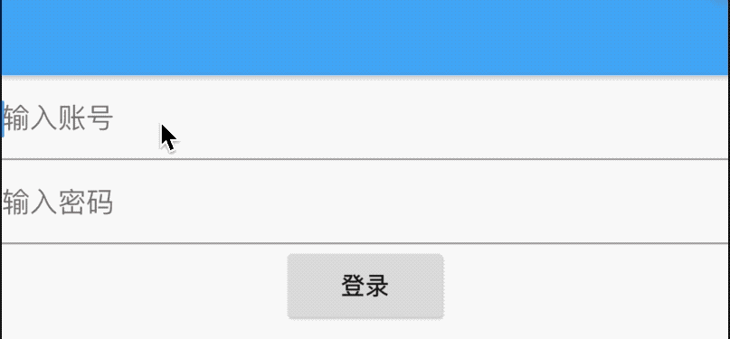
我们希望用户在输入表单时点击返回按钮提示用户"确认退出吗?",用法如下:
Form(
key: _formKey,
onWillPop: () async {
return await showDialog<bool>(
context: context,
builder: (BuildContext context) {
return AlertDialog(
title: Text('提示'),
content: Text('确认退出吗?'),
actions: <Widget>[
FlatButton(
child: Text('取消'),
onPressed: () {
Navigator.of(context).pop(false);
},
),
FlatButton(
child: Text('确认'),
onPressed: () {
Navigator.of(context).pop(true);
},
),
],
);
});
},
...
)
效果如下:
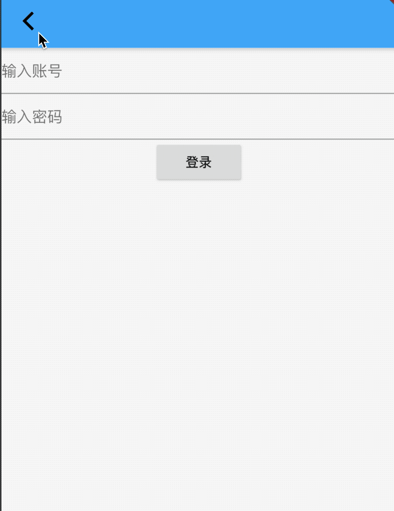
onWillPop回调决定Form所在的路由是否可以直接返回,该回调需要返回Future<bool>,返回false表示当前路由不会返回;为true,则会返回到上一个路由。此属性通常用于拦截返回按钮。
onChanged:当子表单控件发生变化时回调。
title: 'FractionalTranslation' description: '' type: widget
FractionalTranslation
根据Offset平移控件,比如设置Offset的dx为0.25,那么在水平方向上平移控件1/4的宽度。
Container(
height: 200,
width: 200,
color: Colors.blue,
child: FractionalTranslation(
translation: Offset(0.25,.2),
child: Container(
color: Colors.red,
),
),
)
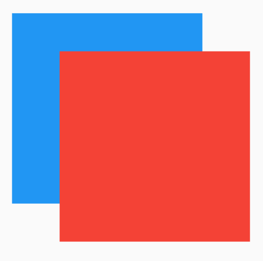
title: 'FutureBuilder' description: '控件介绍' type: widgets
FutureBuilder
展示异步任务状态
当有一个Future(异步)任务需要展示给用户时,可以使用FutureBuilder控件来完成,比如向服务器发送数据成功时显示成功提示:
var _future = Future.delayed(Duration(seconds: 3), () {
return '老孟,一个有态度的程序员';
});
FutureBuilder(
future: _future,
builder: (context, snapshot) {
var widget;
if (snapshot.connectionState == ConnectionState.done) {
if (snapshot.hasError) {
widget = Icon(
Icons.error,
color: Colors.red,
size: 48,
);
} else {
widget = Icon(
Icons.check_circle,
color: Colors.green,
size: 36,
);
}
} else {
widget = Padding(
padding: EdgeInsets.all(20),
child: CircularProgressIndicator(),
);
}
return Center(
child: Container(
height: 100,
width: 100,
decoration: BoxDecoration(
border: Border.all(color: Colors.grey),
borderRadius: BorderRadius.all(Radius.circular(10))),
child: widget,
),
);
},
);
效果如下:

在Future任务中出现异常如何处理,下面模拟出现异常,修改_future:
var _future = Future.delayed(Duration(seconds: 3), () {
return Future.error('');
});
效果如下:
builder是FutureBuilder的构建函数,在这里可以判断状态及数据显示不同的UI,
ConnectionState的状态包含四种:none、waiting、active、done,但我们只需要关注done状态,此状态表示Future执行完成,snapshot参数的类型是AsyncSnapshot<T>。
ListView加载网络数据
FutureBuilder还有一个比较常用的场景:网络加载数据并列表展示,这是一个非常常见的功能,在网络请求过程中显示loading,请求失败时显示失败UI,成功时显示成功UI。
模拟成功网络请求,通常会返回json字符串:
var _future = Future.delayed(Duration(seconds: 3), () {
return 'json 字符串';
});
构建FutureBuilder控件:
FutureBuilder(
future: _future,
builder: (context, snapshot) {
var widget;
if (snapshot.connectionState == ConnectionState.done) {
if (snapshot.hasError) {
widget = _loadingErrorWidget();
} else {
widget = _dataWidget(snapshot.data);
}
} else {
widget = _loadingWidget();
}
return widget;
},
);
构建loading控件:
_loadingWidget() {
return Center(
child: Padding(
padding: EdgeInsets.all(20),
child: CircularProgressIndicator(),
),
);
}
构建网络加载失败控件:
_loadingErrorWidget() {
return Center(
child: Text('数据加载失败,请重试。'),
);
}
数据加载成功,构建数据展示控件:
_dataWidget(data) {
return ListView.separated(
itemBuilder: (context, index) {
return Container(
height: 60,
alignment: Alignment.center,
child: Text(
'$index',
style: TextStyle(fontSize: 20),
),
);
},
separatorBuilder: (context, index) {
return Divider();
},
itemCount: 10,
);
}
效果如下:
模拟网络加载失败:
var _future = Future.delayed(Duration(seconds: 3), () {
return Future.error('');
});
效果如下:
通过上面的示例说明FutureBuilder控件极大的简化了异步任务相关显示的控件,不再需要开发者自己维护各种状态以及更新时调用State.setState。
防止FutureBuilder重绘
FutureBuilder是一个StatefulWidget控件,如果在FutureBuilder控件节点的父节点重绘rebuild,那么FutureBuilder也会重绘,这不仅耗费不必要的资源,如果是网络请求还会消耗用户的流量,这是非常糟糕的体验,如何解决这个问题?
通过源代码发现FutureBuilder重绘逻辑是这样的:
@override
void didUpdateWidget(FutureBuilder<T> oldWidget) {
super.didUpdateWidget(oldWidget);
if (oldWidget.future != widget.future) {
if (_activeCallbackIdentity != null) {
_unsubscribe();
_snapshot = _snapshot.inState(ConnectionState.none);
}
_subscribe();
}
}
FutureBuilder在重建时判断旧的future和新的future是否相等,如果不相等才会重建,所以我们只需要让其相等即可,有人可能会以为设置的future是同一个函数,如下:
_future() async{
...
}
FutureBuilder(
future: _future(),
...
)
上面的方式是不相等的,是错误的用法,可以将_future方法赋值给变量:
var _mFuture;
@override
void initState() {
// TODO: implement initState
super.initState();
_mFuture = _future();
}
_future() async{
...
}
FutureBuilder(
future: _mFuture,
...
)
title: 'GestureDetector' description: '监听手势的组件' type: widgets
GestureDetector
GestureDetector是手势识别的组件,可以识别点击、双击、长按事件、拖动、缩放等手势。
点击事件
点击相关事件包括:
-
onTapDown:按下时回调。
-
onTapUp:抬起时回调。
-
onTap:点击事件回调。
-
onTapCancel:点击取消事件回调。
用法如下:
GestureDetector(
onTapDown: (TapDownDetails tapDownDetails) {
print('onTapDown');
},
onTapUp: (TapUpDetails tapUpDetails) {
print('onTapUp');
},
onTap: () {
print('onTap');
},
onTapCancel: () {
print('onTapCancel');
},
child: Center(
child: Container(
width: 200,
height: 200,
color: Colors.red,
),
),
)
按下然后抬起调用顺序:
onTapDown-> onTapUp-> onTap
按下后移动的调用顺序:
onTapDown-> onTapCancel
这种情况下不在调用onTapUp和onTap。
双击事件
双击是快速且连续2次在同一个位置点击,双击监听使用onDoubleTap方法,用法如下:
GestureDetector(
onDoubleTap: ()=>print('onDoubleTap'),
child: Center(
child: Container(
width: 200,
height: 200,
color: Colors.red,
),
),
)
当同时监听onTap和onDoubleTap事件时,只会触发一个事件,如果触发onTap事件,onTap将会延迟触发(延迟时间为系统判断是onDoubleTap事件的间隔),因为系统将会等待一段时间来判断是否为onDoubleTap事件,如果用户只监听了onTap事件则没有延迟。
长按事件
长按事件(LongPress)包含长按开始、移动、抬起、结束事件,说明如下:
-
onLongPressStart:长按开始事件回调。
-
onLongPressMoveUpdate:长按移动事件回调。
-
onLongPressUp:长按抬起事件回调。
-
onLongPressEnd:长按结束事件回调。
-
onLongPress:长按事件回调。
GestureDetector(
onLongPressStart: (v) => print('onLongPressStart'),
onLongPressMoveUpdate: (v) => print('onLongPressMoveUpdate'),
onLongPressUp: () => print('onLongPressUp'),
onLongPressEnd: (v) => print('onLongPressEnd'),
onLongPress: () => print('onLongPress'),
child: Center(
child: Container(
width: 200,
height: 200,
color: Colors.red,
),
),
)
用户按下->移动->抬起的过程调用如下:
onLongPressStart->onLongPress->onLongPressMoveUpdate->... ->onLongPressMoveUpdate-> onLongPressEnd-> onLongPressUp
水平/垂直拖动事件
垂直/水平拖动事件包括按下、开始、移动更新、结束、取消事件,以垂直为例说明如下:
-
onVerticalDragDown:垂直拖动按下事件回调
-
onVerticalDragStart:垂直拖动开始事件回调
-
onVerticalDragUpdate:指针移动更新事件回调
-
onVerticalDragEnd:垂直拖动结束事件回调
-
onVerticalDragCancel:垂直拖动取消事件回调
GestureDetector(
onVerticalDragStart: (v) => print('onVerticalDragStart'),
onVerticalDragDown: (v) => print('onVerticalDragDown'),
onVerticalDragUpdate: (v) => print('onVerticalDragUpdate'),
onVerticalDragCancel: () => print('onVerticalDragCancel'),
onVerticalDragEnd: (v) => print('onVerticalDragEnd'),
child: Center(
child: Container(
width: 200,
height: 200,
color: Colors.red,
),
),
)
用户垂直方向拖动调用顺序如下:
onVerticalDragDown->onVerticalDragStart->onVerticalDragUpdate-> … -> onVerticalDragUpdate-> onVerticalDragEnd。
缩放事件
缩放(Scale)包含缩放开始、更新、结束。说明如下:
-
onScaleStart:缩放开始事件回调。
-
onScaleUpdate:缩放更新事件回调。
-
onScaleEnd:缩放结束事件回调。
GestureDetector(
onScaleStart: (v) => print('onScaleStart'),
onScaleUpdate: (ScaleUpdateDetails v) => print('onScaleUpdate'),
onScaleEnd: (v) => print('onScaleEnd'),
child: Center(
child: Container(
width: 200,
height: 200,
color: Colors.red,
),
),
)
缩放需要2个指针,对于手机就是2个手指进行缩放操作,调用顺序如下:
onScaleStart->onScaleUpdate->…->onScaleUpdate->onScaleEnd
title: 'GlowingOverscrollIndicator' description: '' type: widget
GlowingOverscrollIndicator
GlowingOverscrollIndicator 是Android平台ListView列表滑动到底部时在滑动出现的水波纹效果,此控件配合ScrollNotification使用。
案例:在IOS平台上也使用此效果
ScrollConfiguration(
behavior: MyScrollBehavior(),
child: ListView.builder(
shrinkWrap: true,
itemBuilder: (BuildContext context, int index) {
return Text('Item$index');
},
itemExtent: 50,
itemCount: 50,
),
)
MyScrollBehavior定义如下:
class MyScrollBehavior extends ScrollBehavior {
@override
Widget buildViewportChrome(
BuildContext context, Widget child, AxisDirection axisDirection) {
return GlowingOverscrollIndicator(
child: child,
axisDirection: axisDirection,
color: Colors.blue,
);
}
@override
ScrollPhysics getScrollPhysics(BuildContext context) {
return ClampingScrollPhysics();
}
}
title: 'GridPaper' description: '绘制一个像素宽度的直线网格控件' type: widgets
GridPaper
绘制一个像素宽度的直线网格,用法如下:
GridPaper(
color: Colors.red,
)
效果如下:
interval参数表示2条线之间的间隔,默认是100逻辑像素,注意单位是逻辑像素,而不是物理像素。
divisions参数表示每个主网格的分割数。
subdivisions参数表示次网格的分割数,包含它自身。
设置200x200的区域,绘制网格,divisions和subdivisions都为1,代码如下:
Container(
height: 200,
width: 200,
child: GridPaper(
color: Colors.red,
divisions: 1,
subdivisions: 1,
),
)
divisions设置为1、2、4效果如下:
将divisions为2,subdivisions设置为1、2、4效果如下:
title: 'GridTile|GridTileBar'
description: '主要作为GridView子child,提供丰富的页眉和页脚'
type: widget
GridTile
继承关系 Object>Diagnosticable>DiagnosticableTree>Widget>StatelessWidget>GridTile
GridTile通常作为GridView的子控件,用法如下:
GridView.builder(
gridDelegate: SliverGridDelegateWithFixedCrossAxisCount(
crossAxisCount: 3,
),
itemBuilder: (context, index) {
return GridTile(
child: Container(
height: 80,
color: Colors.primaries[index % Colors.primaries.length],
),
);
},
itemCount: 50,
)
效果如下:
增加header和footer,一般情况下header和footer使用GridTileBar控件,用法如下:
GridTile(
header: GridTileBar(title: Text('Header'),),
child: Container(
height: 80,
color: Colors.primaries[index % Colors.primaries.length],
),
footer: GridTileBar(title: Text('Footer'),),
)
效果如下:
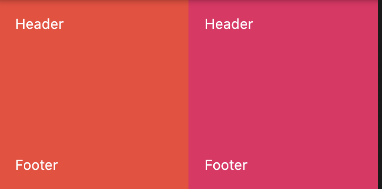
通过代码和图可以看到GridTile有如下几个特点:
- 页眉、页脚在视图顶层,覆盖在child之上
- child组件高度设置无效,这个源码里可以看到原因
- 继承自StatelessWidget,一旦创建,不可变。
GridTileBar
GridTileBar用于GridTile 组件中,做为header或者footer。
用法如下:
GridTile(
header: GridTileBar(
title: Text('老孟'),
subtitle: Text('专注分享Flutter'),
backgroundColor: Colors.blue,
leading: Icon(Icons.rotate_right),
trailing: Icon(Icons.details),
),
child: Container(
color: Colors.blueGrey,
),
)
leading 和trailing分别代表前置图标和后置图标,效果如下:
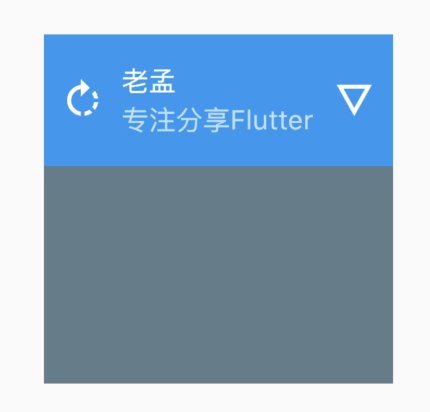
源码分析
@override
Widget build(BuildContext context) {
if (header == null && footer == null)
return child;
return Stack(
children: <Widget>[
Positioned.fill(
child: child,
),
if (header != null)
Positioned(
top: 0.0,
left: 0.0,
right: 0.0,
child: header,
),
if (footer != null)
Positioned(
left: 0.0,
bottom: 0.0,
right: 0.0,
child: footer,
),
],
);
}
- Stack 创建一个堆结构视图
- header 、footer都为null时直接返回child
- Positioned.fill 让child充满父组件
- Positioned(top: 0.0,left: 0.0,right: 0.0,child: header,) header放顶部显示
- Positioned(left: 0.0,bottom: 0.0,right: 0.0,child: footer,) footer放底部显示
总结
GridTile适合做带有页眉页脚的页面样式,但有一点child 顶部和底部会被页眉页脚覆盖,用的时候需要注意。
title: 'GridView' description: '控件介绍' type: widgets
GridView
GridView是一个可滚动的,2D数组控件。
基本用法如下:
GridView(
gridDelegate: SliverGridDelegateWithFixedCrossAxisCount(
crossAxisCount: 3,
),
children: [
_createGridViewItem(Colors.primaries[0]),
_createGridViewItem(Colors.primaries[1]),
_createGridViewItem(Colors.primaries[2]),
_createGridViewItem(Colors.primaries[3]),
_createGridViewItem(Colors.primaries[4]),
_createGridViewItem(Colors.primaries[5]),
_createGridViewItem(Colors.primaries[6]),
_createGridViewItem(Colors.primaries[7]),
],
)
_createGridViewItem(Color color){
return Container(
height: 80,
color: color,
);
}
效果如下:
gridDelegate参数控制子控件的排列,有2个选择:
- SliverGridDelegateWithFixedCrossAxisCount:交叉轴方向上固定数量,对于垂直方向的GridView来说交叉轴方向指的是水平方向。
- SliverGridDelegateWithMaxCrossAxisExtent:交叉轴方向上尽量大,比如水平方上有500空间,指定此值为150,那么可以放3个,剩余一些空间,此时GridView将会缩小每一个Item,放置4个。
SliverGridDelegateWithFixedCrossAxisCount有属性介绍如下:
crossAxisCount:交叉轴方向上个数。mainAxisSpacing:主轴方向上2行之间的间隔。crossAxisSpacing:交叉轴方向上之间的间隔。childAspectRatio:子控件宽高比。
设置间隔如下:
GridView(
gridDelegate: SliverGridDelegateWithFixedCrossAxisCount(
crossAxisCount: 3,
crossAxisSpacing: 2,
mainAxisSpacing: 4
)
...
)
效果如下:
scrollDirection`表示滚动方向,默认是垂直方向,可以设置为水平方向。
reverse表示是否反转滚动方向,比如当前滚动方向是垂直方向,reverse设置为true,滚动方向为从上倒下,设置为false,滚动方向为从下倒上。
用法如下:
GridView(
scrollDirection: Axis.horizontal,
reverse: true,
...
)
controller表示滚动相关,可以通过ScrollController获取到当前滚动位置,或者指定滚动到某一位置,用法如下:
ScrollController _gridViewController;
@override
void initState() {
_gridViewController = ScrollController()..addListener(() {
print('${_gridViewController.position}');
});
}
GridView(
controller: _gridViewController,
...
)
physics参数控制滚动到物理特性,比如设置为不可滚动:
GridView(
physics: NeverScrollableScrollPhysics(),
···
)
系统提供的ScrollPhysics有:
- AlwaysScrollableScrollPhysics:总是可以滑动
- NeverScrollableScrollPhysics:禁止滚动
- BouncingScrollPhysics :内容超过一屏 上拉有回弹效果
- ClampingScrollPhysics :包裹内容 不会有回弹
直接使用最开始的方法创建GridView是不推荐的,此方法不适合加载大量数据的情况,GridView提供了一些快速构建的方法,比如builder,用法如下:
GridView.builder(
gridDelegate: SliverGridDelegateWithFixedCrossAxisCount(
crossAxisCount: 3,
),
itemBuilder: (context, index) {
return Container(
height: 80,
color: Colors.primaries[index % Colors.primaries.length],
);
},
itemCount: 50,
)
itemBuilder是构建子控件,itemCount指定数据个数。
使用GridView.custom构建:
GridView.custom(
gridDelegate: SliverGridDelegateWithFixedCrossAxisCount(
crossAxisCount: 3,
),
childrenDelegate: SliverChildBuilderDelegate((context, index) {
return Container(
height: 80,
color: Colors.primaries[index % Colors.primaries.length]);
}, childCount: 50),
)
使用GridView.count构建:
GridView.count(
crossAxisCount: 3,
children: List.generate(50, (i) {
return Container(
height: 80,
color: Colors.primaries[i % Colors.primaries.length],
);
}),
)
使用GridView.extent构建:
GridView.extent(
maxCrossAxisExtent: 100,
children: List.generate(50, (i) {
return Container(
height: 80,
color: Colors.primaries[i % Colors.primaries.length],
);
}),
)
title: 'Hero' description: '控件介绍' type: widgets
Hero
Hero是我们常用的过渡动画,当用户点击一张图片,切换到另一个页面时,这个页面也有此图,那么使用Hero组件就在合适不过了,先看下Hero的效果图:
上面效果实现的列表页面代码如下:
class HeroDemo extends StatefulWidget {
@override
State<StatefulWidget> createState() => _HeroDemo();
}
class _HeroDemo extends State<HeroDemo> {
@override
Widget build(BuildContext context) {
return Scaffold(
body: GridView(
gridDelegate: SliverGridDelegateWithFixedCrossAxisCount(
crossAxisCount: 3, crossAxisSpacing: 5, mainAxisSpacing: 3),
children: List.generate(10, (index) {
if (index == 6) {
return InkWell(
onTap: () {
Navigator.push(
context,
new MaterialPageRoute(
builder: (context) => new _Hero1Demo()));
},
child: Hero(
tag: 'hero',
child: Container(
child: Image.asset(
'images/bird.png',
fit: BoxFit.fitWidth,
),
),
),
);
}
return Container(
color: Colors.red,
);
}),
),
);
}
}
第二个页面代码如下:
class _Hero1Demo extends StatelessWidget {
@override
Widget build(BuildContext context) {
return Scaffold(
appBar: AppBar(),
body: Container(
alignment: Alignment.topCenter,
child: Hero(
tag: 'hero',
child: Container(
child: Image.asset(
'images/bird.png',
),
),
)),
);
}
}
2个页面都有Hero控件,且tag参数一致。
title: 'HtmlElementView' description: '' type: widget
HtmlElementView
在Flutter Web中的Widget层次结构中嵌入HTML元素。
注意:此控件只能在Flutter Web中使用,如果想在Android和IOS中嵌入web内容请使用flutter_webview 插件
title: 'Icon' description: '用字形绘制的图形图标控件' type: widgets
Icon
Icon是图标控件,Icon不具有交互属性,如果想要交互,可以使用IconButton,另外Icon是具有方向性(Directionality)的,但通常情况下不会在Icon中设置textDirection,而是使用顶级控件中的设置。
使用图标需要在pubspec.yaml中进行设置:
flutter:
uses-material-design: true
创建Flutter项目的时候默认配置了此项,所以正常情况下不需要关注。
基本用法:
Icon(Icons.add)
系统提供的图标都在Icons中,效果如下:
到官网查看所有图标:https://api.flutter.dev/flutter/material/Icons-class.html
所有图标一览:
推荐一些图标库:
建议大家多使用图标,不仅包体会小很多,而且图标都是矢量的,不存在失真的问题。
设置其大小和颜色:
Icon(
Icons.add,
size: 28,
color: Colors.red,
)
效果如下:
AssetImage
AssetImage控件是根据图片绘制图标,就是图片上的透明通道不绘制,而不透明的地方使用设置的颜色绘制,
比如下面这张原图
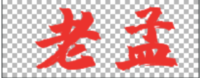
除了字体外,其他地方是透明的,将字体显示为蓝色:
ImageIcon(
AssetImage('images/name1.png'),
size: 100,
color: Colors.blue,
)
效果如下:
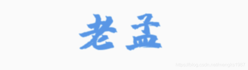
这里说下image参数,它接收的类型是ImageProvider,平时使用的Image.asset、Image.memory等不是此类型,需要使用AssetImage、MemoryImage等。
title: 'IconTheme' description: 'icon 样式' type: widgets
IconTheme
用于应用栏图标的颜色,不透明度和大小。
IconTheme({
Key key,
@required this.data,
@required Widget child,
})
案例
IconTheme(
data: IconThemeData(color: Colors.blue, opacity: 3.0,size: 36),
child: Container(
padding: EdgeInsets.all(20.0),
child: Icon(Icons.equalizer),
),
)
本文由Rock提供。
title: 'Image Icon 图片 .9图 Flutter 实战' description: '' type: widgets
图片组件是Flutter基础组件之一,和文本组件一样必不可少。图片组件包含Image和Icon两个组件,本质上Icon不属于图片组件,但其外形效果上类似于图片。
在项目中建议优先使用Icon组件,Icon本质上是一种字体,只不过显示的不是文字,而是图标,而Image组件先通过图片解码器将图片解码,所以Icon有如下优点:
- 通常情况下,图标比图片体积更小,显著的减少App包体积。
- 图标不会出现失真或者模糊的现象,例如将20x20的图片,渲染在200x200的屏幕上,图片会失真或模糊,而图标是矢量图,不会失真,就像字体一样。
- 多个图标可以存放在一个文件中,方便管理。
- 全平台通用。
Image
Image组件用于显示图片,图片的来源可以是网络、项目中图片或者设备上的图片。
加载网络图片:
Image.network(
'http://pic1.win4000.com/pic/c/cf/cdc983699c.jpg',
)
加载项目中图片:
首先将图片拷贝到项目中,通常情况下,拷贝到assets/images/目录下,assets/images/目录为手动创建,新建的项目默认是没有此目录的。
设置pubspec.yaml配置文件:
assets:
- assets/images/
或者指定具体图片的名称:
assets:
- assets/images/aa.jpg
通常情况下,使用第一种方式,因为图片会有很多张,增加一张就这里配置一个太麻烦。
注意:assets前面的空格问题,极容易引发编译异常,正确格式如下:
加载图片:
Image.asset('assets/images/aa.jpg')
加载设备上的图片:
要加载设备(手机)上的图片首先需要获取设备图片的路径,由于不同平台的路径不同,因此路径的获取必须依靠原生支持,如果了解原生(Android和iOS)开发,可以直接使用MethodChannel获取路径,如果不懂原生(Android和iOS)开发,可以使用第三方插件获取路径,这里推荐官方的path_provider。
加载设备上的图片:
Image.file(File('path'))
设置图片的大小:
Image.asset('assets/images/aa.jpg',width: 100,height: 200,),
当Image的大小和图片大小不匹配时,需要设置填充模式fit,设置组件大小为150x150,
Container(
color: Colors.red.withOpacity(.3),
child: Image.asset('assets/images/aa.jpg',width: 150,height: 150),
)

看到,图片左右两边有空白区域(浅红色填充的区域),如果想要图片充满整个区域,设置如下:
Container(
color: Colors.red.withOpacity(.3),
child: Image.asset('assets/images/aa.jpg',width: 150,height: 150,fit: BoxFit.fill,),
)

虽然图片充满整个区域,但图片变形了,使图片等比拉伸,直到两边都充满区域:
Container(
color: Colors.red.withOpacity(.3),
child: Image.asset('assets/images/aa.jpg',width: 150,height: 150,fit: BoxFit.cover,),
)

此时,图片未变形且两边都充满区域,不过图片被裁减了一部分。
fit参数就是设置填充方式,其值介绍如下:
- fill:完全填充,宽高比可能会变。
- contain:等比拉伸,直到一边填充满。
- cover:等比拉伸,直到2边都填充满,此时一边可能超出范围。
- fitWidth:等比拉伸,宽填充满。
- fitHeight:等比拉伸,高填充满。
- none:当组件比图片小时,不拉伸,超出范围截取。
- scaleDown:当组件比图片小时,图片等比缩小,效果和contain一样。
BoxFit.none的裁减和alignment相关,默认居中,
Image.asset(
'assets/images/aa.jpg',
width: 150,
height: 150,
fit: BoxFit.none,
alignment: Alignment.centerRight,
),
左边为原图。
设置对齐方式:
Container(
color: Colors.red.withOpacity(.3),
child: Image.asset(
'assets/images/aa.jpg',
width: 150,
height: 150,
alignment: Alignment.centerLeft,
),
),
color和colorBlendMode用于将颜色和图片进行颜色混合,colorBlendMode表示混合模式,下面介绍的混合模式比较多,浏览一遍即可,此属性可以用于简单的滤镜效果。
- clear:清楚源图像和目标图像。
- color:获取源图像的色相和饱和度以及目标图像的光度。
- colorBurn:将目标的倒数除以源,然后将结果倒数。
- colorDodge:将目标除以源的倒数。
- darken:通过从每个颜色通道中选择最小值来合成源图像和目标图像。
- difference:从每个通道的较大值中减去较小的值。合成黑色没有效果。合成白色会使另一张图像的颜色反转。
- dst:仅绘制目标图像。
- dstATop:将目标图像合成到源图像上,但仅在与源图像重叠的位置合成。
- dstIn:显示目标图像,但仅显示两个图像重叠的位置。不渲染源图像,仅将其视为蒙版。源的颜色通道将被忽略,只有不透明度才起作用。
- dstOut:显示目标图像,但仅显示两个图像不重叠的位置。不渲染源图像,仅将其视为蒙版。源的颜色通道将被忽略,只有不透明度才起作用。
- dstOver:将源图像合成到目标图像下。
- exclusion:从两个图像的总和中减去两个图像的乘积的两倍。
- hardLight:调整源图像和目标图像的成分以使其适合源图像之后,将它们相乘。
- hue:获取源图像的色相,以及目标图像的饱和度和光度。
- lighten:通过从每个颜色通道中选择最大值来合成源图像和目标图像。
- luminosity:获取源图像的亮度,以及目标图像的色相和饱和度。
- modulate:将源图像和目标图像的颜色分量相乘。
- multiply:将源图像和目标图像的分量相乘,包括alpha通道。
- overlay:调整源图像和目标图像的分量以使其适合目标后,将它们相乘。
- plus:对源图像和目标图像的组成部分求和。
- saturation:获取源图像的饱和度以及目标图像的色相和亮度。
- screen:将源图像和目标图像的分量的逆值相乘,然后对结果求逆。
- softLight:对于低于0.5的源值使用colorDodge,对于高于0.5的源值使用colorBurn。
- src:放置目标图像,仅绘制源图像。
- srcATop:将源图像合成到目标图像上,但仅在与目标图像重叠的位置合成。
- srcIn:显示源图像,但仅显示两个图像重叠的位置。目标图像未渲染,仅被视为蒙版。目标的颜色通道将被忽略,只有不透明度才起作用。
- srcOut:显示源图像,但仅显示两个图像不重叠的位置。
- srcOver:将源图像合成到目标图像上。
- xor:将按位异或运算符应用于源图像和目标图像。
**是不是感觉看了和没看差不多,看了也看不懂。**正常,估计只有学过视觉算法的才能看懂吧,直接看下各个属性的效果吧:
repeat表示当组件有空余位置时,将会重复显示图片
Image.asset(
'assets/images/aa.jpg',
width: double.infinity,
height: 150,
repeat: ImageRepeat.repeatX,
)

重复的模式有:
- repeat:x,y方向都充满。
- repeatX:x方向充满。
- repeatY:y方向充满。
- noRepeat:不重复。
matchTextDirection设置为true时,图片的绘制方向为TextDirection设置的方向,其父组件必须为Directionality:
Directionality(
textDirection: TextDirection.rtl,
child: Image.asset(
'assets/images/logo.png',
height: 150,
matchTextDirection: true,
)),
左边为原图,效果是左右镜像。
filterQuality表示绘制图像的质量,从高到低为:high->medium->low->none。越高效果越好,越平滑,当然性能损耗越大,默认是low,如果发现图片有锯齿,可以设置此参数。
当加载图片的时候回调frameBuilder,当此参数为null时,此控件将会在图片加载完成后显示,未加载完成时显示空白,尤其在加载网络图片时会更明显。因此此参数可以用于处理图片加载时显示占位图片和加载图片的过渡效果,比如淡入淡出效果。
下面的案例是淡入淡出效果:
Image.network(
'https://flutter.github.io/assets-for-api-docs/assets/widgets/puffin.jpg',
frameBuilder: (BuildContext context, Widget child, int frame,
bool wasSynchronouslyLoaded) {
if (wasSynchronouslyLoaded) {
return child;
}
return AnimatedOpacity(
child: child,
opacity: frame == null ? 0 : 1,
duration: const Duration(seconds: 2),
curve: Curves.easeOut,
);
},
)
loadingBuilder参数比frameBuilder控制的力度更细,可以获取图片加载的进度,下面的案例显示了加载进度条:
Image.network(
'https://flutter.github.io/assets-for-api-docs/assets/widgets/puffin.jpg',
loadingBuilder: (BuildContext context, Widget child,
ImageChunkEvent loadingProgress) {
if (loadingProgress == null) {
return child;
}
return Center(
child: CircularProgressIndicator(
value: loadingProgress.expectedTotalBytes != null
? loadingProgress.cumulativeBytesLoaded /
loadingProgress.expectedTotalBytes
: null,
),
);
})
centerSlice用于.9图,.9图用于拉伸图片的特定区域,centerSlice设置的区域(Rect)就是拉伸的区域。.9图通常用于控件大小、宽高比不固定的场景,比如聊天背景图片等。
Container(
width: 250,
height: 300,
decoration: BoxDecoration(
image: DecorationImage(
centerSlice: Rect.fromLTWH(20, 20, 10, 10),
image: AssetImage(
'assets/images/abc.jpg',
),
fit: BoxFit.fill))),
上面为原图,下面为拉伸的图片。
在使用时大概率会出现如下异常:

这是由于图片比组件的尺寸大,如果使用centerSlice属性,图片必须比组件的尺寸小,一般情况下,.9图的尺寸都非常小。
Icon
Icon是图标组件,Icon不具有交互属性,如果想要交互,可以使用IconButton。
Icon(Icons.add),
设置图标的大小和颜色:
Icon(
Icons.add,
size: 40,
color: Colors.red,
)
上面的黑色为默认大小和颜色。
Icons.add是系统提供的图标,创建Flutter项目的时候,pubspec.yaml中默认有如下配置:
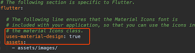
所有的图标在Icons中已经定义,可以直接在源代码中查看,也可以到官网查看所有图标。
所有图标效果如下:
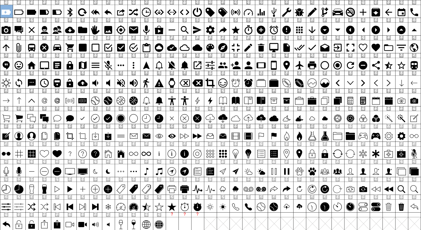
title: 'ImageIcon' description: '来自[ImageProvider]的图标,例如 一个[AssetImage]' type: widgets
ImageIcon
ImageIcon是一个使用[ImageProvider]来绘制的图标控件,根据图片绘制图标,就是图片上的透明通道不绘制,而不透明的地方使用设置的颜色绘制,
比如下面这张原图
除了字体外,其他地方是透明的,将字体显示为蓝色:
ImageIcon(
AssetImage('images/name1.png'),
size: 100,
color: Colors.blue,
)
效果如下:
这里说下image参数,它接收的类型是ImageProvider,平时使用的Image.asset、Image.memory等不是此类型,需要使用AssetImage、MemoryImage等。
title: 'InkWell' description: '控件介绍' type: widgets
InkWell
InkWell组件在用户点击时出现“水波纹”效果,InkWell简单用法:
InkWell(
onTap: (){},
child: Text('这是InkWell点击效果'),
)
onTap是点击事件回调,如果不设置无法出现“水波纹”效果,效果如下:
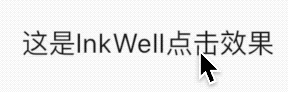
设置水波纹颜色:
InkWell(
onTap: () {},
splashColor: Colors.red,
...
)
效果如下:

设置高亮颜色颜色:
InkWell(
onTap: () {},
highlightColor: Colors.blue,
...
)
高亮颜色是按住时显示的颜色,效果如下:
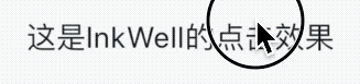
给字体添加边距和圆角边框,扩大“水波纹”效果:
InkWell(
onTap: (){},
child: Container(
padding: EdgeInsets.symmetric(horizontal: 20,vertical: 8),
decoration: BoxDecoration(
border:Border.all(color: Colors.blue),
borderRadius: BorderRadius.all(Radius.circular(30))
),
child: Text('这是InkWell点击效果'),
),
)
效果如下:
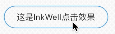
发现“水波纹”超出的了圆角边框,如何解决这个问题呢?Ink隆重登场。
Ink
Ink的官方解释:
A convenience widget for drawing images and other decorations on [Material] widgets, so that [InkWell] and [InkResponse] splashes will render over them.
简单翻译:Ink控件用于在[Material]控件上绘制图像和其他装饰,以便[InkWell]、[InkResponse]控件的“水波纹”效果在其上面显示。
上面的问题修改代码如下:
Ink(
decoration: BoxDecoration(
gradient: LinearGradient(
begin: Alignment.topLeft,
end: Alignment.bottomRight,
colors: [Color(0xFFDE2F21), Color(0xFFEC592F)]),
borderRadius: BorderRadius.all(Radius.circular(20))),
child: InkWell(
borderRadius: BorderRadius.all(Radius.circular(20)),
child: Container(
padding: EdgeInsets.symmetric(vertical: 8, horizontal: 20),
child: Text(
'这是InkWell的点击效果',
style: TextStyle(color: Colors.white),
),
),
onTap: () {},
),
)
效果如下:
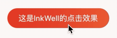
title: 'InputDecoration' description: '' type: widget
InputDecoration
InputDecoration 并不是一个控件,而是一个装饰类,用于装饰Material 风格的TextField组件的边框,标签,图标和样式。
icon
显示在输入框的前面,用法如下:
TextField(
decoration: InputDecoration(
icon: Icon(Icons.person),
),
)
效果如下:

labelText labelStyle hasFloatingPlaceholder
当输入框是空而且没有焦点时,labelText显示在输入框上边,当获取焦点或者不为空时labelText往上移动一点,labelStyle参数表示文本样式,具体参考TextStyle, 用法如下:
TextField(
decoration: InputDecoration(
labelText: '姓名:',
labelStyle: TextStyle(color:Colors.red)
),
)
效果如下:
hasFloatingPlaceholder参数控制当输入框获取焦点或者不为空时是否还显示labelText,默认为true,显示。
helperText helperStyle helperMaxLines
helperText显示在输入框的左下部,用于提示用户,helperStyle参数表示文本样式,具体参考TextStyle用法如下:
TextField(
decoration: InputDecoration(
helperText: '用户名长度为6-10个字母',
helperStyle: TextStyle(color: Colors.blue),
helperMaxLines: 1
),
)
效果如下:
hintText hintStyle hintMaxLines
hintText是当输入框为空时的提示,不为空时不在显示,用法如下:
TextField(
decoration: InputDecoration(
hintText: '请输入用户名',
hintStyle: TextStyle(color: Colors.grey),
hintMaxLines: 1
),
)
errorText errorStyle errorMaxLines errorBorder
errorText显示在输入框的左下部,默认字体为红色,用法如下:
TextField(
decoration: InputDecoration(
errorText: '用户名输入错误',
errorStyle: TextStyle(fontSize: 12),
errorMaxLines: 1,
errorBorder: OutlineInputBorder(borderSide: BorderSide(color: Colors.red)),
),
)
效果如下:
prefixIcon prefix prefixText prefixStyle
prefix系列的组件是输入框前面的部分,用法如下:
TextField(
decoration: InputDecoration(
prefixIcon: Icon(Icons.person)
),
)
注意prefix和icon的区别,icon是在输入框边框的外部,而prefix在里面,效果如下:

suffix suffixIcon suffixText suffixStyle
suffix和prefix相反,suffix在输入框的尾部,用法如下:
TextField(
decoration: InputDecoration(
suffixIcon: Icon(Icons.person)
),
)
效果:

counter counterText counterStyle
counter组件统计输入框文字的个数,counter仅仅是展示效果,不具备自动统计字数的功能, 自动统计字数代码如下:
var _textFieldValue = '';
TextField(
onChanged: (value){
setState(() {
_textFieldValue = value;
});
},
decoration: InputDecoration(
counterText: '${_textFieldValue.length}/32'
),
)
效果如下:
filled fillColor focusedBorder disabledBorder
filled为true时,输入框将会被fillColor填充,仿QQ登录输入框代码如下:
Container(
height: 60,
width: 250,
child: TextField(
decoration: InputDecoration(
fillColor: Color(0x30cccccc),
filled: true,
enabledBorder: OutlineInputBorder(
borderSide: BorderSide(color: Color(0x00FF0000)),
borderRadius: BorderRadius.all(Radius.circular(100))),
hintText: 'QQ号/手机号/邮箱',
focusedBorder: OutlineInputBorder(
borderSide: BorderSide(color: Color(0x00000000)),
borderRadius: BorderRadius.all(Radius.circular(100))),
),
),
)
效果如下:
title: 'InputDecorator' description: '' type: widget
InputDecorator
定义Material风格文本外观,类似于TextField外观,实际上TextField包含了此控件。
InputDecorator(
decoration: InputDecoration(),
child: Text('老孟'),
)
decoration属性是外观装饰,详情查看InputDecoration
baseStyle表示:如果decoration不指定样式,则decoration的label, hint, counter, and error使用此样式。
textAlign:表示水平布局。
textAlignVertical:表示垂直布局。
isFocused:是否具有焦点。
isHovering:输入字段是否被鼠标指针悬停。
expands:设置为true,此控件的高度尽可能大。
isEmpty:是否为空。
title: 'IntrinsicHeight | IntrinsicWidth' description: '控件介绍' type: widgets
IntrinsicHeight
根据内部子控件高度来调整高度,它将其子widget的高度调整其本身实际的高度:
将其子控件调整为该子控件的固有高度,举个例子来说,Row中有3个子控件,其中只有一个有高度,默认情况下剩余2个控件将会充满父组件,而使用IntrinsicHeight控件,则3个子控件的高度一致。
此类非常有用,例如,当可以使用无限制的高度并且您希望孩子尝试以其他方式无限扩展以将其自身调整为更合理的高度时,该类非常有用。
但是此类相对昂贵,因为它在最终布局阶段之前添加了一个推测性布局遍历。 避免在可能的地方使用它。 在最坏的情况下,此小部件可能会导致树的深度的布局为O(N²)。所以不推荐使用。
IntrinsicHeight({
Key key,
Widget child
})
用法如下:
IntrinsicHeight(
child: Row(
mainAxisAlignment: MainAxisAlignment.spaceBetween,
children: <Widget>[
new Container(color: Colors.blue, width: 100.0),
new Container(color: Colors.red, width: 50.0,height: 50.0,),
new Container(color: Colors.yellow, width: 150.0),
],
),
);
没有IntrinsicHeight包裹时第一三个Container高度是不受限制的:
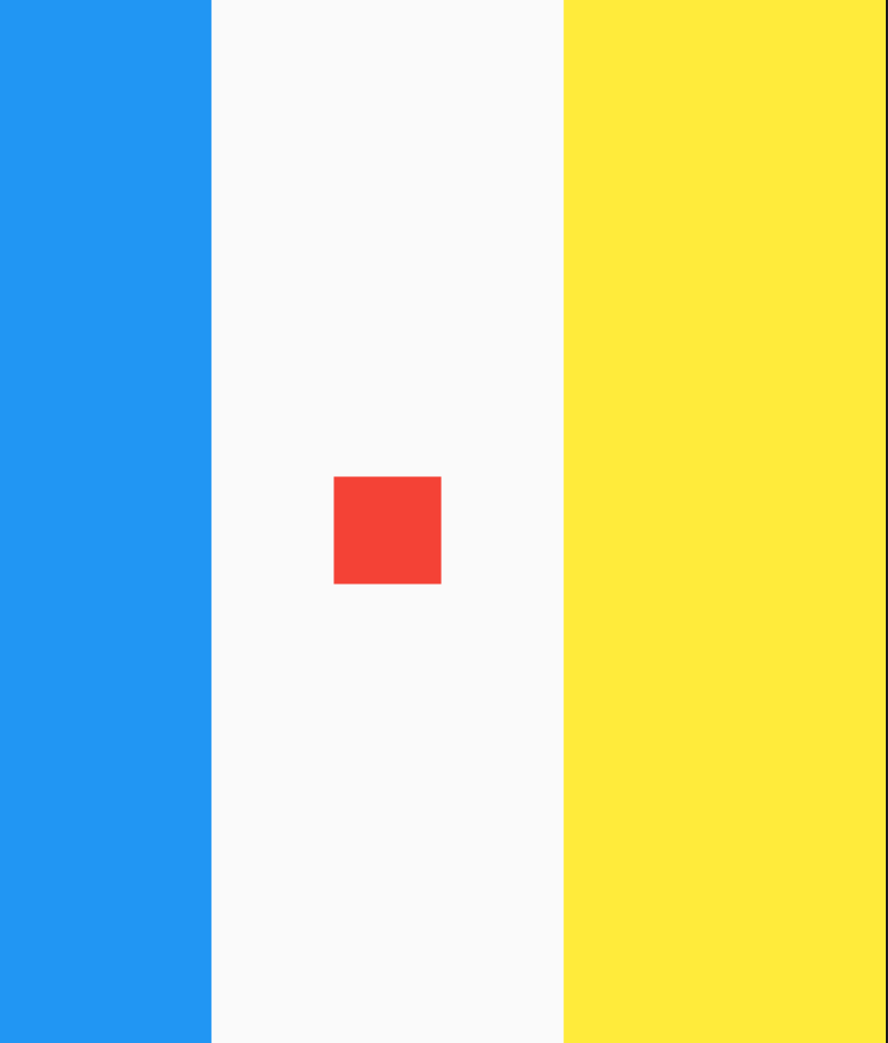
使用IntrinsicHeight包裹时第一三个Container高度就调整到第二个一样的高度:
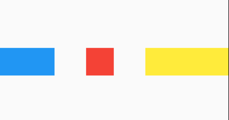
IntrinsicWidth
IntrinsicWidth和IntrinsicHeight一样,不过多了2个参数,stepHeight以及stepWidth:
- 当stepWidth不是null的时候,child的宽度将会是stepWidth的倍数,当stepWidth值比child最小宽度小的时候,这个值不起作用;
- 当stepWidth为null的时候,child的宽度是child的最小宽度;
- 当stepHeight不为null的时候,效果跟stepWidth相同;
- 当stepHeight为null的时候,高度取最大高度。
案例:
IntrinsicWidth(
stepHeight: 450.0,
stepWidth: 300.0,
child: Column(
children: <Widget>[
new Container(color: Colors.blue, height: 100.0),
new Container(color: Colors.red, width: 150.0, height: 100.0),
new Container(
color: Colors.yellow,
height: 150.0,
),
],
),
)

本文由Rock提供。
title: 'KeyedSubtree' description: '将Key附加到子控件上' type: widgets
KeyedSubtree
KeyedSubtree提供了一种简便的给子控件添加key的方法。
用法如下:
KeyedSubtree(
key: GlobalKey(),
child: Container(),
)
通常使用其提供的2个构建方法:KeyedSubtree.wrap和ensureUniqueKeysForList
KeyedSubtree.wrap返回一个带key的组件,用法如下:
KeyedSubtree.wrap(child, itemIndex)
ensureUniqueKeysForList返回多个带key的组件,key是当前子控件集合的索引,用法如下:
KeyedSubtree.ensureUniqueKeysForList(widget.children)
title: 'LayoutBuilder' description: '控件介绍' type: widgets
LayoutBuilder
有时我们希望根据组件的大小确认组件的外观,比如竖屏的时候上下展示,横屏的时候左右展示,通过LayoutBuilder组件可以获取父组件的约束尺寸。
用法如下:
LayoutBuilder(
builder: (BuildContext context, BoxConstraints constraints) {
var color = Colors.red;
if (constraints.maxHeight > 100) {
color = Colors.blue;
}
return Container(
height: 50,
width: 50,
color: color,
);
},
)
当设置父组件的宽高大于100时显示蓝色,小于100时显示红色。
title: 'LicensePage' description: '显示应用程序使用的软件的许可证的页面' type: widgets
LicensePage
此控件基本不会用到,浏览一下即可。
LicensePage用于描述当前App许可信息,LicensePage需要和showLicensePage配合使用,用法如下:
showLicensePage(
context: context,
applicationIcon: Image.asset(
'images/bird.png',
height: 100,
width: 100,
),
applicationName: '应用程序',
applicationVersion: '1.0.0',
applicationLegalese: 'copyright 老孟,一枚有态度的程序员',
);
效果如下:
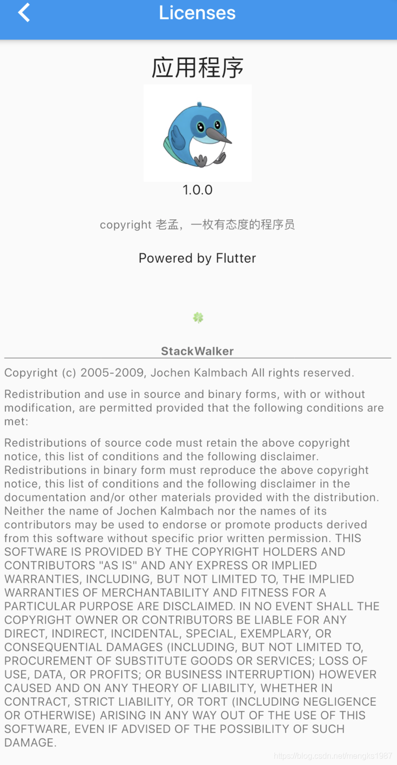
下面的英文我们是无法更改的。
title: 'ListBody' description: '' type: widget
ListBody
ListBody是一个沿着给定轴顺序排列子组件的组件,此控件不是很常用,通常使用ListView和Column和Row。
基本用法如下:
SingleChildScrollView(
child: ListBody(
mainAxis: Axis.vertical,
reverse: false,
children: <Widget>[
Container(
height: 45,
color: Colors.primaries[0],
),
Container(
height: 45,
color: Colors.primaries[1],
),
Container(
height: 45,
color: Colors.primaries[2],
),
],
),
)
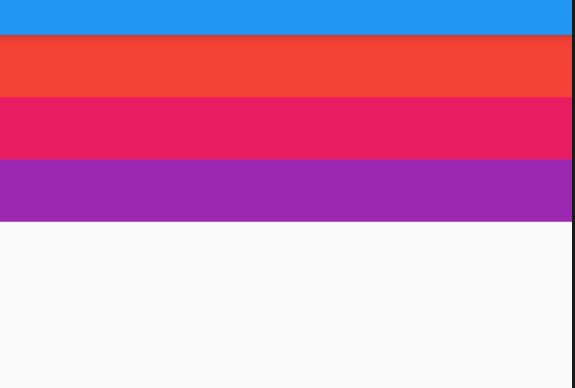
mainAxis:表示主轴方向,可以设置水平和垂直。
reverse:表示是否反转布局方向,比如当前主轴方向是垂直方向,reverse设置为true,布局方向为从下倒上,设置为false,布局方向为从上倒下。
title: 'Listener' description: '监听指针事件的小部件' type: widgets
Listener
Listener是一个监听指针事件的控件,比如按下、移动、释放、取消等指针事件,但Listener无法监听鼠标特有的事件,比如:移入、悬停、移出事件。鼠标事件使用MouseRegion监听。
通常情况下,监听手势事件使用GestureDetector,GestureDetector是更高级的手势事件。
Listener的事件介绍如下:
- onPointerDown:按下时回调
- onPointerMove:移动时回调
- onPointerUp:抬起时回调
用法如下:
Listener(
onPointerDown: (PointerDownEvent pointerDownEvent) {
print('$pointerDownEvent');
},
onPointerMove: (PointerMoveEvent pointerMoveEvent) {
print('$pointerMoveEvent');
},
onPointerUp: (PointerUpEvent upEvent) {
print('$upEvent');
},
child: Container(
height: 200,
width: 200,
color: Colors.blue,
alignment: Alignment.center,
),
)
打印结果如下:
flutter: PointerDownEvent#68250(position: Offset(170.3, 417.7), localPosition: Offset(63.3, 69.7), timeStamp: 2:34:54.781426, pointer: 15, kind: touch, device: 140265326177760, buttons: 1, down: true, pressure: 0.0, pressureMin: 0.0, pressureMax: 6.7, radiusMajor: 6.7, radiusMin: 5.0, radiusMax: 8.3, orientation: -1.6)
flutter: PointerMoveEvent#5c647(position: Offset(170.3, 418.0), localPosition: Offset(63.3, 70.0), delta: Offset(0.0, 0.3), timeStamp: 2:34:55.140060, pointer: 15, kind: touch, device: 140265326177760, buttons: 1, down: true, pressure: 0.9, pressureMin: 0.0, pressureMax: 6.7, radiusMajor: 6.7, radiusMin: 5.0, radiusMax: 8.3, orientation: -1.6)
..move...
flutter: PointerUpEvent#15231(position: Offset(198.3, 483.0), localPosition: Offset(91.3, 135.0), timeStamp: 2:34:56.992398, pointer: 15, kind: touch, device: 140265326177760, down: false, pressure: 0.0, pressureMin: 0.0, pressureMax: 6.7, orientation: -1.6)
常用属性说明如下:
-
position:相对屏幕的坐标的偏移。 -
localPosition:相对当前控件的偏移。 -
pressure:按压力度。 -
delta:2次指针移动事件的偏移。 -
orientation:指针移动方向
其实我这里想写的非常多,Flutter的事件传递机制是一大重点和难点,考虑很久还是没有写,主要是怕对初学者不友好,后面会在进阶的文章里面好好说说事件传递机制。
title: 'ListTile' description: '控件介绍' type: widgets
ListTile
ListTile是遵循Material Design 规范且固定高度的组件,让开发者快速的构建精美的布局,通常用于ListView的子控件,当然也可以单独使用。
添加标题和子标题:
ListTile(
title: Text('老孟'),
subtitle: Text('一枚有态度的程序员'),
)
效果如下:
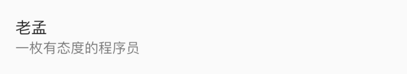
设置头部和尾部的控件:
ListTile(
leading: Container(
height: 45,
width: 45,
decoration: BoxDecoration(
shape: BoxShape.circle,
image: DecorationImage(image: AssetImage('images/2.png'),fit: BoxFit.fill)),
),
title: Text('老孟'),
subtitle: Text('一枚有态度的程序员'),
trailing: Icon(Icons.sort),
)
效果如下:
如果subtitle的内容过多,官方建议:
如果
isThreeLine设置为false,文本应该不换行。如果
isThreeLine设置为true,文本应该最大显示2行。
按照官方建议isThreeLine设置为false:
ListTile(
leading: Container(
height: 45,
width: 45,
decoration: BoxDecoration(
shape: BoxShape.circle,
image: DecorationImage(
image: AssetImage('images/2.png'), fit: BoxFit.fill)),
),
title: Text('老孟'),
subtitle: Text('一枚有态度的程序员,公众号【老孟程序员】。一枚有态度的程序员,公众号【老孟程序员】。',
softWrap: false, overflow: TextOverflow.ellipsis),
trailing: Icon(Icons.sort),
)
效果如下:
isThreeLine设置为true:
ListTile(
leading: Container(
height: 45,
width: 45,
decoration: BoxDecoration(
shape: BoxShape.circle,
image: DecorationImage(
image: AssetImage('images/2.png'), fit: BoxFit.fill)),
),
title: Text('老孟'),
subtitle: Text('一枚有态度的程序员,公众号【老孟程序员】。一枚有态度的程序员,公众号【老孟程序员】。',
maxLines: 2, overflow: TextOverflow.ellipsis),
isThreeLine: true,
trailing: Icon(Icons.sort),
)
效果如下:
dense属性设置为true时,内容及图标将会变小、变得更紧密。selected设置为true,文字及图标颜色会发生变化。
最后还可以给ListTile添加单击事件和长按事件:
ListTile(
onTap: (){
print('onTap');
},
onLongPress: (){
print('onLongPress');
},
...
)
title: 'ListTileTheme' description: '' type: widget
ListTileTheme
用于控制ListTile的样式。
dense设置为true时,ListTile高度为紧凑的,和false比较,高度小一些。
ListTileTheme(
dense: true,
child: ListTile(
leading: Icon(Icons.settings),
title: Text('老孟'),
subtitle: Text('专注分享Flutter'),
),
)
style表示适用范围,
ListTileStyle.list:表示此样式用于ListTileListTileStyle.drawer:用于Drawer中的ListTile
selectedColor:选中文字和图标颜色
iconColor:图标颜色
textColor:字体颜色
contentPadding:文本内边距
title: 'ListView' description: '控件介绍' type: widgets
ListView
ListView是我们最常用的组件之一,用于展示大量数据的列表。
构建方式
数据较少时,可以直接使用如下方式:
ListView(
children: <Widget>[
item,item1,item2,
],
)
这种方式一次加载所有的组件,没有“懒加载”,因此当有大量数据时,使用动态创建列表的方式:
ListView.builder(
itemBuilder: (BuildContext context, int index) {
return Text('Item$index');
},
itemExtent: 50,
)
如果想在每一项中间增加分割线可以使用如下方式:
ListView.separated(
itemBuilder: (BuildContext context, int index) {
return Text('Item$index');
},
separatorBuilder: (BuildContext context, int index){
return Divider();
},
itemCount: 50,
)
一般上面的方式就够用了,如果以上都不能满足你的要求,还可以使用ListView.custom,自定义SliverChildDelegate构建自己的ListView。
基础属性
通过scrollDirection参数控制滚动方向,默认是垂直方向,向上滚动,设置为水平方向:
ListView.builder(
scrollDirection: Axis.horizontal,
...
)
滚动方向如果是垂直方向,默认是向上滚动,通过reverse参数设置其向下滚动,代码如下:
ListView.builder(
reverse: true,
...
)
controller可以控制ListView的滚动,比如获取当前滚动的位置,或者代码直接滚动到指定位置,用法如下:
ScrollController controller;
@override
void initState() {
super.initState();
controller = ScrollController()
..addListener((){
print('${controller.position}');
});
}
@override
Widget build(BuildContext context) {
return ListView.builder(
controller:controller,
itemBuilder: (context, index) {
return Text('Item $index');
});
}
physics参数控制滚动到物理特性,比如设置为不可滚动:
ListView.builder(
physics: NeverScrollableScrollPhysics(),
···
)
系统提供的ScrollPhysics有:
- AlwaysScrollableScrollPhysics:总是可以滑动
- NeverScrollableScrollPhysics:禁止滚动
- BouncingScrollPhysics :内容超过一屏 上拉有回弹效果
- ClampingScrollPhysics :包裹内容 不会有回弹
addAutomaticKeepAlives参数表示当关闭屏幕时Item是否进行垃圾回收,默认为true。
title: 'ListWheelScrollView' description: '控件介绍' type: widgets
ListWheelScrollView
在展示大量数据的时候我们第一会想到使用ListView,如果你觉得ListView比较单一、枯燥,你可以使用ListWheelScrollView,ListWheelScrollView和ListView同源,但它的渲染效果类似于车轮(或者滚筒),它不是在平面上滑动,而是转动车轮,先来看一波效果:
ListWheelScrollView的用法和ListView基本相同,基础用法:
ListWheelScrollView(
itemExtent: 150,
children: <Widget>[
...
],
);
children 是子控件,itemExtent 指定每一个Item的高度。
当有大量数据的时候这种方式明显是不科学的,就像ListView.builder一样,用法如下:
ListWheelScrollView.useDelegate(
itemExtent: 150,
childDelegate: ListWheelChildBuilderDelegate(
builder: (context, index) {
return Container(
margin: EdgeInsets.symmetric(vertical: 10, horizontal: 30),
color: Colors.primaries[index % 10],
alignment: Alignment.center,
child: Text('$index'),
);
},
childCount: 100),
);
调整直径
ListWheelScrollView的渲染效果类似车轮,设置diameterRatio 调整其直径属性:
ListWheelScrollView(
itemExtent: 150,
diameterRatio: 1,
children: <Widget>[
...
],
)
diameterRatio是圆筒直径和主轴渲染窗口的尺寸的比,默认值是2,如果是垂直方向,主轴渲染窗口的尺寸是ListWheelScrollView的高。diameterRatio越小表示圆筒越圆。
调整perspective
perspective属性表示圆柱投影透视图,类似OpenGLES中透视投影,理解为看圆柱的距离,为0时表示从无限远处看,1表示从无限近处看,值的范围(0,0.01],注意是左开右闭区间,默认值是0.003,值越大,渲染效果越圆,用法如下:
ListWheelScrollView(
itemExtent: 150,
perspective: 0.003,
children: <Widget>[
...
],
);
offAxisFraction
offAxisFraction 属性表示车轮水平偏离中心的程度,用法如下:
ListWheelScrollView(
itemExtent: 150,
offAxisFraction: 13,
children: <Widget>[
],
);
offAxisFraction 的值从0到2的效果:
放大镜
通过useMagnifier和magnification属性实现放大镜效果,useMagnifier是否启用放大镜,magnification属性是放大倍率,用法如下:
ListWheelScrollView(
itemExtent: 150,
useMagnifier: true,
magnification: 1.5,
children: <Widget>[
],
);
效果如下:
squeeze
squeeze属性表示车轮上的子控件数量与在同等大小的平面列表上的子控件数量之比,例如,如果高度为100px,[itemExtent]为20px,那么5个项将放在一个等效的平面列表中。当squeeze为1时,RenderListWheelViewport中也会显示5个子控件。当squeeze为2时,RenderListWheelViewport中将显示10个子控件,默认值为1,用法如下:
ListWheelScrollView(
itemExtent: 150,
squeeze: 1,
children: <Widget>[
],
);
title: 'Localizations' description: '' type: widget
Localizations
Localizations 控件用于国际化,也就是多语言支持。
在项目中基本不会用到这个控件,不会用到并不代表这个控件不重要,这个控件非常重要,只不过系统提供的MaterialApp已经集成了此控件,所以我们基本不会直接使用。
定义我们自己的多语言支持:
class AppLocalizations {
AppLocalizations(this.locale);
final Locale locale;
static AppLocalizations of(BuildContext context) {
return Localizations.of<AppLocalizations>(context, AppLocalizations);
}
static Map<String, Map<String, String>> _localizedValues = {
'zh': {
'name': '你好',
},
'en': {
'name': 'Hello World',
},
};
String get name {
return _localizedValues[locale.languageCode]['name'];
}
}
_localizedValues在实际项目中通常一种语言写在一个文件中,这里为了方便放在了一起。
定义Delegate:
class AppLocalizationsDelegate extends LocalizationsDelegate<AppLocalizations> {
const AppLocalizationsDelegate();
@override
bool isSupported(Locale locale) => ['zh', 'en'].contains(locale.languageCode);
@override
Future<AppLocalizations> load(Locale locale) {
return SynchronousFuture<AppLocalizations>(AppLocalizations(locale));
}
@override
bool shouldReload(AppLocalizationsDelegate old) => false;
}
在MaterialApp下定义支持的Delegate,
MaterialApp(
localizationsDelegates: [
AppLocalizationsDelegate()
],
supportedLocales: [
const Locale('zh', 'CH'),
const Locale('en', 'US'),
],
...
)
使用如下:
Text('${AppLocalizations.of(context).name}')
还可以通过Localizations获取当前系统的语言环境:
Locale myLocale = Localizations.localeOf(context);
title: 'Material' description: '' type: widget
Material
一个Material风格的组件,Card组件就是基于此组件实现。
Material(
type: MaterialType.card,
color: Colors.red,
child: Container(
height: 100,
width: 100,
),
)
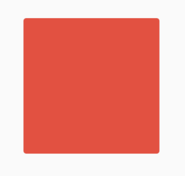
type表示组件类型,此属性影响形状和默认颜色值说明如下:
- card:圆角,默认使用
Card主题颜色。 - canvas:矩形。
- circle:圆形,默认没有颜色,通常用于
floating action button - button:圆角,默认没有颜色,通常用于
MaterialButton - transparency:透明,使用水波纹和高亮颜色绘制。
设置Z轴值和阴影颜色:
Material(
color: Colors.red,
elevation: 10,
shadowColor: Colors.blue,
child: Container(
height: 100,
width: 100,
),
)
设置圆角及字体样式:
Material(
borderRadius: BorderRadius.circular(10),
color: Colors.blue,
textStyle: TextStyle(fontSize: 20, color: Colors.red),
child: Container(
height: 100,
width: 100,
alignment: Alignment.center,
child: Text('老孟'),
),
)
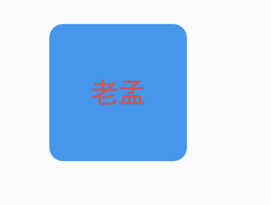
animationDuration表示动画之行时常,shape、elevation、shadowColor属性发生变化时使用此动画时常,用法如下:
double _radius = 0.0;
Color _color = Colors.blue;
@override
Widget build(BuildContext context) {
return Column(
children: <Widget>[
RaisedButton(
onPressed: () {
setState(() {
_radius = 30.0;
_color = Colors.red;
});
},
),
Material(
borderRadius: BorderRadius.circular(_radius),
shadowColor: _color,
color: Colors.green,
animationDuration: Duration(seconds: 1),
child: Container(
height: 100,
width: 100,
alignment: Alignment.center,
child: Text('老孟'),
),
)
],
);
}
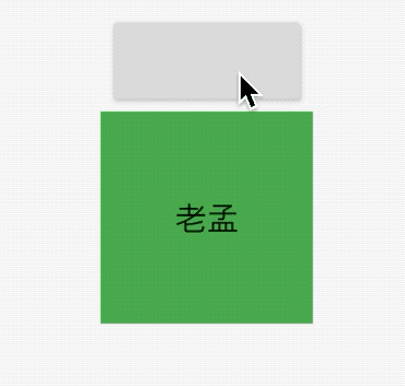
title: 'MaterialApp' description: '控件介绍' type: widgets
MaterialApp
在学习Flutter的过程中我们第一个看见的控件应该就是MaterialApp,毕竟创建一个新的Flutter项目的时候,项目第一个组件就是MaterialApp,这是一个Material风格的根控件,基本用法如下:
MaterialApp(
home: Scaffold(
appBar: AppBar(
title: Text('老孟'),
),
),
)
home参数是App默认显示的页面,效果如下:
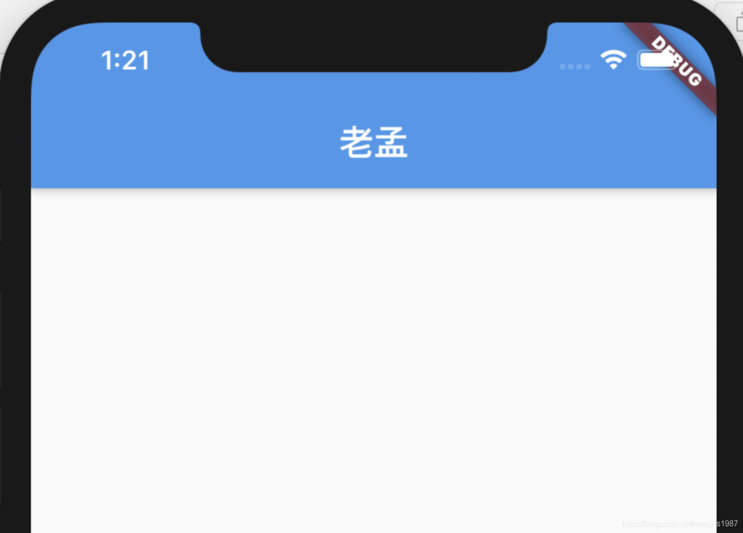
title参数是应用程序的描述,在Android上,在任务管理器的应用程序快照上面显示,在IOS上忽略此属性,IOS上任务管理器应用程序快照上面显示的是Info.plist文件中的CFBundleDisplayName。如果想根据区域显示不同的描述使用onGenerateTitle,用法如下:
MaterialApp(
title: '老孟',
onGenerateTitle: (context) {
var local = Localizations.localeOf(context);
if (local.languageCode == 'zh') {
return '老孟';
}
return 'laomeng';
},
...
)
routes、initialRoute、onGenerateRoute、onUnknownRoute是和路由相关的4个属性,路由简单的理解就是页面,路由的管理通常是指页面的管理,比如跳转、返回等。
MaterialApp按照如下的规则匹配路由:
- 路由为
/,home不为null则使用home。 - 使用
routes指定的路由。 - 使用
onGenerateRoute生成的路由,处理除home和routes以外的路由。 - 如果上面都不匹配则调用
onUnknownRoute。
是不是还是比较迷糊,不要紧,看下面的例子就明白了:
MaterialApp(
routes: {
'container': (context) => ContainerDemo(),
'fitted': (context) => FittedBoxDemo(),
'icon': (context) => IconDemo(),
},
initialRoute: '/',
home: Scaffold(
appBar: AppBar(
title: Text('老孟'),
),
),
onGenerateRoute: (RouteSettings routeSettings){
print('onGenerateRoute:$routeSettings');
if(routeSettings.name == 'icon'){
return MaterialPageRoute(builder: (context){
return IconDemo();
});
}
},
onUnknownRoute: (RouteSettings routeSettings){
print('onUnknownRoute:$routeSettings');
return MaterialPageRoute(builder: (context){
return IconDemo();
});
},
...
)
initialRoute设置为/,那么加载home页面。
如果initialRoute设置为icon,在routes中存在,所以加载routes中指定的路由,即IconDemo页面。
如果initialRoute设置为icons1,此时routes中并不存在名称为icons1的路由,调用onGenerateRoute,如果onGenerateRoute返回路由页面,则加载此页面,如果返回的是null,且home不为null,则加载home参数指定的页面,如果home为null,则回调onUnknownRoute。
theme、darkTheme、themeMode是关于主题的参数,设置整个App的主题,包括颜色、字体、形状等,修改主题颜色为红色用法如下:
MaterialApp(
theme: ThemeData(
primaryColor: Colors.red
),
darkTheme: ThemeData(
primaryColor: Colors.red
),
themeMode: ThemeMode.dark,
效果如下:
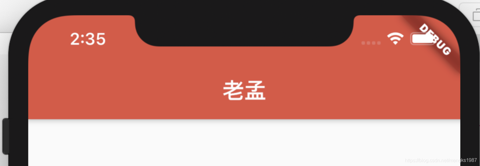
locale、localizationsDelegates、localeListResolutionCallback、localeResolutionCallback、supportedLocales是区域设置和国际化相关的参数,如果App支持多国语言,那么就需要设置这些参数,默认情况下,Flutter仅支持美国英语,如果想要添加其他语言支持则需要指定其他MaterialApp属性,并引入flutter_localizations 包,到2019年4月,flutter_localizations包已经支持52种语言,如果你想让你的应用在iOS上顺利运行,那么你还必须添加“flutter_cupertino_localizations”包。
在pubspec.yaml文件中添加包依赖:
dependencies:
flutter:
sdk: flutter
flutter_localizations:
sdk: flutter
flutter_cupertino_localizations: ^1.0.1
设置如下:
MaterialApp(
localizationsDelegates: [
GlobalMaterialLocalizations.delegate,
GlobalWidgetsLocalizations.delegate,
GlobalCupertinoLocalizations.delegate
],
supportedLocales: [
const Locale('zh', 'CH'),
const Locale('en', 'US'),
],
...
)
- GlobalMaterialLocalizations.delegate :为Material Components库提供了本地化的字符串和其他值。
- GlobalWidgetsLocalizations.delegate:定义widget默认的文本方向,从左到右或从右到左。
- GlobalCupertinoLocalizations.delegate:为Cupertino(ios风格)库提供了本地化的字符串和其他值。
supportedLocales参数指定了当前App支持的语言。
localeResolutionCallback和localeListResolutionCallback都是对语言变化的监听,比如切换系统语言等,localeResolutionCallback和localeListResolutionCallback的区别是localeResolutionCallback返回的第一个参数是当前语言的Locale,而localeListResolutionCallback返回当前手机支持的语言集合,在早期的版本手机没有支持语言的集合,只显示当前语言,在设置->语言和地区的设置选项效果如下:
在早期是没有红色区域的。
因此我们只需使用localeListResolutionCallback即可,通过用户手机支持的语言和当前App支持的语言返回一个语言选项。
通常情况下,如果用户的语言正好是App支持的语言,那么直接返回此语言,如果不支持,则返回一个默认的语言,用法如下:
MaterialApp(
localeListResolutionCallback:
(List<Locale> locales, Iterable<Locale> supportedLocales) {
if (locales.contains('zh')) {
return Locale('zh');
}
return Locale('en');
},
...
)
在App中也可以通过如下方法获取区域设置:
Locale myLocale = Localizations.localeOf(context);
还有几个方便调试的选项,debugShowMaterialGrid:打开网格调试
MaterialApp(
debugShowMaterialGrid: true,
效果如下:
showPerformanceOverlay:打开性能检测
MaterialApp(
showPerformanceOverlay: true,
效果如下:
右上角有一个DEBUG的标识,这是系统在debug模式下默认显示的,不显示的设置如下:
MaterialApp(
debugShowCheckedModeBanner: true,
...
)
CupertinoApp
我想你一定能想到既然有Material风格的MaterialApp,那么也应该有Cupertino(ios)风格与之相对应,是的Cupertino风格的是CupertinoApp,CupertinoApp的属性及用法和MaterialApp一模一样,就不在具体介绍了。
title: 'MaterialBanner' description: '' type: widget
MaterialBanner
Material 风格的标语(Banner)控件
基本用法:
MaterialBanner(
content: Text('老孟'),
actions: <Widget>[
IconButton(icon: Icon(Icons.add),onPressed: (){},),
IconButton(icon: Icon(Icons.close),onPressed: (){},)
],
)
设置内容样式:
MaterialBanner(
contentTextStyle: TextStyle(color: Colors.red),
content: Text('老孟'),
actions: <Widget>[
IconButton(icon: Icon(Icons.add),onPressed: (){},),
IconButton(icon: Icon(Icons.close),onPressed: (){},)
],
)
添加开头图标及内边距:
MaterialBanner(
leading: IconButton(
icon: Icon(Icons.person),
onPressed: (){},
),
leadingPadding: EdgeInsets.all(5),
content: Text('老孟'),
actions: <Widget>[
IconButton(
icon: Icon(Icons.add),
onPressed: () {},
),
IconButton(
icon: Icon(Icons.close),
onPressed: () {},
)
],
)
title: 'MaterialBannerTheme MaterialBannerThemeData' description: '' type: widget
MaterialBannerTheme
用于控制MaterialBanner组件的样式。
MaterialBannerTheme(
data: MaterialBannerTheme.of(context)
.copyWith(backgroundColor: Colors.red),
child: MaterialBanner(
content: Text('老孟'),
actions: <Widget>[
IconButton(
icon: Icon(Icons.add),
onPressed: () {},
),
IconButton(
icon: Icon(Icons.close),
onPressed: () {},
)
],
),
)
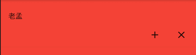
MaterialBannerThemeData
属性说明如下:
const MaterialBannerThemeData({
this.backgroundColor,//背景颜色
this.contentTextStyle,//内容文本样式
this.padding,//内边距
this.leadingPadding,// leading 内边距
})
title: 'MaterialTapTargetSize' description: '配置组件点击区域大小的属性' type: widgets
MaterialTapTargetSize
MaterialTapTargetSize并不是一个组件,是配置组件点击区域大小的属性,很多组件都有materialTapTargetSize属性,比如:
[FloatingActionButton], only the mini tap target size is increased.
* [MaterialButton]
* [OutlineButton]
* [FlatButton]
* [RaisedButton]
* [TimePicker]
* [SnackBar]
* [Chip]
* [RawChip]
* [InputChip]
* [ChoiceChip]
* [FilterChip]
* [ActionChip]
* [Radio]
* [Switch]
* [Checkbox]
MaterialTapTargetSize有2个值,分别为:
- padded:最小点击区域为48*48。
- shrinkWrap:子组件的实际大小。
源码如下:
BoxConstraints constraints;
switch (widget.materialTapTargetSize ?? theme.materialTapTargetSize) {
case MaterialTapTargetSize.padded:
constraints = const BoxConstraints(minHeight: kMinInteractiveDimension);
break;
case MaterialTapTargetSize.shrinkWrap:
constraints = const BoxConstraints();
break;
}
kMinInteractiveDimension值为48。
title: 'MediaQuery' description: '控件介绍' type: widgets
MediaQuery
通常情况下,不会直接将MediaQuery当作一个控件,而是使用MediaQuery.of获取当前设备的信息,用法如下:
var data = MediaQuery.of(context);
此方式必须放在MediaQuery作用域内,否则会抛出异常,MaterialApp和WidgetsApp都引入了MediaQuery,并且随着屏幕的变化而导致重建,比如旋转屏幕、弹出输入框等。
MediaQueryData
MediaQueryData是MediaQuery.of获取数据的类型。说明如下:
| 属性 | 说明 |
|---|---|
| size | 逻辑像素,并不是物理像素,类似于Android中的dp,逻辑像素会在不同大小的手机上显示的大小基本一样,物理像素 = size*devicePixelRatio。 |
| devicePixelRatio | 单位逻辑像素的物理像素数量,即设备像素比。 |
| textScaleFactor | 单位逻辑像素字体像素数,如果设置为1.5则比指定的字体大50%。 |
| platformBrightness | 当前设备的亮度模式,比如在Android Pie手机上进入省电模式,所有的App将会使用深色(dark)模式绘制。 |
| viewInsets | 被系统遮挡的部分,通常指键盘,弹出键盘,viewInsets.bottom表示键盘的高度。 |
| padding | 被系统遮挡的部分,通常指“刘海屏”或者系统状态栏。 |
| viewPadding | 被系统遮挡的部分,通常指“刘海屏”或者系统状态栏,此值独立于padding和viewInsets,它们的值从MediaQuery控件边界的边缘开始测量。在移动设备上,通常是全屏。 |
| systemGestureInsets | 显示屏边缘上系统“消耗”的区域输入事件,并阻止将这些事件传递给应用。比如在Android Q手势滑动用于页面导航(ios也一样),比如左滑退出当前页面。 |
| physicalDepth | 设备的最大深度,类似于三维空间的Z轴。 |
| alwaysUse24HourFormat | 是否是24小时制。 |
| accessibleNavigation | 用户是否使用诸如TalkBack或VoiceOver之类的辅助功能与应用程序进行交互,用于帮助视力有障碍的人进行使用。 |
| invertColors | 是否支持颜色反转。 |
| highContrast | 用户是否要求前景与背景之间的对比度高, iOS上,方法是通过“设置”->“辅助功能”->“增加对比度”。 此标志仅在运行iOS 13的iOS设备上更新或以上。 |
| disableAnimations | 平台是否要求尽可能禁用或减少动画。 |
| boldText | 平台是否要求使用粗体。 |
| orientation | 是横屏还是竖屏。 |
padding、viewPadding和viewInsets的区别如下:
使用场景
根据尺寸构建不同的布局
SafeArea控件就是通过MediaQuery.of来实现的,平板和手机的(或者横屏和竖屏)布局可能是不一样的,比如如下布局:
布局代码如下:
var screenSize = MediaQuery.of(context).size;
if(screenSize.width>oneColumnLayout){
//平板布局
}else{
//手机布局
}
oneColumnLayout表示一列布局的宽度。
系统字体变化
很多App都有一个功能就是调节字体大小,通过MediaQuery来实现,实现如下:
@override
Widget build(BuildContext context) {
var _data = MediaQuery.of(context).copyWith(textScaleFactor: 2.0);
return Scaffold(
appBar: AppBar(
title: Text('老孟'),
),
body: MediaQuery(
data: _data,
child: Text('字体变大'),
),
);
}
我们发现字体变大了一倍。
title: 'Menu PopupMenu 弹出菜单' description: '' type: widget
Menu
在Flutter中提供了两种方式来完成弹出菜单功能。
PopupMenuButton
使用PopupMenuButton,点击时弹出菜单,用法如下:
PopupMenuButton<String>(
itemBuilder: (context) {
return <PopupMenuEntry<String>>[
PopupMenuItem<String>(
value: '语文',
child: Text('语文'),
),
PopupMenuItem<String>(
value: '数学',
child: Text('数学'),
),
PopupMenuItem<String>(
value: '英语',
child: Text('英语'),
),
PopupMenuItem<String>(
value: '生物',
child: Text('生物'),
),
PopupMenuItem<String>(
value: '化学',
child: Text('化学'),
),
];
},
)
效果如下:
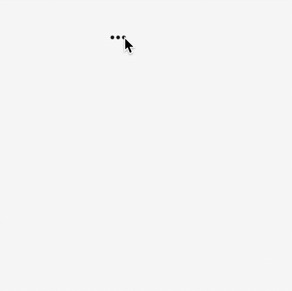
设置其初始值:
PopupMenuButton<String>(
initialValue: '语文',
...
)
设置初始值后,打开菜单后,设置的值将会高亮,效果如下:
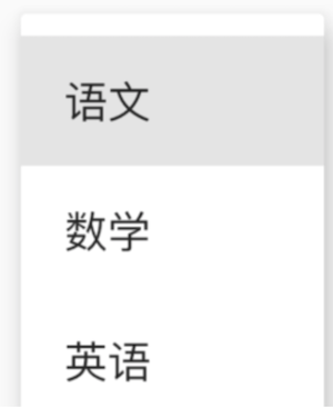
获取用户选择了某一项的值,或者用户未选中,代码如下:
PopupMenuButton<String>(
onSelected: (value){
print('$value');
},
onCanceled: (){
print('onCanceled');
},
...
)
tooltip是长按时弹出的提示,用法如下:
PopupMenuButton<String>(
tooltip: 'PopupMenuButton',
...
)
效果如下:
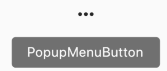
设置其阴影值、内边距和弹出菜单的背景颜色:
PopupMenuButton<String>(
elevation: 5,
padding: EdgeInsets.all(5),
color: Colors.red,
...
)
默认情况下,PopupMenuButton显示3个小圆点,我们也可以对齐进行设置,设置文字如下:
PopupMenuButton<String>(
child: Text('学科'),
...
)
child组件将会被InkWell包裹,点击弹出菜单,效果如下:

也可以设置其他图标:
PopupMenuButton<String>(
icon: Icon(Icons.add),
...
)
效果如下:
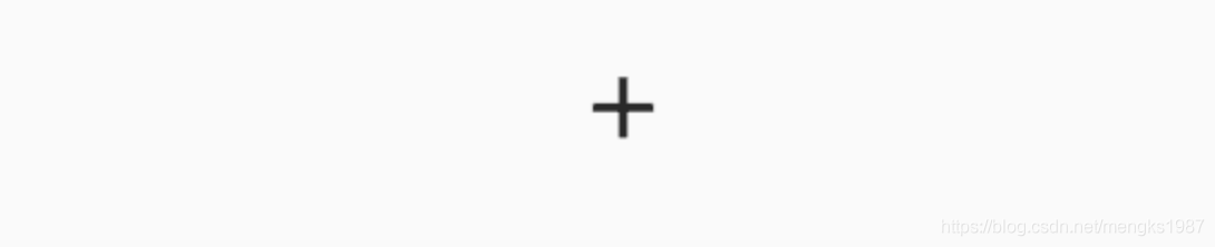
设置弹出菜单边框:
PopupMenuButton<String>(
shape: RoundedRectangleBorder(
side: BorderSide(
color: Colors.red
),
borderRadius: BorderRadius.circular(10)
),
...
)
效果如下:

menu有一个非常重要的参数Offset,这个参数是控制菜单弹出的位置,通常情况下,菜单在当前按钮下面展示:
PopupMenuButton<String>(
offset: Offset(0,100),
itemBuilder: (context) {
return <PopupMenuEntry<String>>[
PopupMenuItem<String>(
value: '语文',
child: Text('语文'),
),
PopupMenuItem<String>(
value: '数学',
child: Text('数学'),
),
];
},
)
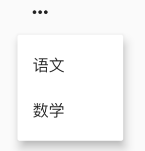
PopupMenuButton的每一项都需要是PopupMenuEntry类型,PopupMenuEntry为抽象类,其子类有PopupMenuItem、PopupMenuDivider、CheckedPopupMenuItem。
PopupMenuItem
构造函数为
参数说明:
- value:当此项选中后,此值将会通过
onSelected返回。 - enabled:此项是否可用。
- height:此项的高度
- textStyle:文本样式
- child:子控件。
用法如下:
PopupMenuButton<String>(
onSelected: (value) {
print('$value');
},
itemBuilder: (context) {
return <PopupMenuEntry<String>>[
PopupMenuItem<String>(
value: '语文',
enabled: false,
child: Text('语文'),
),
PopupMenuItem<String>(
value: '数学',
textStyle: TextStyle(color: Colors.red),
child: Text('数学'),
),
PopupMenuItem<String>(
value: '英语',
height: 100,
child: Text('英语'),
),
];
},
)
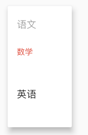
PopupMenuDivider
PopupMenuDivider是菜单分割线,用法如下:
PopupMenuButton<String>(
onSelected: (value) {
print('$value');
},
itemBuilder: (context) {
return <PopupMenuEntry<String>>[
PopupMenuItem<String>(
value: '语文',
child: Text('语文'),
),
PopupMenuDivider(),
PopupMenuItem<String>(
value: '数学',
child: Text('数学'),
),
];
},
)
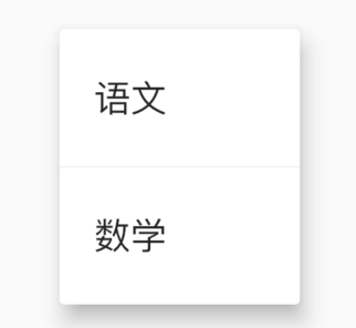
PopupMenuDivider默认高度为16,注意这个高度并不是分割线的高度,而是分割线控件的高度,设置为50代码:
PopupMenuDivider(height: 50,),
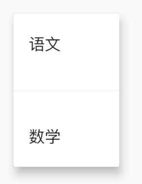
CheckedPopupMenuItem
CheckedPopupMenuItem是前面带是否选中的控件,本质就是一个ListTile,用法如下:
PopupMenuButton<String>(
onSelected: (value) {
print('$value');
},
itemBuilder: (context) {
return <PopupMenuEntry<String>>[
CheckedPopupMenuItem(
value: '语文',
checked: true,
child: Text('语文'),
),
CheckedPopupMenuItem(
value: '数学',
child: Text('数学'),
),
];
},
)
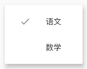
showMenu
如果你看下PopupMenuButton的源码会发现,PopupMenuButton也是使用showMenu实现的,用法如下:
showMenu(
context: context,
position: RelativeRect.fill,
items: <PopupMenuEntry>[
PopupMenuItem(child: Text('语文')),
PopupMenuDivider(),
CheckedPopupMenuItem(
child: Text('数学'),
checked: true,
),
PopupMenuDivider(),
PopupMenuItem(child: Text('英语')),
]);
position参数表示弹出的位置,效果如下:
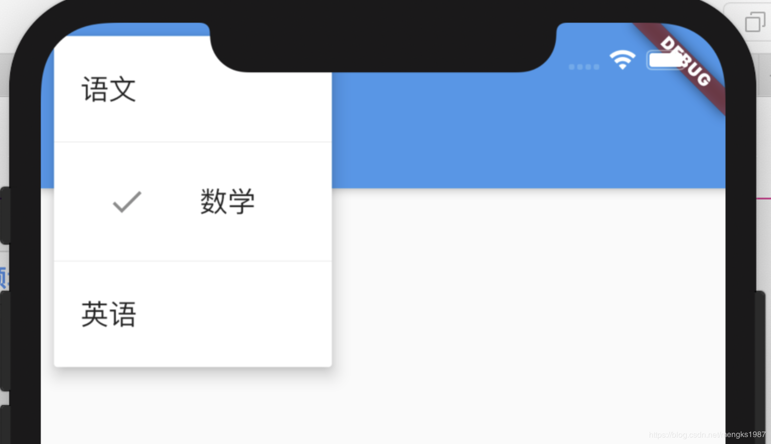
属性和PopupMenuButton基本一样,但使用showMenu需要我们指定位置,所以一般情况下,我们不会直接使用showMenu,而是使用PopupMenuButton,免去了计算位置的过程。
看下PopupMenuButton是如何计算的,有助于帮助我们理解:
final PopupMenuThemeData popupMenuTheme = PopupMenuTheme.of(context);
final RenderBox button = context.findRenderObject();
final RenderBox overlay = Overlay.of(context).context.findRenderObject();
final RelativeRect position = RelativeRect.fromRect(
Rect.fromPoints(
button.localToGlobal(widget.offset, ancestor: overlay),
button.localToGlobal(button.size.bottomRight(Offset.zero), ancestor: overlay),
),
Offset.zero & overlay.size,
);
final List<PopupMenuEntry<T>> items = widget.itemBuilder(context);
title: 'MergeableMaterial'
description: '子组件发生变化时,动画打开或者关闭子组件'
type: widget
MergeableMaterial
MergeableMaterial 展示一些MergeableMaterialItem组件,当子组件发生变化时,动画打开或者关闭,MergeableMaterial的父控件需要在主轴方向是一个没有限制的控件,比如SingleChildScrollView、Row、Column等。
基本用法如下:
SingleChildScrollView(
child: MergeableMaterial(
children: [
MaterialSlice(
key: ValueKey(1),
child: Container(
height: 45,
color: Colors.primaries[1 % Colors.primaries.length],
)),
MaterialGap(key: ValueKey(2)),
MaterialSlice(
key: ValueKey(3),
child: Container(
height: 45,
color: Colors.primaries[1 % Colors.primaries.length],
)),
MaterialGap(key: ValueKey(4)),
MaterialSlice(
key: ValueKey(5),
child: Container(
height: 45,
color: Colors.primaries[1 % Colors.primaries.length],
)),
],
),
)
效果如下:
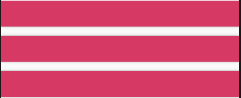
MergeableMaterial的子控件只能是MaterialSlice和MaterialGap,MaterialSlice是带子控件的控件,显示实际内容,MaterialGap用于分割,只能放在MaterialSlice中间。
静态情况下,看不出具体的效果,动态改变子组件用法如下:
List<MergeableMaterialItem> items = [];
List.generate(_count, (index) {
items.add(MaterialSlice(
key: ValueKey(index * 2),
child: Container(
height: 45,
color: Colors.primaries[index % Colors.primaries.length],
)));
});
return SingleChildScrollView(
child: MergeableMaterial(
children: items,
),
)
效果如下:
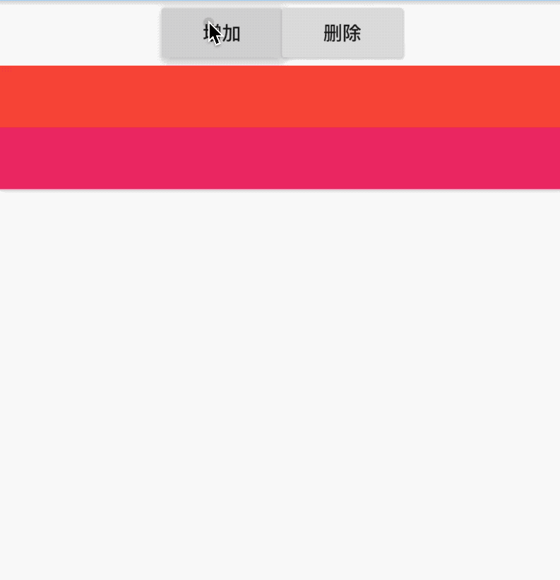
主要看增加/删除子组件时的动画效果。
增加分割线和阴影:
MergeableMaterial(
hasDividers: true,
elevation: 24,
children: items,
)
效果如下:
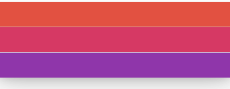
阴影值不能随便设置,只能设置如下值:1, 2, 3, 4, 6, 8, 9, 12, 16, 24
此控件可以实现什么样的效果呢?看下面效果:
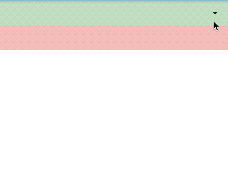
实现代码:
bool _expand = false;
@override
Widget build(BuildContext context) {
return Column(
children: <Widget>[
Container(
height: 45,
color: Colors.green.withOpacity(.3),
alignment: Alignment.centerRight,
child: IconButton(
icon: Icon(Icons.arrow_drop_down),
onPressed: () {
setState(() {
_expand = !_expand;
});
},
),
),
_expand
? MergeableMaterial(
hasDividers: true,
elevation: 24,
children: [
MaterialSlice(
key: ValueKey(1),
child: Container(
height: 200,
color: Colors.green.withOpacity(.3),
))
],
)
: Container(),
Container(
height: 45,
color: Colors.red.withOpacity(.3),
),
],
);
}
看到这个效果是否想到了ExpansionPanelList呢?系统控件ExpansionPanelList就是使用此控件实现的。
title: 'ModalBarrier' description: '防止用户与其自身背后的组件进行交互的组件' type: widgets
ModalBarrier
ModalBarrier是一个静态蒙层控件,ModalRoute控件就是间接使用的此控件,此控件有点击属性,点击会调用
if (dismissible)
Navigator.maybePop(context);
和Dialog相似,用法如下:
Center(
child: Container(
height: 100,
width: 100,
child: ModalBarrier(
color: Colors.black.withOpacity(.4),
),
),
)
效果如下:
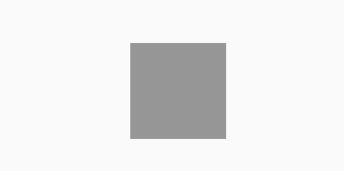
dismissible表示是否可点击。
title: 'NavigationToolbar' description: '布局水平方向上3个子组件' type: widgets
NavigationToolbar
NavigationToolbar是一个布局控件,控制3个子组件,用法如下:
NavigationToolbar(
leading: IconButton(
icon: Icon(Icons.add),
),
middle: IconButton(
icon: Icon(Icons.clear),
),
trailing: IconButton(
icon: Icon(Icons.home),
),
)
效果如下:
centerMiddle参数表示中间控件是否居中,默认为true,设置为false,中间控件靠近第一个控件,代码如下:
NavigationToolbar(
centerMiddle: false,
leading: IconButton(
icon: Icon(Icons.add),
),
middle: IconButton(
icon: Icon(Icons.clear),
),
trailing: IconButton(
icon: Icon(Icons.home),
),
)
效果如下:
middleSpacing中间控件的间距,用法如下:
NavigationToolbar(
centerMiddle: false,
middleSpacing: 30,
leading: IconButton(
icon: Icon(Icons.add),
),
middle: IconButton(
icon: Icon(Icons.clear),
),
trailing: IconButton(
icon: Icon(Icons.home),
),
)
title: 'Navigator route 导航 路由' description: '' type: widget
Navigator
Navigator 是管理路由的控件,通常情况下直接使用Navigator.of(context)的方法来跳转页面,之所以可以直接使用Navigator.of(context)是因为在WidgetsApp中使用了此控件,应用程序的根控件通常是MaterialApp,MaterialApp包含WidgetsApp,所以可以直接使用Navigator的相关属性。
Navigator用法非常简单,如下:
Navigator(
initialRoute: '/',
onGenerateRoute: (RouteSettings settings) {
WidgetBuilder builder;
switch (settings.name) {
case 'home':
builder = (context) => PageA();
break;
case 'user':
builder = (context) => PageB();
break;
}
return MaterialPageRoute(builder: builder, settings: settings);
},
)
initialRoute表示初始化路由,onGenerateRoute表示根据RouteSettings生成路由。
那么在什么情况下需要使用Navigator?在需要局部页面跳转的地方使用Navigator,如下面的场景:
头条客户端举报场景
头条客户端每一个新闻下面都有一个“叉号”,点击弹出相关信息,点击其中的局部,会在当前小窗户内跳转到举报页面,效果如下:

此场景就是使用Navigator的典型场景,点击举报,并不是全屏切换页面,而是仅仅在当前弹出的页面进行切换。
首页代码如下:
@override
Widget build(BuildContext context) {
return Center(
child: Container(
height: 350,
width: 300,
child: Navigator(
initialRoute: '/',
onGenerateRoute: (RouteSettings settins) {
WidgetBuilder builder;
switch (settins.name) {
case '/':
builder = (context) => PageC();
break;
}
return MaterialPageRoute(builder: builder);
},
),
),
);
}
Navigator的初始化路由为PageC页面,PageC页面代码如下:
class PageC extends StatelessWidget {
@override
Widget build(BuildContext context) {
return Center(
child: Card(
child: Column(
children: <Widget>[
_buildItem(Icons.clear, '不感兴趣', '减少这类内容'),
Divider(),
_buildItem(Icons.access_alarm, '举报', '标题夸张,内容质量差 等',
showArrow: true, onPress: () {
Navigator.of(context).push(MaterialPageRoute(builder: (context) {
return PageD();
}));
}),
Divider(),
_buildItem(Icons.perm_identity, '拉黑作者:新华网客户端', ''),
Divider(),
_buildItem(Icons.account_circle, '屏蔽', '军事视频、驾驶员等'),
],
),
),
);
}
_buildItem(IconData iconData, String title, String content,
{bool showArrow = false, Function onPress}) {
return Row(
children: <Widget>[
Icon(iconData),
SizedBox(
width: 20,
),
Expanded(
child: Column(
crossAxisAlignment: CrossAxisAlignment.start,
children: <Widget>[
Text(
title,
style: TextStyle(fontSize: 18),
),
Text(
content,
style: TextStyle(
color: Colors.black.withOpacity(.5), fontSize: 14),
)
],
),
),
!showArrow
? Container()
: IconButton(
icon: Icon(Icons.arrow_forward_ios),
iconSize: 16,
onPressed: onPress,
),
],
);
}
}
PageC页面跳转到PageD页面,PageD页面代码如下:
class PageD extends StatelessWidget {
@override
Widget build(BuildContext context) {
return Container(
height: 200,
width: 250,
color: Colors.grey.withOpacity(.5),
child: Column(
children: <Widget>[
Row(
children: <Widget>[
IconButton(
icon: Icon(Icons.arrow_back_ios),
onPressed: () {
Navigator.of(context).pop();
},
),
Text('返回'),
SizedBox(
width: 30,
),
Text('举报'),
],
),
],
),
);
}
}
最终实现了局部跳转效果,只在中间区域变化,其他区域不变。
Tab内跳转
还有一个典型到应用场景就Tab内跳转,效果如下:
底部导航一直存在,每个tab都有自己的导航器。
首页代码如下:
class TabMain extends StatefulWidget {
@override
State<StatefulWidget> createState() => _TabMainState();
}
class _TabMainState extends State<TabMain> {
int _currentIndex = 0;
@override
Widget build(BuildContext context) {
return Scaffold(
body: IndexedStack(
index: _currentIndex,
children: <Widget>[
TabNavigator(0),
TabNavigator(1),
TabNavigator(2),
],
),
bottomNavigationBar: BottomNavigationBar(
onTap: (int index) {
setState(() {
_currentIndex = index;
});
},
currentIndex: _currentIndex,
items: <BottomNavigationBarItem>[
BottomNavigationBarItem(title: Text('首页'), icon: Icon(Icons.home)),
BottomNavigationBarItem(title: Text('书籍'), icon: Icon(Icons.book)),
BottomNavigationBarItem(
title: Text('我的'), icon: Icon(Icons.perm_identity)),
],
),
);
}
}
首页定义了3个tab及切换效果。
定义TabNavigator:
class TabNavigator extends StatelessWidget {
TabNavigator(this.index);
final int index;
@override
Widget build(BuildContext context) {
return Navigator(
initialRoute: '/',
onGenerateRoute: (RouteSettings settins) {
WidgetBuilder builder;
switch (settins.name) {
case '/':
builder = (context) => ListPage(index);
break;
}
return MaterialPageRoute(builder: builder);
},
);
}
}
列表页面,此页面一般为List页面,点击其中一个跳转到相关详情页面,这里为了简便,只放了一个跳转按钮:
class ListPage extends StatelessWidget {
ListPage(this.index);
final int index;
@override
Widget build(BuildContext context) {
return Scaffold(
appBar: AppBar(),
body: Center(
child: RaisedButton(
child: Text('$index'),
onPressed: () {
Navigator.of(context).push(MaterialPageRoute(builder: (context) {
return DetailPage();
}));
},
),
),
);
}
}
详情页面
class DetailPage extends StatelessWidget {
@override
Widget build(BuildContext context) {
return Scaffold(
appBar: AppBar(),
body: Center(
child: Text('DetailPage'),
),
);
}
}
虽然Navigator控件不是特别常用,但在一些场景下非常适用。
title: 'NestedScrollView' description: '在其内部嵌套其他滚动视图的滚动视图' type: widgets
NestedScrollView
可以在其内部嵌套其他滚动视图的滚动视图,其滚动位置是固有链接的。
在普通的[ScrollView]中, 如果有一个Sliver组件容纳了一个[TabBarView],它沿相反的方向滚动(例如,允许用户在标签所代表的页面之间水平滑动,而列表则垂直滚动),则该[TabBarView]内部的任何列表都不会相互作用 与外部[ScrollView]。 例如,浏览内部列表以滚动到顶部不会导致外部[ScrollView]中的[SliverAppBar]折叠以展开。
滚动隐藏AppBar
用法如下:
NestedScrollView(
headerSliverBuilder: (BuildContext context, bool innerBoxIsScrolled) {
return <Widget>[SliverAppBar(
title: Text('老孟'),
)];
},
body: ListView.builder(itemBuilder: (BuildContext context,int index){
return Container(
height: 80,
color: Colors.primaries[index % Colors.primaries.length],
alignment: Alignment.center,
child: Text(
'$index',
style: TextStyle(color: Colors.white, fontSize: 20),
),
);
},itemCount: 20,),
)
效果如下:
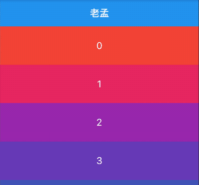
SliverAppBar展开折叠
用法如下:
NestedScrollView(
headerSliverBuilder: (BuildContext context, bool innerBoxIsScrolled) {
return <Widget>[SliverAppBar(
expandedHeight: 230.0,
pinned: true,
flexibleSpace: FlexibleSpaceBar(
title: Text('复仇者联盟'),
background: Image.network(
'http://img.haote.com/upload/20180918/2018091815372344164.jpg',
fit: BoxFit.fitHeight,
),
),
)];
},
body: ListView.builder(itemBuilder: (BuildContext context,int index){
return Container(
height: 80,
color: Colors.primaries[index % Colors.primaries.length],
alignment: Alignment.center,
child: Text(
'$index',
style: TextStyle(color: Colors.white, fontSize: 20),
),
);
},itemCount: 20,),
)
效果如下:
与TabBar配合使用
用法如下:
NestedScrollView(
headerSliverBuilder: (BuildContext context, bool innerBoxIsScrolled) {
return <Widget>[
SliverAppBar(
expandedHeight: 230.0,
pinned: true,
flexibleSpace: Padding(
padding: EdgeInsets.symmetric(vertical: 8),
child: PageView(),
),
),
SliverPersistentHeader(
pinned: true,
delegate: StickyTabBarDelegate(
child: TabBar(
labelColor: Colors.black,
controller: this._tabController,
tabs: <Widget>[
Tab(text: '资讯'),
Tab(text: '技术'),
],
),
),
),
];
},
body: TabBarView(
controller: this._tabController,
children: <Widget>[
RefreshIndicator(
onRefresh: (){
print(('onRefresh'));
},
child: _buildTabNewsList(_newsKey, _newsList),
),
_buildTabNewsList(_technologyKey, _technologyList),
],
),
)
StickyTabBarDelegate 代码如下:
class StickyTabBarDelegate extends SliverPersistentHeaderDelegate {
final TabBar child;
StickyTabBarDelegate({@required this.child});
@override
Widget build(
BuildContext context, double shrinkOffset, bool overlapsContent) {
return Container(
color: Theme.of(context).backgroundColor,
child: this.child,
);
}
@override
double get maxExtent => this.child.preferredSize.height;
@override
double get minExtent => this.child.preferredSize.height;
@override
bool shouldRebuild(SliverPersistentHeaderDelegate oldDelegate) {
return true;
}
}
效果如下:

通过scrollDirection和reverse参数控制其滚动方向,用法如下:
NestedScrollView(
scrollDirection: Axis.horizontal,
reverse: true,
...
)
scrollDirection滚动方向,分为垂直和水平方向。
reverse参数表示反转滚动方向,并不是有垂直转为水平,而是垂直方向滚动时,默认向下滚动,reverse设置false,滚动方向改为向上,同理水平滚动改为水平向左。
controller为滚动控制器,可以监听滚到的位置,设置滚动的位置等,用法如下:
_scrollController = ScrollController();
//监听滚动位置
_scrollController.addListener((){
print('${_scrollController.position}');
});
//滚动到指定位置
_scrollController.animateTo(20.0);
CustomScrollView(
controller: _scrollController,
...
)
physics表示可滚动组件的物理滚动特性,具体查看ScrollPhysics
title: 'NotificationListener' description: '以冒泡的方式监听[Notification]' type: widgets
NotificationListener
NotificationListener是以冒泡的方式监听Notification的组件,冒泡方式就是向上传递,从子组件向父组件传递。
系统定义了很多Notification,比如SizeChangedLayoutNotification、ScrollNotification、KeepAliveNotification、OverscrollIndicatorNotification、DraggableScrollableNotification等。
监听ListView的滚动事件
下面监听最常见的ListView:
NotificationListener<ScrollNotification>(
onNotification: (ScrollNotification notification) {
print('$notification');
return true;
},
child: ListView.builder(
itemBuilder: (context, index) {
return ListTile(
title: Text('index:$index'),
);
},
itemCount: 100,
),
)
打印日志:
ScrollStartNotification(depth: 0 (local), FixedScrollMetrics(0.0..[896.0]..4782.0), DragStartDetails(Offset(153.3, 520.3)))
UserScrollNotification(depth: 0 (local), FixedScrollMetrics(0.0..[896.0]..4782.0), direction: ScrollDirection.reverse)
ScrollUpdateNotification(depth: 0 (local), FixedScrollMetrics(1.2..[896.0]..4780.8), scrollDelta: 1.1666666666666667, DragUpdateDetails(Offset(0.0, -1.7)))
...ScrollUpdateNotification...
flutter: ScrollEndNotification(depth: 0 (local), FixedScrollMetrics(296.5..[896.0]..4485.5), DragEndDetails(Velocity(0.0, 0.0)))
flutter: UserScrollNotification(depth: 0 (local), FixedScrollMetrics(296.5..[896.0]..4485.5), direction: ScrollDirection.idle)
ScrollNotification中metrics 类型是ScrollMetrics,ScrollMetrics属性说明如下:
- pixels:当前的位置
- minScrollExtent:最小滚动距离
- maxScrollExtent:最大滚动距离
- viewportDimension:滚动控件的长度
- axisDirection:滚动的方向,向上、下、左、右
- axis:滚动控件的轴向,垂直或者水平
- outOfRange:是否超出滚动范围
- atEdge:是否在边缘(开始或者结束的位置),
- extentBefore:距离开始的距离,==0,表示在开始处。
- extentAfter:距离结尾的距离,==0,表示在末尾处。
- extentInside:控件范围内的列表长度
自定义监听事件
自定义事件:
class CustomNotification extends Notification {
CustomNotification(this.value);
final String value;
}
发送和接收事件:
NotificationListener<CustomNotification>(
onNotification: (CustomNotification notification) {
print('介绍事件——2:${notification.value}');
return true;
},
child: Center(
child: Builder(
builder: (context) {
return RaisedButton(
child: Text('发送'),
onPressed: () {
CustomNotification('自定义事件').dispatch(context);
},
);
},
),
),
)
运行打印 :
flutter: 介绍事件——2:自定义事件
onNotification的方法需要返回bool值,返回true,表示当前事件不在向上传递,false表示继续向上传递,
代码修改如下:
NotificationListener<CustomNotification>(
onNotification: (CustomNotification notification) {
print('介绍事件——1:${notification.value}');
return true;
},
child: NotificationListener<CustomNotification>(
onNotification: (CustomNotification notification) {
print('介绍事件——2:${notification.value}');
return false;
},
child: Center(
child: Builder(
builder: (context) {
return RaisedButton(
child: Text('发送'),
onPressed: () {
CustomNotification('自定义事件').dispatch(context);
},
);
},
),
),
))
在事件-2中返回false,打印日志:
flutter: 介绍事件——2:自定义事件
flutter: 介绍事件——1:自定义事件
返回true,打印日志:
flutter: 介绍事件——2:自定义事件
说明,返回true,当前事件不在向上传递。
title: 'Offstage' description: '控件介绍' type: widgets
Offstage
控制是否显示组件:
Offstage({
Key key,
this.offstage = true,
Widget child
})
当offstage为true,当前控件不会被绘制在屏幕上,不会响应点击事件,也不会占用空间,当offstage为false,当前控件则跟平常用的控件一样渲染绘制。
通过一个参数,来控制child是否显示,日常使用中也算是比较常用的控件
当offstage为true,控件隐藏; 当offstage为false,显示;
当Offstage不可见的时候,如果child有动画等,需要手动停掉,Offstage并不会停掉动画等操作。
案例
Column(
children: <Widget>[
Offstage(
offstage: _isOff,
child: Text("Offstage组件"),
),
RaisedButton(
child: Text(_isOff?'显示':'隐藏'),
onPressed: () {
setState(() {
_isOff = !_isOff;
});
},
)
],
)
本文由Rock提供。
title: 'Opacity' description: '控件介绍' type: widgets
Opacity
Flutter中移除一个控件非常容易,只需要在重新创建中移除即可,如果想要移除控件同时它的位置依然保留,类似于Android中View的invisible,比如Row中有3个颜色块,分别为1、2、3,代码如下:
Row(
mainAxisAlignment: MainAxisAlignment.center,
children: <Widget>[
Container(
height: 80,
width: 80,
color: Colors.red,
alignment: Alignment.center,
child: Text('1',style: TextStyle(color: Colors.white),),
),
Container(
height: 80,
width: 80,
color: Colors.green,
alignment: Alignment.center,
child: Text('2',style: TextStyle(color: Colors.white),),
),
Container(
height: 80,
width: 80,
color: Colors.blue,
alignment: Alignment.center,
child: Text('3',style: TextStyle(color: Colors.white),),
),
],
)
效果如下:
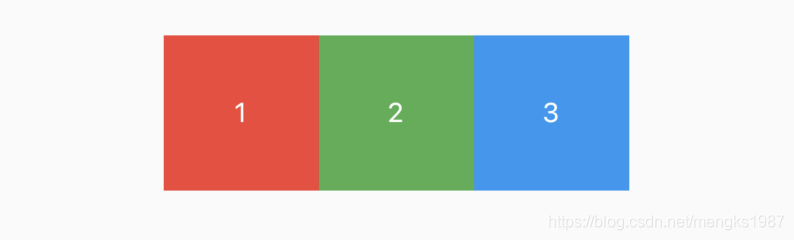
这时想要移除2,同时还保留2的位置,可以使用Opacity控件实现,代码如下:
Opacity(
opacity: 0.0,
child: Container(
height: 80,
width: 80,
color: Colors.green,
alignment: Alignment.center,
child: Text('2',style: TextStyle(color: Colors.white),),
),
)
效果如下:
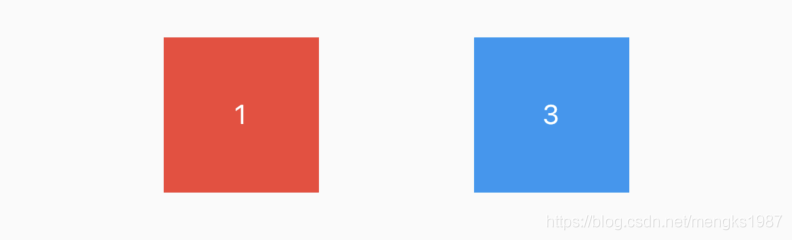
使用Opacity控件和另一个控件层叠在一起,将会出现“蒙层效果”:
Stack(
children: <Widget>[
Image.network(
'https://timgsa.baidu.com/timg?image&quality=80&size=b9999_10000&sec=1582204321233&di=ac7e8572222e1781cef5ad3add4daead&imgtype=0&src=http%3A%2F%2Fn.sinaimg.cn%2Fsinacn15%2F275%2Fw640h435%2F20181010%2Fcaba-hkrzvkw4936632.jpg',
),
Positioned.fill(
child: Opacity(
opacity: 0.5,
child: Container(
decoration: BoxDecoration(
gradient: LinearGradient(
colors: [Colors.white, Colors.blue],
begin: Alignment.bottomCenter,
end: Alignment.topCenter),
),
),
),
),
],
)
效果如下:
AnimatedOpacity
甚至我们可以使用AnimatedOpacity控件实现动画效果:
bool click = false;
AnimatedOpacity(
onEnd: () {
setState(() {
click = !click;
});
},
duration: Duration(seconds: 3),
opacity: click ? 0.2 : 0.8,
child: Container(
decoration: BoxDecoration(
gradient: LinearGradient(
colors: [Colors.white, Colors.grey],
),
),
),
)
动画效果:
title: 'OrientationBuilder' description: '构建依赖父组件方向(与设备方向不同)的控件,屏幕方向发生变化时此控件重构' type: widgets
OrientationBuilder
当手机的屏幕由横屏切换竖屏时,UI布局通常也会发生变化,可以通过OrientationBuilder来实现此效果,用法如下:
OrientationBuilder(
builder: (BuildContext context, Orientation orientation) {
int count = orientation == Orientation.portrait ? 3 : 5;
return GridView.builder(
gridDelegate: SliverGridDelegateWithFixedCrossAxisCount(
crossAxisCount: count, crossAxisSpacing: 2, mainAxisSpacing: 4),
itemBuilder: (context, index) {
return Container(
color: Colors.primaries[index % Colors.primaries.length],
);
},
itemCount: 30,
);
},
)
竖屏效果:
横屏效果:
title: 'OverflowBox' description: '控件介绍' type: widgets
OverflowBox
溢出父容器显示,允许child超出父容器的范围显示
OverflowBox({
Key key,
this.alignment = Alignment.center,//对齐方式。
this.minWidth,//允许child的最小宽度。如果child宽度小于这个值,则按照最小宽度进行显示。
this.maxWidth,//允许child的最大宽度。如果child宽度大于这个值,则按照最大宽度进行展示。
this.minHeight,//允许child的最小高度。如果child高度小于这个值,则按照最小高度进行显示。
this.maxHeight,//允许child的最大高度。如果child高度大于这个值,则按照最大高度进行展示。
Widget child,
})
OverflowBox,允许child超出parent的范围显示,当然不用这个控件,也有很多种方式实现类似的效果。
- 当OverflowBox的最大尺寸大于child的时候,child可以完整显示,
- 当其小于child的时候,则以最大尺寸为基准,当然,这个尺寸都是可以突破父节点的。。
- 当最小以及最大宽高度,如果为null的时候,就取父节点的constraint代替。
案例
Container(
color: Colors.green,
width: 200.0,
height: 200.0,
padding: const EdgeInsets.all(5.0),
child: OverflowBox(
alignment: Alignment.topLeft,
maxWidth: 300.0,
maxHeight: 500.0,
child: Container(
color: Color(0x33FF00FF),
width: 400.0,
height: 400.0,
),
),
)
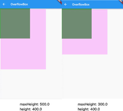
本文由Rock提供。
title: 'Overlay' description: '蒙层控件,可以在当前App显示一个浮层' type: widgets
Overlay
Overlay是蒙层控件,可以在当前App显示一个浮层,用法如下:
RaisedButton(
onPressed: () {
var overlayState = Overlay.of(context);
OverlayEntry overlayEntry = new OverlayEntry(
builder: (context) {
return Align(
alignment: Alignment.bottomCenter,
child: Container(height: 200, width: 200, color: Colors.blue.withOpacity(0.4)),
);
});
overlayState.insert(overlayEntry);
},
)
Overlay通常的用法是,点击一个按钮,弹出一个浮层。
Overlay后一个典型的应用场景就是toast
title: 'Padding' description: '控件介绍' type: widgets
Padding
Padding提供设置内边距的组件,用法非常简单:
Padding(
padding: EdgeInsets.all(20),
child: Text('老孟,一枚有态度的程序员'),
)
主要看下设置padding值的方式,单独设置每一个边:
Padding(
padding: EdgeInsets.only(left: 5, right: 5, top: 5, bottom: 5),
child: Text('老孟,一枚有态度的程序员'),
)
设置垂直和水平方向:
EdgeInsets.symmetric(vertical: 5,horizontal: 5)
title: 'PageView' description: '控件介绍' type: widgets
PageView
PageView控件可以实现一个“图片轮播”的效果,PageView不仅可以水平滑动也可以垂直滑动,简单用法如下:
PageView(
children: <Widget>[
MyPage1(),
MyPage2(),
MyPage3(),
],
)
PageView滚动方向默认是水平,可以设置其为垂直方向:
PageView(
scrollDirection: Axis.vertical,
...
)
PageView配合PageController可以实现非常酷炫的效果,控制每一个Page不占满,
PageView(
controller: PageController(
viewportFraction: 0.9,
),
...
)
PageController中属性initialPage表示当前加载第几页,默认第一页。
onPageChanged属性是页面发生变化时的回调,用法如下:
PageView(
onPageChanged: (int index){
},
...
)
无限滚动
PageView滚动到最后时希望滚动到第一个页面,这样看起来PageView是无限滚动的:
List<Widget> pageList = [PageView1(), PageView2(), PageView3()];
PageView.builder(
itemCount: 10000,
itemBuilder: (context, index) {
return pageList[index % (pageList.length)];
},
)
巧妙的利用取余重复构建页面实现PageView无限滚动的效果:
实现指示器
指示器显示总数和当前位置,通过onPageChanged确定当前页数并更新指示器。
List<String> pageList = ['PageView1', 'PageView2', 'PageView3'];
int _currentPageIndex = 0;
_buildPageView() {
return Center(
child: Container(
height: 230,
child: Stack(
children: <Widget>[
PageView.builder(
onPageChanged: (int index) {
setState(() {
_currentPageIndex = index % (pageList.length);
});
},
itemCount: 10000,
itemBuilder: (context, index) {
return _buildPageViewItem(pageList[index % (pageList.length)]);
},
),
Positioned(
bottom: 10,
left: 0,
right: 0,
child: Container(
child: Row(
mainAxisAlignment: MainAxisAlignment.center,
children: List.generate(pageList.length, (i) {
return Container(
margin: EdgeInsets.symmetric(horizontal: 5),
width: 10,
height: 10,
decoration: BoxDecoration(
shape: BoxShape.circle,
color: _currentPageIndex == i
? Colors.blue
: Colors.grey),
);
}).toList(),
),
),
),
],
),
),
);
}
_buildPageViewItem(String txt, {Color color = Colors.red}) {
return Container(
color: color,
alignment: Alignment.center,
child: Text(
txt,
style: TextStyle(color: Colors.white, fontSize: 28),
),
);
}
效果如下:
切换动画
如此常见的切换效果显然不能体验我们独特的个性,我们需要更炫酷的方式,看下面的效果:
在滑出的时候当前页面逐渐缩小并居中,通过给PageController添加监听获取当前滑动的进度:
_pageController.addListener(() {
setState(() {
_currPageValue = _pageController.page;
});
});
通过当前的进度计算各个页面的缩放系数及平移系数,通过 判断当前构建的是哪个页面
if (index == _currPageValue.floor()) {
//当前的item
var currScale = 1 - (_currPageValue - index) * (1 - _scaleFactor);
} else if (index == _currPageValue.floor() + 1) {
//右边的item
} else if (index == _currPageValue.floor() - 1) {
//左边
} else {
//其他,不在屏幕显示的item
}
通过对这几种类型的页面的缩放和平移达到我们想要的效果。
完整代码:
class ViewPage extends StatefulWidget {
@override
State<StatefulWidget> createState() => _ViewPageState();
}
class _ViewPageState extends State<ViewPage> {
var imgList = [
'https://ss1.bdstatic.com/70cFvXSh_Q1YnxGkpoWK1HF6hhy/it/u=2877516247,37083492&fm=26&gp=0.jpg',
'https://timgsa.baidu.com/timg?image&quality=80&size=b9999_10000&sec=1582796218195&di=04ce93c4ac826e19067e71f916cec5d8&imgtype=0&src=http%3A%2F%2Fhbimg.b0.upaiyun.com%2F344fda8b47808261c946c81645bff489c008326f15140-koiNr3_fw658'
];
PageController _pageController;
var _currPageValue = 0.0;
//缩放系数
double _scaleFactor = .8;
//view page height
double _height = 230.0;
@override
void initState() {
super.initState();
_pageController = PageController(viewportFraction: 0.9);
_pageController.addListener(() {
setState(() {
_currPageValue = _pageController.page;
});
});
}
@override
void dispose() {
super.dispose();
_pageController.dispose();
}
@override
Widget build(BuildContext context) {
return Container(
height: _height,
child: PageView.builder(
itemBuilder: (context, index) => _buildPageItem(index),
itemCount: 10,
controller: _pageController,
));
}
_buildPageItem(int index) {
Matrix4 matrix4 = Matrix4.identity();
if (index == _currPageValue.floor()) {
//当前的item
var currScale = 1 - (_currPageValue - index) * (1 - _scaleFactor);
var currTrans = _height * (1 - currScale) / 2;
matrix4 = Matrix4.diagonal3Values(1.0, currScale, 1.0)
..setTranslationRaw(0.0, currTrans, 0.0);
} else if (index == _currPageValue.floor() + 1) {
//右边的item
var currScale =
_scaleFactor + (_currPageValue - index + 1) * (1 - _scaleFactor);
var currTrans = _height * (1 - currScale) / 2;
matrix4 = Matrix4.diagonal3Values(1.0, currScale, 1.0)
..setTranslationRaw(0.0, currTrans, 0.0);
} else if (index == _currPageValue.floor() - 1) {
//左边
var currScale = 1 - (_currPageValue - index) * (1 - _scaleFactor);
var currTrans = _height * (1 - currScale) / 2;
matrix4 = Matrix4.diagonal3Values(1.0, currScale, 1.0)
..setTranslationRaw(0.0, currTrans, 0.0);
} else {
//其他,不在屏幕显示的item
matrix4 = Matrix4.diagonal3Values(1.0, _scaleFactor, 1.0)
..setTranslationRaw(0.0, _height * (1 - _scaleFactor) / 2, 0.0);
}
return Transform(
transform: matrix4,
child: Padding(
padding: EdgeInsets.symmetric(horizontal: 10),
child: Container(
decoration: BoxDecoration(
borderRadius: BorderRadius.circular(12),
image: DecorationImage(
image: NetworkImage(imgList[index % 2]), fit: BoxFit.fill),
),
),
),
);
}
}
推荐几款Github上带动画效果的PageView
title: 'PaginatedDataTable' description: '带分页功能的DataTable' type: widgets
PaginatedDataTable
PaginatedDataTable是一个带分页功能的DataTable,生成一批数据,项目中此一般通过服务器获取,定义model类:
class User {
User(this.name, this.age, this.sex);
final String name;
final int age;
final String sex;
}
生成数据:
List<User> _data = [];
@override
void initState() {
List.generate(100, (index) {
_data.add(User('老孟$index', index % 50, index % 2 == 0 ? '男' : '女'));
});
super.initState();
}
PaginatedDataTable的基础用法如下:
PaginatedDataTable(
header: Text('header'),
columns: [
DataColumn(label: Text('姓名')),
DataColumn(label: Text('性别')),
DataColumn(label: Text('年龄')),
],
source: MyDataTableSource(_data),
)
header表示表格顶部控件。
columns表示每一列的列头控件。
source表示数据源,需要继承DataTableSource,用法如下:
class MyDataTableSource extends DataTableSource {
MyDataTableSource(this.data);
final List<User> data;
@override
DataRow getRow(int index) {
if (index >= data.length) {
return null;
}
return DataRow.byIndex(
index: index,
cells: [
DataCell(Text('${data[index].name}')),
DataCell(Text('${data[index].sex}')),
DataCell(Text('${data[index].age}')),
],
);
}
@override
int get selectedRowCount {
return 0;
}
@override
bool get isRowCountApproximate {
return false;
}
@override
int get rowCount {
return data.length;
}
}
效果如下:
getRow是根据index获取每一行的数据,通常使用DataRow.byIndex返回数据,cells表示每一个表格的数据,cells的数量需要与PaginatedDataTable中columns数量保持一致。
selectedRowCount是选中的行数,注意这里不是索引,是总共选中的行数。
isRowCountApproximate:如果isRowCountApproximate设置为true,行数将会无尽大,所以正常情况下isRowCountApproximate设置为false。
rowCount表示行数,如果isRowCountApproximate设置为true,此属性无效。
设置actions,显示在header的右端,用法如下:
PaginatedDataTable(
header: Text('header'),
actions: <Widget>[
IconButton(icon: Icon(Icons.add),onPressed: (){},),
IconButton(icon: Icon(Icons.delete),onPressed: (){},),
],
...
)
效果如下:
rowsPerPage表示每页显示的行数,默认10行,设置5行如下:
PaginatedDataTable(
rowsPerPage: 5,
...
)
onRowsPerPageChanged不为null时,在左下角出现每页显示多少行数的选项,用法如下:
var _rowsPerPage = 5;
PaginatedDataTable(
onRowsPerPageChanged: (v) {
setState(() {
_rowsPerPage = v;
});
},
availableRowsPerPage: [5,10,15,16],
rowsPerPage: _rowsPerPage,
...
)
效果如下:
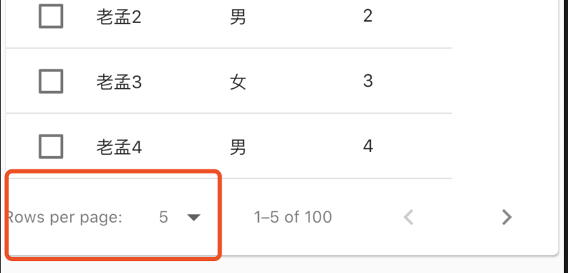
点击出现availableRowsPerPage设置的数组,onRowsPerPageChanged为选择其中一项后回调,用于更新rowsPerPage属性。
显示的数据过多时,需要将PaginatedDataTable包裹在SingleChildScrollView中,滚动显示数据:
SingleChildScrollView(
child: PaginatedDataTable()
)
onPageChanged是翻页时回调,返回当前页第一条数据的索引:
PaginatedDataTable(
onPageChanged: (page){
print('onPageChanged:$page');
},
打印数据为:
flutter: onPageChanged:10
flutter: onPageChanged:20
flutter: onPageChanged:30
flutter: onPageChanged:40
排序
生序降序设置:
PaginatedDataTable(
sortColumnIndex: 1,
sortAscending: false,
...
)
效果如下:
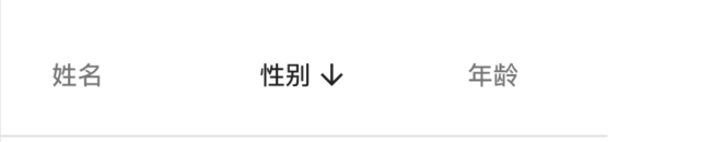
生序降序的设置仅仅显示相应图标,数据并不会实际排序,对数据进行排序可以当用户点击表头时对数据按照本列数据进行排序,用法如下,
var _sortAscending = true;
_buildPaginatedDataTable() {
return PaginatedDataTable(
header: Text('header'),
sortColumnIndex: 2,
sortAscending: _sortAscending,
columns: [
DataColumn(label: Text('姓名')),
DataColumn(label: Text('性别')),
DataColumn(
label: Text('年龄'),
onSort: (index, sortAscending) {
setState(() {
_sortAscending = sortAscending;
if (sortAscending) {
_data.sort((a, b) => a.age.compareTo(b.age));
} else {
_data.sort((a, b) => b.age.compareTo(a.age));
}
});
}),
],
source: MyDataTableSource(_data),
);
}
效果如下:
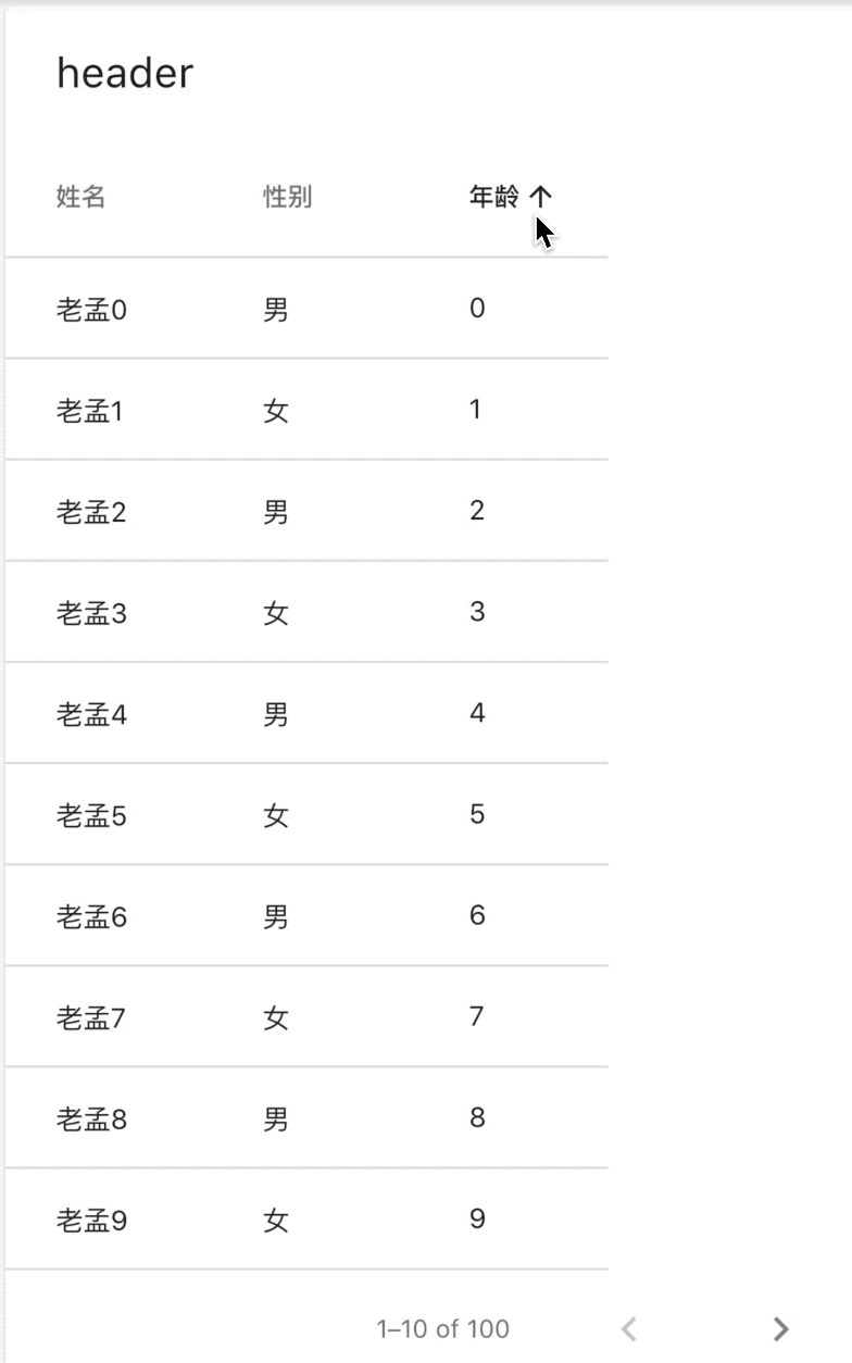
选中
可以在每一行的前面添加复选框,表示当前行是否选中,在User中添加是否选中属性,用法如下:
class User {
User(this.name, this.age, this.sex, {this.selected = false});
final String name;
final int age;
final String sex;
bool selected;
}
添加勾选框:
@override
DataRow getRow(int index) {
if (index >= data.length) {
return null;
}
return DataRow.byIndex(
index: index,
selected: data[index].selected,
onSelectChanged: (selected) {
data[index].selected = selected;
notifyListeners();
},
cells: [
DataCell(
Text('${data[index].name}'),
),
DataCell(Text('${data[index].sex}')),
DataCell(Text('${data[index].age}')),
],
);
}
效果如下:
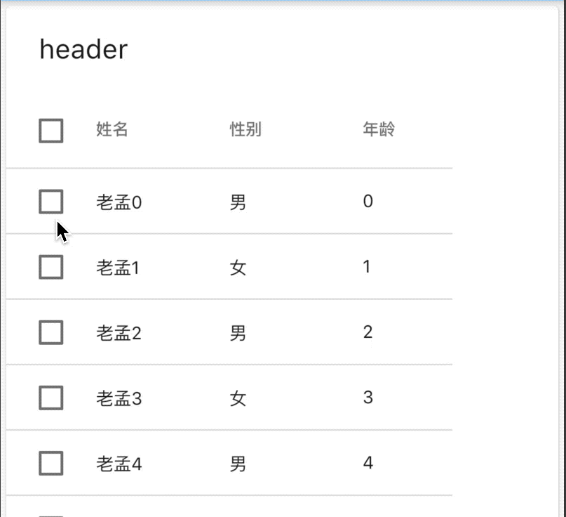
全选控制:
PaginatedDataTable(
header: Text('header'),
onSelectAll: (all) {
setState(() {
_data.forEach((f){
f.selected = all;
});
});
},
处理数据显示不全问题
当表格列比较多的时候,使用SingleChildScrollView包裹,显示不全时滚动显示,用法如下:
SingleChildScrollView(
scrollDirection: Axis.horizontal,
child: PaginatedDataTable()
)
效果如下:
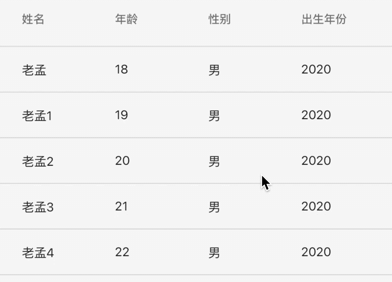
title: 'PhysicalModel|PhysicalShape|裁剪子控件' description: '将其子控件裁剪为一个形状' type: widgets
PhysicalModel
代表物理层的控件,将其子控件裁剪为一个形状,可以设置阴影值及颜色,用法如下:
PhysicalModel(
borderRadius: BorderRadius.circular(20),
color: Colors.blue,
elevation: 8,
child: Container(
height: 100,
width: 100,
),
)
效果如下:
设置阴影值及颜色:
PhysicalModel(
borderRadius: BorderRadius.circular(20),
color: Colors.blue,
elevation: 18,
shadowColor: Colors.red,
child: Container(
height: 100,
width: 100,
),
)
效果如下:
PhysicalShape
PhysicalShape 与PhysicalModel类似,其提供阴影
PhysicalShape({
Key key,
@required this.clipper,设置边缘剪切形状
this.clipBehavior = Clip.none,
this.elevation = 0.0,设置垂直高度
@required this.color,背景颜色
this.shadowColor = const Color(0xFF000000),影子颜色
Widget child,
})
PhysicalShape和PhysicalModel类似,只不过可以自定义path,下面裁剪为圆形:
PhysicalShape(
color: Colors.red,
clipper: ShapeBorderClipper(shape: CircleBorder()),
child: Container(
height: 150,
width: 150,
),
)
本文由Rock提供。
title: 'Placeholder' description: '绘制一个内有交叉线的框' type: widgets
Placeholder
Placeholder是一个占位符控件,用于当没有准备好构建组件时,可以使用Placeholder进行占位。
基础用法如下:
Container(
height: 100,
width: 200,
child: Placeholder(),
)
Placeholder默认充满父组件。效果如下:
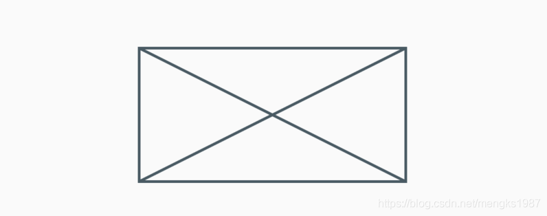
对其颜色、线条粗细进行设置如下:
Placeholder(
color: Colors.red,
strokeWidth: 2,
)
效果如下:
当Placeholder处在一个无限空间的时候,可以通过fallbackWidth和fallbackHeight设置其宽高,ListView就是一个典型的无限空间的控件。看下面的设置:
ListView(
children: <Widget>[
Placeholder(
fallbackHeight: 100,
fallbackWidth: 100,
)
],
)
你以为会显示一个100x100的Placeholder?No,记住fallbackWidth和fallbackHeight是在无限空间的情况下才生效的,比如上面的ListView是垂直滚动,也就是高是无限的,而宽不是,宽充满父控件,所以效果如下:
title: 'PopupMenuTheme PopupMenuThemeData' description: '' type: widget
PopupMenuTheme
用于PopupMenu的样式。
PopupMenuTheme(
data: PopupMenuThemeData(
color: Colors.red
),
child: PopupMenuButton<String>(
itemBuilder: (context) {
return <PopupMenuEntry<String>>[
PopupMenuItem<String>(
value: '语文',
child: Text('语文'),
),
PopupMenuItem<String>(
value: '数学',
child: Text('数学'),
),
PopupMenuItem<String>(
value: '英语',
child: Text('英语'),
),
];
},
),
)
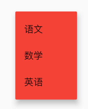
PopupMenuThemeData
样式说明:
const PopupMenuThemeData({
this.color,//背景颜色
this.shape,//形状
this.elevation,//阴影
this.textStyle,//文本样式
})
title: 'Positioned' description: '控件介绍' type: widgets
Positioned
Positioned用于定位Stack子组件,Positioned必须是Stack的子组件,基本用法如下:
Stack(
children: <Widget>[
Positioned(
left: 10,
right: 10,
top: 10,
bottom: 10,
child: Container(color: Colors.red),
),
],
)
效果如下:
相关说明:
- 提供
top、bottom、left、right四种定位属性,分别表示距离上下左右的距离。 - 只能用于Stack组件中。
left、right和width3个参数只能设置其中2个,因为设置了其中2个,第三个已经确定了,同理top、bottom和height也只能设置其中2个。
Positioned提供便捷的构建方式,比如Positioned.fromRect、Positioned.fill等,这些便捷的构建方式万变不离其宗,只不过换了一种方式设置top、bottom、left、right四种定位属性。
title: 'PositionedDirectional' description: '控制[Stack]的子元素的位置,文本方向为系统默认方向,不受Stack组件控制' type: widgets
PositionedDirectional
PositionedDirectional用于定位Stack子组件,PositionedDirectional必须是Stack的子组件,基本用法如下:
Stack(
children: <Widget>[
PositionedDirectional(
start: 10,
end: 10,
top: 10,
bottom: 10,
child: Container(color: Colors.red),
),
],
);

相关说明:
-
提供
top、bottom、start、end四种定位属性,分别表示距离上、下、开始、结尾的距离。 -
只能用于Stack组件中。
-
start、end和width3个参数只能设置其中2个,因为设置了其中2个,第三个已经确定了,同理top、bottom和height也只能设置其中2个。 -
PositionedDirectional的textDirection(文本)方向为系统默认方向,不受Stack组件控制。
-
PositionedDirectional实际上是
Positioned.directional封装的,源码如下:@override Widget build(BuildContext context) { return Positioned.directional( textDirection: Directionality.of(context), start: start, top: top, end: end, bottom: bottom, width: width, height: height, child: child, ); }
title: 'PositionedTransition' description: '控件介绍' type: widgets
PositionedTransition
定位控件动画,用在Stack子组件中,用法如下:
class AnimationDemo extends StatefulWidget {
@override
State<StatefulWidget> createState() => _AnimationDemo();
}
class _AnimationDemo extends State<AnimationDemo>
with SingleTickerProviderStateMixin {
AnimationController _animationController;
Animation _animation;
@override
void initState() {
_animationController =
AnimationController(duration: Duration(seconds: 2), vsync: this);
_animation = RelativeRectTween(
begin: RelativeRect.fromLTRB(10.0, 10.0, 10.0, 10.0),
end: RelativeRect.fromLTRB(100.0, 100.0, 100.0, 100.0))
.animate(_animationController);
//开始动画
_animationController.forward();
super.initState();
}
@override
Widget build(BuildContext context) {
return Container(
height: 300,
width: 300,
color: Colors.blue,
child: Stack(
children: <Widget>[
PositionedTransition(
rect: _animation,
child: Container(
color: Colors.red,
),
)
],
),
);
}
@override
void dispose() {
_animationController.dispose();
super.dispose();
}
}
效果如下:
title: 'PreferredSize' description: '' type: widget
PreferredSize
此控件不对其子控件施加任何约束,并且不以任何方式影响孩子的布局。
此控件对自定义AppBar.bottom和AppBar非常有用。
自定义AppBar,也可以直接设置AppBar的高度(PreferredSize子控件为AppBar)
Scaffold(
appBar: PreferredSize(
preferredSize: Size.fromHeight(200),
child: Container(
color: Colors.blue,
),
),
body: Test1(),
)
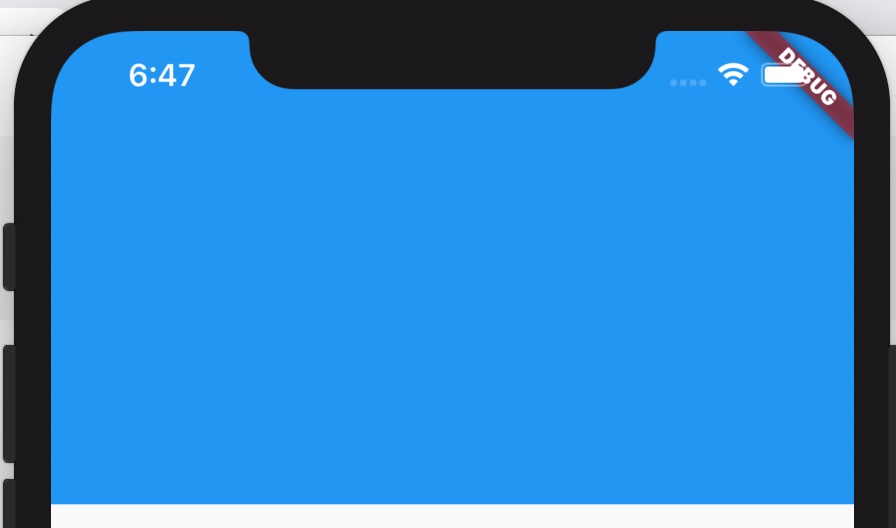
AppBar.bottom通常是TabBar等,通过PreferredSize可设置为任意组件:
Scaffold(
appBar: AppBar(
bottom: PreferredSize(
preferredSize: Size.fromHeight(48),
child: Container(
height: 48,
color: Colors.red,
),
),
),
body: Test1(),
)
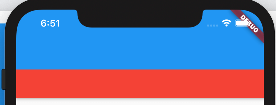
title: 'LinearProgressIndicator' description: '控件介绍' type: widgets
LinearProgressIndicator
水平进度指示器,基本用法如下:
LinearProgressIndicator()
效果如下:
设置具体进度值:
LinearProgressIndicator(
value: 0.3,
)
value的值范围是0-1,效果如下:
设置背景颜色及进度值:
LinearProgressIndicator(
value: 0.3,
backgroundColor: Colors.greenAccent,
valueColor: AlwaysStoppedAnimation<Color>(Colors.red),
)
效果如下:
CircularProgressIndicator
CircularProgressIndicator 是圆形进度条,和LinearProgressIndicator用法一样:
CircularProgressIndicator()
效果如下:
设置进度值及颜色值:
CircularProgressIndicator(
value: 0.3,
backgroundColor: Colors.greenAccent,
valueColor: AlwaysStoppedAnimation<Color>(Colors.red),
)
效果如下:
CupertinoActivityIndicator
CupertinoActivityIndicator是ios风格的指示器,CupertinoActivityIndicator不能设置进度,只能一直转“菊花”。
CupertinoActivityIndicator(
radius: 10,
)
radius参数是半径,值越大,控件越大。
效果如下:
RefreshProgressIndicator
RefreshProgressIndicator 是刷新指示器,通常用于下拉刷新,基本用法如下:
RefreshProgressIndicator()
效果如下:
设置宽度及颜色:
RefreshProgressIndicator(
backgroundColor: Colors.greenAccent,
valueColor: AlwaysStoppedAnimation<Color>(Colors.red),
strokeWidth: 5.0,
)
效果如下:
title: 'Radio' description: 'material风格单选按钮' type: widgets
Radio
Radio为单选控件,基本用法如下:
var _radioValue = '1';
var _radioGroupValue = '';
_buildEditable() {
return Radio(
value: _radioValue,
groupValue: _radioGroupValue,
onChanged: (value){
print('$value');
setState(() {
_radioGroupValue = value;
});
},
);
}
Radio控件本身没有State状态,当value的值和groupValue值相等时,Radio显示选中状态,效果如下:
通常情况下,有多个单选按钮,当选中一个时,其他自动变为未选中状态,用法如下:
var _radioGroupValue = '语文';
_buildEditable() {
return Row(
children: <Widget>[
Radio(
value: '语文',
groupValue: _radioGroupValue,
onChanged: (value){
setState(() {
_radioGroupValue = value;
});
},
),
Radio(
value: '数学',
groupValue: _radioGroupValue,
onChanged: (value){
setState(() {
_radioGroupValue = value;
});
},
),
Radio(
value: '英语',
groupValue: _radioGroupValue,
onChanged: (value){
setState(() {
_radioGroupValue = value;
});
},
),
],
);
}
效果如下:
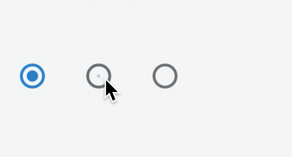
activeColor是选中状态下颜色,用法如下:
Radio(
activeColor: Colors.red,
...
)
效果如下:
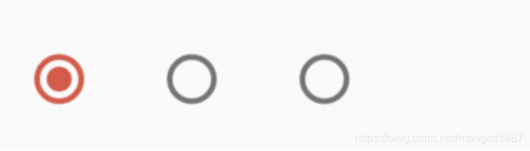
RadioListTile
通常情况下,需要在Radio控件的后面添加说明,用户需要知道自己选择的是什么,当然我们可以直接在Radio后面添加Text控件,不过,Flutter已经为我们提供了相应的控件,就是RadioListTile,通过名字我们就知道这是一个Radio和ListTile 组合的控件,关于ListTile的用法可以查看ListTile,用法如下:
Row(
children: <Widget>[
Flexible(
child: RadioListTile(
title: Text('语文'),
value: '语文',
groupValue: _radioGroupValue,
onChanged: (value) {
setState(() {
_radioGroupValue = value;
});
},
),
),
Flexible(
child: RadioListTile(
title: Text('数学'),
value: '数学',
groupValue: _radioGroupValue,
onChanged: (value) {
setState(() {
_radioGroupValue = value;
});
},
)),
Flexible(
child: RadioListTile(
title: Text('英语'),
value: '英语',
groupValue: _radioGroupValue,
onChanged: (value) {
setState(() {
_radioGroupValue = value;
});
},
)),
],
)
效果如下:
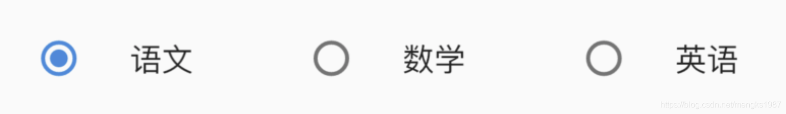
title: 'RawGestureDetector' description: '' type: widget
RawGestureDetector
检测给定手势的控件,对于普通的手势,通常使用GestureRecognizer,RawGestureDetector主要用于开发我们自己的手势。
用法如下:
String _last = '';
RawGestureDetector(
gestures: <Type, GestureRecognizerFactory>{
TapGestureRecognizer:
GestureRecognizerFactoryWithHandlers<TapGestureRecognizer>(
() => TapGestureRecognizer(),
(TapGestureRecognizer instance) {
instance
..onTapDown = (TapDownDetails details) {
setState(() {
_last = 'down';
});
}
..onTapUp = (TapUpDetails details) {
setState(() {
_last = 'up';
});
}
..onTap = () {
setState(() {
_last = 'tap';
});
}
..onTapCancel = () {
setState(() {
_last = 'cancel';
});
};
},
),
},
child: Container(
width: 100.0,
height: 100.0,
color: Colors.yellow,
alignment: Alignment.center,
child: Text(_last)),
)
title: 'RawKeyboardListener' description: '' type: widget
RawKeyboardListener
此控件用于键盘的事件,包括物理按键,通常用于游戏类应用。
此控件目前在部分手机上无法监听到,无法确定是国内手机厂商修改所致,还是flutter系统的bug。也可以关注 github issue,实时了解其进展
用法:
TextEditingController _controller = new TextEditingController();
FocusNode _textNode = new FocusNode();
handleKey(RawKeyEvent key) {
print("Event runtimeType is ${key.runtimeType}");
if(key.runtimeType.toString() == 'RawKeyDownEvent'){
RawKeyEventDataAndroid data = key.data as RawKeyEventDataAndroid;
String _keyCode;
_keyCode = data.keyCode.toString(); //keycode of key event (66 is return)
print("why does this run twice $_keyCode");
}
}
@override
Widget build(BuildContext context) {
TextField _textField = new TextField(
controller: _controller,
);
FocusScope.of(context).requestFocus(_textNode);
return Scaffold(
appBar: AppBar(
actions: <Widget>[
IconButton(
icon: Icon(Icons.close),
onPressed: () {
_key.currentState.removeItem(4);
},
)
],
),
body: Scaffold(
body: RawKeyboardListener(
focusNode: _textNode,
onKey: handleKey,
child: _textField
),
));
}
title: 'RefreshIndicator' description: 'Material风格的“滑动刷新”组件' type: widgets
RefreshIndicator
RefreshIndicator是Material风格的下拉刷新组件。
基本用法如下:
var _list = [1, 2, 3, 4, 5];
RefreshIndicator(
onRefresh: () async {
setState(() {
_list.add(_list.length + 1);
});
},
child: ListView.builder(
itemBuilder: (context, index) {
return ListTile(
title: Text('老孟${_list[index]}'),
);
},
itemExtent: 50,
itemCount: _list.length,
),
)
RefreshIndicator和ListView组合 下拉刷新功能,效果如下:
设置指示器到顶部或者底部到距离:
RefreshIndicator(
displacement: 10,
...
)
设置指示器的前置颜色和背景颜色:
RefreshIndicator(
color: Colors.red,
backgroundColor: Colors.lightBlue,
...
)
效果如下:
CupertinoSliverRefreshControl
CupertinoSliverRefreshControl 是ios风格的下拉刷新控件。
基本用法:
var _list = [1, 2, 3, 4, 5];
CustomScrollView(
slivers: <Widget>[
CupertinoSliverRefreshControl(
onRefresh: () async {
setState(() {
_list.add(_list.length + 1);
});
},
),
SliverList(
delegate: SliverChildBuilderDelegate((content, index) {
return ListTile(
title: Text('老孟${_list[index]}'),
);
}, childCount: _list.length),
)
],
)
CupertinoSliverRefreshControl的用法和RefreshIndicator不同,CupertinoSliverRefreshControl需要放在CustomScrollView中。
效果如下:
title: 'RelativePositionedTransition' description: '控件介绍' type: widgets
RelativePositionedTransition
定位控件动画,用在Stack子组件中,用法如下:
class AnimationDemo extends StatefulWidget {
@override
State<StatefulWidget> createState() => _AnimationDemo();
}
class _AnimationDemo extends State<AnimationDemo>
with SingleTickerProviderStateMixin {
AnimationController _animationController;
Animation _animation;
@override
void initState() {
_animationController =
AnimationController(duration: Duration(seconds: 2), vsync: this);
_animation = RectTween(
begin: Rect.fromLTRB(10.0, 10.0, 10.0, 10.0),
end: Rect.fromLTRB(300.0, 300.0, 0.0, 0.0))
.animate(_animationController);
//开始动画
_animationController.forward();
super.initState();
}
@override
Widget build(BuildContext context) {
return Container(
height: 300,
width: 300,
color: Colors.blue,
child: Stack(
children: <Widget>[
RelativePositionedTransition(
rect: _animation,
size: Size(0.0,0.0),
child: Container(
color: Colors.red,
),
)
],
),
);
}
@override
void dispose() {
_animationController.dispose();
super.dispose();
}
}
效果如下:
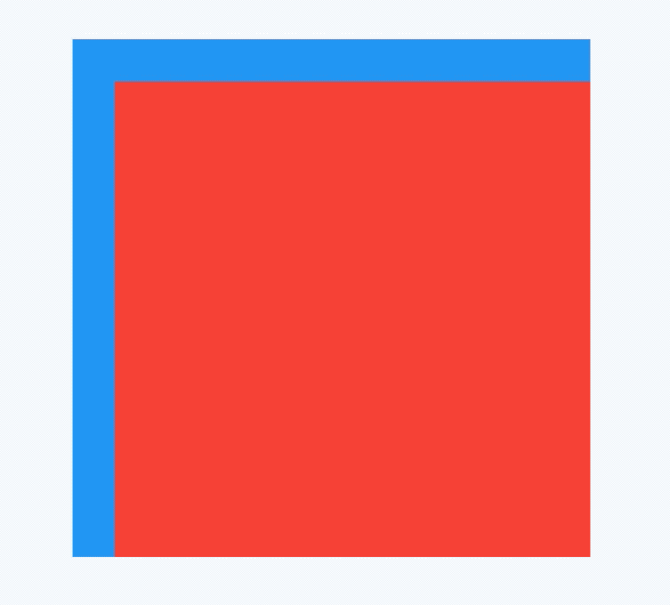
title: 'ReorderableListView' description: '控件介绍' type: widgets
ReorderableListView
ReorderableListView是通过长按拖动某一项到另一个位置来重新排序的列表组件。
ReorderableListView需要设置children和onReorder属性,children是子控件,onReorder是拖动完成后的回调,用法如下:
List<String> items = List.generate(20, (int i) => '$i');
ReorderableListView(
children: <Widget>[
for (String item in items)
Container(
key: ValueKey(item),
height: 100,
margin: EdgeInsets.symmetric(horizontal: 50, vertical: 10),
decoration: BoxDecoration(
color:
Colors.primaries[int.parse(item) % Colors.primaries.length],
borderRadius: BorderRadius.circular(10)),
)
],
onReorder: (int oldIndex, int newIndex) {
if (oldIndex < newIndex) {
newIndex -= 1;
}
var child = items.removeAt(oldIndex);
items.insert(newIndex, child);
setState(() {});
},
)
ReorderableListView的每个子控件必须设置唯一的key,ReorderableListView没有“懒加载”模式,需要一次构建所有的子组件,所以ReorderableListView并不适合加载大量数据的列表,它适用于有限集合且需要排序的情况,比如手机系统里面设置语言的功能,通过拖动对语言排序。
onReorder是拖动完成的回调,第一个参数是旧的数据索引,第二个参数是拖动到位置的索引,回调里面需要对数据进行排序并通过setState刷新数据。
效果如下:
header参数显示在列表的顶部,用法如下:
ReorderableListView(
header: Text(
'一枚有态度的程序员',
style: TextStyle(color: Colors.red,fontSize: 20),
)
...
)
效果如下:
reverse参数设置为true且ReorderableListView的滚动方向为垂直时,滚动条直接滑动到底部,如果是水平方向则滚动条直接滑动到右边,默认为false,用法如下:
ReorderableListView(
reverse: true,
...
)
scrollDirection参数表示滚动到方向,默认为垂直,设置为水平方向如下:
ReorderableListView(
scrollDirection: Axis.horizontal,
...
)
由于改为水平滚动,所以子控件的宽度要设置,否则会出现没有列表。
效果如下:
title: 'RichText' description: '控件介绍' type: widgets
RichText
基础用法
应用程序离不开文字的展示,因此文字的排版非常重要,通常情况下Text组件可以完成绝大多数需求,它可以显示不同大小的文字、字体、颜色等,如果想在一句话或者一段文字里面显示不同样式的文字,Text组件无法满足我们的需求,这个时候需要使用RichText 。
RichText(
text: TextSpan(
style: DefaultTextStyle.of(context).style,
children: <InlineSpan>[
TextSpan(text: '老孟',style: TextStyle(color: Colors.red)),
TextSpan(text: ','),
TextSpan(text: '一个有态度的程序员'),
]),
)
RichText 组件的text属性是TextSpan,TextSpan中的style 样式需要设置属性,不设置无法显示文字,一般设置应用程序的默认字体样式DefaultTextStyle.of(context).style,在子组件其中一个TextSpan设置不同的样式,比如上面的代码中设置“老孟”文字为红色,效果如下:
当文字有较多行时,可以设置其对齐方式:
RichText(
textAlign: TextAlign.end,
...
)
TextAlign.start的效果:
TextAlign.center的效果:
TextAlign.end的效果:
手势交互
当然我们也可以设置其他样式,比如大小、斜体等,甚至我们还可以添加点击效果,
RichText(
text: TextSpan(
style: DefaultTextStyle.of(context).style,
children: <InlineSpan>[
TextSpan(text: '登陆即视为同意'),
TextSpan(
text: '《xxx服务协议》',
style: TextStyle(color: Colors.red),
recognizer: TapGestureRecognizer()..onTap = () {
},
),
]),
)
recognizer 属性指定手势交互,类型是GestureRecognizer,GestureRecognizer是抽象类,一般使用其子类TapGestureRecognizer实现点击交互。
title: 'RotatedBox' description: '旋转控件' type: widgets
RotatedBox
旋转盒子
RotatedBox({
Key key,
@required this.quarterTurns,//旋转的次数,每次旋转的度数只能是90度的整数倍
Widget child,
})
RotatedBox和Transform.rotate功能相似,它们都可以对子组件进行旋转变换,但是有一点不同:RotatedBox的变换是在layout阶段,会影响子组件的位置和大小
案例
Row(
mainAxisAlignment: MainAxisAlignment.center,
children: <Widget>[
DecoratedBox(
decoration: BoxDecoration(color: Colors.red),
//将Transform.rotate换成RotatedBox
child: RotatedBox(
quarterTurns: 1, //旋转90度(1/4圈)
child: Text("Hello world"),
),
),
Text("你好", style: TextStyle(color: Colors.green, fontSize: 18.0),)
],
),
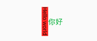
由于RotatedBox是作用于layout阶段,所以子组件会旋转90度(而不只是绘制的内容),decoration会作用到子组件所占用的实际空间上,所以最终就是上图的效果
本文由Rock提供。
title: 'RotationTransition' description: '动画化小部件的旋转' type: widgets
RotationTransition
旋转子控件动画,用法如下:
class AnimationDemo extends StatefulWidget {
@override
State<StatefulWidget> createState() => _AnimationDemo();
}
class _AnimationDemo extends State<AnimationDemo>
with SingleTickerProviderStateMixin {
AnimationController _animationController;
Animation _animation;
@override
void initState() {
_animationController =
AnimationController(duration: Duration(seconds: 2), vsync: this);
_animation = Tween(begin: .0, end: .5).animate(_animationController);
//开始动画
_animationController.forward();
super.initState();
}
@override
Widget build(BuildContext context) {
return RotationTransition(
turns: _animation,
child: Container(
height: 200,
width: 200,
color: Colors.red,
),
);
}
@override
void dispose() {
_animationController.dispose();
super.dispose();
}
}
效果如下:
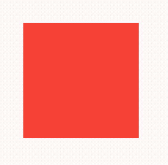
title: 'SafeArea | SliverSafeArea' description: '适配圆角或者刘海屏' type: widgets
SafeArea
现如今的手机已经不能提供给应用程序规整的矩形界面了,一些带圆角或者是刘海屏让应用程序的布局更加复杂,甚至是需要单独适配,这对开发者来来太糟糕了。
因此SafeArea控件应用而生,SafeArea通过MediaQuery检测屏幕的尺寸使应用程序的大小与屏幕适配。
创建一个铺满全屏的ListView,并显示数据,代码如下:
ListView(
children: List.generate(100, (i) => Text('老孟,一个有态度的程序员')),
)
效果如图:
底部的数据明显被遮挡了,想要解决这个问题只需将ListView包裹在SafeArea中即可,代码如下:
SafeArea(
child: ListView(
children: List.generate(100, (i) => Text('老孟,一个有态度的程序员')),
),
)
效果如图:
我们甚至可以指定显示区域,默认情况下上下左右都是指定区域,如下代码去掉左侧区域:
SafeArea(
left: false,
child: ListView(),
)
SliverSafeArea
SliverSafeArea的功能和SafeArea是一样的,区别就是SliverSafeArea用于Sliver控件,比如下面的用法:
CustomScrollView(
slivers: <Widget>[
SliverGrid(
gridDelegate: SliverGridDelegateWithFixedCrossAxisCount(
crossAxisCount: 3, crossAxisSpacing: 5, mainAxisSpacing: 3),
delegate: SliverChildBuilderDelegate((BuildContext context, int index) {
return Container(
color: Colors.primaries[index % Colors.primaries.length],
);
}, childCount: 20),
)
],
)
在刘海屏上的效果:
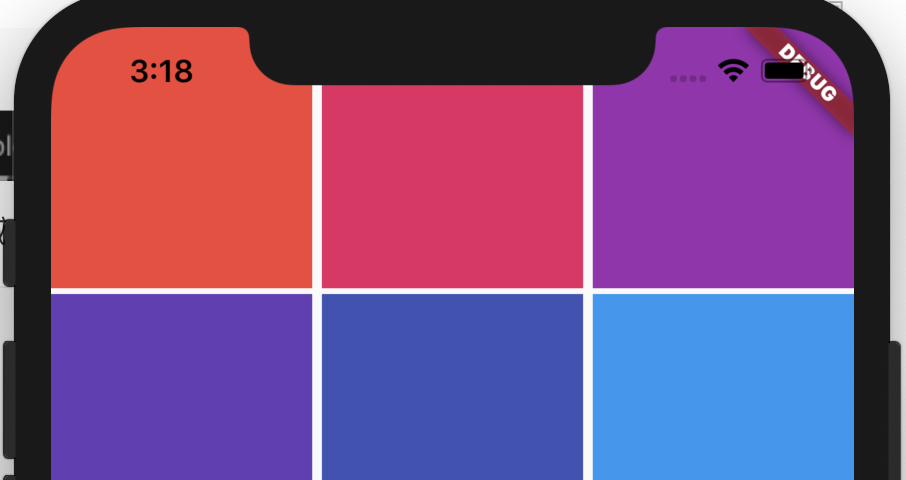
顶部有一部分被刘海屏遮挡住了,解决此问题的方法是将SliverGrid包裹在SliverSafeArea中:
CustomScrollView(
slivers: <Widget>[
SliverSafeArea(
sliver: SliverGrid(
gridDelegate: SliverGridDelegateWithFixedCrossAxisCount(
crossAxisCount: 3, crossAxisSpacing: 5, mainAxisSpacing: 3),
delegate: SliverChildBuilderDelegate((BuildContext context, int index) {
return Container(
color: Colors.primaries[index % Colors.primaries.length],
);
}, childCount: 20),
),
)
],
)
效果:
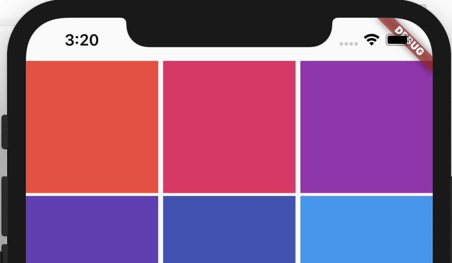
title: 'Scaffold' description: '控件介绍' type: widgets
Scaffold
Scaffold实现了Material风格的基本布局结构,它提供了展示drawers、snack bars和bottom sheets的功能。
基本用法如下:
Scaffold(
appBar: AppBar(
title: Text('老孟'),
),
body: Center(
child: Text('一枚有态度的程序员'),
),
)
更多属性请查看AppBar控件详细说明,效果如下:
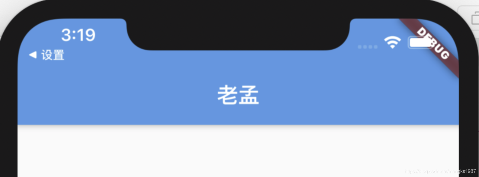
顶部蓝色区域就是appBar,通常设置AppBar。
drawer和endDrawer分别表示从左边和右边出现的抽屉式控件,用法如下:
Scaffold(
drawer: Drawer(),
endDrawer: Drawer(),
...
)
更多属性请查看Drawer控件详细说明。
效果如下:
bottomNavigationBar表示底部导航,用法如下:
Scaffold(
bottomNavigationBar: BottomNavigationBar(
items: <BottomNavigationBarItem>[
BottomNavigationBarItem(title: Text('首页'),icon: Icon(Icons.home)),
BottomNavigationBarItem(title: Text('书籍'),icon: Icon(Icons.book)),
BottomNavigationBarItem(title: Text('我的'),icon: Icon(Icons.perm_identity)),
],
),
...
)
更多属性请查看BottomNavigationBar控件详细说明。
效果如下:
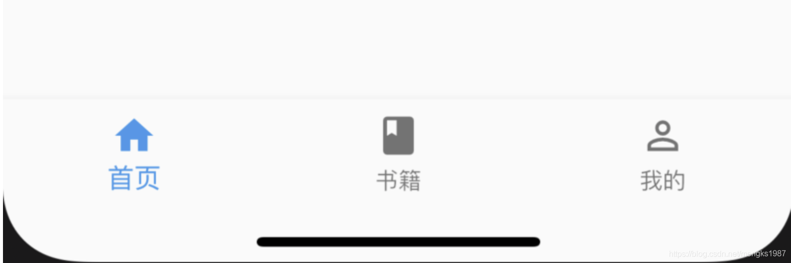
floatingActionButton默认位于右下角,
Scaffold(
floatingActionButton: FloatingActionButton(),
)
效果如下:
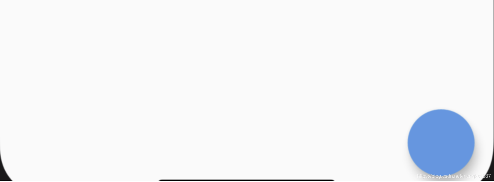
改变其位置,设置按钮嵌入底部导航栏:
Scaffold(
floatingActionButtonLocation: FloatingActionButtonLocation.centerDocked,
floatingActionButton: FloatingActionButton(),
bottomNavigationBar: BottomNavigationBar(
backgroundColor: Colors.yellow,
items: [
BottomNavigationBarItem(icon: Icon(Icons.person),title: Text('老孟')),
BottomNavigationBarItem(icon: Icon(Icons.home),title: Text('程序员'))
],
)
)
用法如下:
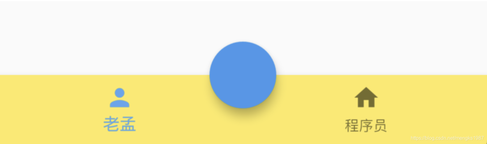
persistentFooterButtons位于body之下,bottomNavigationBar之上,不会随着body滚动而滚动,用法如下:
Scaffold(
persistentFooterButtons: <Widget>[
FlatButton(onPressed: (){},child: Text('FlatButton'),),
FlatButton(onPressed: (){},child: Text('FlatButton'),),
FlatButton(onPressed: (){},child: Text('FlatButton'),),
],
效果如下:
bottomSheet位于persistentFooterButtons之上,用法如下:
Scaffold(
bottomSheet: BottomSheet(
onClosing: () {},
backgroundColor: Colors.lightBlue,
builder: (context) {
return Container(
height: 150,
alignment: Alignment.center,
child: Text('BottomSheet'),
);
}),
...
)
效果如下:
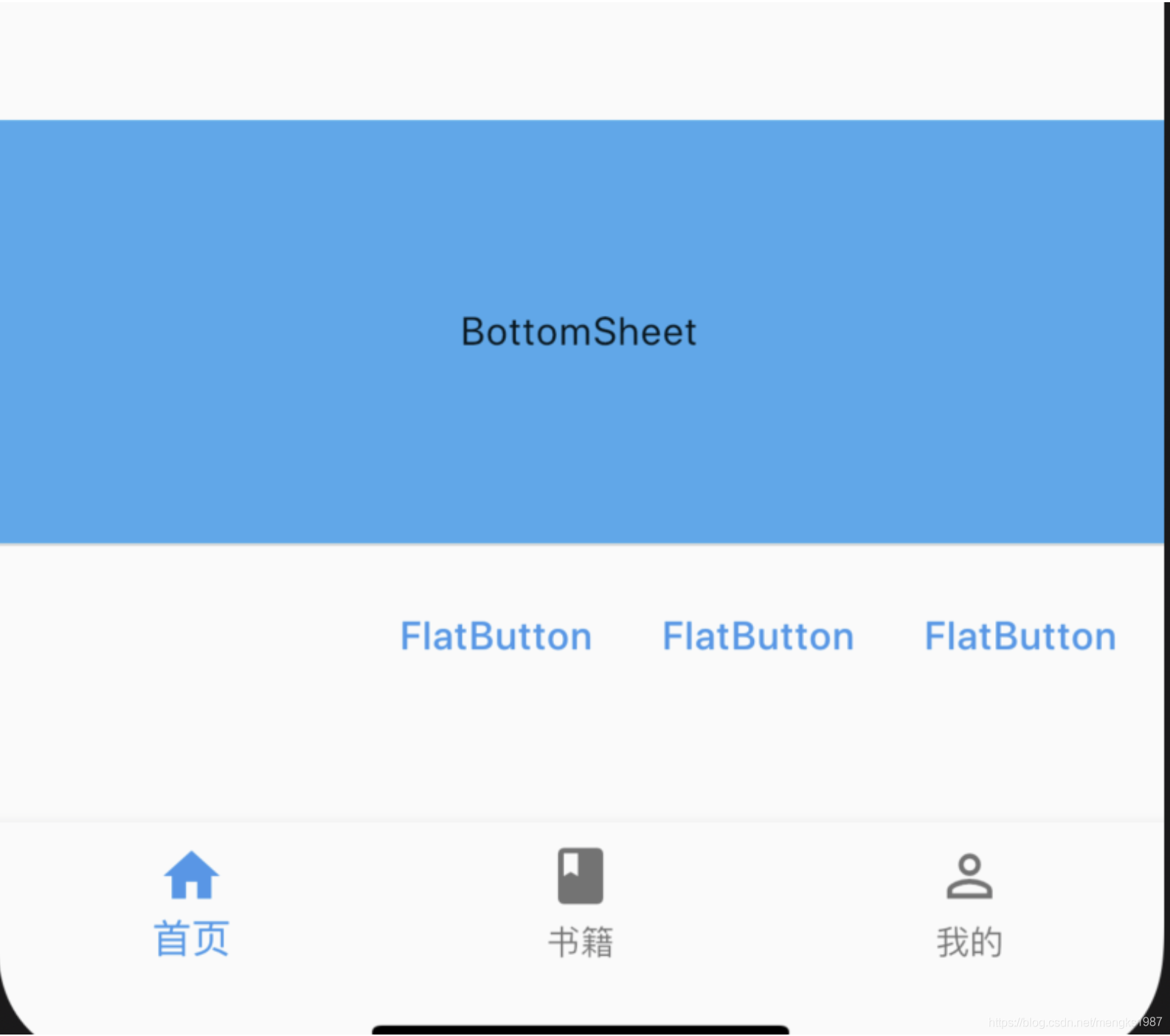
除了可以设置固定的bottomSheet外,还可以通过showBottomSheet方法弹出此控件,具体查看showBottomSheet的说明。
title: 'ScaleTransition' description: '控件介绍' type: widgets
ScaleTransition
缩放子控件动画,用法如下:
class AnimationDemo extends StatefulWidget {
@override
State<StatefulWidget> createState() => _AnimationDemo();
}
class _AnimationDemo extends State<AnimationDemo>
with SingleTickerProviderStateMixin {
AnimationController _animationController;
Animation _animation;
@override
void initState() {
_animationController =
AnimationController(duration: Duration(seconds: 2), vsync: this);
_animation = Tween(begin: .5, end: .1).animate(_animationController);
//开始动画
_animationController.forward();
super.initState();
}
@override
Widget build(BuildContext context) {
return ScaleTransition(
scale: _animation,
child: Container(
height: 200,
width: 200,
color: Colors.red,
),
);
}
@override
void dispose() {
_animationController.dispose();
super.dispose();
}
}
效果如下:
title: 'Scrollable' description: '' type: widget
Scrollable
是一个滚动控件,它实现了滚动小部件的交互模型,包括手势识别,但没有提供如何显示实际子项的视口。
因此我们基本不会直接使用Scrollable控件,而是使用ListView,GridView,这些控件将滚动,视口和布局模型结合在一起,使用起来更加方便。
title: 'Scrollbar CupertinoScrollbar' description: '' type: widget
Scrollbar
Material风格的滚动条,比如ListView等可滚动控件默认情况下是没有滚动指示器的,如果想给其加滚动条,用法如下:
Scrollbar(
child: ListView.builder(
itemBuilder: (BuildContext context, int index) {
return Text('Item$index');
},
itemExtent: 50,
itemCount: 50,
),
)
CupertinoScrollbar
CupertinoScrollbar是iOS风格的滚动条,用法和Scrollbar一样。
title: 'ScrollConfiguration' description: '' type: widget
ScrollConfiguration
ScrollConfiguration 用于控制子控件的滚动行为。通常我们不会直接使用此控件。
用法如下:
ScrollConfiguration(
behavior: ScrollBehavior(),
child: ListView.separated(
itemBuilder: (BuildContext context, int index) {
return Text('Item$index');
},
separatorBuilder: (BuildContext context, int index){
return Divider();
},
itemCount: 50,
),
)
在ios上效果如下:
效果由ScrollBehavior控制,看下ScrollBehavior的源码:
在ios上直接返回子控件,在android上返回GlowingOverscrollIndicator。
title: 'ScrollPhysics' description: '可滚动组件的物理滚动特性' type: widgets
ScrollPhysics
ScrollPhysics并不是一个组件,它定义了可滚动组件的物理滚动特性。例如,当用户达到最大滚动范围时,是停止滚动,还是继续滚动。
滚动组件(CustomScrollView、ScrollView、GridView、ListView等)的physics参数表示此属性,
系统提供的ScrollPhysics有:
AlwaysScrollableScrollPhysics
总是可以滑动,用法如下:
CustomScrollView(
physics: AlwaysScrollableScrollPhysics()
...
)
NeverScrollableScrollPhysics
禁止滚动,用法如下:
CustomScrollView(
physics: NeverScrollableScrollPhysics()
...
)
BouncingScrollPhysics
内容超过一屏 上拉有回弹效果,用法如下:
CustomScrollView(
physics: BouncingScrollPhysics()
...
)
ClampingScrollPhysics
包裹内容 不会有回弹,用法如下:
CustomScrollView(
physics: ClampingScrollPhysics()
...
)
FixedExtentScrollPhysics
滚动条直接落在某一项上,而不是任何位置,类似于老虎机,只能在确定的内容上停止,而不能停在2个内容的中间,用于可滚动组件的FixedExtentScrollController。
PageScrollPhysics
用于PageView的滚动特性,停留在页面的边界
title: 'SelectableText' description: '单一样式的可选文本' type: widgets
SelectableText
想象一下,应用程序中的文本可以被选中,并可以复制、剪切是不是很酷炫,SelectableText控件就提供了这样的功能,如下:
SelectableText(
'老孟,一枚有态度的程序员'
)
选中效果:
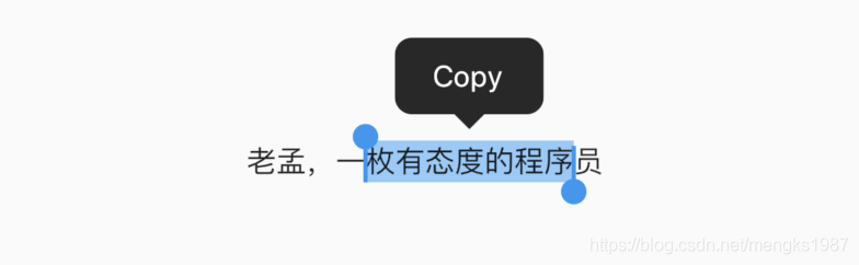
设置光标的相关参数,光标默认不显示,showCursor为true显示光标,用法如下:
SelectableText(
'老孟,一枚有态度的程序员',
showCursor: true,
autofocus: true,
cursorColor: Colors.red,
cursorRadius: Radius.circular(10),
cursorWidth: 5,
)
效果如下:
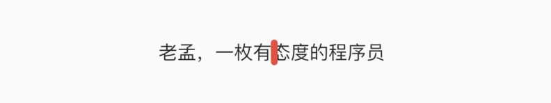
默认情况下选择的操作有Copy和SelectAll,虽然ToolbarOptions还可以设置cut和paste,但这2个属性对EditableText组件才起作用,用法如下:
SelectableText(
'老孟,一枚有态度的程序员',
toolbarOptions: ToolbarOptions(
copy: true,
selectAll: true
),
)
我们还可以添加onTap响应单击手势,用法如下:
SelectableText(
'老孟,一枚有态度的程序员',
onTap:(){}
)
当文字超过文本框的时候,可向下滚动显示更多的文本,用法如下:
Container(
height: 100,
width: 250,
child: SelectableText(
'老孟,一枚有态度的程序员。老孟,一枚有态度的程序员。'
'老孟,一枚有态度的程序员。老孟,一枚有态度的程序员。'
'老孟,一枚有态度的程序员。老孟,一枚有态度的程序员。'
'老孟,一枚有态度的程序员。老孟,一枚有态度的程序员。',
scrollPhysics: ClampingScrollPhysics(),
),
)
效果如下:
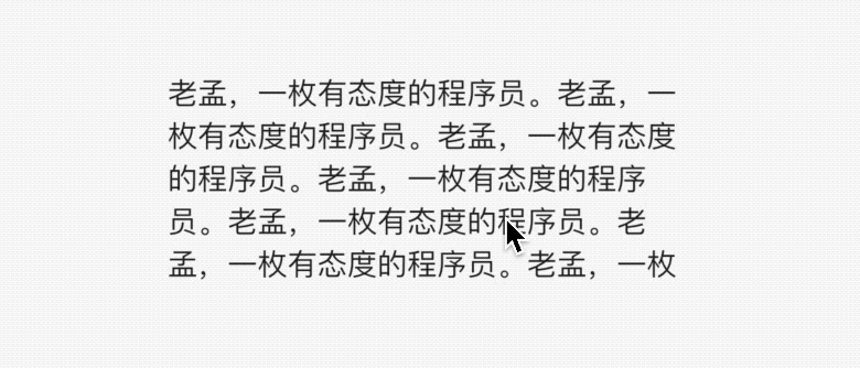
通过SelectableText.rich命名构造函数可以构建更多样式的文本,SelectableText.rich的用法和Text.rich或者RichText用法一样,SelectableText还有一些关于文本样式的参数,比如style、textAlign等,这些参数的用法和Text一样,这里就不在单独介绍。
title: 'Semantics' description: '' type: widget
Semantics
Semantics组件用于屏幕阅读器、搜索引擎、或者其他语义分析工具,比如视力有障碍的人士需要借助屏幕阅读器,屏幕阅读器可以对Semantics进行解析,比如语音。
很多组件有semantics属性,都是此功能。Semantics提供了50多种属性,可以查看源代码进行查看。
title: 'ShaderMask 渐变 LinearGradient RadialGradient SweepGradient' description: '控件介绍' type: widgets
ShaderMask
Flutter 中渐变有三种:
- LinearGradient:线性渐变
- RadialGradient:放射状渐变
- SweepGradient:扇形渐变
看下原图,下面的渐变都是在此图基础上完成。

LinearGradient
给一张图片添加从上到下的线性渐变:
ShaderMask(
shaderCallback: (Rect bounds) {
return LinearGradient(
begin: Alignment.topCenter,
end: Alignment.bottomCenter,
colors: [Colors.red,Colors.blue,Colors.green],
).createShader(bounds);
},
blendMode: BlendMode.color,
child: Image.asset(
'assets/images/b.jpg',
fit: BoxFit.cover,
),
)
begin 和 end 表示渐变的方向,上面设置的方向是从顶部中间到底部中间。
color 表示渐变的颜色。
设置各个渐变色的结束点:
Color color = Colors.orange;
return ShaderMask(
shaderCallback: (Rect bounds) {
return LinearGradient(
begin: Alignment.topCenter,
end: Alignment.bottomCenter,
colors: [color,color,Colors.transparent,Colors.transparent,color,color],
stops: [0,.4,.41,.6,.61,1]
).createShader(bounds);
},
blendMode: BlendMode.color,
child: Image.asset(
'assets/images/b.jpg',
fit: BoxFit.cover,
),
);
stops 的个数要对应 color。
由于中间设置的渐变色为透明,所以中间是原图。
RadialGradient
RadialGradient 是放射状渐变。
ShaderMask(
shaderCallback: (Rect bounds) {
return RadialGradient(
radius: .5,
colors: <Color>[Colors.red, Colors.blue],
).createShader(bounds);
},
blendMode: BlendMode.color,
child: Image.asset(
'assets/images/b.jpg',
fit: BoxFit.cover,
),
)
实现中间显示圆形原图,其他地方有灰色蒙板:
ShaderMask(
shaderCallback: (Rect bounds) {
return RadialGradient(
radius: .6,
colors: <Color>[
Colors.transparent,
Colors.transparent,
Colors.grey.withOpacity(.7),
Colors.grey.withOpacity(.7)
],
stops: [0, .5, .5, 1],
).createShader(bounds);
},
blendMode: BlendMode.srcATop,
child: Image.asset(
'assets/images/b.jpg',
fit: BoxFit.cover,
),
)
SweepGradient
SweepGradient 扇形渐变效果。
ShaderMask(
shaderCallback: (Rect bounds) {
return SweepGradient(
colors: <Color>[
Colors.red,
Colors.blue
],
).createShader(bounds);
},
child: Image.asset(
'assets/images/b.jpg',
fit: BoxFit.cover,
),
)
startAngle 和 endAngle 表示开始和结束角度。
绘制渐变圆环:
Container(
width: 200,
height: 200,
child: CustomPaint(
painter: _CircleProgressPaint(.5),
),
)
class _CircleProgressPaint extends CustomPainter {
final double progress;
_CircleProgressPaint(this.progress);
Paint _paint = Paint()
..style = PaintingStyle.stroke
..strokeWidth = 20;
@override
void paint(Canvas canvas, Size size) {
_paint.shader = ui.Gradient.sweep(
Offset(size.width / 2, size.height / 2), [Colors.red, Colors.yellow]);
canvas.drawArc(
Rect.fromLTWH(0, 0, size.width, size.height), 0, pi*2, false, _paint);
}
@override
bool shouldRepaint(CustomPainter oldDelegate) {
return true;
}
}
除了图片,可以给任何组件加入渐变效果,比如文字:
ShaderMask(
shaderCallback: (Rect bounds) {
return LinearGradient(
colors: <Color>[Colors.blue, Colors.red],
tileMode: TileMode.mirror,
).createShader(bounds);
},
blendMode: BlendMode.srcATop,
child: Center(
child: Text(
'老孟,一枚有态度的程序员',
style: TextStyle(fontSize: 24),
),
),
)

title: 'ShapeBorder BeveledRectangleBorder Border BorderDirectional CircleBorder ContinuousRectangleBorder RoundedRectangleBorder StadiumBorder OutlineInputBorder UnderlineInputBorder' description: '' type: widget
ShapeBorder
Flutter中很多组件都有一个叫做shape的属性,类型是ShapeBorder,比如Button类、Card等组件,shape表示控件的形状,系统已经为我们提供了很多形状。
BeveledRectangleBorder
斜角矩形边框,用法如下:
RaisedButton(
shape: BeveledRectangleBorder(
side: BorderSide(width: 1, color: Colors.red),
borderRadius: BorderRadius.circular(10)),
child: Text('老孟'),
onPressed: () {},
)
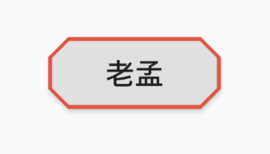
如果设置的半径比控件还大,就会变成菱形:
3RaisedButton(
shape: BeveledRectangleBorder(
side: BorderSide(width: 1, color: Colors.red),
borderRadius: BorderRadius.circular(100)),
child: Text('老孟'),
onPressed: () {},
)
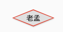
同理,如果半径设置为0,就是矩形。
RaisedButton(
shape: BeveledRectangleBorder(
side: BorderSide(width: 1, color: Colors.red),
borderRadius: BorderRadius.circular(0)),
child: Text('老孟'),
onPressed: () {},
)
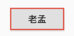
Border
Border允许单独设置每一个边上的线条样式.
RaisedButton(
shape: Border(
top: BorderSide(color: Colors.red,width: 2)
),
child: Text('老孟'),
onPressed: () {},
)
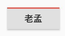
设置全部
RaisedButton(
shape: Border(
top: BorderSide(color: Colors.red,width: 10),
right: BorderSide(color: Colors.blue,width: 10),
bottom: BorderSide(color: Colors.yellow,width: 10),
left: BorderSide(color: Colors.green,width: 10),
),
child: Text('老孟'),
onPressed: () {},
)
BorderDirectional
BorderDirectional和Border基本一样,区别就是BorderDirectional带有阅读方向,大部分国家阅读是从左到右,但有的国家是从右到左的,比如阿拉伯等。
RaisedButton(
shape: BorderDirectional(
start: BorderSide(color: Colors.red,width: 2),
end: BorderSide(color: Colors.blue,width: 2),
),
child: Text('老孟'),
onPressed: () {},
)
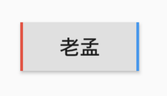
CircleBorder
圆形
RaisedButton(
shape: CircleBorder(side: BorderSide(color: Colors.red)),
child: Text('老孟'),
onPressed: () {},
)
ContinuousRectangleBorder
连续的圆角矩形,直线和圆角平滑连续的过渡,和RoundedRectangleBorder相比,圆角效果会小一些。
RaisedButton(
shape: ContinuousRectangleBorder(
side: BorderSide(color: Colors.red),
borderRadius: BorderRadius.circular(20)),
child: Text('老孟'),
onPressed: () {},
)
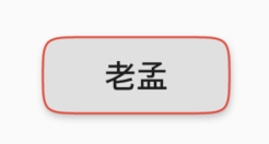
RoundedRectangleBorder
圆角矩形
RaisedButton(
shape: RoundedRectangleBorder(
side: BorderSide(color: Colors.red),
borderRadius: BorderRadius.circular(10)),
child: Text('老孟'),
onPressed: () {},
)
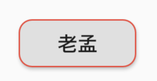
StadiumBorder
类似足球场的形状,两边圆形,中间矩形
RaisedButton(
shape: StadiumBorder(
side: BorderSide(color: Colors.red),),
child: Text('老孟'),
onPressed: () {},
)
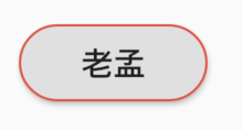
OutlineInputBorder
带外边框
RaisedButton(
shape: OutlineInputBorder(
borderSide: BorderSide(color: Colors.red),
borderRadius: BorderRadius.circular(10),
),
child: Text('老孟'),
onPressed: () {},
)
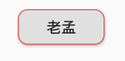
UnderlineInputBorder
下划线边框
RaisedButton(
shape: UnderlineInputBorder(
borderSide: BorderSide(color: Colors.red),
),
child: Text('老孟'),
onPressed: () {},
)
title: 'showDialog | showModalBottomSheet' description: '控件介绍' type: widgets
showDialog
showDialog 用于弹出Material风格对话框,基本用法如下:
showDialog(
context: context,
builder: (context) {
return AlertDialog(
...
);
}
);
效果如下:
builder通常返回Dialog组件,比如SimpleDialog和AlertDialog。
useRootNavigator参数用于确定是否将对话框推送到给定“context”最远或最接近的Navigator。默认情况下,useRootNavigator为“true”,被推送到根Navigator。如果应用程序有多个Navigator,关闭对话框需要使用
Navigator.of(context, rootNavigator: true).pop(result)
而不是
Navigator.pop(context, result)
barrierDismissible参数确认点击提示框外部区域时是否弹出提示框,默认true。
showCupertinoDialog
showCupertinoDialog 用于弹出ios风格对话框,基本用法如下:
showCupertinoDialog(
context: context,
builder: (context) {
return CupertinoAlertDialog(
...
);
});
效果如下:
builder通常返回CupertinoDialog或者CupertinoAlertDialog。
showGeneralDialog
如果上面2种提示框不满足你的需求,还可以使用showGeneralDialog自定义提示框,事实上,showDialog和showCupertinoDialog也是通过showGeneralDialog实现的,基本用法如下:
showGeneralDialog(
context: context,
barrierDismissible:true,
barrierLabel: '',
transitionDuration: Duration(milliseconds: 200),
pageBuilder: (BuildContext context, Animation<double> animation,
Animation<double> secondaryAnimation) {
return Center(
child: Container(
height: 300,
width: 250,
color: Colors.lightGreenAccent,
),
);
});
效果如下:
加上背景颜色:
showGeneralDialog(
context: context,
barrierColor: Colors.black.withOpacity(.5),
...
)
效果如下:
barrierDismissible:是否可以点击背景关闭。
barrierColor:背景颜色
transitionDuration:动画时长,
transitionBuilder是构建进出动画,默认动画是渐隐渐显,构建缩放动画代码如下:
showGeneralDialog(
transitionBuilder: (BuildContext context, Animation<double> animation,
Animation<double> secondaryAnimation, Widget child) {
return ScaleTransition(scale: animation, child: child);
},
...
)
效果如下:
showAboutDialog
AboutDialog用于描述当前App信息,底部提供2个按钮:查看许可按钮和关闭按钮。AboutDialog需要和showAboutDialog配合使用,用法如下:
showAboutDialog(
context: context,
applicationIcon: Image.asset(
'images/bird.png',
height: 100,
width: 100,
),
applicationName: '应用程序',
applicationVersion: '1.0.0',
applicationLegalese: 'copyright 老孟,一枚有态度的程序员',
children: <Widget>[
Container(
height: 30,
color: Colors.red,
),
Container(
height: 30,
color: Colors.blue,
),
Container(
height: 30,
color: Colors.green,
)
],
);
效果如下:

属性说明如下:
applicationIcon:应用程序的图标。applicationName:应用程序名称。applicationVersion:应用程序版本。applicationLegalese:著作权(copyright)的提示。children:位置如上图的红蓝绿色的位置。
所有的属性都需要手动设置,不是自动获取的。
下面的2个按钮根据应用程序支持的语言显示相应的语言,比如显示中文方法如下:
- 在
pubspec.yaml中配置支持国际化:
dependencies:
flutter:
sdk: flutter
flutter_localizations:
sdk: flutter
- 在MaterialApp中配置当前区域:
MaterialApp(
title: 'Flutter Demo',
localizationsDelegates: [
GlobalMaterialLocalizations.delegate,
GlobalWidgetsLocalizations.delegate,
],
supportedLocales: [
const Locale('zh', 'CH'),
const Locale('en', 'US'),
],
locale: Locale('zh'),
...
)
此时效果:

此时点击查看许将会调用showLicensePage,相关效果可以查看showLicensePage。
showLicensePage
此控件基本不会用到,浏览一下即可。
LicensePage用于描述当前App许可信息,LicensePage需要和showLicensePage配合使用,用法如下:
showLicensePage(
context: context,
applicationIcon: Image.asset(
'images/bird.png',
height: 100,
width: 100,
),
applicationName: '应用程序',
applicationVersion: '1.0.0',
applicationLegalese: 'copyright 老孟,一枚有态度的程序员',
);
效果如下:

下面的英文我们是无法更改的。
showBottomSheet
在最近的Scaffold父组件上展示一个material风格的bottom sheet,位置同Scaffold组件的bottomSheet,如果Scaffold设置了bottomSheet,调用showBottomSheet抛出异常。
基本用法如下:
showBottomSheet(
context: context,
builder: (context) {
return Container(height: 200, color: Colors.lightBlue);
});
效果如下:
设置其背景颜色、阴影值、形状:
showBottomSheet(
context: context,
backgroundColor: Colors.lightGreenAccent,
elevation:20,
shape: CircleBorder(),
builder: (context) {
return Container(height: 200);
});
效果如下:
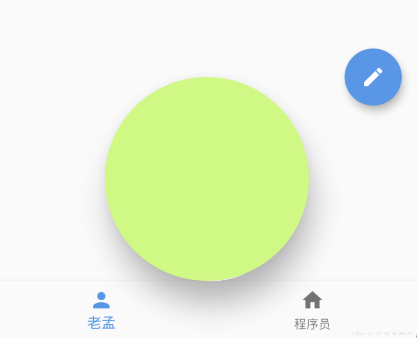
通常情况下,我们希望直接从底部弹出,showModalBottomSheet提供了直接从底部弹出的功能。
showModalBottomSheet
从底部弹出,通常和BottomSheet配合使用,用法如下:
showModalBottomSheet(
context: context,
builder: (BuildContext context) {
return BottomSheet(...);
});
效果如下:
设置背景、阴影、形状:
showModalBottomSheet(
context: context,
backgroundColor: Colors.lightBlue,
elevation: 10,
shape: RoundedRectangleBorder(borderRadius: BorderRadius.circular(30)),
...
)
效果如下:
isDismissible:是否可以点击背景关闭。
isScrollControlled参数指定是否使用可拖动的可滚动的组件,如果子组件是ListView或者GridView,此参数应该设置为true,设置为true后,最大高度可以占满全屏。用法如下:
showModalBottomSheet(
context: context,
isScrollControlled: true,
builder: (BuildContext context) {
return ListView.builder(
itemBuilder: (context, index) {
return ListTile(
title: Text('老孟$index'),
);
},
itemExtent: 50,
itemCount: 50,
);
});
showCupertinoModalPopup
showCupertinoModalPopup 展示ios的风格弹出框,通常情况下和CupertinoActionSheet配合使用,用法如下:
showCupertinoModalPopup(
context: context,
builder: (BuildContext context) {
return CupertinoActionSheet(
title: Text('提示'),
message: Text('是否要删除当前项?'),
actions: <Widget>[
CupertinoActionSheetAction(
child: Text('删除'),
onPressed: () {},
isDefaultAction: true,
),
CupertinoActionSheetAction(
child: Text('暂时不删'),
onPressed: () {},
isDestructiveAction: true,
),
],
);
}
);
效果如下:
filter参数可以对弹出框以外的区域做模糊或者矩阵操作,用法如下:
showCupertinoModalPopup(
context: context,
filter: ImageFilter.blur(sigmaX: 5.0, sigmaY: 5.0),
...
)
效果如下:
弹出框以外的区域有毛玻璃的效果。
showMenu
showMenu弹出一个Menu菜单,用法如下:
showMenu(
context: context,
position: RelativeRect.fill,
items: <PopupMenuEntry>[
PopupMenuItem(child: Text('语文')),
PopupMenuDivider(),
CheckedPopupMenuItem(
child: Text('数学'),
checked: true,
),
PopupMenuDivider(),
PopupMenuItem(child: Text('英语')),
]);
position参数表示弹出的位置,效果如下:

弹出的位置在屏幕的左上角,我们希望弹出的位置在点击按钮的位置,因此需要计算按钮的位置,计算如下:
final RenderBox button = context.findRenderObject();
final RenderBox overlay = Overlay.of(context).context.findRenderObject();
final RelativeRect position = RelativeRect.fromRect(
Rect.fromPoints(
button.localToGlobal(Offset(0, 0), ancestor: overlay),
button.localToGlobal(button.size.bottomRight(Offset.zero),
ancestor: overlay),
),
Offset.zero & overlay.size,
);
你需要将按钮单独封装为StatefulWidget组件,否则context代表的就不是按钮组件。
showSearch
showSearch 是直接跳转到搜索页面,用法如下:
showSearch(context: context, delegate: CustomSearchDelegate());
class CustomSearchDelegate extends SearchDelegate<String>{
@override
List<Widget> buildActions(BuildContext context) {
return null;
}
@override
Widget buildLeading(BuildContext context) {
return null;
}
@override
Widget buildResults(BuildContext context) {
return null;
}
@override
Widget buildSuggestions(BuildContext context) {
return null;
}
}
使用showSearch,首先需要重写一个SearchDelegate,实现其中的4个方法。
buildLeading表示构建搜索框前面的控件,一般是一个返回按钮,点击退出,代码如下:
@override
Widget buildLeading(BuildContext context) {
return IconButton(
icon: Icon(Icons.arrow_back,color: Colors.blue,),
onPressed: (){
close(context, '');
},
);
}
效果如下:
buildSuggestions是用户正在输入时显示的控件,输入框放生变化时回调此方法,通常返回一个ListView,点击其中一项时,将当前项的内容填充到输入框,用法如下:
@override
Widget buildSuggestions(BuildContext context) {
return ListView.separated(
itemBuilder: (context, index) {
return ListTile(
title: Text('老孟 $index'),
onTap: () {
query = '老孟 $index';
},
);
},
separatorBuilder: (context, index) {
return Divider();
},
itemCount: Random().nextInt(5),
);
}
效果如下:
buildActions输入框后面的控件,一般情况下,输入框不为空,显示一个清空按钮,点击清空输入框:
@override
List<Widget> buildActions(BuildContext context) {
return [
IconButton(
icon: Icon(
Icons.clear,
),
onPressed: () {
query = '';
},
)
];
}
buildResults是构建搜索结果控件,当用户点击软键盘上的“Search”时回调此方法,一般返回ListView,用法如下:
@override
Widget buildResults(BuildContext context) {
return ListView.separated(
itemBuilder: (context, index) {
return Container(
height: 60,
alignment: Alignment.center,
child: Text(
'$index',
style: TextStyle(fontSize: 20),
),
);
},
separatorBuilder: (context, index) {
return Divider();
},
itemCount: 10,
);
}
效果如下:
title: 'SingleChildScrollView' description: '一个可以滚动且只能包含单个组件' type: widgets
SingleChildScrollView
当遇到内容较多时,需要滚动组件进行展示,SingleChildScrollView是一个只能包含单个组件的滚动组件,如果内容较多,建议使用ListView等,因为SingleChildScrollView没有“懒加载”模式,性能不如ListView。
SingleChildScrollView(
child: Column(
children: List.generate(50, (index) {
return Container(
height: 150,
color: Colors.primaries[index % Colors.primaries.length],
);
}).toList(),
),
)
效果如下,可垂直滚动:
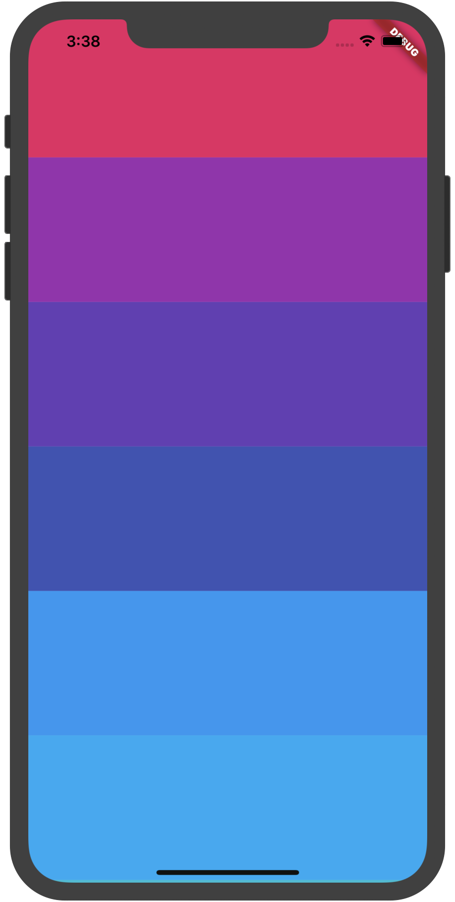
设置水平滚动:
SingleChildScrollView(
scrollDirection: Axis.horizontal
...
)
reverse参数表示反转滚动方向,并不是有垂直转为水平,而是垂直方向滚动时,默认向下滚动,reverse设置false,滚动方向改为向上,同理水平滚动改为水平向左。
SingleChildScrollView(
reverse: false,
...
)
设置内边距Padding:
SingleChildScrollView(
padding: EdgeInsets.all(10),
...
)
primary设置为true时,不能设置controller,因为primarytrue时,controller使用PrimaryScrollController,这种机制带来的好处是父组件可以控制子树中可滚动组件的滚动行为,例如,Scaffold正是使用这种机制在iOS中实现了点击导航栏回到顶部的功能。
也可以设置其他controller:
SingleChildScrollView(
controller: ScrollController(),
...
)
physics表示滚动视图应如何响应用户输入。
系统提供的ScrollPhysics有:
- AlwaysScrollableScrollPhysics:总是可以滑动
- NeverScrollableScrollPhysics:禁止滚动
- BouncingScrollPhysics :内容超过一屏 上拉有回弹效果
- ClampingScrollPhysics :包裹内容 不会有回弹
title: 'SizeChangedLayoutNotifier SizeChangedLayoutNotification' description: '' type: widget
SizeChangedLayoutNotifier
当子组件尺寸发生变化时,此组件发出通知(Notification),通知类型为SizeChangedLayoutNotification。
NotificationListener(
onNotification: (notification) {
print('child:$notification');
return false;
},
child: SizeChangedLayoutNotifier(
child: Container(width: size, height: size, color: Colors.red),
),
),
当改变size大小时,onNotification接收到通知,打印如下:
flutter: child:SizeChangedLayoutNotification()
NotificationListener 是接收通知到组件。
SizeChangedLayoutNotification
SizeChangedLayoutNotification继承自LayoutChangedNotification,其本质就是一个Notification
title: 'SizedOverflowBox' description: '控件介绍' type: widgets
SizedOverflowBox
是SizedBox与OverflowBox的结合体。一个特定大小的widget,但是会将它的原始约束传递给它的子组件,它可能会溢出。
SizedOverflowBox({
Key key,
@required this.size,//固定的尺寸。
this.alignment = Alignment.center,//对齐方式。
Widget child,
})
SizedOverflowBox主要的布局行为有两点:
- 尺寸部分。通过将自身的固定尺寸,传递给child,来达到控制child尺寸的目的;
- 超出部分。可以突破父节点尺寸的限制,超出部分也可以被渲染显示,与OverflowBox类似。
案例
Container(
color: Colors.blue[50],
child: SizedOverflowBox(
size: const Size(100.0, 100.0),
alignment: AlignmentDirectional.bottomStart,
child: Container(height: 50.0, width: 150.0, color: Colors.blue,),
),
)
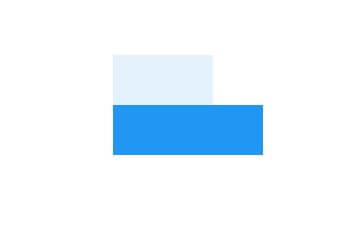
本文由Rock提供。
title: 'SizeTransition' description: '控件介绍' type: widgets
SizeTransition
尺寸控件动画,并不是控制子控件的尺寸,而是父控件,用法如下:
class AnimationDemo extends StatefulWidget {
@override
State<StatefulWidget> createState() => _AnimationDemo();
}
class _AnimationDemo extends State<AnimationDemo>
with SingleTickerProviderStateMixin {
AnimationController _animationController;
Animation _animation;
@override
void initState() {
_animationController =
AnimationController(duration: Duration(seconds: 2), vsync: this);
_animation = Tween(begin: 0.1, end: 1.5).animate(_animationController);
//开始动画
_animationController.forward();
super.initState();
}
@override
Widget build(BuildContext context) {
return Container(
color: Colors.blue,
height: 200,
child: SizeTransition(
sizeFactor: _animation,
axis: Axis.horizontal,
child: Container(
height: 100,
width: 100,
color: Colors.red,
),
),
);
}
@override
void dispose() {
_animationController.dispose();
super.dispose();
}
}
axis表示变化的方向,水平或者垂直。
效果如下,红色为子控件,蓝色为父控件:
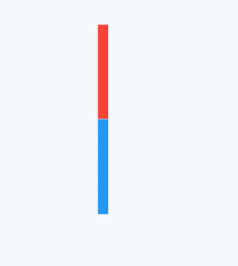
title: 'Slider | RangeSlider |CupertinoSlider' description: '滑块组件' type: widgets
Slider
Slider可以快速的从一系列值中做出选择,Slider需要设置value和onChanged属性,用法如下:
double _sliderValue = 0;
Slider(
value: _sliderValue,
onChanged: (v){
setState(() {
_sliderValue = v;
});
},
)
如果不设置onChanged属性,Slider控件处于禁用状态,不可滑动,另外Slider控件本身没有滑动效果,需要通过onChanged回调动态改变value的值,效果如下:
更改Slider值的范围:
Slider(
min: 0,
max: 100,
...
)
通过设置divisions属性使Slider停留在某些点上,Slider只能滑动到这些点,效果如下:
注意看Slider上分了3个点。
设置label参数则可以在拖动Slider时在其上方显示一个标签,显示标签需要设置divisions参数:
Slider(
label: '$_sliderValue',
divisions: 5,
...
)
效果如下:
通过activeColor和inactiveColor参数设置其颜色:
Slider(
activeColor: Colors.red,
inactiveColor: Colors.blue,
...
)
效果如下:
RangeSlider
如果想要选择一段值,可以使用RangeSlider,用法和Slider一样,如下:
RangeValues _rangeValues = RangeValues(0, 1);
RangeSlider(
values: _rangeValues,
onChanged: (v) {
setState(() {
_rangeValues = v;
});
},
)
效果:
CupertinoSlider
如果想用ios风格的Slider,可以使用CupertinoSlider:
double _sliderValue = 0;
CupertinoSlider(
value: _sliderValue,
onChanged: (v) {
setState(() {
_sliderValue = v;
});
},
)
效果如下:
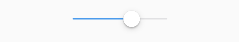
当然我们也可以根据平台显示不同风格的Slider,ios平台显示CupertinoSlider效果,其他平台显示Material风格,用法如下:
Slider.adaptive(
value: _sliderValue,
onChanged: (v) {
setState(() {
_sliderValue = v;
});
},
)
title: 'SliderTheme SliderThemeData' description: '' type: widget
SliderTheme
用于Slider样式。
SliderTheme(
data: SliderTheme.of(context).copyWith(activeTrackColor: Colors.red),
child: Slider(
value: .5,
onChanged: (value) {},
),
)
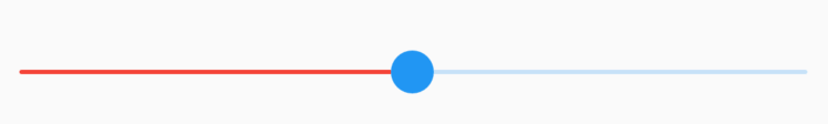
SliderThemeData
轨道相关属性:
-
trackHeight:轨道的高度
-
trackShape:轨道的形状
-
activeTrackColor:已滑过轨道的颜色
-
inactiveTrackColor:未滑过轨道的颜色
SliderTheme(
data: SliderTheme.of(context).copyWith(
trackHeight: 3,
activeTrackColor: Colors.red,
inactiveTrackColor: Colors.green
),
child: Slider(
value: .5,
onChanged: (value) {},
),
)
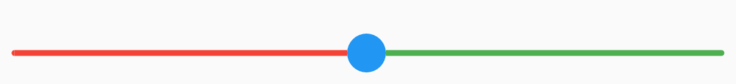
禁用状态下轨道样式,onChanged不设置就是禁用状态:
SliderTheme(
data: SliderTheme.of(context).copyWith(
disabledActiveTrackColor: Colors.green,
disabledInactiveTrackColor:Colors.red,
),
child: Slider(
value: .5,
),
)
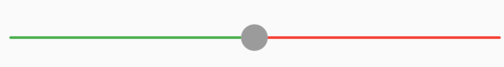
分段样式介绍:
- activeTickMarkColor:已滑过分割点点颜色(设置divisions的值)
- inactiveTickMarkColor:未滑过分割点点颜色(设置divisions的值)
- disabledActiveTickMarkColor:禁用状态下已滑过分割点点颜色(设置divisions的值)
- disabledInactiveTickMarkColor:禁用状态下未滑过分割点点颜色(设置divisions的值)
- tickMarkShape:分割点形状
onChanged不设置就是禁用状态。
SliderTheme(
data: SliderTheme.of(context).copyWith(
trackHeight: 8,
activeTickMarkColor: Colors.yellow,
inactiveTickMarkColor: Colors.red,
),
child: Slider(
value: .5,
divisions: 4,
onChanged: (value) {},
),
)
滑块样式:
- thumbColor:滑块颜色
- thumbShape:滑块形状
- disabledThumbColor:禁用状态滑块颜色
SliderTheme(
data: SliderTheme.of(context).copyWith(
thumbColor: Colors.red,
thumbShape: RoundSliderThumbShape(enabledThumbRadius: 20),
disabledThumbColor: Colors.yellow,
),
child: Slider(
value: .5,
onChanged: (value) {},
),
)
滑动指示器样式:
- valueIndicatorColor:指示器颜色
- valueIndicatorShape:指示器形状
- valueIndicatorTextStyle:指示器文本样式
- ShowValueIndicator:指示器显示类型
- onlyForDiscrete:分段时显示,设置了
divisions - onlyForContinuous:连续时显示,
divisions不设置 - always:总显示
- never:不显示
- onlyForDiscrete:分段时显示,设置了
SliderTheme(
data: SliderTheme.of(context).copyWith(
valueIndicatorColor: Colors.red,
),
child: Slider(
value: _slideValue,
label: '$_slideValue',
divisions: 5,
onChanged: (value) {
setState(() {
_slideValue = value;
});
},
),
)
RangeSlider样式:
- rangeTickMarkShape:RangeSlider分段形状
- rangeThumbShape:RangeSlider滑块形状
- rangeTrackShape:RangeSlider轨道形状
- rangeValueIndicatorShape:RangeSlider 指示器形状
SliderTheme(
data: SliderTheme.of(context).copyWith(
rangeTrackShape: RoundedRectRangeSliderTrackShape()
),
child: RangeSlider(
values: RangeValues(0.2,1.0),
onChanged: (value) {
setState(() {
});
},
),
)
thumbSelector确定交互时选中哪个滑块,默认接近哪个选中哪个,下面设置只能选中前面的:
SliderTheme(
data: SliderTheme.of(context).copyWith(thumbSelector: (
TextDirection textDirection,
RangeValues values,
double tapValue,
Size thumbSize,
Size trackSize,
double dx,
) {
return Thumb.start;
}),
child: RangeSlider(
values: RangeValues(0.2, 1.0),
onChanged: (value) {
setState(() {});
},
),
)
滑块按下时叠加的样式:
- overlayColor:滑块周围颜色,默认半透明
- overlayShape:滑块周围的形状
SliderTheme(
data: SliderTheme.of(context).copyWith(
overlayColor: Colors.red.withOpacity(.5)
),
child: RangeSlider(
values: RangeValues(0.2, 1.0),
onChanged: (value) {
setState(() {});
},
),
)
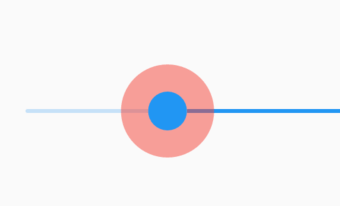
title: 'SlideTransition' description: '控件介绍' type: widgets
SlideTransition
平移动画,用法如下:
class AnimationDemo extends StatefulWidget {
@override
State<StatefulWidget> createState() => _AnimationDemo();
}
class _AnimationDemo extends State<AnimationDemo>
with SingleTickerProviderStateMixin {
AnimationController _animationController;
Animation _animation;
@override
void initState() {
_animationController =
AnimationController(duration: Duration(seconds: 2), vsync: this);
_animation = Tween(begin: Offset(0.0,0.0), end: Offset(1.0,1.0)).animate(_animationController);
super.initState();
}
@override
Widget build(BuildContext context) {
return Container(
color: Colors.blue,
height: 100,
width: 100,
child: SlideTransition(
position: _animation,
child: Container(
color: Colors.red,
),
),
);
}
@override
void dispose() {
_animationController.dispose();
super.dispose();
}
}
Tween中设置Offset的值是比例,1表示父组件的宽高。
效果如下:
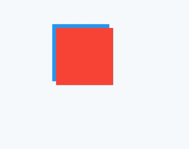
title: 'SliverAnimatedList 动画List' description: '' type: widgets
SliverAnimatedList
SliverAnimatedList是带动画的SliverList组件,但列表数据增加或者减少时,以动画的形式展现,定义一个增加和删除按钮,另外列表数据变化时不仅要改变数据源,还要使用如下方式增加或者删除数据:
SliverAnimatedListState.insertItem
SliverAnimatedListState.removeItem
获取SliverAnimatedListState有2种方式:
- 通过context获取
SliverAnimatedList.of(context)
- 设置key
var _key = GlobalKey<SliverAnimatedListState>();
SliverAnimatedList(
key: _key,
...
)
用例如下:
List<int> _list = [];
var _key = GlobalKey<SliverAnimatedListState>();
@override
Widget build(BuildContext context) {
return CustomScrollView(
slivers: <Widget>[
SliverAppBar(
actions: <Widget>[
IconButton(
icon: Icon(Icons.add),
onPressed: () {
SliverAnimatedList.of(context)
final int _index = _list.length;
_list.insert(_index, _index);
_key.currentState.insertItem(_index);
},
),
IconButton(
icon: Icon(Icons.clear),
onPressed: () {
final int _index = _list.length - 1;
var item = _list[_index].toString();
_key.currentState.removeItem(_index,
(context, animation) => _buildItem(item, animation));
_list.removeAt(_index);
},
),
],
),
SliverAnimatedList(
key: _key,
initialItemCount: _list.length,
itemBuilder:
(BuildContext context, int index, Animation<double> animation) {
return _buildItem(_list[index].toString(), animation);
},
),
],
);
}
动画重点
Widget _buildItem(String _item, Animation _animation) {
return SlideTransition(
position: _animation
.drive(CurveTween(curve: Curves.easeIn))
.drive(Tween<Offset>(begin: Offset(1, 1), end: Offset(0, 1))),
child: Card(
child: ListTile(
title: Text(
_item,
),
),
),
);
}
换一种效果,实现从上掉落的效果,只需将_buildItem方法代码修改如下即可:
Widget _buildItem(String _item, Animation _animation) {
return SizeTransition(
sizeFactor: _animation,
child: Card(
child: ListTile(
title: Text(
_item,
),
),
),
);
}
title: 'SliverAppBar' description: '控件介绍' type: widgets
SliverAppBar
SliverAppBar控件可以实现页面头部区域展开、折叠的效果,类似于Android中的CollapsingToolbarLayout。 先看下SliverAppBar实现的效果,效果图如下:
SliverAppBar控件需要和CustomScrollView搭配使用,SliverAppBar要通常放在slivers的第一位,后面接其他sliver控件。
CustomScrollView(
slivers: <Widget>[
SliverAppBar(
),
//其他sliver控件
],
)
SliverAppBar和其他slivers控件的结构如下:
SliverAppBar中有一个非常重要的参数flexibleSpace,flexibleSpace是SliverAppBar中展开和折叠区域,flexibleSpace与expandedHeight一起使用, expandedHeight表示flexibleSpace的高度,
SliverAppBar(
expandedHeight: 200.0,
flexibleSpace: FlexibleSpaceBar(
),
),
SliverAppBar其他常用属性说明如下: | 属性 | 说明 | |--|--| | leading | 左侧控件,通常情况下为"返回"图标 | | title | 标题,通常为Text控件 | | actions | 右侧控件 | | flexibleSpace | 展开和折叠区域 | | bottom | 底部控件 | | elevation | 阴影 | | backgroundColor | 背景颜色 | | expandedHeight | 展开区域的高度 | | floating | 设置为true时,向下滑动时,即使当前CustomScrollView不在顶部,SliverAppBar也会跟着一起向下出现 | | pinned | 设置为true时,当SliverAppBar内容滑出屏幕时,将始终渲染一个固定在顶部的收起状态 | | snap | 设置为true时,当手指放开时,SliverAppBar会根据当前的位置进行调整,始终保持展开或收起的状态,此效果在floating=true时生效 |
实现文章开头效果的整体代码如下:
class SliverAppBarDemo extends StatelessWidget {
@override
Widget build(BuildContext context) {
return CustomScrollView(
slivers: <Widget>[
SliverAppBar(
pinned: true,
expandedHeight: 200.0,
flexibleSpace: FlexibleSpaceBar(
title: Text('复仇者联盟'),
background: Image.network(
'http://img.haote.com/upload/20180918/2018091815372344164.jpg',
fit: BoxFit.fitHeight,
),
),
),
SliverFixedExtentList(
itemExtent: 80.0,
delegate: SliverChildBuilderDelegate(
(BuildContext context, int index) {
return Card(
child: Container(
alignment: Alignment.center,
color: Colors.primaries[(index % 18)],
child: Text(''),
),
);
},
),
),
],
);
}
}
title: 'SliverFillRemaining' description: '' type: widget
SliverFillRemaining
SliverFillRemaining是sliver系列组件之一,此组件充满视口剩余空间,通常用于最后一个sliver组件,以便于没有任何剩余控件。
CustomScrollView(
slivers: <Widget>[
SliverToBoxAdapter(
child: Container(
color: Colors.amber[300],
height: 150.0,
),
),
SliverFillRemaining(
hasScrollBody: false,
child: Container(
color: Colors.blue[100],
child: Icon(
Icons.sentiment_very_satisfied,
size: 75,
color: Colors.blue[900],
),
),
),
],
)
hasScrollBody表示内容是否可以滚动,比如上面的例子,设置为false,向上滑动松手后,自动回到原位置,如果设置为true,向上滑动松手后,不会自动回到原位置。
fillOverscroll表示子控件是否应该应该伸展以填充超出区域(比如iOS的ListView默认可伸展出一部分区域),当hasScrollBody为false时才起作用。
title: 'SliverFillViewport' description: '占满全屏的Sliver组件' type: widgets
SliverFillViewport
SliverFillViewport生成的每一个item都占满全屏,用法如下:
CustomScrollView(
slivers: <Widget>[
SliverFillViewport(
delegate: SliverChildBuilderDelegate((context, index) {
return Container(
color: Colors.primaries[index % Colors.primaries.length],
);
}, childCount: 4),
viewportFraction: 1.0,
)
],
)
效果如下:
viewportFraction表示比率,默认是1,表示占满全屏,如果设置0.8,则在开始和结尾处出现空白,如下:
title: 'SliverFixedExtentList' description: '' type: widget
SliverFixedExtentList
SliverFixedExtentList是sliver系列组件之一,和SliverList用法一样,唯一的区别就是SliverFixedExtentList是固定子控件的高度的,SliverFixedExtentList比SliverList更加高效,因为SliverFixedExtentList无需计算子控件的布局。
CustomScrollView(
slivers: <Widget>[
SliverFixedExtentList(
itemExtent: 100,
delegate: SliverChildBuilderDelegate((content, index) {
return Container(
color: Colors.primaries[index % Colors.primaries.length],
);
}, childCount: 50),
),
],
)
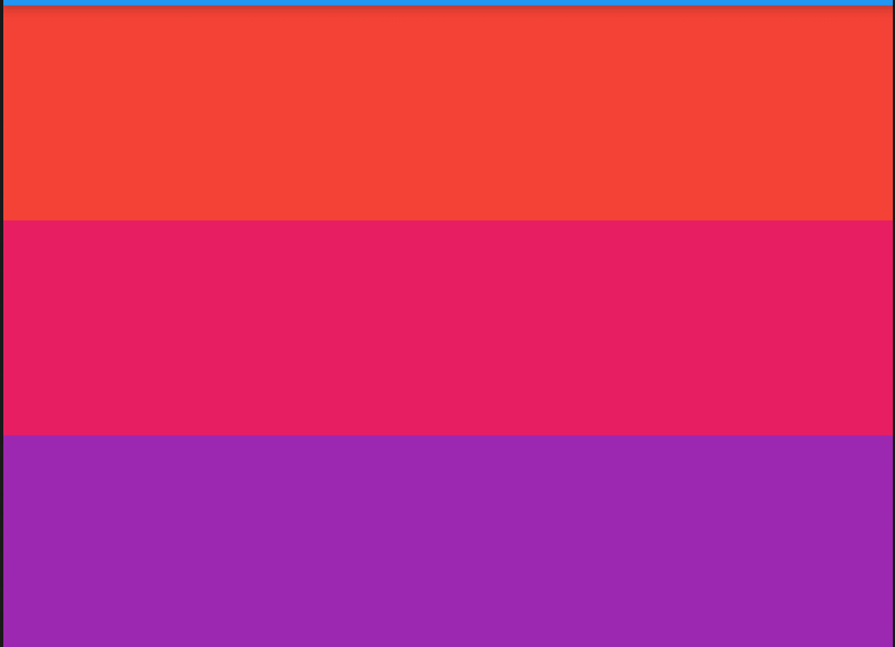
title: 'SliverLayoutBuilder' description: '' type: widget
SliverLayoutBuilder
根据组件的约束条件提供子组件,比如当用户向下划动时,盒子显示红色,向上滑动时显示蓝色:
CustomScrollView(
slivers: <Widget>[
SliverLayoutBuilder(
builder: (BuildContext context, SliverConstraints constraints) {
print('${constraints.userScrollDirection}');
var color = Colors.red;
if (constraints.userScrollDirection == ScrollDirection.forward) {
color = Colors.blue;
}
return SliverToBoxAdapter(
child: Container(
height: 100,
color: color,
));
},
),
],
)
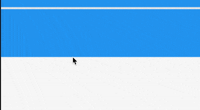
title: 'SliverList | SliverGrid' description: '控件介绍' type: widgets
SliverList
要同时滚动ListView和GridView的时候可以使用SliverList和SliverGrid。
SliverList
SliverList的用法非常简单,只需一个构建函数,用法如下:
SliverList(
delegate: SliverChildBuilderDelegate((content, index) {
return Container(
height: 65,
color: Colors.primaries[index % Colors.primaries.length],
);
}, childCount: 5),
)
SliverGrid
同样SliverGrid的用法如下:
SliverGrid(
gridDelegate: SliverGridDelegateWithFixedCrossAxisCount(
crossAxisCount: 3, crossAxisSpacing: 5, mainAxisSpacing: 3),
delegate: SliverChildBuilderDelegate((BuildContext context, int index) {
return Container(
color: Colors.primaries[index % Colors.primaries.length],
);
}, childCount: 20),
)
此时需要将SliverList和SliverGrid放在一起,使用CustomScrollView,用法如下:
CustomScrollView(slivers: <Widget>[
SliverList(
delegate: SliverChildBuilderDelegate((content, index) {
return Container(
height: 65,
color: Colors.primaries[index % Colors.primaries.length],
);
}, childCount: 5),
),
SliverGrid(
gridDelegate: SliverGridDelegateWithFixedCrossAxisCount(
crossAxisCount: 3, crossAxisSpacing: 5, mainAxisSpacing: 3),
delegate: SliverChildBuilderDelegate((BuildContext context, int index) {
return Container(
color: Colors.primaries[index % Colors.primaries.length],
);
}, childCount: 20),
)
])
效果如下:
title: 'SliverOpacity' description: '' type: widgets
SliverOpacity
SliverOpacity是sliver系列组件,子控件为sliver组件,可设置子组件透明度,
SliverOpacity(
opacity: 0.5,
sliver: SliverList(
delegate: SliverChildBuilderDelegate((content, index) {
return Container(
height: 65,
color: Colors.primaries[index % Colors.primaries.length],
);
}, childCount: 50),
),
),

title: 'SliverPadding' description: '' type: widgets
SliverPadding
SliverPadding 组件是sliver系列的Padding组件,配合CustomScrollView使用。
比如给CustomScrollView中SliverList添加内边距:
CustomScrollView(
slivers: <Widget>[
SliverPadding(
padding: EdgeInsets.symmetric(horizontal: 10),
sliver: SliverList(
delegate: SliverChildBuilderDelegate((content, index) {
return Container(
height: 65,
color: Colors.primaries[index % Colors.primaries.length],
);
}, childCount: 50),
),
)
],
)
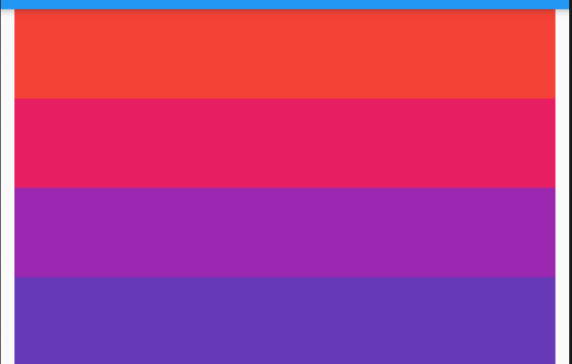
有时使用SliverPadding会出现一些意想不到的问题,比如,使用SliverPadding包裹SliverPersistentHeader(pinned:true),会出现SliverPersistentHeader和SliverAppBar重叠的问题,问题代码如下:
CustomScrollView(
slivers: <Widget>[
SliverAppBar(
title: Text('SliverAppBar'),
pinned: true,
),
SliverPadding(
padding: EdgeInsets.symmetric(horizontal: 10),
sliver: SliverPersistentHeader(
delegate: MySliverPersistentHeaderDelegate(),
pinned: true,
),
),
SliverPadding(
padding: EdgeInsets.symmetric(horizontal: 10),
sliver: SliverList(
delegate: SliverChildBuilderDelegate((content, index) {
return Container(
height: 65,
color: Colors.primaries[index % Colors.primaries.length],
);
}, childCount: 50),
),
)
],
)
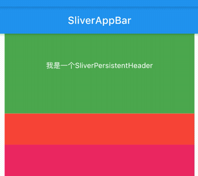
通过上面的效果图发现SliverPersistentHeader和SliverAppBar发生了重叠。
title: 'SliverPersistentHeader' description: '滚动到边缘时根据滚动的距离缩小高度' type: widgets
SliverPersistentHeader
SliverPersistentHeader控件当滚动到边缘时根据滚动的距离缩小高度,有点类似 SliverAppBar 的背景效果。
用法如下:
CustomScrollView(
slivers: <Widget>[
SliverPersistentHeader(
delegate: MySliverPersistentHeaderDelegate(),
),
SliverGrid(
gridDelegate: SliverGridDelegateWithFixedCrossAxisCount(
crossAxisCount: 3, crossAxisSpacing: 5, mainAxisSpacing: 3),
delegate:
SliverChildBuilderDelegate((BuildContext context, int index) {
return Container(
color: Colors.primaries[index % Colors.primaries.length],
);
}, childCount: 20),
)
],
)
MySliverPersistentHeaderDelegate定义如下:
class MySliverPersistentHeaderDelegate extends SliverPersistentHeaderDelegate {
@override
Widget build(
BuildContext context, double shrinkOffset, bool overlapsContent) {
return Container(
color: Colors.blue,
alignment: Alignment.center,
child: Text('我是一个SliverPersistentHeader',
style: TextStyle(color: Colors.white)));
}
@override
double get maxExtent => 200.0;
@override
double get minExtent => 100.0;
@override
bool shouldRebuild(SliverPersistentHeaderDelegate oldDelegate) =>
false; // 如果内容需要更新,设置为true
}
SliverPersistentHeader的delegate需要我们自定义,build返回显示的内容,maxExtent和minExtent表示最大和最小值,滚动的时候高度在这个范围内变化。
shouldRebuild表示是否需要更新,如果内容需要变化需要设置为true。
效果如下:
设置悬停在顶部:
SliverPersistentHeader(
pinned: true,
...
)
效果如下:
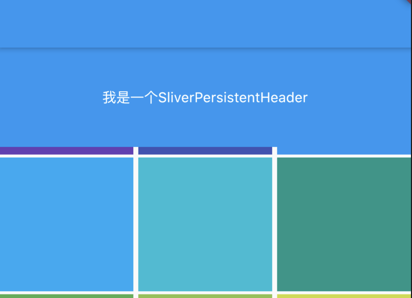
floating 设置为true时,向下滑动时,即使当前CustomScrollView不在顶部,SliverAppBar也会跟着一起向下出现
pinned 设置为true时,当SliverAppBar内容滑出屏幕时,将始终渲染一个固定在顶部的收起状态
title: 'SliverPrototypeExtentList' description: '' type: widget
SliverPrototypeExtentList
SliverPrototypeExtentList和SliverList用法一样,区别是SliverPrototypeExtentList的高度由prototypeItem控件决定。
SliverPrototypeExtentList 比SliverList更加高效,因为SliverFixedExtentList无需计算子控件的布局。
SliverPrototypeExtentList比SliverFixedExtentList更加灵活,因为SliverPrototypeExtentList不必指定像素高度。
SliverPrototypeExtentList通常用于不确定item高度,随prototypeItem变化的场景,比如调整整个App字体的大小,字体越大,需要的高度越高,如果使用SliverFixedExtentList指定具体的高度,会出现字体显示不全的状况。
用法如下:
CustomScrollView(
slivers: <Widget>[
SliverPrototypeExtentList(
prototypeItem: Text('老孟',style: TextStyle(fontSize: 28),),
delegate: SliverChildBuilderDelegate((content, index) {
return Container(
color: Colors.primaries[index % Colors.primaries.length],
);
}, childCount: 50),
),
],
)
title: 'SliverToBoxAdapter' description: '' type: widget
SliverToBoxAdapter
在使用CustomScrollView创建自定义滚动效果的时候,CustomScrollView只能包含sliver系列组件,如果包含普通的组件如何处理?使用SliverToBoxAdapter包裹。
CustomScrollView(
slivers: <Widget>[
SliverToBoxAdapter(
child: Container(
height: 100,
color: Colors.black,
),
),
SliverList(
delegate: SliverChildBuilderDelegate((content, index) {
return Container(
height: 65,
color: Colors.primaries[index % Colors.primaries.length],
);
}, childCount: 50),
)
],
)
黑色区域就是SliverToBoxAdapter包裹的部分。
title: 'SnackBar SnackBarAction' description: '' type: widget
SnackBar
带有可选操作的轻量级消息,在屏幕底部短暂显示,SnackBar一般不单独使用,而是配合Scaffold.of(context).showSnackBar进行弹出展示。
RaisedButton(
onPressed: () {
Scaffold.of(context).showSnackBar(SnackBar(
content: Text('老孟,专注分享Flutter相关技术'),
));
},
)
设置背景和形状:
Scaffold.of(context).showSnackBar(SnackBar(
backgroundColor: Colors.red,
elevation: 8,
shape: RoundedRectangleBorder(borderRadius: BorderRadius.circular(100)),
content: Text('老孟,专注分享Flutter相关技术'),
));
content属性不一定是文字,也可以是其他组件,比如显示一个图标和文字:
Scaffold.of(context).showSnackBar(SnackBar(
content: Row(
children: <Widget>[
Icon(Icons.check,color: Colors.green,),
Text('下载成功')],
),
duration: Duration(seconds: 1),
));
设置显示时间,默认是4秒:
Scaffold.of(context).showSnackBar(SnackBar(
duration: Duration(seconds: 2),
content: Text('老孟,专注分享Flutter相关技术'),
));
onVisible属性是在显示的时候调用。
SnackBar的有2种弹出形式,默认是fixed,直接在底部弹出,另一种是floating,悬浮在底部,用法如下:
Scaffold.of(context).showSnackBar(SnackBar(
content: Row(
children: <Widget>[
Icon(Icons.check,color: Colors.green,),
Text('下载成功')],
),
behavior: SnackBarBehavior.floating,
));
floating效果:
SnackBarAction
SnackBarAction 用在SnackBar中,
Scaffold.of(context).showSnackBar(SnackBar(
action: SnackBarAction(
label: '确定',
onPressed: () {
print('确定');
},
),
content: Text('老孟,专注分享Flutter相关技术'),
));
瞬间多个弹出延迟问题
当短时间内多次调用SnackBar方法时,SnackBar消息将会以队列的形式一个一个的弹出,比如下面的代码:
RaisedButton(
child: Text(
'点我,弹出SnackBar',
),
onPressed: () {
List.generate(10, (index){
Scaffold.of(context).showSnackBar(SnackBar(
content: Text('我是消息:$index'),
));
});
},
)
默认情况下每个显示4秒,如果有10个,那么40秒内会一直弹消息,体验明显不友好,我们希望的效果是如果有新的消息时,旧的都消息立刻消失,显示新的消息,只需在弹出新的SnackBar时移除现在的SnackBar,
Scaffold.of(context).removeCurrentSnackBar();
Scaffold.of(context).showSnackBar(...);
title: 'Stack' description: '控件介绍' type: widgets
Stack
Stack组件可以将子组件叠加显示,根据子组件的顺利依次向上叠加,用法如下:
Stack(
children: <Widget>[
Container(
height: 200,
width: 200,
color: Colors.red,
),
Container(
height: 170,
width: 170,
color: Colors.blue,
),
Container(
height: 140,
width: 140,
color: Colors.yellow,
)
],
)
效果如下:
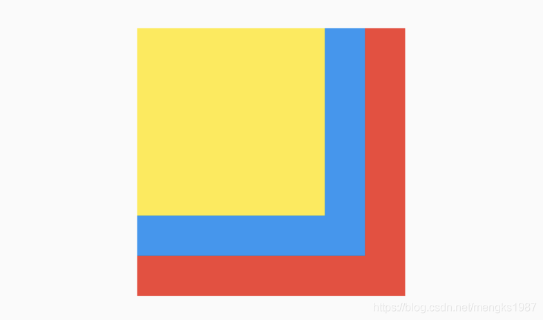
Stack未定位的子组件大小由fit参数决定,默认值是StackFit.loose,表示子组件自己决定,StackFit.expand表示尽可能的大,用法如下:
Stack(
fit: StackFit.expand,
...
)
Stack未定位的子组件的默认左上角对齐,通过alignment参数控制,用法如下:
Stack(
alignment: Alignment.center,
...
)
效果如下:
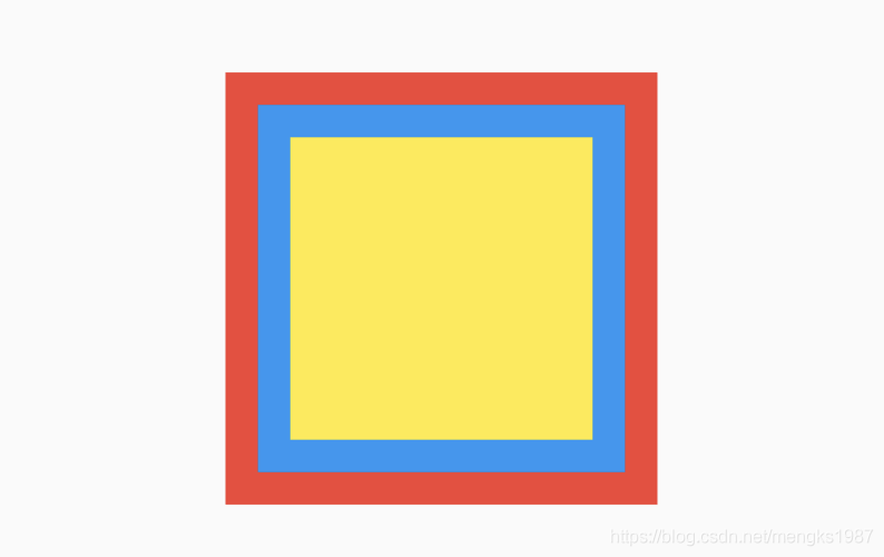
有没有注意到fit和alignment参数控制的都是未定位的子组件,那什么样的组件叫做定位的子组件?使用Positioned包裹的子组件就是定位的子组件,用法如下:
Stack(
alignment: Alignment.center,
children: <Widget>[
Container(
height: 200,
width: 200,
color: Colors.red,
),
Positioned(
left: 10,
right: 10,
bottom: 10,
top: 10,
child: Container(
color: Colors.green,
),
)
],
)
Positioned组件可以指定距Stack各边的距离,效果如下:
如果子组件超过Stack边界由overflow控制,默认是裁剪,下面设置总是显示的用法:
Stack(
overflow: Overflow.visible,
children: <Widget>[
Container(
height: 200,
width: 200,
color: Colors.red,
),
Positioned(
left: 100,
top: 100,
height: 150,
width: 150,
child: Container(
color: Colors.green,
),
)
],
)
效果如下:
IndexedStack
IndexedStack是Stack的子类,Stack是将所有的子组件叠加显示,而IndexedStack只显示指定的子组件,用法如下:
IndexedStack(
index: _index,
children: <Widget>[
Center(
child: Container(
height: 300,
width: 300,
color: Colors.red,
alignment: Alignment.center,
child: Icon(
Icons.fastfood,
size: 60,
color: Colors.blue,
),
),
),
Center(
child: Container(
height: 300,
width: 300,
color: Colors.green,
alignment: Alignment.center,
child: Icon(
Icons.cake,
size: 60,
color: Colors.blue,
),
),
),
Center(
child: Container(
height: 300,
width: 300,
color: Colors.yellow,
alignment: Alignment.center,
child: Icon(
Icons.local_cafe,
size: 60,
color: Colors.blue,
),
),
),
],
)
通过点击按钮更新_index值,代码如下:
Row(
mainAxisAlignment: MainAxisAlignment.center,
children: <Widget>[
IconButton(
icon: Icon(Icons.fastfood),
onPressed: () {
setState(() {
_index = 0;
});
},
),
IconButton(
icon: Icon(Icons.cake),
onPressed: () {
setState(() {
_index = 1;
});
},
),
IconButton(
icon: Icon(Icons.local_cafe),
onPressed: () {
setState(() {
_index = 2;
});
},
),
],
)
效果如下:
title: 'StatefulBuilder' description: '' type: widget
StatefulBuilder
StatefulBuilder提供了局部更新控件的方法,当StatefulWidget中控件树较大时,更新一个属性导致整个树重建,消耗性能,而使用StatefulBuilder能有效的提高性能。
使用场景:弹出一个对话框,当这个对话框有状态变化时,使用StatefulBuilder控件
showDialog<void>(
context: context,
builder: (BuildContext context) {
int selectedRadio = 0;
return AlertDialog(
content: StatefulBuilder(
builder: (BuildContext context, StateSetter setState) {
return Column(
mainAxisSize: MainAxisSize.min,
children: List<Widget>.generate(4, (int index) {
return Radio<int>(
value: index,
groupValue: selectedRadio,
onChanged: (int value) {
setState(() => selectedRadio = value);
},
);
}),
);
},
),
);
},
);
title: 'Stepper | Step' description: '展示一系列步骤的进度、material 风格控件' type: widgets
Stepper
Stepper控件是一个展示一系列步骤进度的控件,用法如下:
Stepper(
steps: <Step>[
Step(
title: Text('2020-4-23'),
content: Text('今天是2020-4-23')
),
Step(
title: Text('2020-4-24'),
content: Text('今天是2020-4-24')
),
Step(
title: Text('2020-4-25'),
content: Text('今天是2020-4-25')
),
],
)
效果如下:
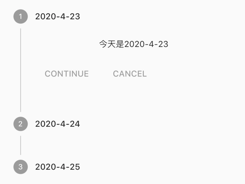
Step还可以设置subtitle属性,用法如下:
Step(
title: Text('2020-4-23'),
subtitle: Text('老孟'),
content: Text('今天是2020-4-23')
)
效果如下:
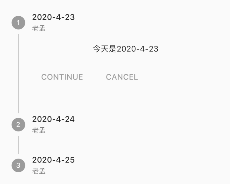
state参数可以设置为StepState.complete、StepState.indexed等,其余参数可以参考StepState类,用法如下:
Step(
title: Text('2020-4-23'),
subtitle: Text('老孟'),
content: Text('今天是2020-4-23'),
state: StepState.complete
)
影响字体样式和圆圈内图标:
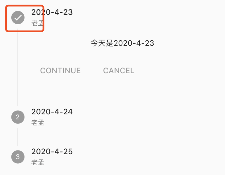
设置为StepState.error的效果:
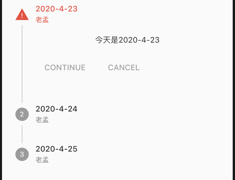
点击事件:
Stepper(
onStepCancel: (){
print('onStepCancel');
},
onStepContinue: (){
print('onStepContinue');
},
onStepTapped: (index){
print('onStepTapped:$index');
},
...
)
onStepCancel:点击CANCEL回调。
onStepContinue:点击CONTINUE回调。
onStepTapped:点击Step时回调。
效果如下:
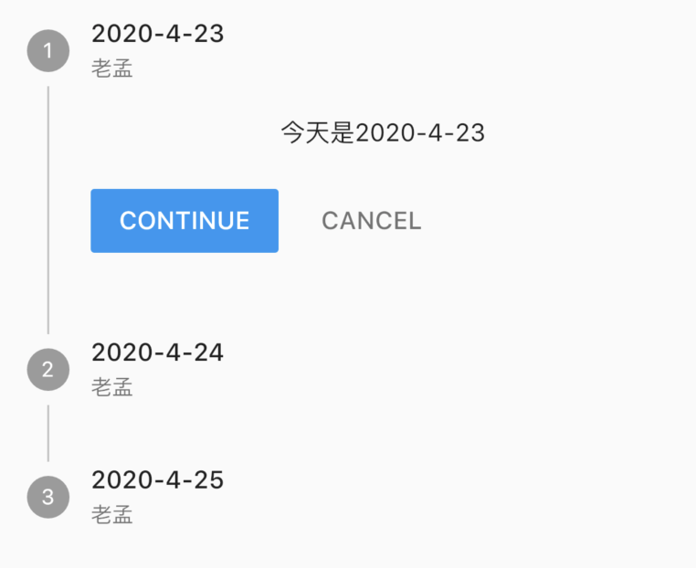
切换显示的Step,设置如下:
int _currentStep = 0;
Stepper(
onStepTapped: (index) {
setState(() {
_currentStep = index;
});
},
currentStep: _currentStep,
...
)
效果如下:
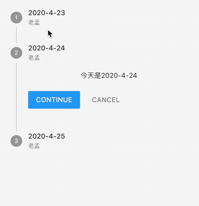
我们最关心的是每一个Step下面的2个按钮如何去掉呢?可以使用controlsBuilder,用法如下:
Stepper(
controlsBuilder: (BuildContext context, {VoidCallback onStepContinue, VoidCallback onStepCancel}){
return Row(
children: <Widget>[],
);
},
...
)
效果如下:
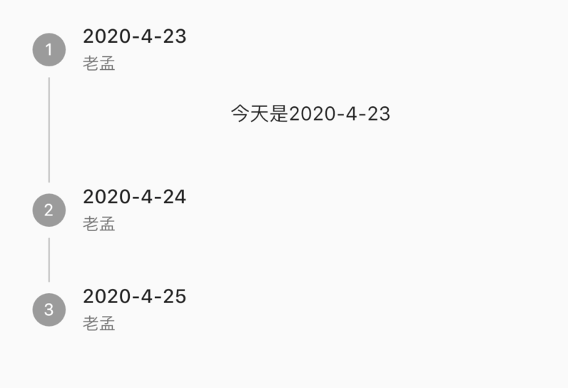
修改下面的2个按钮:
Stepper(
controlsBuilder: (BuildContext context, {VoidCallback onStepContinue, VoidCallback onStepCancel}){
return Row(
children: <Widget>[
RaisedButton(
child: Text('确定'),
onPressed: onStepContinue,
),
RaisedButton(
child: Text('取消'),
onPressed: onStepCancel,
),
],
);
},
...
)
效果如下:
Stepper(
controlsBuilder: (BuildContext context, {VoidCallback onStepContinue, VoidCallback onStepCancel}){
return Row(
children: <Widget>[
FlatButton(
child: Text('确定'),
onPressed: onStepContinue,
),
FlatButton(
child: Text('取消'),
onPressed: onStepCancel,
),
],
);
},
onStepTapped: (index) {
setState(() {
_currentStep = index;
});
},
onStepContinue: (){},
onStepCancel: (){},
...
)
效果如下:
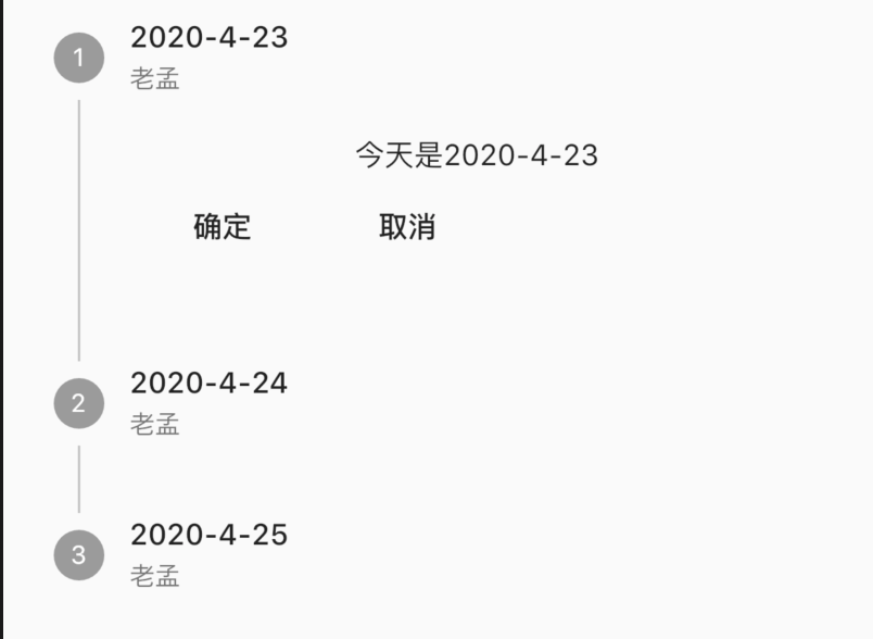
title: 'StreamBuilder' description: '控件介绍' type: widgets
StreamBuilder
StreamBuilder组件用于异步接收数据更新组件,与FutureBuilder不同的地方在于StreamBuilder可以接收多个异步操作。
使用StreamBuilder首先需要构建一个Stream,我们可以使用StreamController,用法如下:
StreamController<String> _streamController;
@override
void initState() {
_streamController = StreamController<String>();
...
}
StreamBuilder的用法如下:
StreamBuilder(
stream: _streamController.stream,
builder: (BuildContext context, AsyncSnapshot<String> snapshot) {
if (snapshot.hasData) {
return Text(snapshot.data);
}
return Text('未收到数据');
},
)
注意最后关闭:
@override
dispose() {
super.dispose();
_streamController.close();
}
通过点击按钮发送数据:
RaisedButton(
child: Text('发送数据'),
onPressed: () {
_streamController.add('老孟,一枚有态度的程序员');
},
)
此时就会构建新的文本。
title: 'Switch' description: '控件介绍' type: widgets
Switch
Switch为material风格的开关组件,基本用法如下:
var _switchValue = false;
_buildSwitch(){
return Switch(
value: _switchValue,
onChanged: (value){
setState(() {
_switchValue = value;
});
},
);
}
效果如下:
设置激活状态下thumb及track颜色,用法如下:
Switch(
activeColor: Colors.red,
activeTrackColor: Colors.blue,
...
)
效果如下:
注意红色区域为thumb,蓝色区域为track。
thumb区域也可以设置图片,用法如下:
Switch(
activeThumbImage: AssetImage('images/bird.png',),
...
)
效果如下:
有激活状态样式的设置,也有未激活样式的设置,用法如下:
Switch(
inactiveThumbColor: Colors.black54,
inactiveThumbImage: AssetImage('images/bird.png',),
inactiveTrackColor: Colors.blue,
...
)
SwitchListTile
SwitchListTile是Switch和ListTile组合控件,基本用法如下:
var _switchValue = false;
_buildSwitch(){
return SwitchListTile(
title:Text('是否允许4G下载'),
value: _switchValue,
onChanged: (value){
setState(() {
_switchValue = value;
});
},
);
}
效果如下:
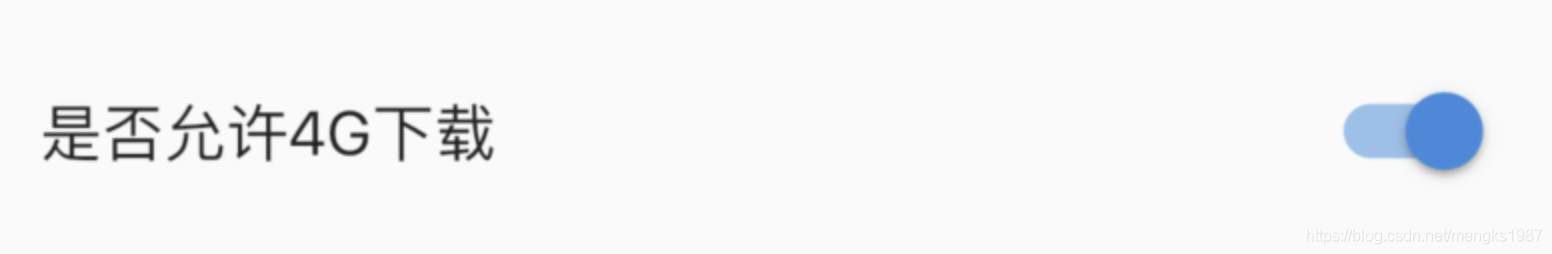
所有的属性都是Switch和ListTile属性的组合,可到具体控件查看其属性。
CupertinoSwitch
CupertinoSwitch是ios风格控件,用法和Switch一样,用法如下:
var _switchValue = false;
_buildSwitch(){
return CupertinoSwitch(
value: _switchValue,
onChanged: (value){
setState(() {
_switchValue = value;
});
},
);
}
效果如下:
title: 'Tab' description: 'Material 风格 tab,用于TabBar的tab' type: widgets
Tab
Material 风格 tab,用于TabBar的tab。Tab可以单独作为一个控件使用,但通常情况下作为TabBar的tabs,用法如下:
TabBar(
controller: _tabController,
labelColor: Colors.blue,
tabs: <Widget>[
Tab(
text: '老孟',
),
Tab(
text: 'Flutter',
),
],
)
效果如下:
设置图标:
Tab(
text: '老孟',
icon: Icon(Icons.add),
),
图标和text是上下布局,icon位于上部,效果如下:
设置child属性,child和text不能同时设置,child通常设置为Text控件,用法如下:
Tab(
child: Text('老孟',style: TextStyle(color: Colors.red),),
icon: Icon(Icons.add),
)
效果如下:
title: 'TabBar' description: '控件介绍' type: widgets
TabBar
TabBar 是一排水平的标签,可以来回切换,效果图:
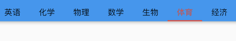
| 属性 | 说明 |
|---|---|
| tabs | 一系列标签控件 |
| controller | 标签选择变化控制器 |
| isScrollable | 是否可滚动,默认false |
| indicatorColor | 指示器颜色 |
| indicatorWeight | 指示器粗细 |
| indicator | 指示器,可自定义形状等样式 |
| indicatorSize | 指示器长短,tab:和tab一样长,label:和标签label 一样长 |
| labelColor | 标签颜色 |
| labelStyle | 标签样式 |
| labelPadding | 标签padding |
| unselectedLabelColor | 未选中标签颜色 |
| unselectedLabelStyle | 未选中标签样式 |
TabBarView
TabBar 一般情况下和TabBarView一起使用,TabBarView用于选择不同的TabBar,TabBarView显示对应的View TabBarView属性说明:
| children | 一系列子控件,如果和TabBar一起使用注意和TabBar的长度一样 |
| controller | 控制器,如果和TabBar一起使用注意和TabBar使用同一个controller |
使用:
import 'package:flutter/material.dart';
class TabBarDemo extends StatefulWidget {
@override
State<StatefulWidget> createState() => _TabBar();
}
class _TabBar extends State<TabBarDemo> {
final List<String> _tabValues = [
'语文',
'英语',
'化学',
'物理',
'数学',
'生物',
'体育',
'经济',
];
TabController _controller;
@override
void initState() {
super.initState();
_controller = TabController(
length: _tabValues.length,
vsync: ScrollableState(),
);
}
@override
Widget build(BuildContext context) {
// TODO: implement build
return Scaffold(
appBar: AppBar(
title: Text('TabBar'),
bottom: TabBar(
tabs: _tabValues.map((f) {
return Text(f);
}).toList(),
controller: _controller,
indicatorColor: Colors.red,
indicatorSize: TabBarIndicatorSize.tab,
isScrollable: true,
labelColor: Colors.red,
unselectedLabelColor: Colors.black,
indicatorWeight: 5.0,
labelStyle: TextStyle(height: 2),
),
),
body: TabBarView(
controller: _controller,
children: _tabValues.map((f) {
return Center(
child: Text(f),
);
}).toList(),
),
);
}
}
效果:
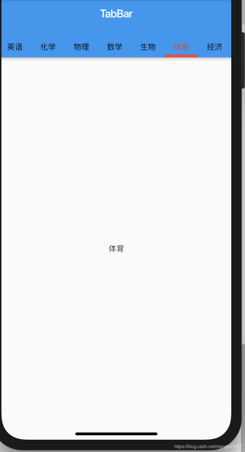
title: 'Table' description: '控件介绍' type: widgets
Table
Table组件是一个表格组件,适合不滑动的网格控件,尤其是如果拥有不同大小的小控件。嵌套的行和列可能会比较乱,但Table组件组件提供了一致性并为您调整子窗口的大小。
Table
基本用法:
Table(
children: [
TableRow(
children: [
TableCell(child: Text('姓名')),
TableCell(child: Text('性别')),
TableCell(child: Text('年龄')),
]
),
TableRow(
children: [
TableCell(child: Text('老孟')),
TableCell(child: Text('男')),
TableCell(child: Text('18')),
]
),
TableRow(
children: [
TableCell(child: Text('小红')),
TableCell(child: Text('女')),
TableCell(child: Text('18')),
]
),
],
)
效果如下:
给表格添加边框:
Table(
border: TableBorder(
horizontalInside: BorderSide(color: Colors.red),
verticalInside: BorderSide(color: Colors.green),
)
...
)
效果如下:
只有表格内部有边框,给四周也加上边框:
Table(
border: TableBorder(
top: BorderSide(color: Colors.red),
left: BorderSide(color: Colors.red),
right: BorderSide(color: Colors.red),
bottom: BorderSide(color: Colors.red),
horizontalInside: BorderSide(color: Colors.red),
verticalInside: BorderSide(color: Colors.green),
)
...
)
效果如下:
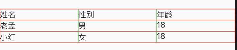
列宽默认是平分的,也可以设置为固定的宽度,代码如下:
Table(
defaultColumnWidth: FixedColumnWidth(100),
...
)
TableRow
TableRow表示表格的行,TableRow有多个TableCell,基本用法如下:
TableRow(children: [
TableCell(child: Text('姓名')),
TableCell(child: Text('性别')),
...
]),
设置TableRow的装饰,用法如下:
TableRow(
decoration: ShapeDecoration(
shape: RoundedRectangleBorder(
borderRadius: BorderRadius.circular(30)),
color: Colors.blue),
children: [
TableCell(child: Text('姓名')),
TableCell(child: Text('性别')),
TableCell(child: Text('年龄')),
]),
效果如下:
TableCell
TableCell表示每一个网格内的控件,用法如下:
TableCell(child: Text('年龄')),
设置其垂直方向的对齐方式:
TableCell(
child: Text('老孟'),
verticalAlignment: TableCellVerticalAlignment.middle,
),
title: 'TabPageSelector' description: '小圆圈指示器' type: widgets
TabPageSelector
TabPageSelector是小圆圈指示器,个数取决于TabController,通常和TabBarView配合使用,用法如下:
Column(
children: <Widget>[
Container(
height: 50,
width: double.infinity,
color: Colors.blue,
alignment: Alignment.center,
child: TabPageSelector(
controller: _tabController,
color: Colors.white,
selectedColor: Colors.red,
),
),
Expanded(
child: TabBarView(
controller: _tabController,
children: <Widget>[
Container(
color: Colors.blue,
),
Container(
color: Colors.red,
),
Container(
color: Colors.yellow,
),
],
),
),
],
)
效果如下:
TabPageSelector和TabBarView使用同一个controller。
title: 'TabPageSelectorIndicator' description: '一个指定背景颜色、边框颜色和大小的圆形指示器' type: widgets
TabPageSelectorIndicator
TabPageSelectorIndicator是一个指定背景颜色、边框颜色和大小的圆形指示器,用法如下:
TabPageSelectorIndicator(
backgroundColor: Colors.blue,
borderColor: Colors.red,
size: 100,
)
效果如下:
TabPageSelectorIndicator是一个相对简单的控件,其实质就是一个Container,源代码如下:
@override
Widget build(BuildContext context) {
return Container(
width: size,
height: size,
margin: const EdgeInsets.all(4.0),
decoration: BoxDecoration(
color: backgroundColor,
border: Border.all(color: borderColor),
shape: BoxShape.circle,
),
);
}
title: 'Text' description: '单一样式的文字' type: widgets
Text
Text是显示文本的组件,最常用的组件,都没有之一。基本用法如下:
Text('老孟,一枚有态度的程序员')
一般情况下App的最外层都是Scaffold组件包裹,因此Text有默认的样式,如果Text组件的父组件没有Scaffold,需要设置样式。
style
style是文本的样式,可以设置颜色、字体、大小、背景颜色等等,具体参考TextStyle。基本用法如下:
Text(
'老孟,一枚有态度的程序员。欢迎关注他的公众号',
style: TextStyle(color: Colors.red,fontSize: 16,fontWeight: FontWeight.bold),
)
textAlign
textAlign参数是文本的对齐方式,用法参考【TextAlign】
textDirection
textDirection是指文本的方向,有TextDirection.ltr从左到右和TextDirection.rtl从右到左,阿拉伯等国家的文字就是从右到左,用法如下:
Text(
'老孟,一枚有态度的程序员。欢迎关注他的公众号',
textDirection: TextDirection.rtl,
)
效果如下:
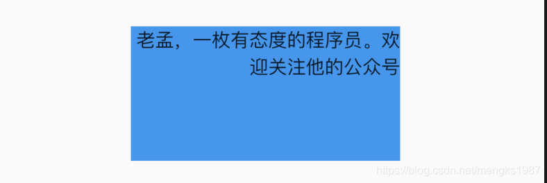
softWrap和overflow
softWrap表示是否自动换行,用法如下:
Text(
'老孟,一枚有态度的程序员。欢迎关注他的公众号',
softWrap: true,
)
设置为false时,显示不全的文本将会按照overflow的设置的方式显示,比如以省略号结尾,用法如下:
Text(
'老孟,一枚有态度的程序员。欢迎关注他的公众号',
softWrap: false,
overflow: TextOverflow.ellipsis,
)
效果如下:
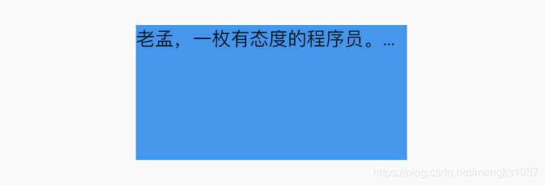
溢出的处理方式说明:
- clip:直接裁剪。
- fade:越来越透明。
- ellipsis:省略号结尾。
- visible:依然显示,此时将会溢出父组件。
textScaleFactor
textScaleFactor是文字缩放系数,用法如下:
Text(
'老孟,一枚有态度的程序员。欢迎关注他的公众号',
textScaleFactor: 1.5,
)
1.5表示比原来的字大50%,效果如下:
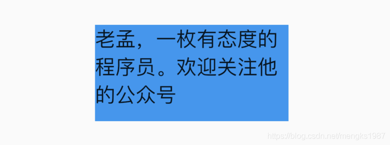
title: 'TextAlign' description: '控件介绍' type: widgets
TextAlign
TextAlign设置文本的对齐方式,用法如下:
Container(
height: 100,
width: 200,
color:Colors.blue,
child: Text(
'老孟,一枚有态度的程序员。欢迎关注他的公众号【老孟程序员】',
textAlign: TextAlign.start,
),
)
要给Text设置宽高的显示,当文本不满一行时,对齐方式的效果就体现出来了,下图是start的效果:
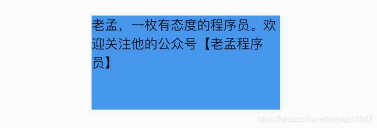
对齐方式说明如下:
- left:对齐父组件的左边。
- right:对齐父组件的右边。
- center:中间对齐。
- justify:拉伸“软换行”对齐父组件,而“硬换行”的文本依然对齐开始边。如果一行文本写到最后还剩2个单位,而下一个字需要4个单位,那么此时这个字不会分开写,而是直接换行,那么上面的可以称为“软换行”,“软换行”导致文本边缘有空隙,对齐方式设置justify时将会拉伸此行,字与字的间隔变大。“软换行”就是正好换行,没有空隙或者不满一行的文本。
- start:对齐父组件的开始边,开始边取决于TextDirection,如果是TextDirection.ltr,开始边是左边,如果是TextDirection.rtl,开始边是右边,
- end:对齐父组件的结束边,同start一样,结束边取决于TextDirection。
title: 'TextField' description: 'material风格文本输入框' type: widgets
TextField
EditableText
EditableText是一个基本的文本输入组件,此组件和TextInput一起让用户编辑输入框的内容,提供滚动、选择、光标运动,但不提供焦点管理。通常情况下我们不会直至使用此组件,而是使用Material风格的TextField组件。
TextInput
TextInput并不是组件,而是Flutter与原生交互的服务,控制键盘的显示。TextField组件的TextInputAction属性通过此服务实现。
TextField
TextField是文本输入组件,即输入框,常用组件之一。基本用法:
TextField()
不需要任何参数,一个最简单的文本输入组件就出来了,效果如下:
decoration
decoration是TextField组件的装饰(外观)参数,类型是InputDecoration。
icon
显示在输入框的前面,用法如下:
TextField(
decoration: InputDecoration(
icon: Icon(Icons.person),
),
)
效果如下:
labelText labelStyle hasFloatingPlaceholder
当输入框是空而且没有焦点时,labelText显示在输入框上边,当获取焦点或者不为空时labelText往上移动一点,labelStyle参数表示文本样式,具体参考TextStyle, 用法如下:
TextField(
decoration: InputDecoration(
labelText: '姓名:',
labelStyle: TextStyle(color:Colors.red)
),
)
效果如下:
hasFloatingPlaceholder参数控制当输入框获取焦点或者不为空时是否还显示labelText,默认为true,显示。
helperText helperStyle helperMaxLines
helperText显示在输入框的左下部,用于提示用户,helperStyle参数表示文本样式,具体参考TextStyle用法如下:
TextField(
decoration: InputDecoration(
helperText: '用户名长度为6-10个字母',
helperStyle: TextStyle(color: Colors.blue),
helperMaxLines: 1
),
)
效果如下:
hintText hintStyle hintMaxLines
hintText是当输入框为空时的提示,不为空时不在显示,用法如下:
TextField(
decoration: InputDecoration(
hintText: '请输入用户名',
hintStyle: TextStyle(color: Colors.grey),
hintMaxLines: 1
),
)
errorText errorStyle errorMaxLines errorBorder
errorText显示在输入框的左下部,默认字体为红色,用法如下:
TextField(
decoration: InputDecoration(
errorText: '用户名输入错误',
errorStyle: TextStyle(fontSize: 12),
errorMaxLines: 1,
errorBorder: OutlineInputBorder(borderSide: BorderSide(color: Colors.red)),
),
)
效果如下:

prefixIcon prefix prefixText prefixStyle
prefix系列的组件是输入框前面的部分,用法如下:
TextField(
decoration: InputDecoration(
prefixIcon: Icon(Icons.person)
),
)
注意prefix和icon的区别,icon是在输入框边框的外部,而prefix在里面,效果如下:
suffix suffixIcon suffixText suffixStyle
suffix和prefix相反,suffix在输入框的尾部,用法如下:
TextField(
decoration: InputDecoration(
suffixIcon: Icon(Icons.person)
),
)
效果:
counter counterText counterStyle
counter组件统计输入框文字的个数,counter仅仅是展示效果,不具备自动统计字数的功能, 自动统计字数代码如下:
var _textFieldValue = '';
TextField(
onChanged: (value){
setState(() {
_textFieldValue = value;
});
},
decoration: InputDecoration(
counterText: '${_textFieldValue.length}/32'
),
)
效果如下:
filled fillColor focusedBorder disabledBorder
filled为true时,输入框将会被fillColor填充,仿QQ登录输入框代码如下:
Container(
height: 60,
width: 250,
child: TextField(
decoration: InputDecoration(
fillColor: Color(0x30cccccc),
filled: true,
enabledBorder: OutlineInputBorder(
borderSide: BorderSide(color: Color(0x00FF0000)),
borderRadius: BorderRadius.all(Radius.circular(100))),
hintText: 'QQ号/手机号/邮箱',
focusedBorder: OutlineInputBorder(
borderSide: BorderSide(color: Color(0x00000000)),
borderRadius: BorderRadius.all(Radius.circular(100))),
),
),
)
效果如下:
isDense contentPadding
- isDense:设置为true则输入框的文本垂直方向空隙更小。
- contentPadding:内边距。
controller
controller是输入框文本编辑的控制器,可以获取TextField的内容、设置TextField的内容,下面将输入的英文变为大写:
TextEditingController _controller;
@override
void initState() {
super.initState();
_controller = TextEditingController()
..addListener(() {
//获取输入框的内容,变为大写
_controller.text = _controller.text.toUpperCase();
});
}
@override
Widget build(BuildContext context) {
return TextField(
controller: _controller,
);
}
@override
dispose() {
super.dispose();
_controller.dispose();
}
有时输入框后面带有“清除”功能,需要controller来实现。如果需要2个TextField的内容进行同步,只需要给2个TextField设置同一个controller即可实现。
keyboardType
keyboardType参数控制软键盘的类型,说明如下:
- text:通用键盘。
- multiline:当TextField为多行时(maxLines设置大于1),右下角的为“换行” 按键。
- number:数字键盘。
- phone:手机键盘,比数字键盘多"*"和 "#"。
- datetime:在ios上和text一样,在android上出现数字键盘、":"和 "-"。
- emailAddress:邮箱键盘,有"@" 和 "."按键。
- url:url键盘,有"/" 和 "."按键。
- visiblePassword:既有字幕又有数字的键盘。
textInputAction
textInputAction参数控制软键盘右下角的按键,说明如下:
- none:android上显示返回键,ios不支持。
- unspecified:让操作系统自己决定哪个合适,一般情况下,android显示“完成”或者“返回”。
- done:android显示代表“完成”的按钮,ios显示“Done”(中文:完成)。
- go:android显示表达用户去向目的地的图标,比如向右的箭头,ios显示“Go”(中文:前往)。
- search:android显示表达搜索的按钮,ios显示"Search"(中文:搜索)。
- send:android显示表达发送意思的按钮,比如“纸飞机”按钮,ios显示"Send"(中文:发送)。
- next:android显示表达“前进”的按钮,比如“向右的箭头”,ios显示"Next"(中文:下一项)。
- previous:android显示表达“后退”的按钮,比如“向左的箭头”,ios不支持。
- continueAction:android 不支持,ios仅在ios9.0+显示"Continue"(中文:继续)。
- join:Android和ios显示"Join"(中文:加入)。
- route:android 不支持,ios显示"Route"(中文:路线)。
- emergencyCall:android 不支持,ios显示"Emergency Call"(中文:紧急电话)。
- newline:android显示表达“换行”的按钮,ios显示”换行“。
大家可能发现了,Android上显示的按钮大部分是不确定的,比如next有的显示向右的箭头,有的显示前进,这是因为各大厂商对Android ROM定制引发的。
textCapitalization
textCapitalization参数是配置键盘是大写还是小写,仅支持键盘模式为text,其他模式下忽略此配置,说明如下:
- words:每一个单词的首字母大写。
- sentences:每一句话的首字母大写。
- characters:每个字母都大写
- none:都小写
这里仅仅是控制软键盘是大写模式还是小写模式,你也可以切换大小写,系统并不会改变输入框内的内容。
textAlign textAlignVertical textDirection
textAlign表示文本的对齐方式,用法参考【TextAlign】。
textAlignVertical表示垂直方向的对齐方式,textDirection表示文本方向,用法如下:
TextField(
textAlignVertical: TextAlignVertical.center,
textDirection: TextDirection.rtl,
)
toolbarOptions
toolbarOptions表示长按时弹出的菜单,有copy、cut、paste、selectAll,用法如下:
TextField(
toolbarOptions: ToolbarOptions(
copy: true,
cut: true,
paste: true,
selectAll: true
),
)
showCursor cursorWidth cursorRadius cursorColor
cursor表示光标,用法如下:
TextField(
showCursor: true,
cursorWidth: 3,
cursorRadius: Radius.circular(10),
cursorColor: Colors.red,
)
效果如下:
密码输入框
将输入框设置为密码框,只需obscureText属性设置true即可,用法如下:
TextField(
obscureText: true,
)
输入格式匹配
通过inputFormatters可以限制用户输入的内容,比如只想让用户输入字符,设置如下:
TextField(
inputFormatters: [
WhitelistingTextInputFormatter(RegExp("[a-zA-Z]")),
],
)
这时用户是无法输入数字的。
onChanged onSubmitted onTap
onChanged是当内容发生变化时回调,onSubmitted是点击回车或者点击软键盘上的完成回调,onTap点击输入框时回调,用法如下:
TextField(
onChanged: (value){
print('onChanged:$value');
},
onEditingComplete: (){
print('onEditingComplete');
},
onTap: (){
print('onTap');
},
)
字数统计
输入框右下角经常需要字数统计,除了使用上面介绍的方法外,还可以使用buildCounter,建议使用此方法,用法如下:
TextField(
maxLength: 100,
buildCounter: (
BuildContext context, {
int currentLength,
int maxLength,
bool isFocused,
}) {
return Text(
'$currentLength/$maxLength',
);
},
)
动态获取焦点
FocusScope.of(context).requestFocus(_focusNode);
_focusNode为TextField的focusNode:
_focusNode = FocusNode();
TextField(
focusNode: _focusNode,
...
)
动态失去焦点
_focusNode.unfocus();
CupertinoTextField
CupertinoTextField和TextField基本一样,TextField是基于Material风格的,而CupertinoTextField是ios风格的输入框。ios风格默认效果如下:

title: 'TextSelectionGestureDetector' description: '' type: widget
TextSelectionGestureDetector
TextSelectionGestureDetector 是一个文本选择的手势识别控件,和GestureDetector的区别是GestureDetector只能处理单击或者双击事件,而TextSelectionGestureDetector可以同时处理单击和双击事件。
TextSelectionGestureDetector(
child: SelectableText('TextSelectionGestureDetector'),
onTapDown: (TapDownDetails details) {
print('onTapDown');
},
)
onTapDown:单击事件
TextSelectionGestureDetector(
child: SelectableText('TextSelectionGestureDetector'),
onTapDown: (TapDownDetails details) {
print('onTapDown');
},
onSingleTapUp: (TapUpDetails details) {
print('onSingleTapUp');
},
onSingleTapCancel: () {
print('onSingleTapCancel');
},
onSingleLongTapStart: (LongPressStartDetails details) {
print('onSingleLongTapStart');
},
onSingleLongTapMoveUpdate: (LongPressMoveUpdateDetails details) {
print('onSingleLongTapMoveUpdate');
},
onSingleLongTapEnd: (LongPressEndDetails details) {
print('onSingleLongTapEnd');
},
)
onSingleTapUp:单击抬起事件
onSingleTapCancel:单击取消事件
onSingleLongTapStart:长按开始事件
onSingleLongTapMoveUpdate:长按移动事件
onSingleLongTapEnd:长按结束事件
TextSelectionGestureDetector(
child: SelectableText('TextSelectionGestureDetector'),
onDoubleTapDown: (TapDownDetails details) {
print('onDoubleTapDown');
},
)
onDoubleTapDown:双击事件
title: 'TextSpan|不同样式文本' description: 'span' type: widgets
TextSpan
文本片段,html里有个span这里有个TextSpan,作用基本相同,文字放一行,text与children任选一样填写。
TextSpan与RichText配合使用可以实现不同样式文字布局。
TextSpan({
this.text,
this.children,//是一个TextSpan的数组,也就是说TextSpan可以包括其他TextSpan
TextStyle style,
this.recognizer,//它是点击链接后的一个处理器,用于对该文本片段上用于手势进行识别处理,设定手势识别器
this.semanticsLabel,
})
案例:
RichText(
text: TextSpan(
style: DefaultTextStyle.of(context).style,
children: <InlineSpan>[
TextSpan(text: '登录即视为同意'),
TextSpan(
text: '《xxx服务协议》',
style: TextStyle(color: Colors.red),
),
]),
)
还可以给一部分文字添加点击效果:
TextSpan(
text: '《xxx服务协议》',
style: TextStyle(color: Colors.red),
recognizer: TapGestureRecognizer()..onTap = () {},
),
本文由Rock提供。
title: 'Theme | CupertinoTheme' description: '将主题应用于子组件' type: widgets
Theme
Theme是一个将主题应用于子组件的组件,用法如下:
Theme(
data: ThemeData(
primaryColor: Colors.red,
),
child: Scaffold(
appBar: AppBar(
title: Text('老孟程序员'),
),
),
)
效果如下:
Theme下有很多主题可以设置:
ThemeData({
Brightness brightness, //深色还是浅色
MaterialColor primarySwatch, //主题颜色样本,见下面介绍
Color primaryColor, //主色,决定导航栏颜色
Color accentColor, //次级色,决定大多数Widget的颜色,如进度条、开关等。
Color cardColor, //卡片颜色
Color dividerColor, //分割线颜色
ButtonThemeData buttonTheme, //按钮主题
Color cursorColor, //输入框光标颜色
Color dialogBackgroundColor,//对话框背景颜色
String fontFamily, //文字字体
TextTheme textTheme,// 字体主题,包括标题、body等文字样式
IconThemeData iconTheme, // Icon的默认样式
TargetPlatform platform, //指定平台,应用特定平台控件风格
...
})
还有很多主题,可以查看ThemeData类,通过名称基本就明白其表示的意思了。
CupertinoTheme
CupertinoThemeData组件是将主题应用于IOS风格的子组件,用法如下:
CupertinoTheme(
data: CupertinoThemeData(
barBackgroundColor: Colors.red,
),
child: CupertinoPageScaffold(
navigationBar: CupertinoNavigationBar(
leading: Icon(Icons.arrow_back),
middle: Text('老孟'),
),
child: Container(),
),
)
效果如下:
CupertinoThemeData主题包括:
const CupertinoThemeData({
Brightness brightness, //深色还是浅色
Color primaryColor, //主色,决定导航栏颜色
Color primaryContrastingColor, //在[primaryColor]背景上呈现时必须易于查看的颜色。
CupertinoTextThemeData textTheme, // 字体主题
Color barBackgroundColor, //导航背景颜色
Color scaffoldBackgroundColor, //整体布局背景颜色
})
title: 'Title' description: '在操作系统中描述此应用的组件' type: widgets
Title
通常情况下,这个组件不会使用,Title是系统使用的组件,用于显示描述此应用的组件,在Android或者IOS中,打开后台所有应用程序的时候,会显示应用的截图和应用名称,这个名称就是通过Title设置的。开发者在MaterialApp设置title属性。
title: 'ToggleButtons' description: '控件介绍' type: widgets
ToggleButtons
ToggleButtons组件将多个组件组合在一起,并让用户从中选择,ToggleButtons基础用法如下:
List<bool> _selecteds = [false, false, true];
ToggleButtons(
isSelected: _selecteds,
children: <Widget>[
Icon(Icons.local_cafe),
Icon(Icons.fastfood),
Icon(Icons.cake),
],
onPressed: (index) {
setState(() {
_selecteds[index] = !_selecteds[index];
});
},
);
isSelected 属性是bool类型集合,数量和children的数量一致,onPressed是点击回调,这时就有了不错了切换按钮行,效果如下:
我们还可以自定义外观,比如设置按钮的颜色:
ToggleButtons(
color: Colors.green,
selectedColor: Colors.orange,
fillColor: Colors.red,
...
)
效果如下:
fillColor是选中按钮的背景颜色。
如果不需要边框,可以将renderBorder设置为false:
ToggleButtons(
renderBorder: false,
)
效果如下:
当然我们也可以设置边框的圆角半径、宽度、颜色等:
ToggleButtons(
borderRadius: BorderRadius.circular(30),
borderColor: Colors.orange,
borderWidth: 3,
selectedBorderColor: Colors.deepOrange,
)
效果如下:
甚至可以设置点击水波纹颜色(splashColor)和按下时的高亮颜色(highlightColor):
ToggleButtons(
splashColor: Colors.purple,
highlightColor: Colors.yellow,
)
效果如下:
如果按钮处于禁用状态,可以设置禁用状态下按钮及边框的颜色:
ToggleButtons(
onPressed: null,
disabledColor: Colors.grey[300],
disabledBorderColor: Colors.blueGrey,
)
效果如下:
如果开发的是web程序,我们可以设置鼠标悬停颜色:
ToggleButtons(
hoverColor: Colors.cyan,
)
title: 'ToggleButtonsTheme ToggleButtonsThemeData' description: '' type: widget
ToggleButtonsTheme
用于ToggleButtons组件样式。
ToggleButtonsTheme(
data: ToggleButtonsTheme.of(context).copyWith(
color: Colors.red
),
child: ToggleButtons(
isSelected: _selecteds,
children: <Widget>[
Icon(Icons.local_cafe),
Icon(Icons.fastfood),
Icon(Icons.cake),
],
onPressed: (index) {
setState(() {
_selecteds[index] = !_selecteds[index];
});
},
),
)
ToggleButtonsThemeData
样式说明如下:
const ToggleButtonsThemeData({
this.textStyle, //文本样式
this.constraints,//定义button尺寸
this.color,//文本和Icon的颜色
this.selectedColor,//选中文本和Icon的颜色
this.disabledColor,//禁用文本和Icon的颜色
this.fillColor,//选中button填充颜色
this.focusColor,//按钮具有输入焦点时用于填充按钮的颜色。
this.highlightColor,//高亮颜色
this.hoverColor,// 指针悬停在它上面时的颜色
this.splashColor,// 水波纹颜色
this.borderColor,//边框颜色
this.selectedBorderColor,//选中边框颜色
this.disabledBorderColor,//禁用边框颜色
this.borderRadius,//边框半径
this.borderWidth,//边框宽度
});
title: 'Tooltip' description: '控件介绍' type: widgets
Tooltip
Tooltip是一个消息提示组件,当用户点击或者长按时显示提示,在屏幕阅读器能够使它语音化,这有助于视力障碍人士阅读,用法如下:
Tooltip(
message: '这是提示',
child: Icon(Icons.storage),
)
效果如下:
我们还可以设置提示的宽高、内外边距、垂直偏移,用法如下:
Tooltip(
padding: EdgeInsets.all(2.0),
margin: EdgeInsets.all(5.0),
verticalOffset: 2,
message: '这是提示',
child: Icon(Icons.storage),
)
设置样式及字体样式,用法如下:
Tooltip(
textStyle: TextStyle(color: Colors.blue),
decoration: BoxDecoration(
color: Colors.red
),
message: '这是提示',
child: Icon(Icons.storage),
)
效果如下:
设置显示和等待时长,用法如下:
Tooltip(
waitDuration: Duration(seconds: 1),
showDuration: Duration(seconds: 2),
message: '这是提示',
child: Icon(Icons.storage),
)
title: 'TooltipTheme TooltipThemeData' description: '' type: widget
TooltipTheme
用于Tooltip样式。
TooltipTheme(
data: TooltipTheme.of(context).copyWith(
decoration: BoxDecoration(
color: Colors.red
)
),
child: Tooltip(
message: '这是提示',
child: Icon(Icons.storage),
),
)
TooltipThemeData
属性说明如下:
const TooltipThemeData({
this.height,//高度
this.padding,//内边距
this.margin,//外边距
this.verticalOffset,//垂直偏移
this.preferBelow,//是否显示在当前控件的下面
this.excludeFromSemantics,//用于语义解析,比如对于视力障碍人士的会转变为语音
this.decoration,//背景颜色和形状
this.textStyle,//文本样式
this.waitDuration,//等待时常
this.showDuration,//显示时常
})
title: 'Transform' description: '控件介绍' type: widgets
Transform
Transform可以对子组件进行变化,比如旋转、平移、缩放等。
基本用法:
return Transform(
transform: Matrix4.rotationZ(0.5),
child: Container(
height: 100,
width: 100,
color: Colors.red,
),
);
transform参数是变化4x4矩阵,上面的案例是绕z轴旋转弧度,效果如下:
origin参数表示变换矩阵的坐标,默认是(0,0)即左上角,如果想围绕圆心旋转,代码如下;
Container(
color: Colors.blue,
child: Transform(
transform: Matrix4.rotationZ(0.5),
origin: Offset(50, 50),
child: Container(
height: 100,
width: 100,
color: Colors.red,
),
),
)
效果如下:
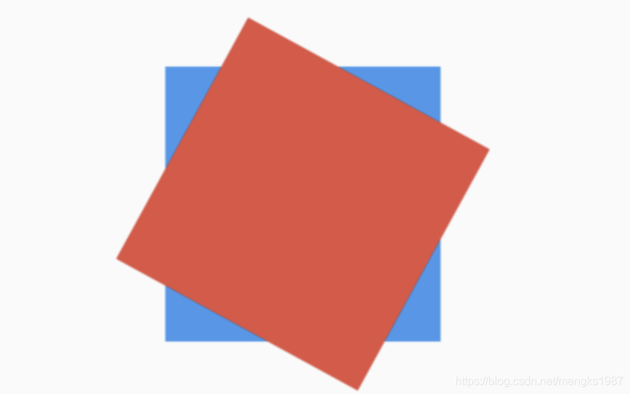
Transform为方便调用构建了Transform.translate、Transform.rotate和Transform.scale,用法如下:
Transform.scale(
scale: 0.5,
child: Container(
height: 100,
width: 100,
color: Colors.red,
),
)
title: 'TweenAnimationBuilder' description: '控件介绍' type: widgets
TweenAnimationBuilder
开发App中有时需要一个简单的动画,可以通过AnimationController实现,但比较麻烦,有没有一个内置的隐式动画组件来解决这个问题?TweenAnimationBuilder可以满足你对所有自定义动画的需求,而不用关系AnimationController。
TweenAnimationBuilder用法比较简单,首先需要一个动画时长参数:
TweenAnimationBuilder<double>(
duration: Duration(seconds: 2),
)
然后添加一个builder方法,用法如下:
builder: (context, value, child) {
return Container(
height: value,
width: value,
child: child,
);
}
builder方法有3个参数,第一个是BuildContext,第二个value的类型取决于你要做动画的数据,比如:
TweenAnimationBuilder<double>(
builder: (context, value, child) {
}
)
value的类型就是double,如果是TweenAnimationBuilder<Color>,value的类型就是Color。
第三个就是TweenAnimationBuilder的子组件,用于优化。
设置tween(动画的值),比如需要一个100到200的差值,设置如下:
tween: Tween<double>(begin: 100.0, end: 200),
如果需要颜色值使用ColorTween,这样我们的动画组件就可以动起来了。
我们也可以设置动画曲线,设置如下:
TweenAnimationBuilder<double>(
curve: Curves.bounceIn,
)
通过onEnd监听动画完成通知,用法如下:
TweenAnimationBuilder<double>(
onEnd: () {}
)
下面写一个图片不断放大变小的demo:
double _value = 200;
@override
Widget build(BuildContext context) {
return Center(
child: TweenAnimationBuilder<double>(
tween: Tween<double>(begin: 100.0, end: _value),
duration: Duration(seconds: 2),
curve: Curves.bounceIn,
builder: (context, value, child) {
return Container(
height: value,
width: value,
child: child,
);
},
onEnd: () {
setState(() {
_value = _value == 200 ? 250 : 200;
});
},
child: Image.network(
'https://flutter.github.io/assets-for-api-docs/assets/widgets/owl-2.jpg',
fit: BoxFit.fill,
),
));
}
效果如下:
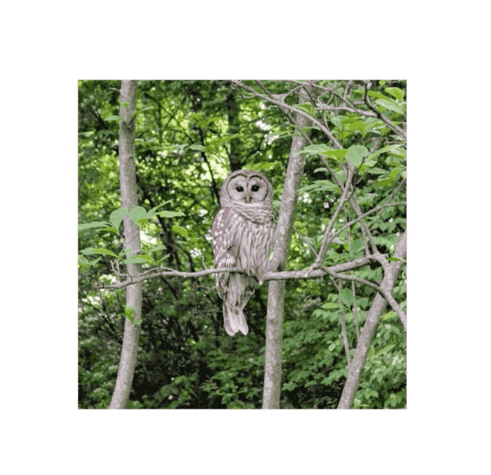
title: 'UserAccountsDrawerHeader' description: 'material 风格的[Drawer]的header控件' type: widgets
UserAccountsDrawerHeader
通常用于[Drawer]的header控件,基础用法如下:
UserAccountsDrawerHeader(
accountName: Text('老孟Flutter'),
accountEmail: Text('laomeng@gmail.com'),
)
效果如下:
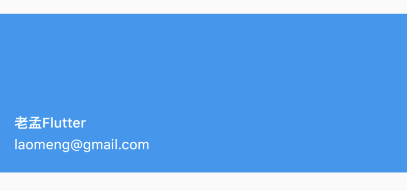
设置decoration:
UserAccountsDrawerHeader(
decoration: BoxDecoration(
color: Colors.green,
borderRadius: BorderRadius.all(Radius.circular(30))
),
accountName: Text('老孟Flutter'),
accountEmail: Text('laomeng@gmail.com'),
)
效果如下:
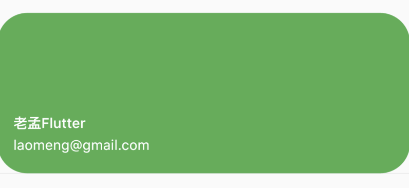
设置当前头像和其他账号头像:
UserAccountsDrawerHeader(
decoration: BoxDecoration(
color: Colors.green,
borderRadius: BorderRadius.all(Radius.circular(30))
),
currentAccountPicture: CircleAvatar(backgroundImage: AssetImage('images/2.png'),),
otherAccountsPictures: <Widget>[
CircleAvatar(backgroundImage: AssetImage('images/1.png'),),
CircleAvatar(backgroundImage: AssetImage('images/1.png'),),
],
accountName: Text('老孟Flutter'),
accountEmail: Text('laomeng@gmail.com'),
)
效果如下:
设置margin:
UserAccountsDrawerHeader(
margin: EdgeInsets.symmetric(vertical: 10,horizontal: 10),
...
)
效果如下:
onDetailsPressed参数不为null时,右下角出现一个三角箭头,三角箭头可以设置其颜色,具有点击效果,可以用于展开详细信息,用法如下:
UserAccountsDrawerHeader(
onDetailsPressed: (){
print('onDetailsPressed');
},
arrowColor: Colors.red,
...
)
效果如下:
UserAccountsDrawerHeader一般用[Draw]组件:
Scaffold(
drawer: Drawer(
child: ListView(
children: <Widget>[
UserAccountsDrawerHeader(
accountName: Text('老孟Flutter'),
accountEmail: Text('laomeng@gmail.com'),
),
],
),
),
...
)
效果如下:
title: 'ValueListenableBuilder | ValueNotifier' description: '控件介绍' type: widgets
ValueListenableBuilder ValueNotifier
在开发应用程序的时候有些数据是全局的,贯穿整个应用程序,比如用户信息,我们希望当这些数据发生变化时,应用程序任何页面的数据都更新,ValueListenableBuilder组件就是解决此问题的。
基本用法如下:
ValueNotifier<String> _name = ValueNotifier<String>('');
ValueListenableBuilder(
builder: (context, value, child) {
return Text(value);
},
valueListenable: _name,
child: Text('未登录'),
);
说明如下:
-
builder:在数据发生变化时调用,共有3个参数,分别表示context、数据新的值、子控件。 -
valueListenable:监听到数据,数据类型为ValueNotifier。 -
child:此参数将会回传给builder,可以为null。
更新数据用法如下:
_name = ValueNotifier<String>('老孟'); //错误用法
_name.value = '老孟';
注意这2种写法,第一种是错误的。
title: 'Visibility' description: '显示/隐藏子控件' type: widgets
Visibility
控制子组件隐藏/可见的组件
Visibility({
Key key,
@required this.child,
this.replacement = const SizedBox.shrink(),//不可见时显示的组件(当maintainState=false)
this.visible = true,//子组件是否可见,默认true(可见)
this.maintainState = false,//不可见时是否维持状态,默认为false
this.maintainAnimation = false,//不可见时,是否维持子组件中的动画
this.maintainSize = false,//不可见时是否留有空间
this.maintainSemantics = false,//不可见时是否维持它的语义
this.maintainInteractivity = false,//不可见时是否具有交互性
})
Offstage与Visibility比较:
Offstage是控制组件隐藏/可见的组件,如果感觉有些单调功能不全,我们可以使用Visibility,Visibility也是控制子组件隐藏/可见的组件。不同是的Visibility有隐藏状态是否留有空间、隐藏状态下是否可调用等功能。
Visibility的用法比较简单,控制控件的显示和隐藏,基本用法如下:
Visibility(
child: Container(
height: 100,
width: 100,
color: Colors.blue,
),
)
默认可见,效果如下:
设置为不可见:
Visibility(
visible: false,
child: Container(
height: 100,
width: 100,
color: Colors.blue,
),
)
此时蓝色的盒子消失。
replacement参数表示隐藏情况下显示的组件,用法如下:
Visibility(
visible: false,
replacement: Container(
height: 50,
width: 50,
color: Colors.red,
),
child: Container(
height: 100,
width: 100,
color: Colors.blue,
),
)
效果如下:
maintainState:表示不可见时是否维持状态,设置为true时,子控件依然会保存在内存中。
maintainAnimation:表示不可见时是否维持动画状态。
maintainSize:表示不可见时是否维持大小。
maintainInteractivity:表示不可见时是否可交互。
本文由Rock提供。
title: 'WidgetsApp' description: '便利类,包装了应用程序通常需要的许多小部件' type: widgets
WidgetsApp
一般情况下,不会直接使用WidgetsApp,而是使用MaterialApp或者CupertinoApp,WidgetsApp组件中有18个参数属性和MaterialApp一样,这些参数可以参考MaterialApp中的说明,下面说说有差别的参数。
textStyle
应用程序默认字体,用法如下:
WidgetsApp(
textStyle: TextStyle(fontSize: 19),
)
debugShowWidgetInspector
debugShowWidgetInspector是在debug模式下打开widgets检查器,此时在模拟器(或者手机)上点击某个控件,代码会直接跳转到相关控件,用法如下:
WidgetsApp(
debugShowWidgetInspector: true,
...
)
这个参数分成方便调试,在Android Studio上也有Flutter Inspector,但目前只能显示控件树,不能图形化,不过据说图形化功能已经快开发完成了,Flutter Inspector效果如下图:
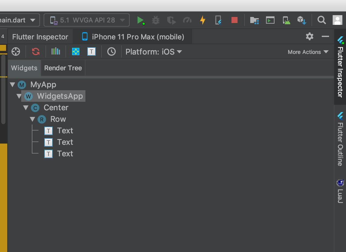
inspectorSelectButtonBuilder
打开debugShowWidgetInspector的情况下,点击一个控件时构建一个按钮,用法如下:
WidgetsApp(
debugShowWidgetInspector: true,
inspectorSelectButtonBuilder: (BuildContext context, VoidCallback onPressed) {
return FloatingActionButton(
child: const Icon(Icons.search),
onPressed: onPressed,
mini: true,
);
},
...
)
title: 'WidgetSpan |文本中嵌入组件' description: 'span' type: widgets
WidgetSpan
WidgetSpan在文本中内嵌固定大小Widget。
WidgetSpan({
@required this.child,
ui.PlaceholderAlignment alignment = ui.PlaceholderAlignment.bottom,//对齐方式
TextBaseline baseline,//基准线对齐
TextStyle style,//文本样式
})
案例:
Text.rich(TextSpan(
children: <InlineSpan>[
TextSpan(text: 'Flutter is'),
WidgetSpan(
child: SizedBox(
width: 120,
height: 50,
child: Card(child: Center(child: Text('Hello World!'))),
)),
TextSpan(text: 'the best!'),
],
))
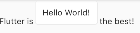
本文由Rock提供。
title: 'WillPopScope | 拦截返回键' description: '控件介绍' type: widgets
WillPopScope
WillPopScope用于处理是否离开当前页面,在Flutter中有多种方式可以离开当前页面,比如AppBar、CupertinoNavigationBar上面的返回按钮,点击将会回到前一个页面,在Android手机上点击实体(虚拟)返回按钮,也将会回到前一个页面,此功能对于iOS程序员来说可能特别容易忽略。
以下几种情况我们会用到WillPopScope:
- 需要询问用户是否退出。
- App中有多个Navigator,想要的是让其中一个 Navigator 退出,而不是直接让在 Widget tree 底层的 Navigator 退出。
询问用户是否退出
在Android App中最开始的页面点击后退按钮,默认会关闭当前activity并回到桌面,我们希望此时弹出对话框或者给出提示“再次点击退出”,避免用户的误操作。
WillPopScope(
onWillPop: () async => showDialog(
context: context,
builder: (context) =>
AlertDialog(title: Text('你确定要退出吗?'), actions: <Widget>[
RaisedButton(
child: Text('退出'),
onPressed: () => Navigator.of(context).pop(true)),
RaisedButton(
child: Text('取消'),
onPressed: () => Navigator.of(context).pop(false)),
])),
child: Container(
alignment: Alignment.center,
child: Text('点击后退按钮,询问是否退出。'),
))
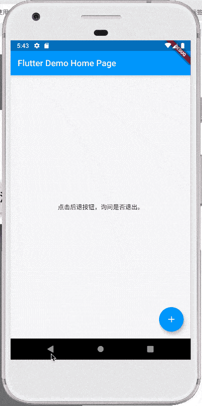
我们也可以把效果做成快速点击2次退出:
DateTime _lastQuitTime;
WillPopScope(
onWillPop: () async {
if (_lastQuitTime == null ||
DateTime.now().difference(_lastQuitTime).inSeconds > 1) {
print('再按一次 Back 按钮退出');
Scaffold.of(context)
.showSnackBar(SnackBar(content: Text('再按一次 Back 按钮退出')));
_lastQuitTime = DateTime.now();
return false;
} else {
print('退出');
Navigator.of(context).pop(true);
return true;
}
},
child: Container(
alignment: Alignment.center,
child: Text('点击后退按钮,询问是否退出。'),
))
App中有多个Navigator
我们的App通常是在MaterialApp和CupertinoApp下,MaterialApp和CupertinoApp本身有一个Navigator,所以默认情况下调用Navigator.pop或者Navigator.push就是在操作此Navigator。不过在一些情况下,我们希望有自己定义的Navigator,比如如下场景:
- 在页面底部有一个常驻bar,其上展示内容,这个常驻bar就需要一个自己的Navigator。
- 在使用TabView、BottomNavigationBar、CupertinoTabView这些组件时,希望有多个Tab,但每个Tab中有自己的导航行为,这时需要给每一个Tab加一个Navigator。
首页:
class MyHomePage extends StatefulWidget {
MyHomePage({Key key, this.title}) : super(key: key);
final String title;
@override
_MyHomePageState createState() => _MyHomePageState();
}
class _MyHomePageState extends State<MyHomePage> {
GlobalKey<NavigatorState> _key = GlobalKey();
@override
Widget build(BuildContext context) {
return Scaffold(
body: WillPopScope(
onWillPop: () async {
if (_key.currentState.canPop()) {
_key.currentState.pop();
return false;
}
return true;
},
child: Column(
children: <Widget>[
Expanded(
child: Navigator(
key: _key,
onGenerateRoute: (RouteSettings settings) =>
MaterialPageRoute(builder: (context) {
return OnePage();
}),
),
),
Container(
height: 50,
color: Colors.blue,
alignment: Alignment.center,
child: Text('底部Bar'),
)
],
)),
);
}
}
第一个页面:
class OnePage extends StatelessWidget {
@override
Widget build(BuildContext context) {
return Scaffold(
body: Center(
child: Container(
child: RaisedButton(
child: Text('去下一个页面'),
onPressed: () {
Navigator.push(context, MaterialPageRoute(builder: (context) {
return TwoPage();
}));
},
),
),
),
);
}
}
第二个页面:
class TwoPage extends StatelessWidget {
@override
Widget build(BuildContext context) {
return Scaffold(
body: Center(
child: Container(
child: Text('这是第二个页面'),
),
),
);
}
}
使用TabView、BottomNavigationBar、CupertinoTabView这些组件时也是一样的原理,只需在每一个Tab中加入Navigator,不要忘记指定key。
title: 'Wrap' description: '控件介绍' type: widgets
Wrap
Wrap可以为子控件进行水平或者垂直方向布局,且当空间用完时,Wrap会自动换行,也是常说的流式布局。
创建多个子控件做为Wrap的子控件,代码如下:
Wrap(
children: List.generate(10, (i) {
double w = 50.0 + 10 * i;
return Container(
color: Colors.primaries[i],
height: 50,
width: w,
child: Text('$i'),
);
}),
)
效果如图:
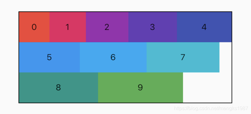
布局方向
direction属性控制布局方向,默认为水平方向,设置方向为垂直代码如下:
Wrap(
direction: Axis.vertical,
...
)
效果如图:
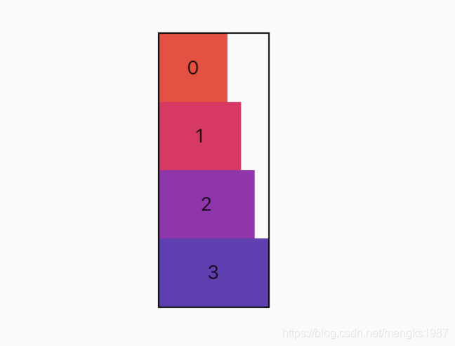
对齐方式
alignment属性控制主轴对齐方式,crossAxisAlignment属性控制交叉轴对齐方式,对齐方式只对有剩余空间的行或者列起作用,例如水平方向上正好填充完整,则不管设置主轴对齐方式为什么,看上去的效果都是铺满。
说明:主轴就是与当前控件方向一致的轴,而交叉轴就是与当前控件方向垂直的轴,如果Wrap的布局方向为水平方向
Axis.horizontal,那么主轴就是水平方向,反之布局方向为垂直方向Axis.vertical,主轴就是垂直方向。
设置主轴对齐方式代码如下:
Wrap(
alignment: WrapAlignment.spaceBetween,
...
)
主轴对齐方式有6种,效果如下图:
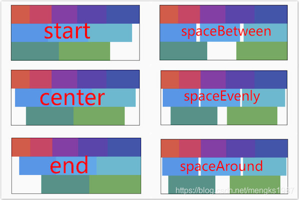
spaceAround和spaceEvenly区别是:
- spaceAround:第一个子控件距开始位置和最后一个子控件距结尾位置是其他子控件间距的一半。
- spaceEvenly:所有间距一样。
设置交叉轴对齐代码如下:
Wrap(
crossAxisAlignment: WrapCrossAlignment.center,
...
)
如果Wrap的主轴方向为水平方向,交叉轴方向则为垂直方向,如果想要看到交叉轴对齐方式的效果需要设置子控件的高不一样,代码如下:
Wrap(
spacing: 5,
runSpacing: 3,
crossAxisAlignment: WrapCrossAlignment.center,
children: List.generate(10, (i) {
double w = 50.0 + 10 * i;
double h = 50.0 + 5 * i;
return Container(
color: Colors.primaries[i],
height: h,
alignment: Alignment.center,
width: w,
child: Text('$i'),
);
}),
)
效果如下图:
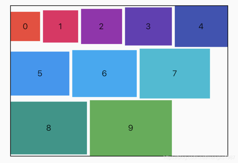
runAlignment属性控制Wrap的主轴垂直方向每一行的对齐方式,语言描述大家可能云里雾绕的,下面直接看runAlignment6中方式对应的效果图,
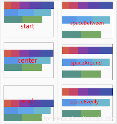
runAlignment和alignment的区别:
alignment是主轴方向上对齐方式,作用于每一行。
runAlignment是垂直主轴方向上将每一行看作一个整体的对齐方式。
设置runAlignment属性代码如下:
Wrap(
runAlignment: WrapAlignment.spaceEvenly,
...
)
runAlignment、alignment、crossAxisAlignment这3个属性如果只是从文字上描述是比较难描述清楚的,上面提供了效果图,方便大家理解,这3个属性是Wrap最重要的属性。
间隔
spacing和runSpacing 属性控制Wrap主轴方向和交叉轴方向子控件之间的间隙,代码如下:
Wrap(
spacing: 5,
runSpacing: 2,
...
)
效果如下:
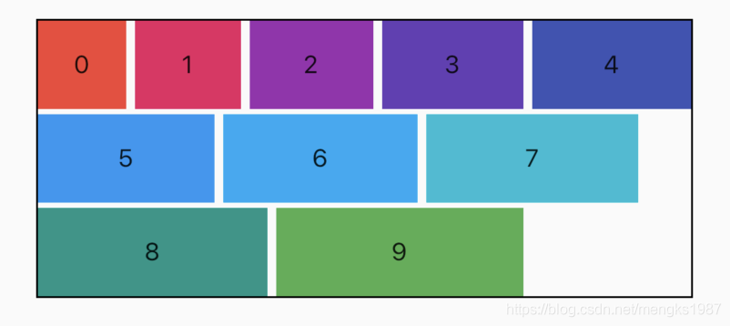
textDirection
textDirection属性表示Wrap主轴方向上子控件的方向,取值范围是ltr(从左到右)和rtl(从右到左),下面是从右到左的代码:
Wrap(
textDirection: TextDirection.rtl,
...
)
效果如下:
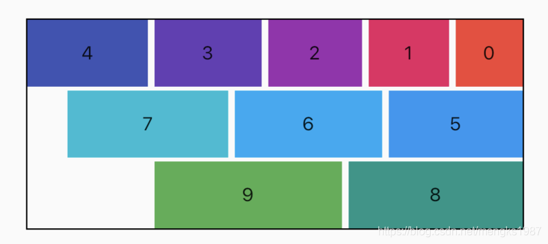
verticalDirection
verticalDirection属性表示Wrap交叉轴方向上子控件的方向,取值范围是up(从上到下)和down(从下到上),设置代码如下:
Wrap(
verticalDirection: VerticalDirection.up,
...
)
效果如下: